2D Design: Branding
Lawrence S. Bloomberg Faculty of Nursing
Client
University of Toronto
Scope of Work
- Research
- Concept Development
- Advertising
- Copy Writing
- Art Direction of Photography
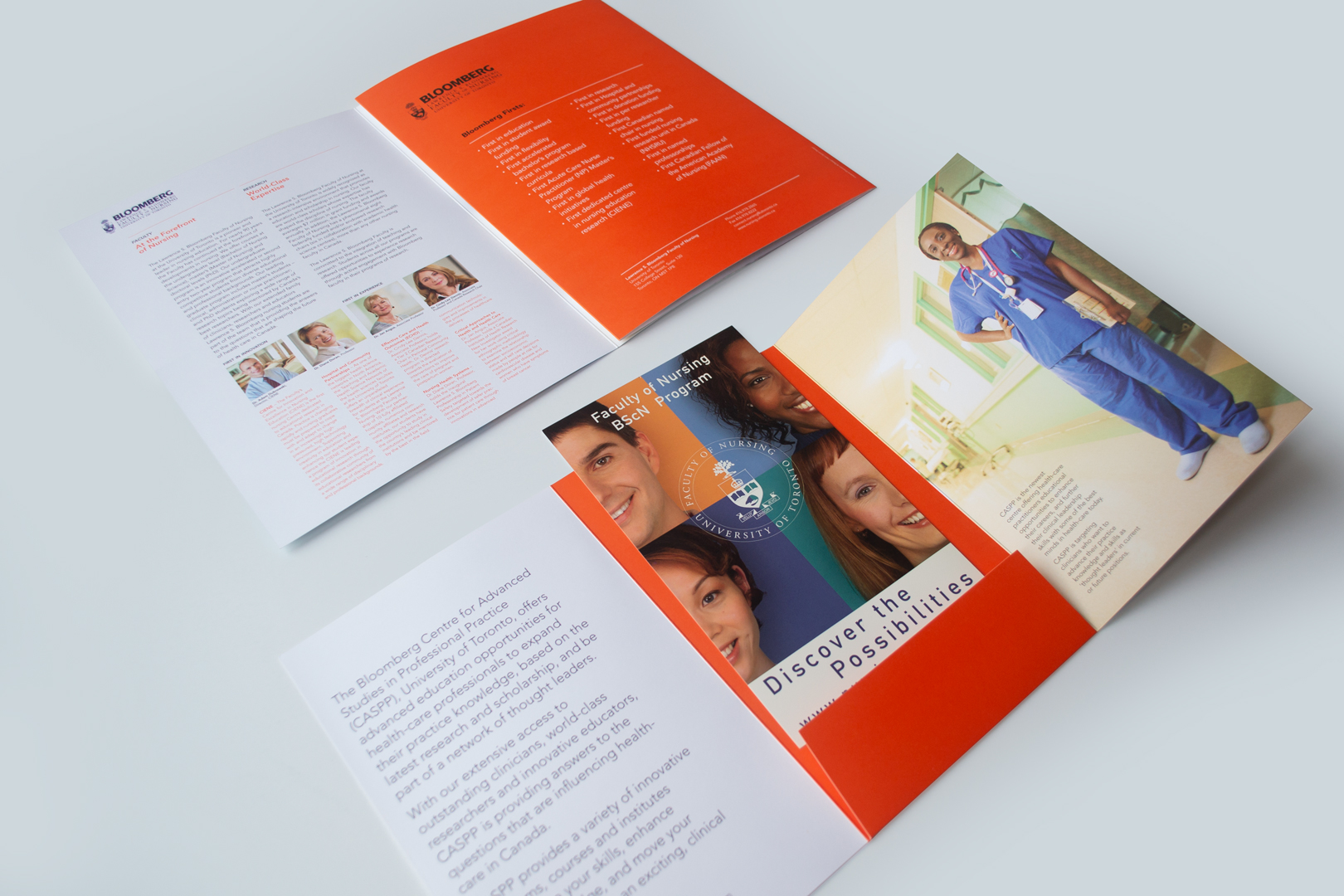
- Recruitment Brochure
- Posters
- Postcards
- Website Template
Strategic Admission, Promotion Recruitment and Brand Communications
For one of Canada’s leading schools of nursing, our strategy, brand toolkit, photography, main messages and key recruitment and promotional materials created an emotional connection for stakeholders to see nurses as personable, confident and professional. Our work helped build a 35% increase in applications.
The Design Challenge
The Faculty of Nursing at the University of Toronto wanted to use strategy, consistency and discipline to communicate their leadership in nursing education. They specifically wanted to highlight their various programs, departments and facilities, and forefront important faculty members. It was also important to create a design strategy that linked with the over-arching University of Toronto design style and blue brand.
Insight
We looked at the landscape of nursing education in Canada. Our research and engagement revealed that the faculty was missing the opportunity to project a friendly, diverse and real face to prospective students, faculty and alumni. We also discovered, the complexity of Bloomberg’s offerings required organization, infographics, clear typography and good writing to clarify the main messages.
Image & Slogan
The slogan “First in Nursing” boldly states the confidence of the faculty. Fundamental to the strategy was our new image library. We art-directed an original portfolio of 25 photographs, which we used on the website, brochure, e-cards, postcards, posters, PowerPoint presentations, advertisements and website template. The portraits deliver a friendly professional message that reflect the diversity of the faculty and students. We chose an orange accent colour to complement the U of T blue and precise typography was used throughout. We employed editorial design techniques in a system of carefully tiered messages to give readers a compelling, accessible and engaging read.
Results
A 35% increase in applications to the Faculty of Nursing were achieved in the first year.


© KerrSmith Design 2023
550 Queen St. East, Unit 335
Toronto, ON M5A 1V2
416-703-5377
