2D Design: Promotion
Canadian Stage
Client
Canadian Stage
Scope of Work
- Research
- Concept
- Layout
- Writing
- Communication Tools
- Fundraising Brochure
Canadian Stage was created from the 1987 merger of Toronto Free Theatre and Centre Stage Company. In July of 2009, Matthew Jocelyn joined the company as Artistic and General Director. He unveiled his first programmed season in 2010-2011, along with a new company mission and brand, Canadian Stage. Over the past six years, Canadian Stage has focused on contemporary aesthetics, technologies and themes, the multidisciplinary, and the international.
In its 30-year history, Canadian Stage has produced groundbreaking works by new and established playwrights. It has employed thousands of artists and developed and produced hundreds of new productions. Many of the plays developed by Canadian Stage have been awarded and nominated for Canada’s most prestigious literary and performing arts honours, including Governor General’s, Chalmers and Dora Mavor Moore Awards.
Throughout the theatre season, nearly 100,000 patrons attend performances and workshops in the three Toronto venues. Throughout its history, Canadian Stage has provided outstanding education and outreach programs cultivating a diverse audience demographic.
Productions have travelled across Canada and internationally to Great Britain, Australia, New Zealand, Norway, the United States, Belgium, Germany and Austria.
Canadian Stage presents an extremely wide variety of avant-garde theatre, performance, music and dance. Working with the company we wanted to create a bold graphic language that would set the tone for this confident and provocative theatre group and link the many types of performance in a consistent promotional style.
We worked closely with the Artistic Director Matthew Jocelyn and Managing Director Su Hutchinson to develop the new look. The company wanted a graphic identity that would help it raise its institutional profile and stand out in the city’s crowded arts landscape, with the goal of attracting new audiences, sponsors and partnerships.
Matthew Jocelyn briefed us to create a visual identity that was different, honest and aligned to the theatre’s ambitious vision. We took inspiration from his own words, and even the words of detractors. We turned criticism into an attribute.
At the centre of the work for Canadian Stage were two common challenges of many performing arts and cultural institutions. The first issue is that any arts organization faces the pull of either promoting its individual productions or the entire institution. Both need to be successful, but budgets are limited and the institution must find a balance. Often in the tradition of theatrical promotion, theatres want to create an individual “iconic” image for every production. However, when each show is promoted individually it does not build continuity or acknowledge the parent institution. When the production becomes noted it establishes a name for the show, not the organization that developed the work.
The second issue is that institutions often don’t have budgets for unique and elaborate images to use in their campaigns for programming. So it can be challenging to find something suitably powerful and memorable that will carry the spirit of the show. Canadian Stage needed a methodology to overcome this deficit as part of their promotion and branding initiatives. They commissioned or acquired good photography of performances, but the result is that there was an unintended sameness to all production promotion. It needed a flexible system that would support all of their plans while promoting an aligned institutional image.
The Solution
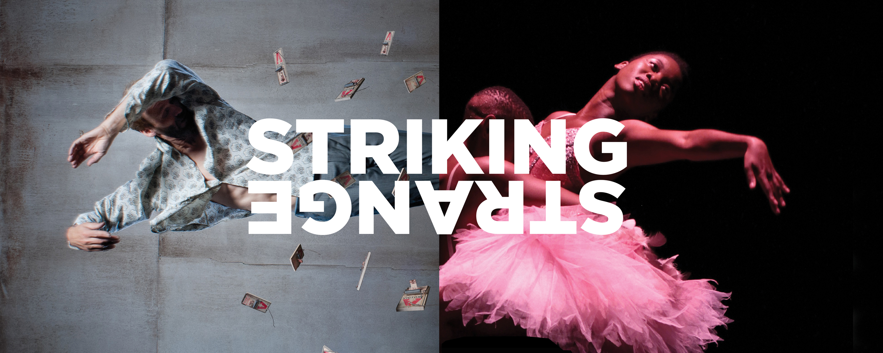
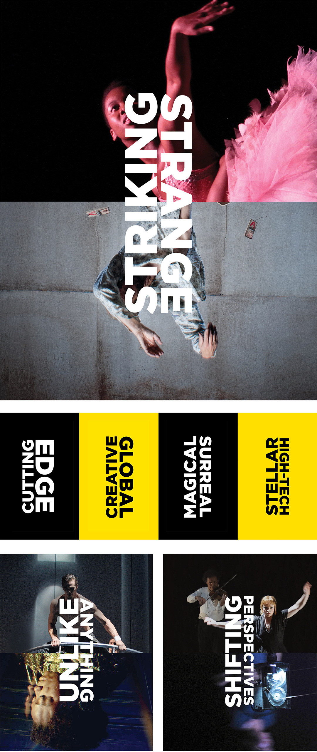
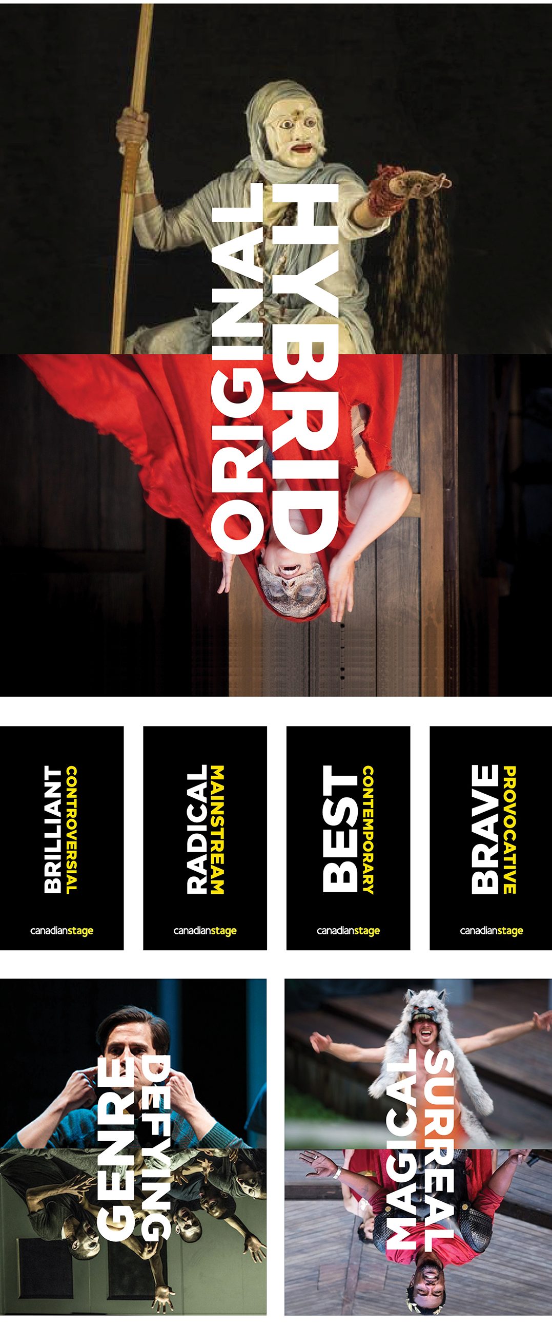
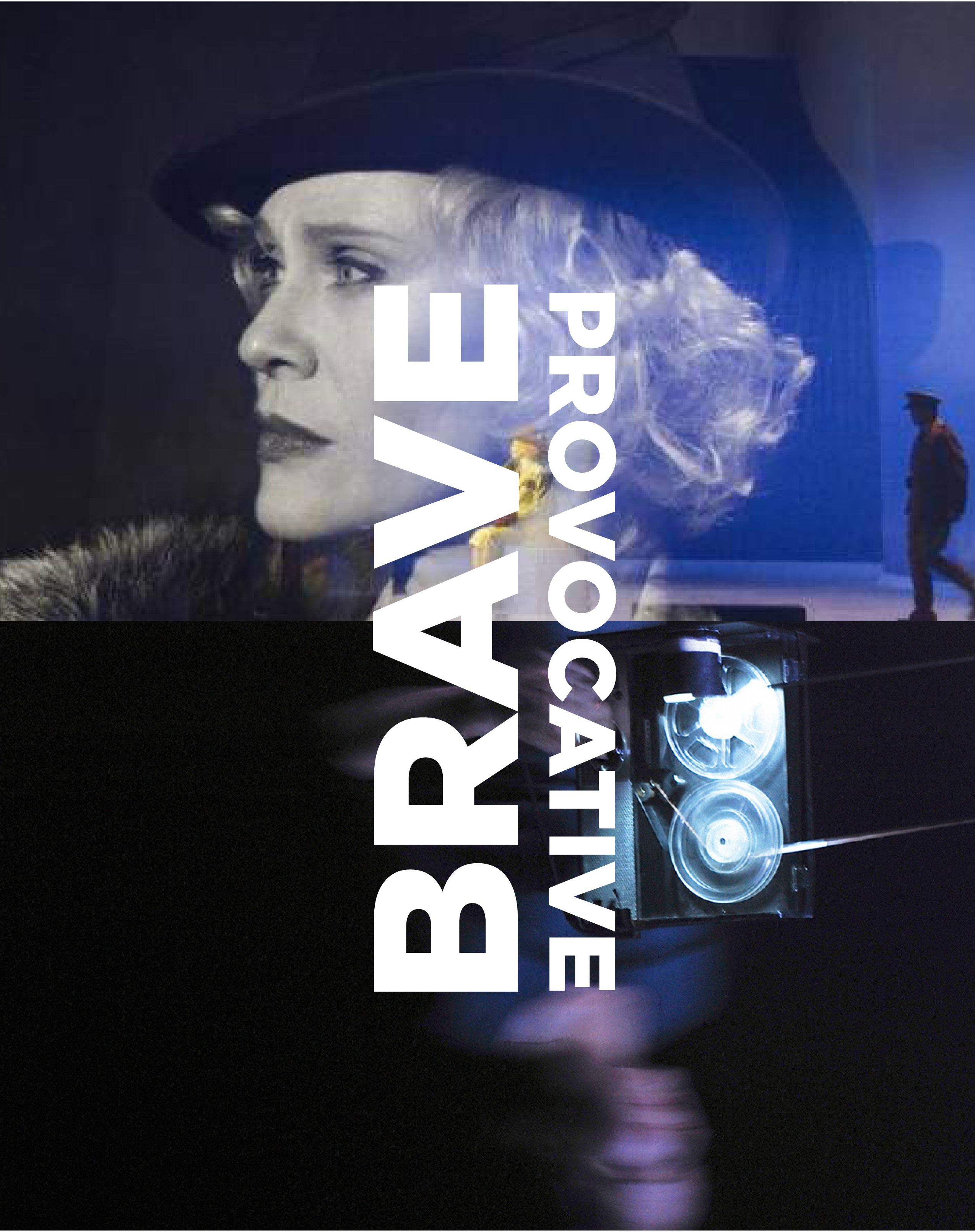
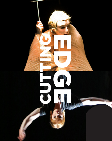
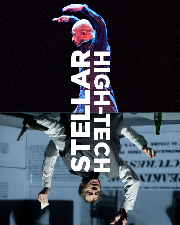
We developed a system that can accommodate a wide range of uses but still be unmistakably read as Canadian Stage. Canadian Stage really is different and they wanted to express this edgy stance. We designed a new style that reflects this bold, original voice. The graphics program combines a simple layout device and strong typography to create an iconic visual personality for the company.
The new framework takes the form of a horizontal image abutment and perpendicular up and down titles in bold typography. The format can be used as a device to present imagery related to a featured play or program, or to represent the larger vision of Canadian Stage.
The written phrases or titles of the posters and brochure covers came directly from the staff, leadership, promotional materials, and media reviews. The joy was to embrace complexity and contradiction in the word choice to reflect the peculiarities of avant-garde contemporary performance.
The identity’s colours are yellow black and white. The concept can also be reduced to typography only. We wanted to create something so distinct that the 2 – dimensional form alone would communicate before the words were even read. The semi-symmetrical pairings with the bold yellow up and down typography are graphic and provocative. They demand pause and a quick deciphering.
The system has a built-in flexibility that will allow it to evolve and adapt with the institution over time. Images of objects, portraits or illustration fragments can be used in the format.
This structure is applied to posters, brochures, reports and the website through a prescribed grid and typographic system that accommodates an ever-changing range of title and image combinations.
© KerrSmith Design 2023
550 Queen St. East, Unit 335
Toronto, ON M5A 1V2
416-703-5377