2D Design
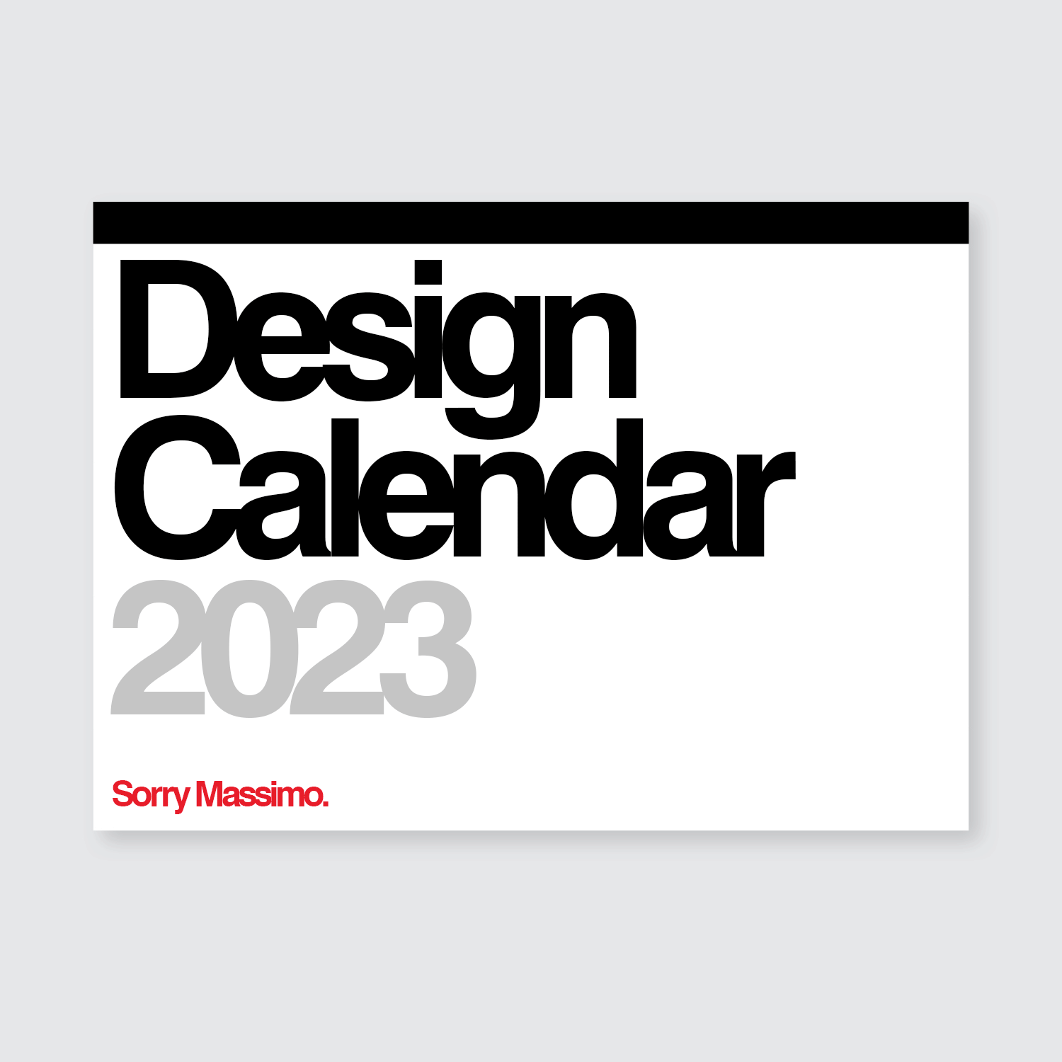
Design Calendar 2023
Based on the Stendig Calendar
Designed by Massimo Vignelli
1967
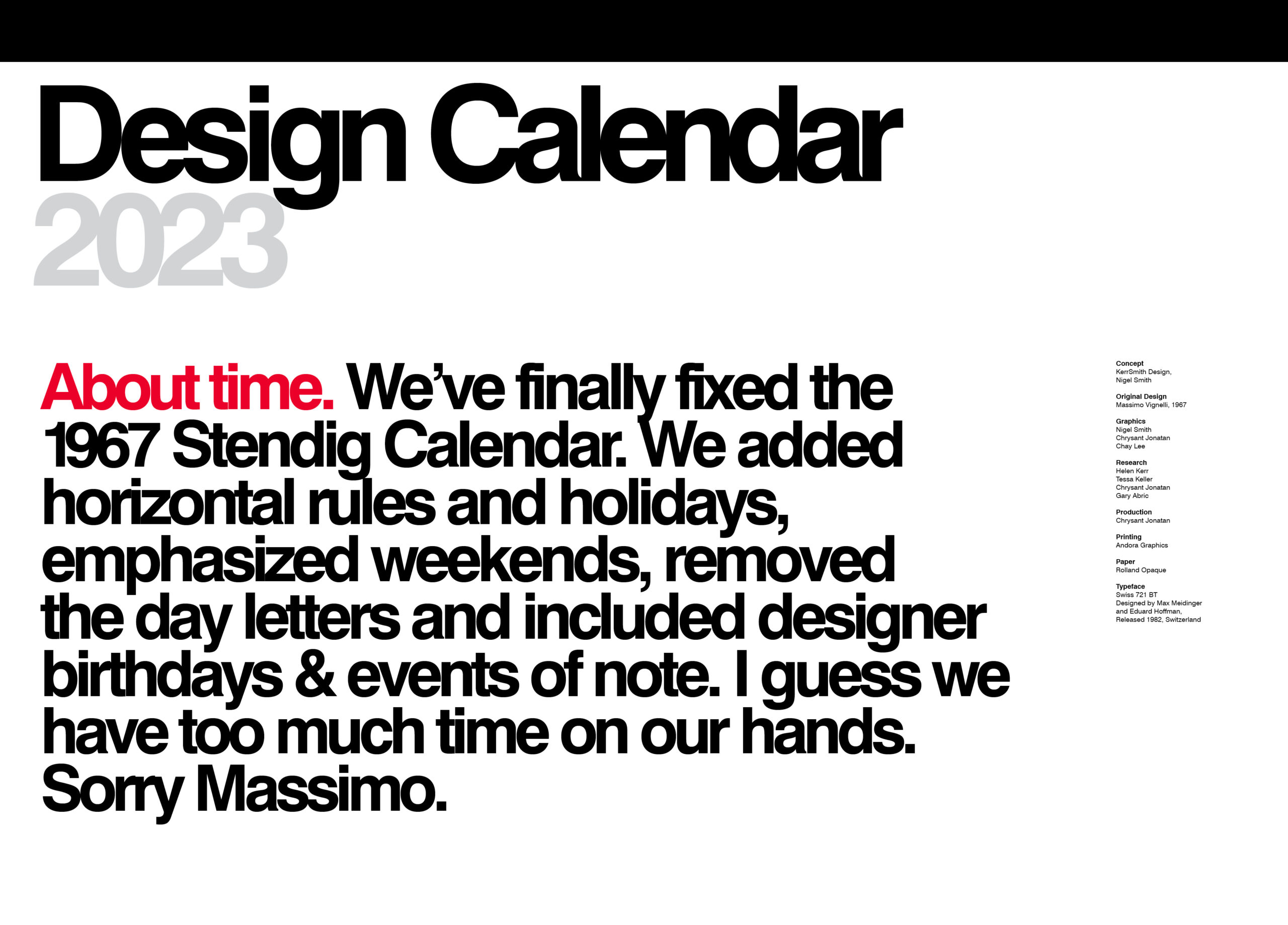
This calendar design is unrepentantly ripped off from Massimo Vignelli’s famous and beautiful 1967 Stendig Calendar. Like the alterations that had to be made to his iconic NYC subway wayfinding and mapping system this beautiful design also needed some fixes.
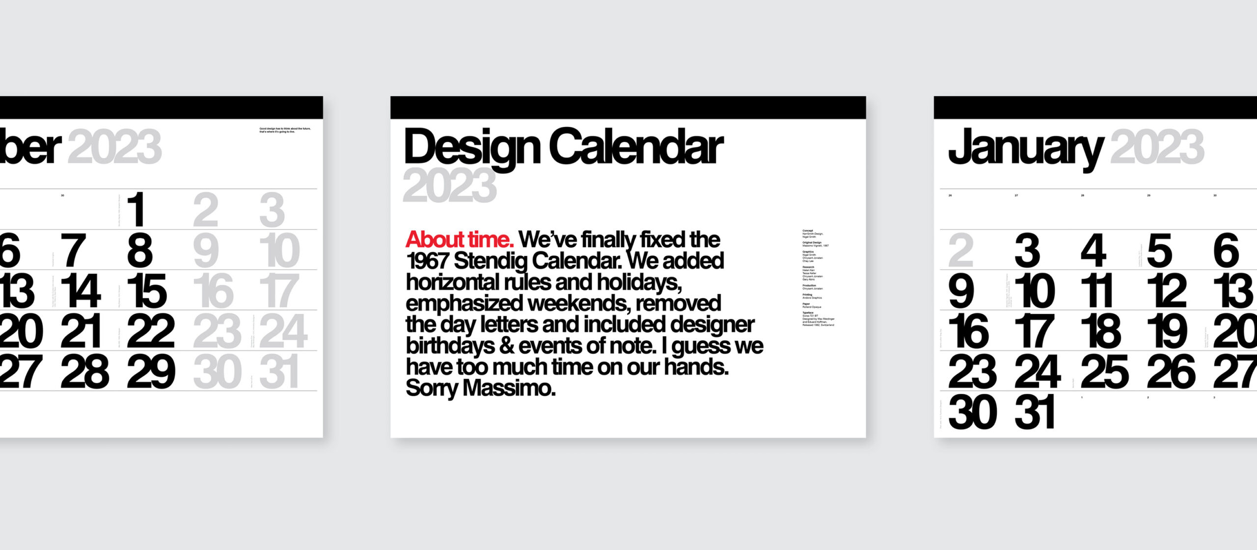
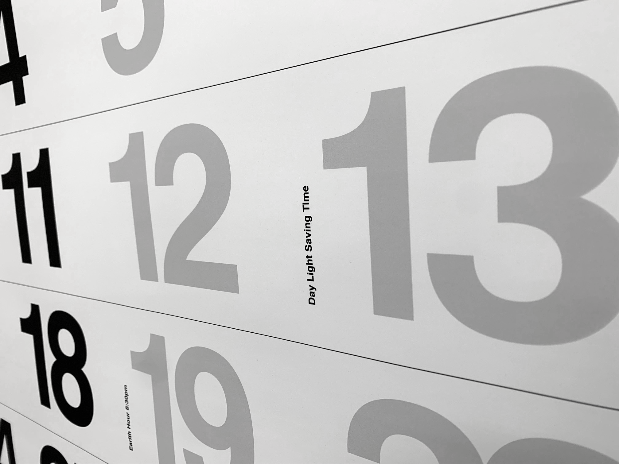
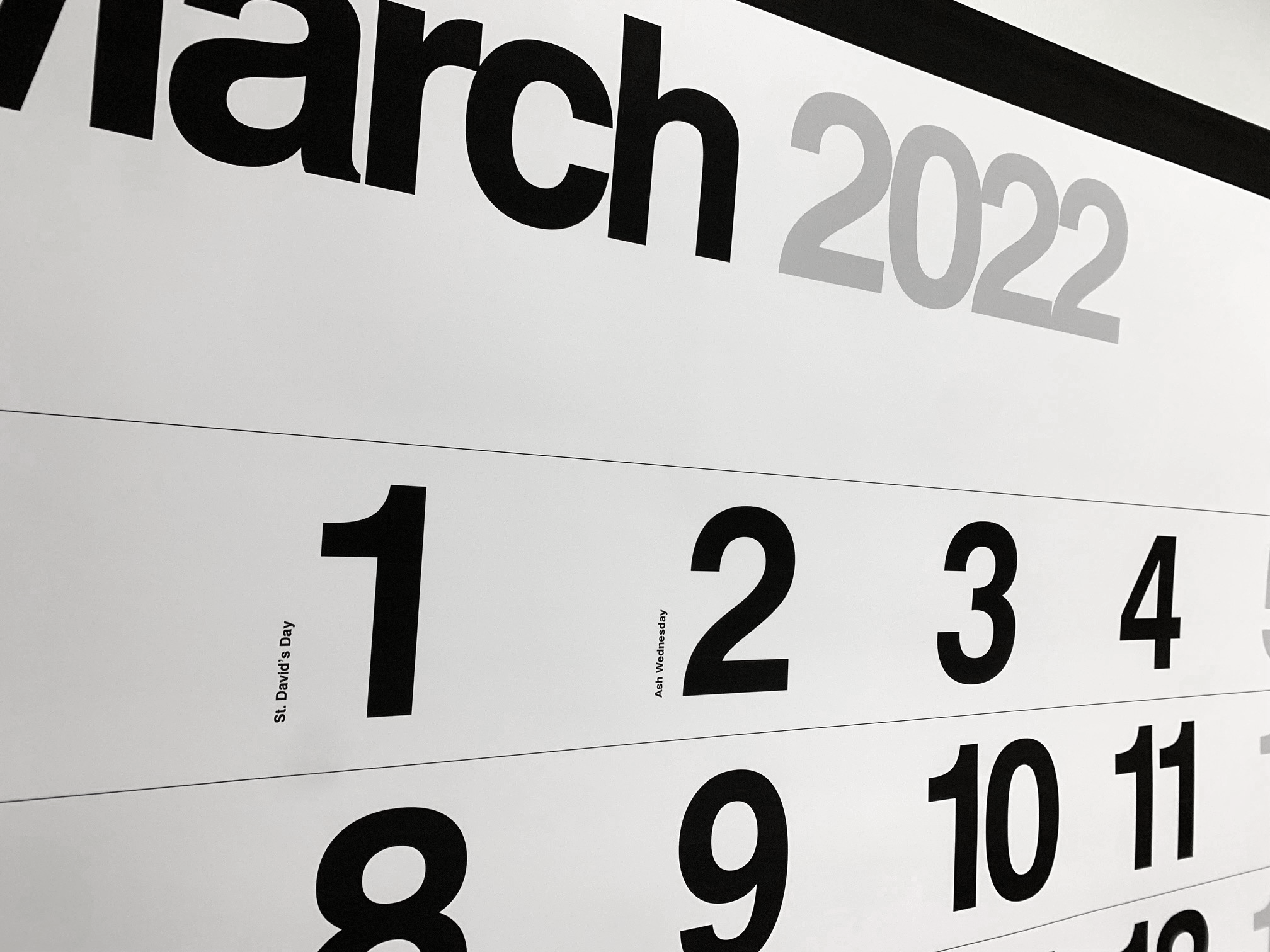
We thought it really needed to show the weekends more distinctly and add holidays and vacations in colour. It should be easy to understand where you are in the week and month and what’s coming up. Marking long weekends and yearly milestones are intuitively how we navigate the year. Other notable days we marked in colour and with small captions. (Some we added just for laughs, like Frank Gehry’s appearance on the Simpsons. Comedy I believe, was not a Massimo strong suit.)
By making the weekend number dates in grey we eliminated the need for the large day letter labels. Beautiful but now sadly extraneous. We changed the fine rules to horizontal aligning with the weeks. Nobody reads a calendar vertically. (When I showed the design to Michael Bierut, who worked with Vignelli, he said it was a big deal that the numbers were flush left. Usually numbers are always flush right, but Massimo told them: “Nobody adds up the Saturdays!” (Then why did you have vertical lines?)
We set the month big in the left corner. We eliminated the mid-size type and introduced a teeny-tiny caption size running up beside the numbers. We added the overlapping month dates in the mini caption size too, because you often count ahead to see what day will be the 3rd or 4th of the next month. What Modern typographer doesn’t like stark contrasts, vertical type and bold 2 colour-use for emphasis?
At Unimark, Bob Noorda and Massimo’s use of unapologetically monolithic large sans serif numbers and letterforms, tight letterspacing, bold size contrasts and an overall minimal aesthetic are altars of modern graphic upon which we still worship. But design should be user-friendly and beautiful so sometimes it needs tweaking. The original NYC subway wayfinding was white type on black - much too easily vandalized and hard to maintain. And the subway map was much too overly simplified and geometric to really understand. It wasn’t human-needs based. The design was too adherent to formalism. Sure, it’s good to tidy things up for clarity, but not if you sweep comprehension into the bin too. So the NYC subway map has been modified many times since Unimark’s first overly-rationalized iteration in 1972.
Next up - the Milan subway system. So gloomy and dull. All the station signs look exactly the same. And those all-caps are much too hostile.
Charles William Stendig (October 25, 1924 – February 11, 2024) was an American businessman and philanthropist who was the founder of Stendig, Inc. The Stendig furniture company was active between 1955 and 1976 and imported a unique selection of modern European furniture to the United States, focusing on contract-grade pieces for commercial use in libraries, colleges, hotels, and offices.
The original Stendig calendar designed to promote the furniture company was acquired by the Museum of Modern Art for its permanent collection in 1966.
We mailed our calendar out to friends to much glee. But truth be told, we’re looking for a sponsor and distributor, so if you’d like to help us keep making it, please get in touch.
© KerrSmith Design 2023