
2D Design: Publication and Art Direction
SAM Magazine
Client
Toronto Wholesale Produce Association
Scope of Work
- Research
- Concept
- Layout
- Writing
- Editorial Design
- Art Direction of Photography
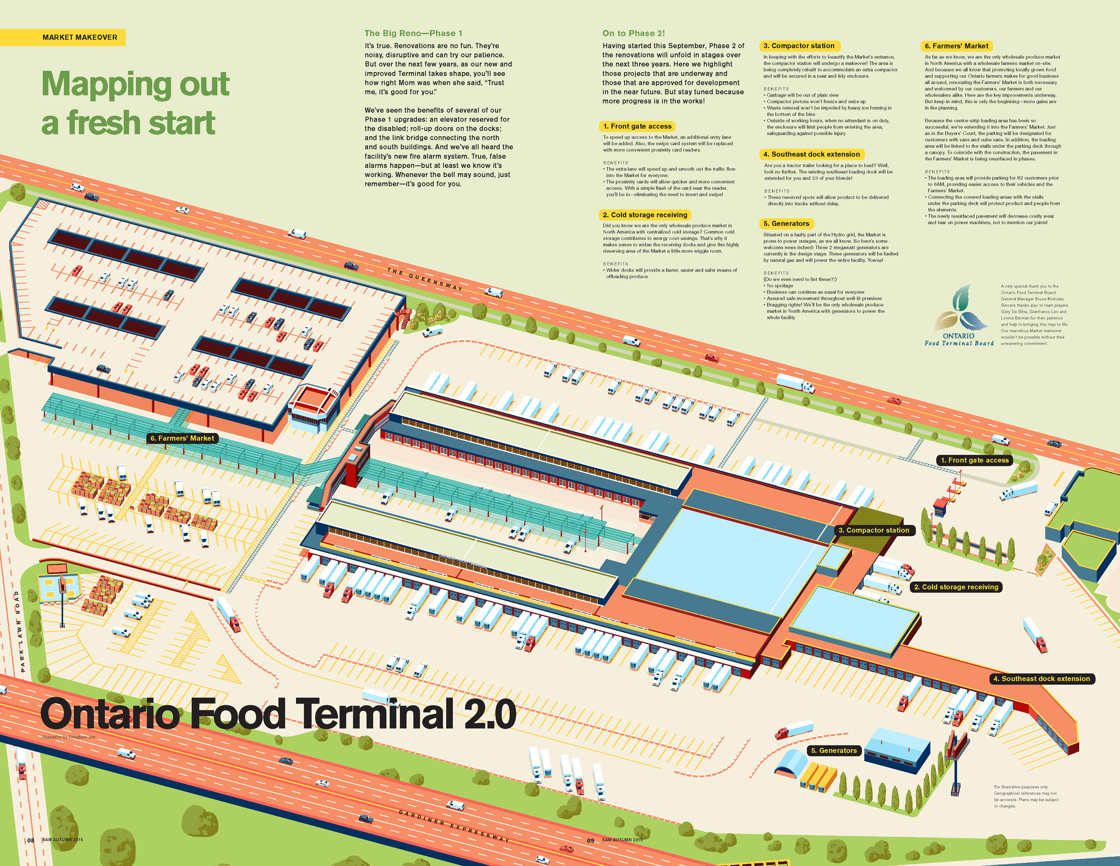
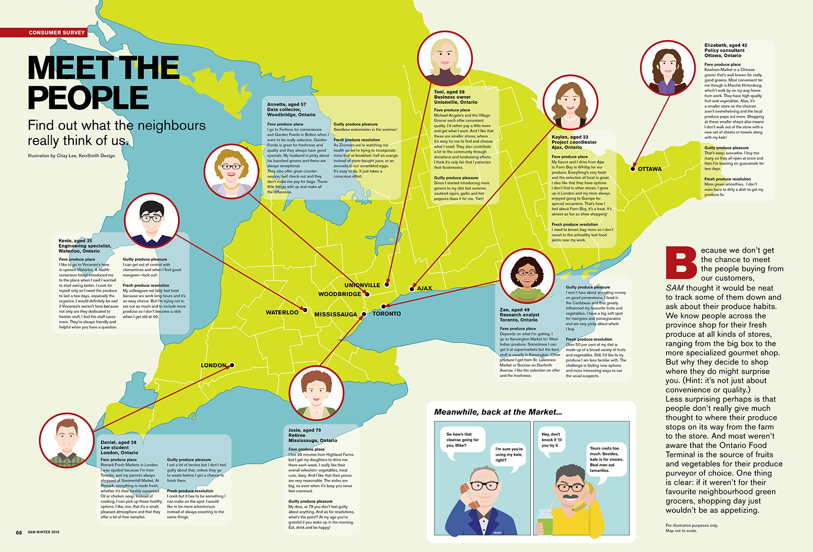
- Infographics
- Illustration
- Advertising
- Social Media
- Livery Design
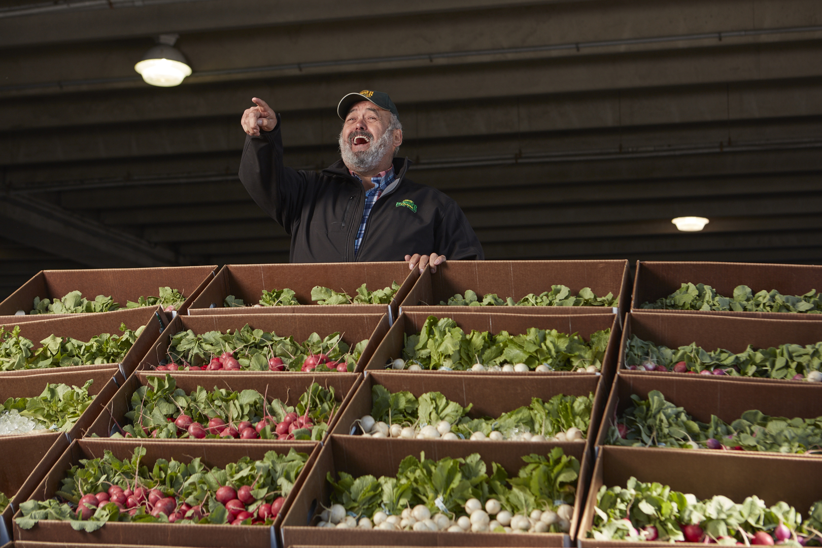
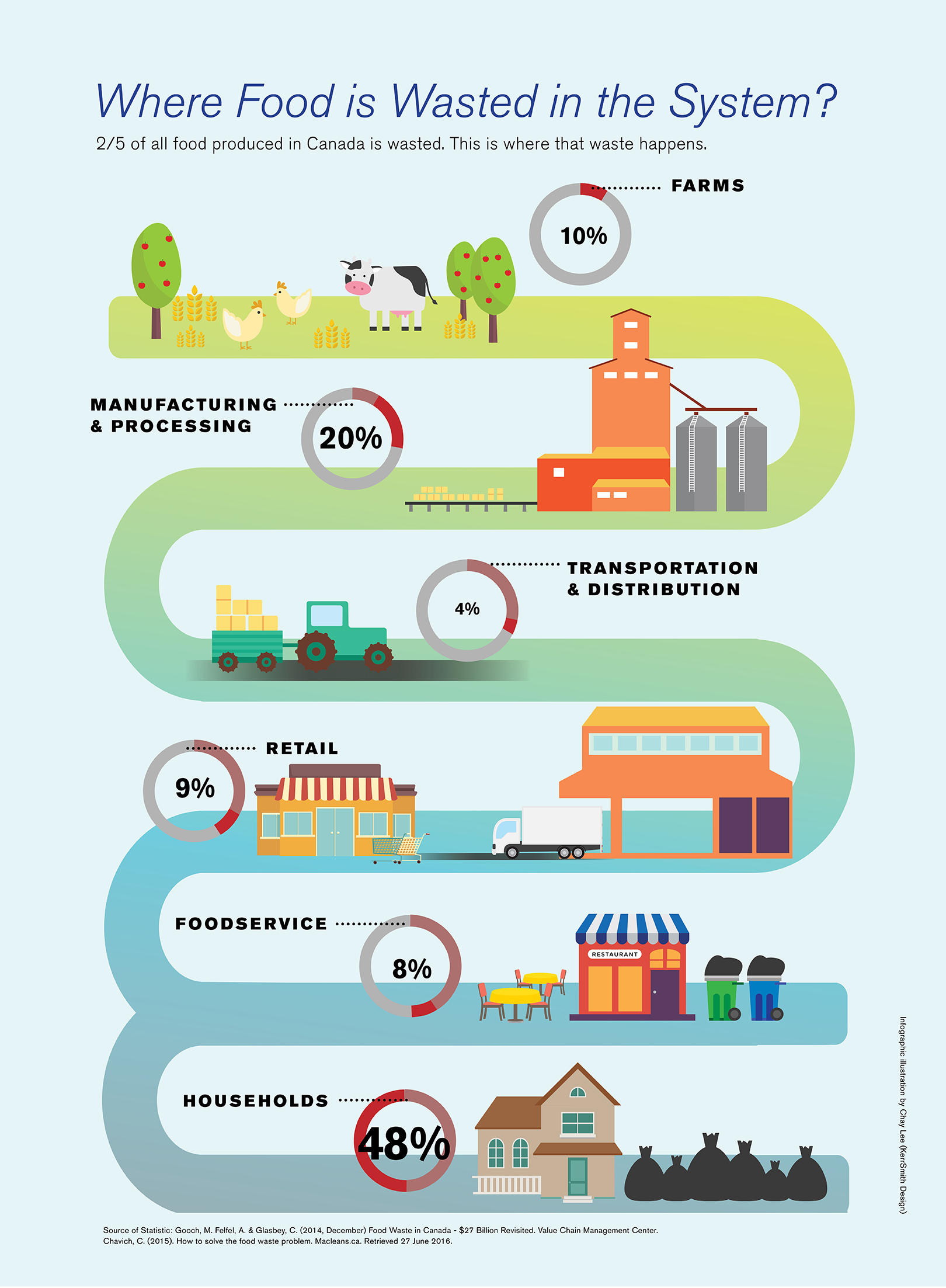
The Toronto Wholesale Produce Association (TWPA) was established in 1933 to represent the wholesaler tenants at the Ontario Food Terminal. Starting out as a small group of wholesalers that supplied retailers in Toronto, it has grown to supply fresh produce across Ontario, Quebec and Eastern Canada. The TWPA makes it possible for independent grocers and restaurants to be in business and is the source of “small, special and local” offerings. Without the competitive wholesale market, the vibrant food scene in the region would not have the international reputation it does. The diversity of the city demands innovative solutions in products and services and the TWPA delivers with high quality, organic, local and exotic fresh produce. The TWPA is the link between farmers near and far and independent green-grocers and restaurants.
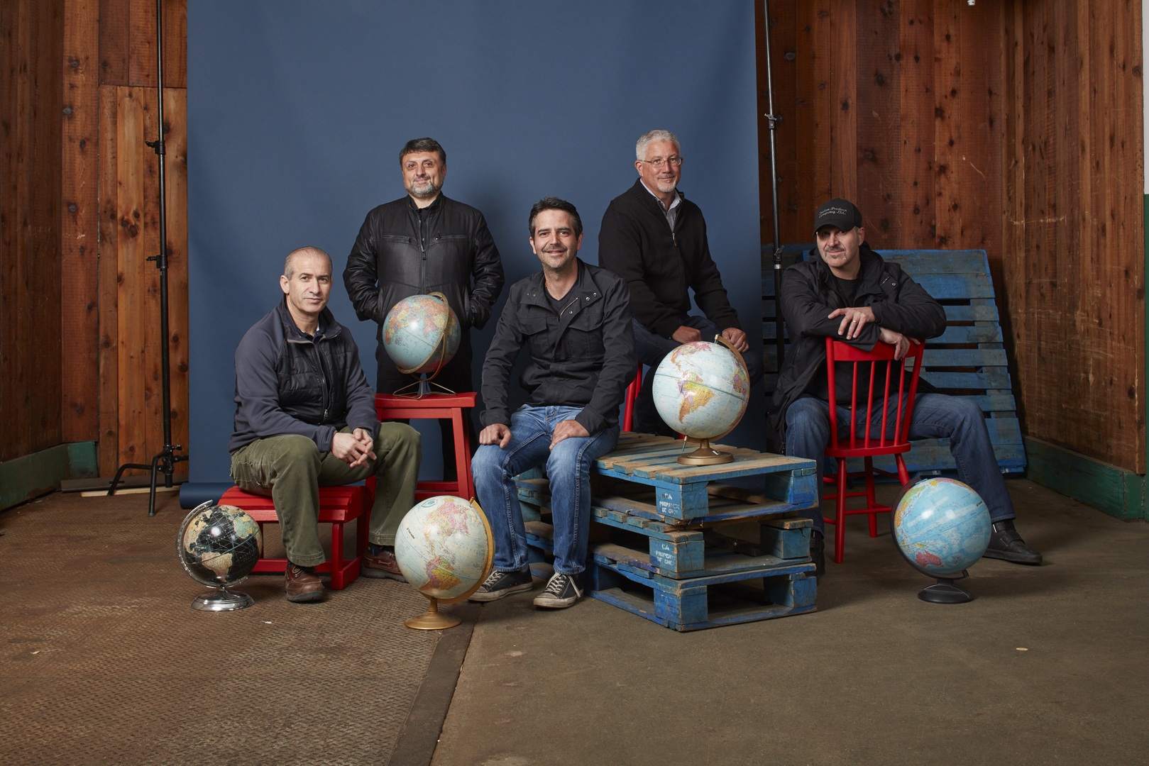
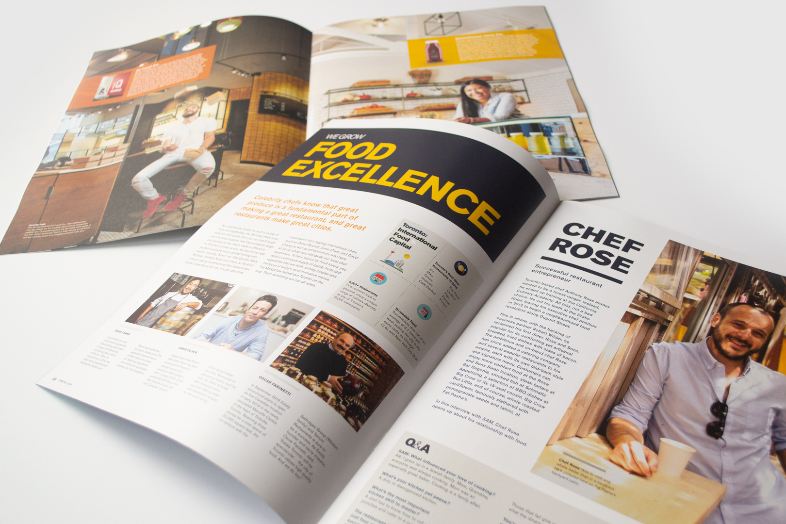
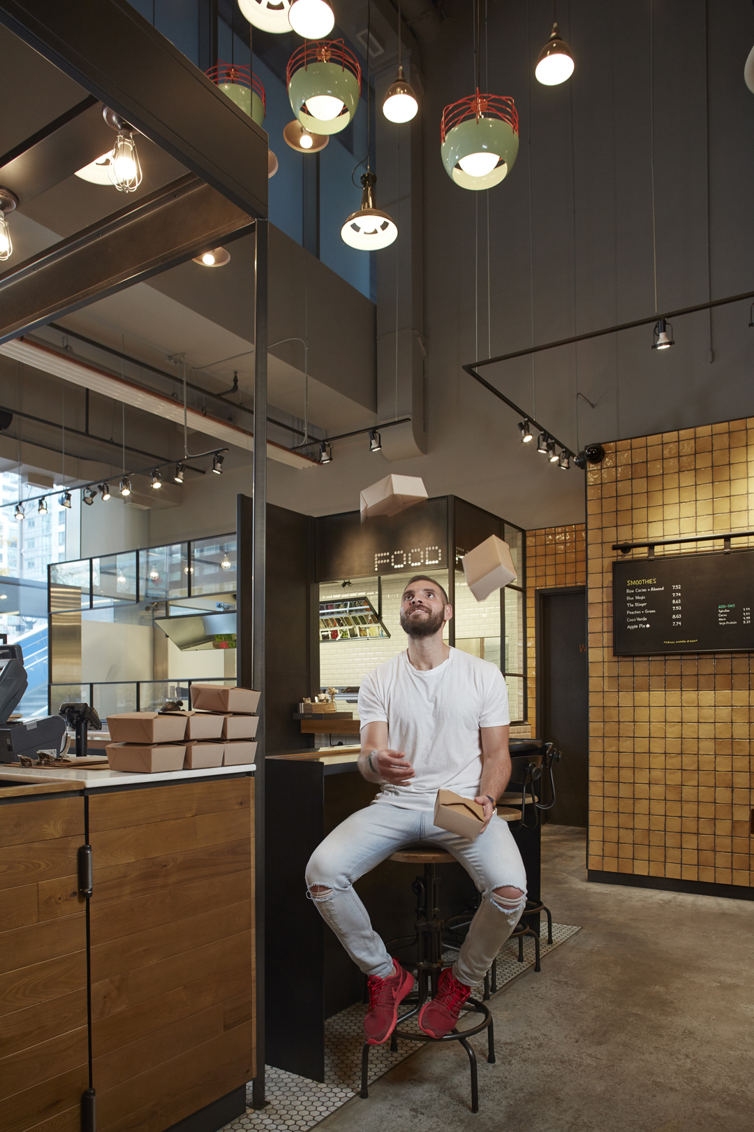
To build community and celebrate the wholesaler tenants, local retailers, and small businesses, SAM magazine was created and distributed quarterly within the TWPA network.
KerrSmith was tasked to design the Fall 2015, Fall 2016, and Winter 2016 issues. We worked closely with the TWPA to art direct the magazine in a way that emphasized the small, unique, and regional characteristics of the many farmers, wholesalers and retailers in Ontario. We designed the magazine to emphasize that food is not just a commodity in our city, but rather, it is a core contributor to the social, cultural, economic and environmental fabric of Toronto. The TWPA quietly has a huge impact on our lives and neighbourhoods.
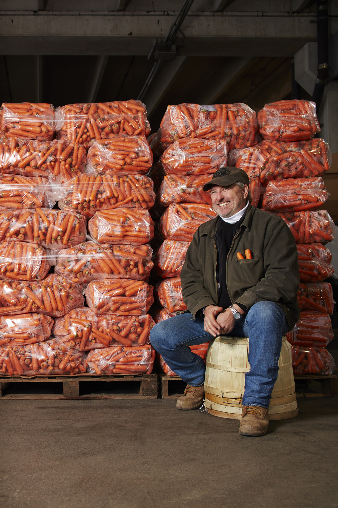
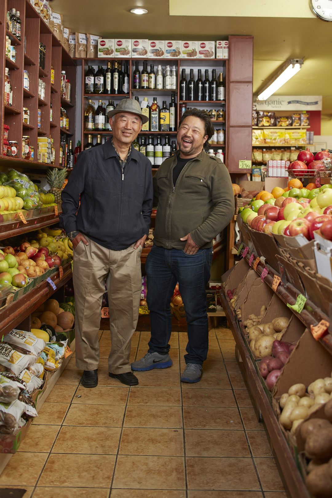
Through this project we were able to tell the stories of the people behind the faces of these businesses and show how their passion for food is impacting the growth and enormous changes in the city.
In the case of Winners we were inspired by the graphic language of Chanel, DKNY, Calvin Klein, and Marc Jacob. We used a clean elegant extended slightly modified sans-serif type face on a field of black to speak the language of high fashion – while the name of the store communicates the off-price nature of the offering. For HomeSense we eliminated the cliché peaked roof of the old logo which reminded many of hardware rather than housewares and home goods. The new classical serif typography and underline we designed are reminiscent of the labels from high quality linens, gifts and décor shops.
Winners and HomeSense have never looked back. Business growth, brand recognition and marketing recall are extremely high. Our guidelines have been adapted and continue to roll through expansion.
Photographs by Evan Dion


© KerrSmith Design 2023
550 Queen St. East, Unit 335
Toronto, ON M5A 1V2
416-703-5377