Thinking
Team Canada's Design Win
50th Anniversary
In 1972, the most famous Canadian sports uniform—a design icon—was created by John Lloyd.
Special to National Post
Published on September 29, 2012
View original article here.
In 1972, the most famous Canadian sports uniform — a design icon — was created by John Lloyd, a transplanted Englishman with no knowledge of hockey. (He was more into yoga.) Lloyd is completely uncelebrated for his extraordinary contribution, and he never mentioned it. This work is an example of the power of good design, and here’s how it came to be.
Anything to do with the Summit Series starts with the “Eagle.” In the early ’70s, Alan Eagleson had his sights on a World Cup of hockey, for a mix of financial, patriotic and love-of-the-game reasons. He represented NHL players and their wins were his (financial) wins, too. Later, of course, he was convicted of fraud and embezzlement and removed from the Order of Canada.
In 1972, at the height of negotiations to start the Summit Series, Eagleson was also the corporate lawyer for ad agency Vickers and Benson. Eagleson gave Vickers and Benson 24 hours to come up with a name and a sweater, remembers Terry O’Malley, the agency’s former owner.
O’Malley reveals the ambitions at play: “For years, Al had been trying to satisfy a dream of his by having a team of NHL All-Stars play a team of Russian stars. The prize would not only be hockey supremacy, but lots and lots of revenue for all concerned.”
For Eagleson, it was not an easy process to create this series. “His strategy was simple. Move quickly and act on every demand by the Russians immediately and give them no breathing room. It was a whirlwind ride,” O’Malley remembers.
The first thing that was needed was a name. “Al wanted to call the team the NHL All-Stars,” O’Malley recalls. “We tried to convince him this was not a series between Russia and the NHL, but Russia and Canada. This was for, remember, hockey supremacy and national pride. He agreed.” Portraying the series as an international face-off was O’Malley’s marketing genius.
It was advertising copy-writer Terry Hill, an American from Detroit, who came up with the name “Team Canada.” Hill remembers: “I remember going over my suggestions with Terry several days later and touting my favourite: “The Dream Team.” Terry refused to even consider it for the short list he was going to submit to a group headed by Alan Eagleson. “What’s wrong with it?” Hill asked. “It’s just too cocky,” Terry said, “and think how stupid the name will look when Canada loses the first game.”
(Hill felt vindicated 20 years later when the NBA Olympic all stars used that name)
Hill recalled CHUM radio scoffing at his naming “genius.” “Of course, there had been no actual genius involved. I had pretty much stolen the idea for the name from a well-known auto-racing team of the time — “Team McLaren.” I thought placing the adjective after the noun, in the manner of most non-English languages, made it sound vaguely international.”
The name seems obvious now — used by countless sports teams and trade delegations — but then, it was a clever and new solution.
The design of the sweater was assigned to Englishman John Lloyd, who had been in Canada for just two years. O’Malley described it: “I was working closely at this point with an amazing art director named John Lloyd, a transplanted Brit, whose visual sensitivity was brilliant. Everything was moving at warp speed. We not only required the sweater, but we needed home and away versions by, you guessed it, tomorrow.” The pressure was enormous. A press conference had already been arranged, even a song was written.
In a way, this was ideal. Eagleson was lucky. He didn’t have time to redesign the sweater or come up with another name at a committee meeting. Nobody asked the public and they had no forum or way to express their wishes.
“Meanwhile,” O’Malley says, “the incredible John Lloyd had bought two large red and two large white sweaters. He cut out the now famous stylized maple leaf in red and in white. He then stitched the red on the white jersey for home and reversed the process for the away. Simply brilliant. The press conference went off as if planned for months.”
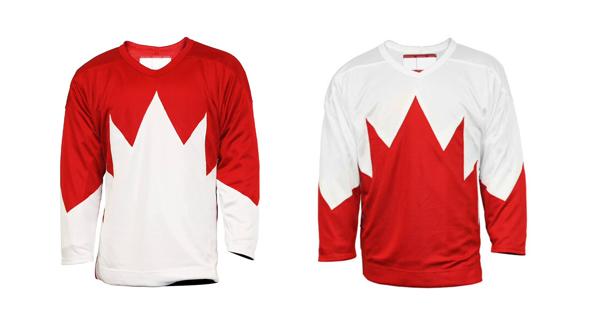
Lloyd bought two large red and two large white sweaters. He cut out the stylized maple leaf in red and in white. He then stitched the red on the white jersey for home and reversed the process for the away.
My research tells me that it was actually Michelle Lloyd, who was married to John at the time, who did the stitching. Her interpretation of the design into patterns has to, in part, be credited for the sweater’s beauty. “We were living on Walker Avenue. I was a seamstress then. I remember working on usherette uniforms as well. I’m not sure we really knew how big an assignment this was,” Michelle told me.
“John was a very ‘less is more’ kind of guy,” O’Malley says. “Much of his stuff, graphically, was crisp and didn’t have a love of frills in it. I never imagined the Maple Leaf could look that good. I think it’s still one of the great sweaters of all time. It’s so simple, but so strong.”
When we look at the Lloyds’ design, we see a truly innovative solution. The sweater features an enormous maple-leaf shape that covers the entire front. The points are more like shards than a leaf, but it is instantly recognizable. Remember the “new” Canadian flag with its large stylized bright red leaf on a white ground was only seven years old in 1972. The sweater’s leaf has 11 points, as does the leaf on the flag. The Lloyds’ design cleverly wrapped the players in the flag.
There is no central crest on the uniform. Every other hockey sweater in history always features a logo on the chest. This is minimal; no doodads, no tags, no sponsorships or trademarks.
There are also no numbers on the sleeves. Two points of the “leaf” are integrated into the bottom of the sleeves. The Lloyd design avoided stripes around the upper arm or shoulder patches. This fresh approach avoided the conventions. They just didn’t know them. Lloyd had a bold simple idea, which he and his wife rendered (quickly).
In another innovation, every player wore CANADA on his back — in big letters above his number. That sort of label is psychologically important. Most players in the NHL did not wear their last names on the backs of sweaters until it became mandatory in 1976.
In the Edmonton Journal of April 21, 2008, David Staples reported that “The players loved the sweater, too, though it was a double-knit cotton-polyester blend, quite heavy to wear, especially when it got sweaty.”
John Lloyd died in 1996, with no mention or attribution of this extraordinary piece of creative work. His love and passion became photography and film. He was deeply influenced by Eastern mysticism.
Terry Hill recalls: “O’Malley used to call John ‘Jackie Clouds,’ a nod to his penchant for including sky and clouds in virtually every layout he ever did. It could be an ad for a liquid floor cleaner or a can of tuna, but somehow John would manage to inject some cumulus content.”
Lloyd never realized how important and famous his design was. His wife, Michelle, who went on to a tremendous career with Club Monaco, is similarly nonchalant about her work.
The image of that team, in that bold design, is stamped on our collective consciousness. It is only right that we celebrate Henderson, Esposito, Ron Ellis, Bobby Clark and the rest. But Team Canada was also made up of Eagleson, O’Malley and Hill and the designers who wrapped it all up with such verve and panache, John and Michelle Lloyd.
Nigel Smith is a partner at Kerr Smith design in Toronto.
© KerrSmith Design 2023