2D Design: Branding
Brand Development
for Boszko & Verity
Client
Boszko & Verity Construction
Scope of Work
- Logo
- Tagline
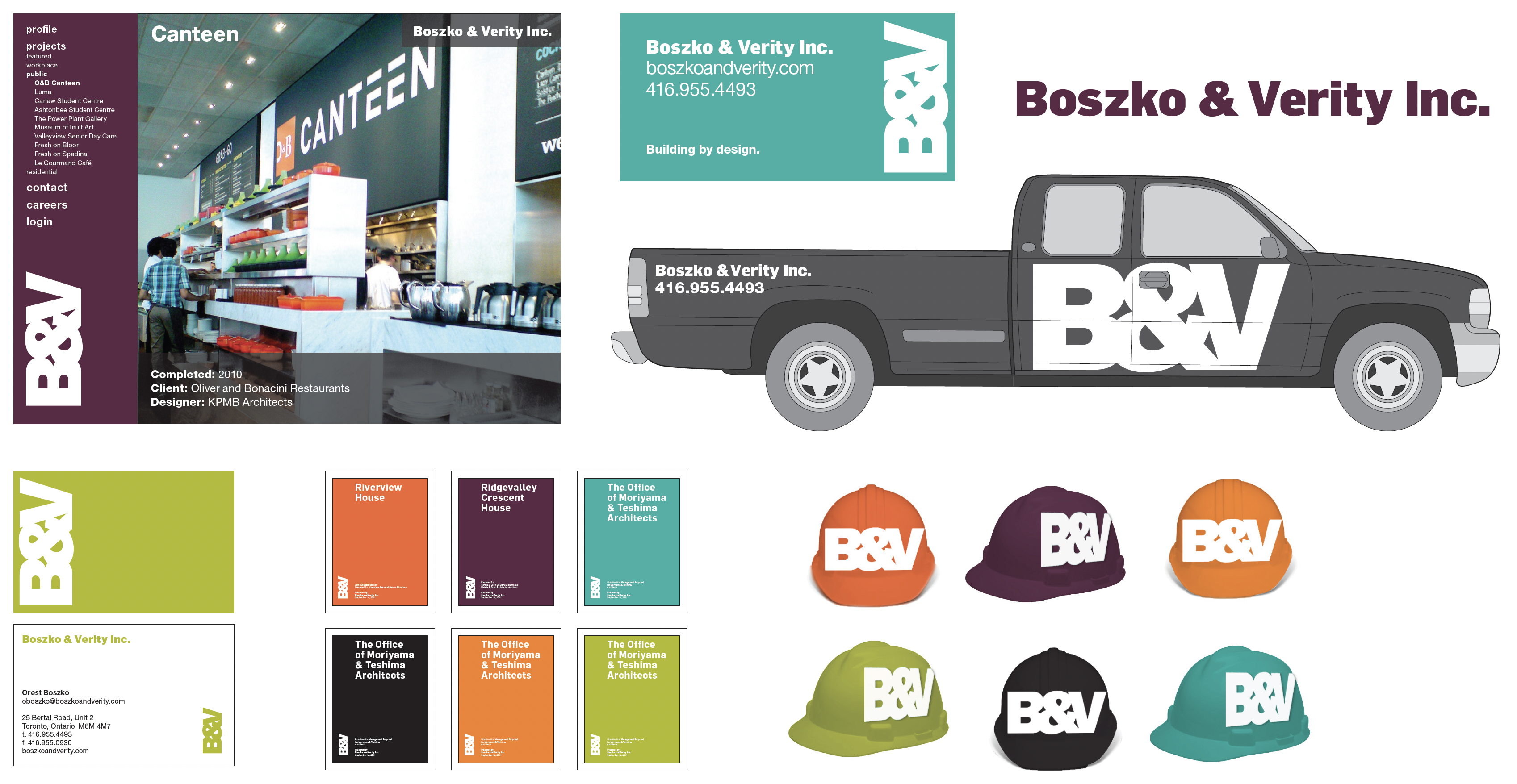
- Branding
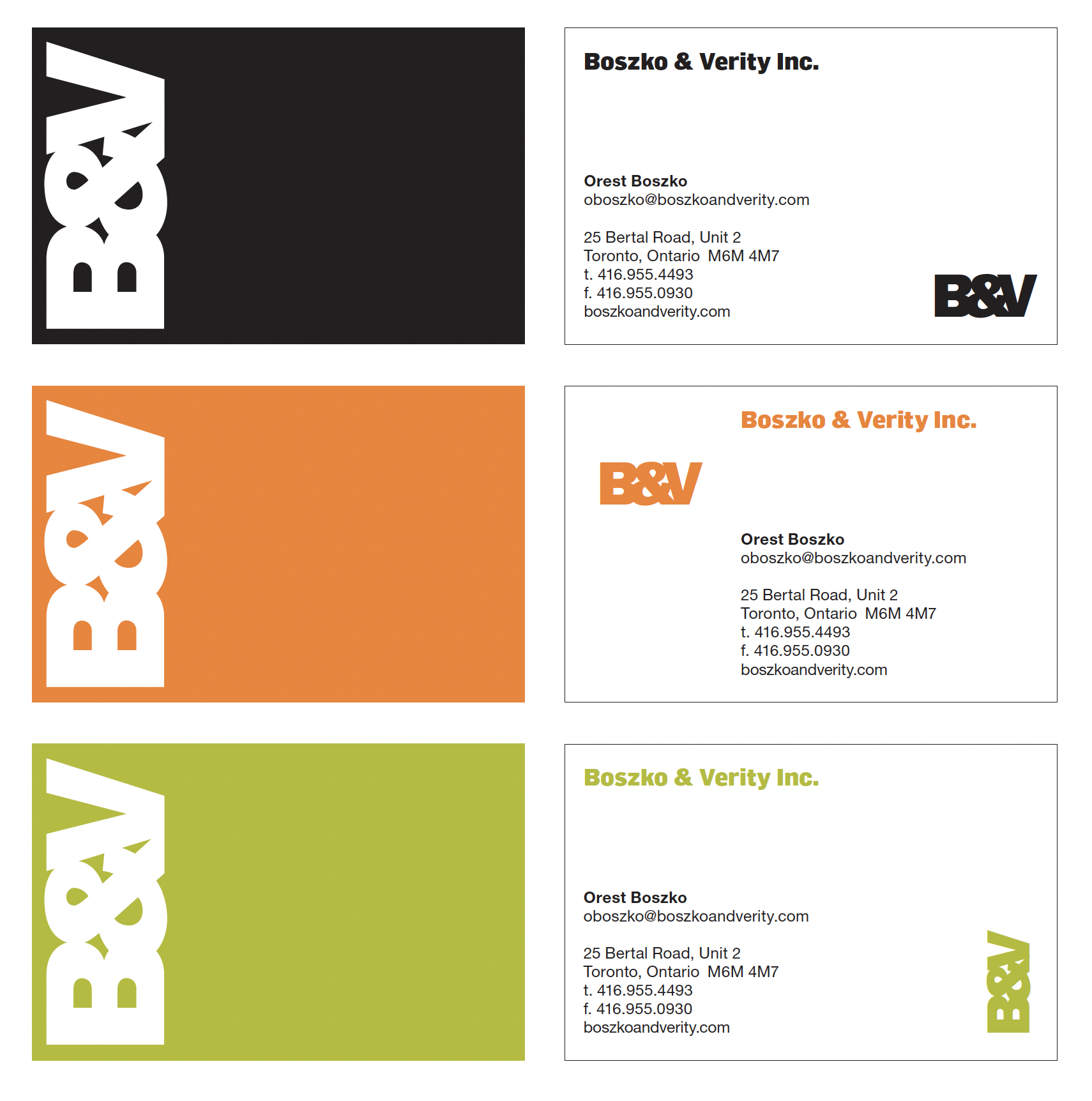
- Stationery
- Sales Materials
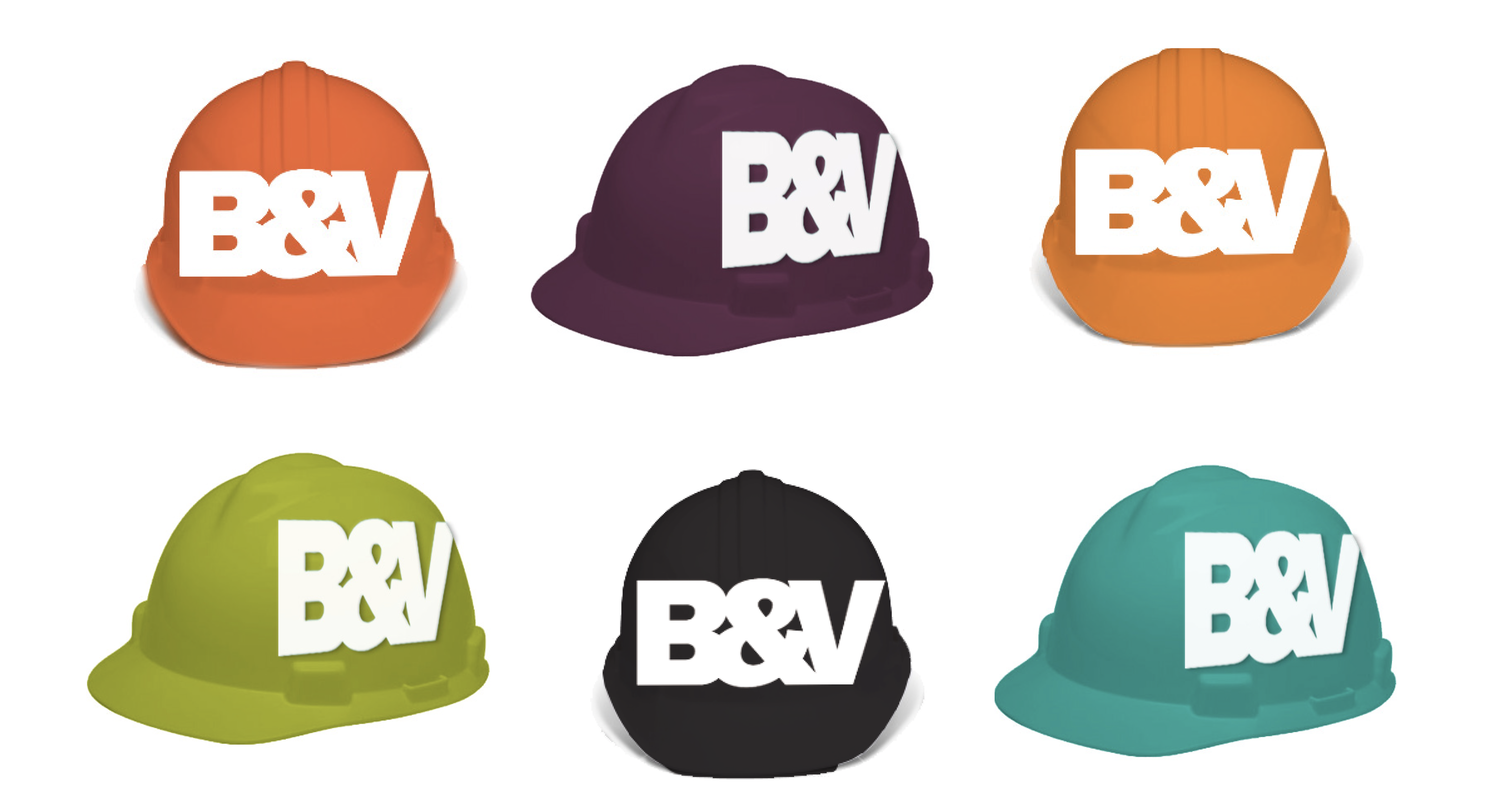
- Clothing
- Signage
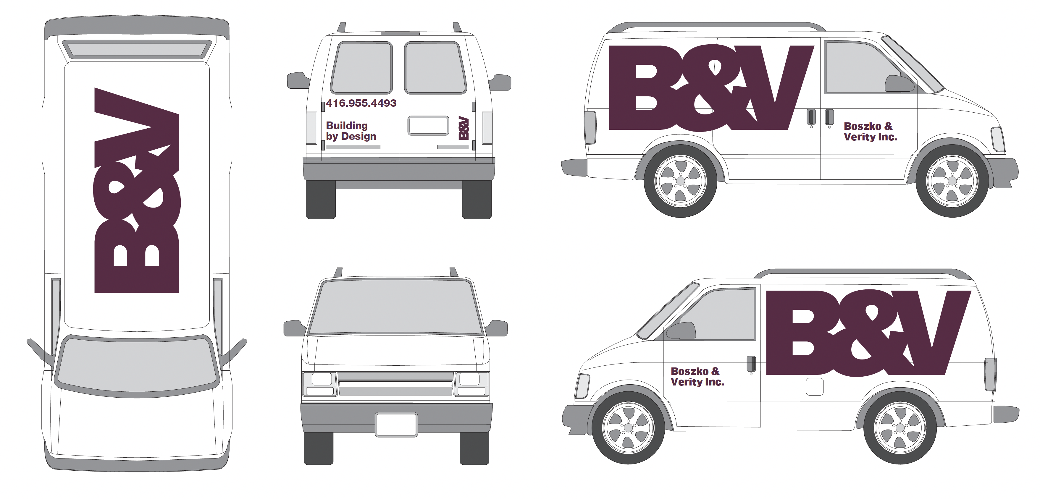
- Livery
Orest and Mike asked us to create a full visual identity for them for their growing construction management business. Because they work with architects and designers, they wanted a sophisticated, integrated look.
The thing I like the most about the work was the idea of putting a big logo on top of their vans and trucks. I always imagine some hot shot gazillionaire developer in his Bay Street tower office, on the phone with some massive new money, peering down on Toronto’s clogged streets and bellowing “Who the (bleep!) can we get to build that?!” and the camera zooms in on our exquisite logo. Cut. Shot of gorgeous massive skyscraper being built with same logo plastered on crane, signage, trucks, and hard hats. Roll credits.
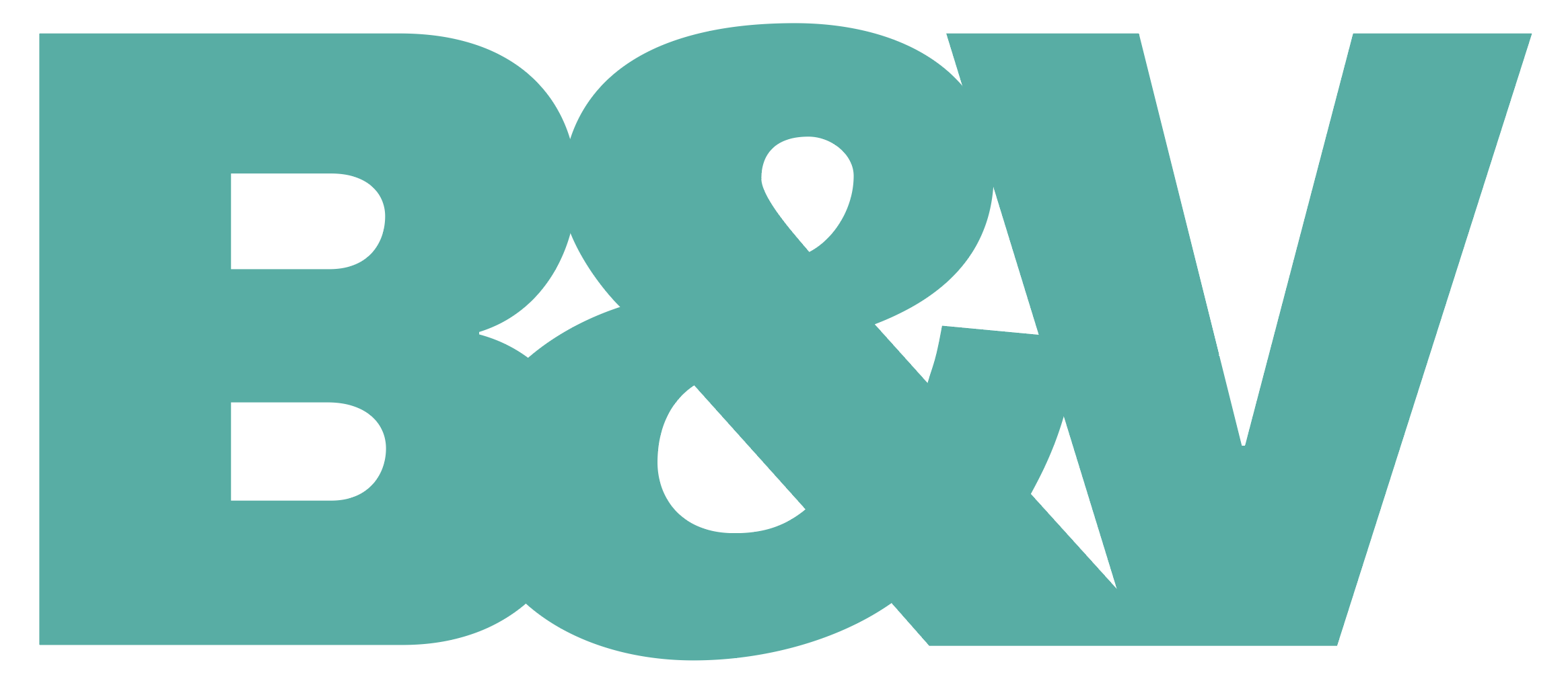
We designed the logo to run horizontally or vertically. I love the counters (holes in the letters) and the negative spaces we created in the logo. I’m amazed we had the restraint to leave them with their idiosyncratic, semi-geometric pleasantries. It has a lovely unpretentious flow to it.
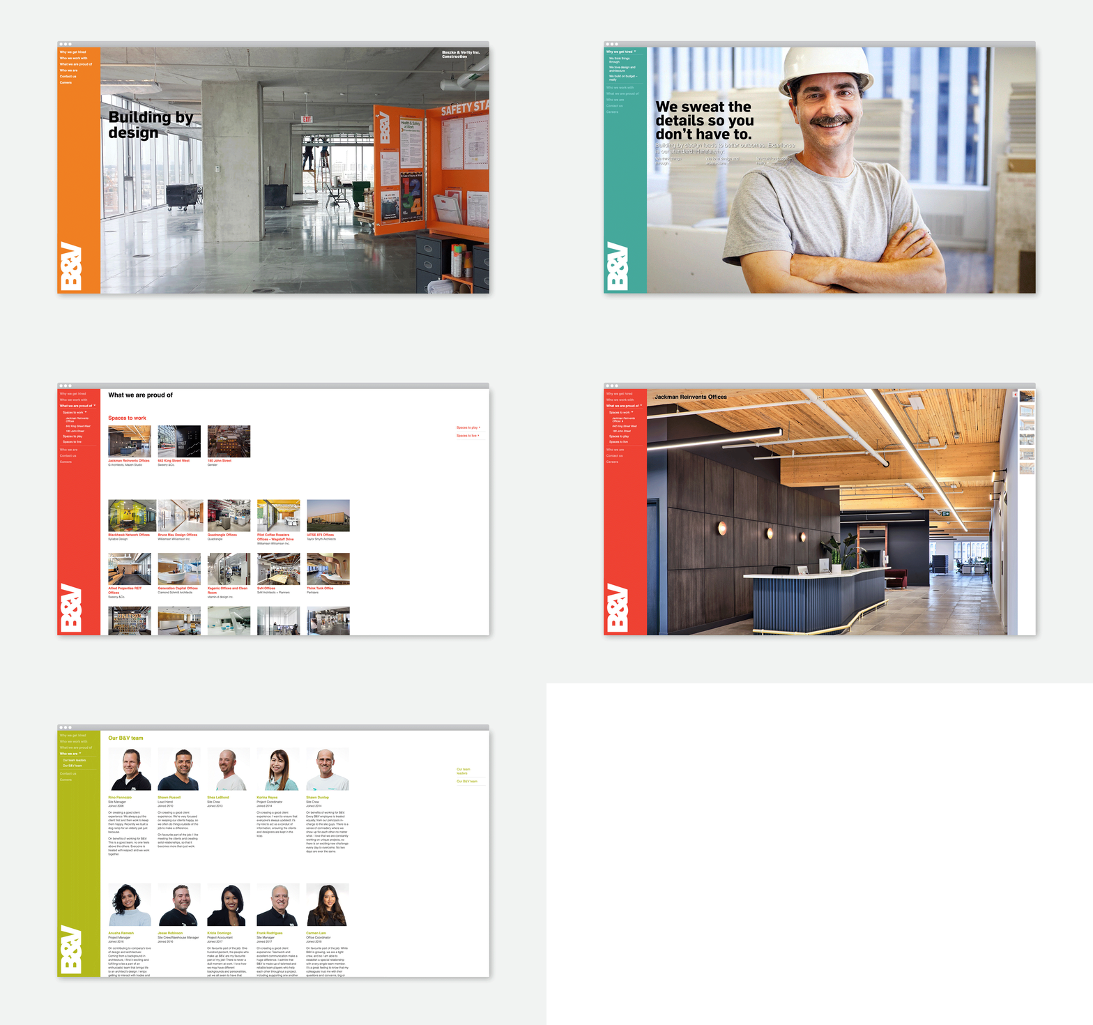
We are pleased to be continuing our relationship with B&V as we update the brand across a range of media.


© KerrSmith Design 2023
