2D Design: Branding, Annual Reports, Logo, Visual Identity
RGA
Client
Reinsurance Group of America
Scope of Work
Research
Competitive Audit
Engagement
Brand Strategy
Logo
Visual Identity
Annual Reports
Website
Stationery
Signage
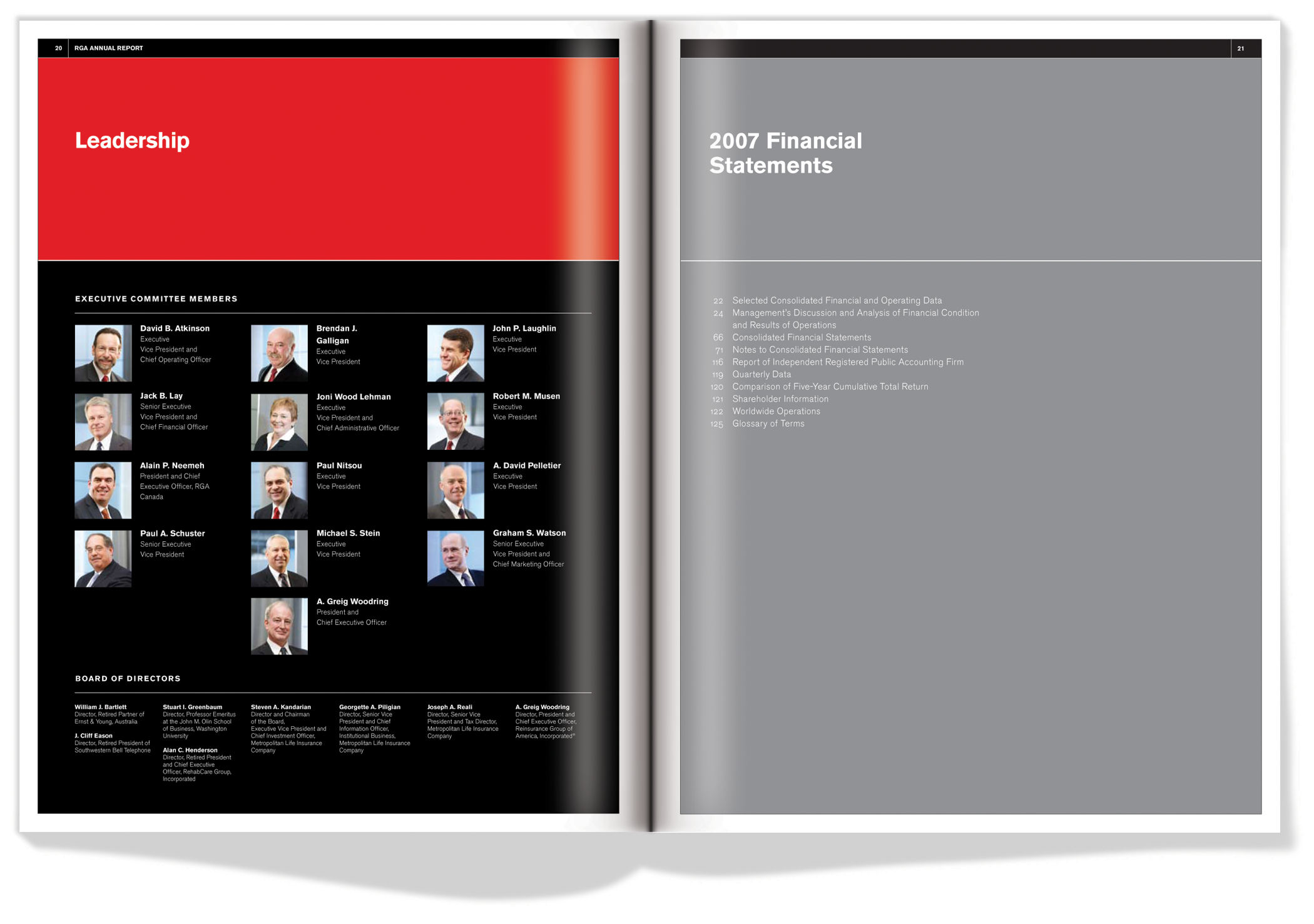
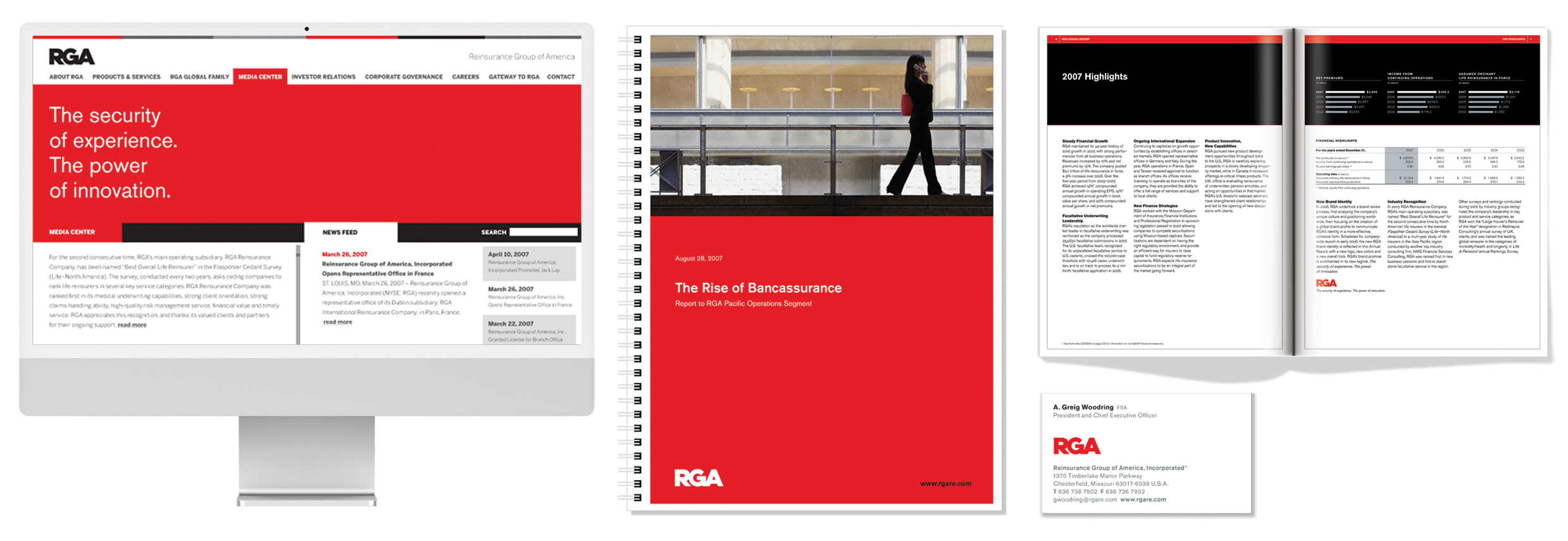
With over 20 offices worldwide, 1500 employees and with AUM of $1.3 billion St. Louis-based Reinsurance Group of America is the world’s leading Life Reinsurer. RGA asked KerrSmith to help with a range of branding challenges and update their Visual Identity after we completed their annual report. They realized that their ongoing success needed to be marked by signaling a new chapter in their growth. RGA produces a wide range of collateral material including newsletters, invitations, banners, and advertisements, in addition to a full range of stationery products, a large annual report, signage and power point presentations. The range of communication vehicles in use was widely inconsistent as growth had pulled the company in multiple directions.
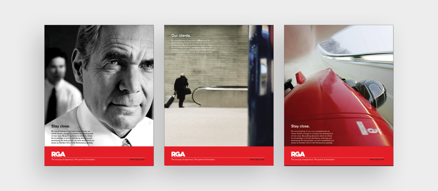
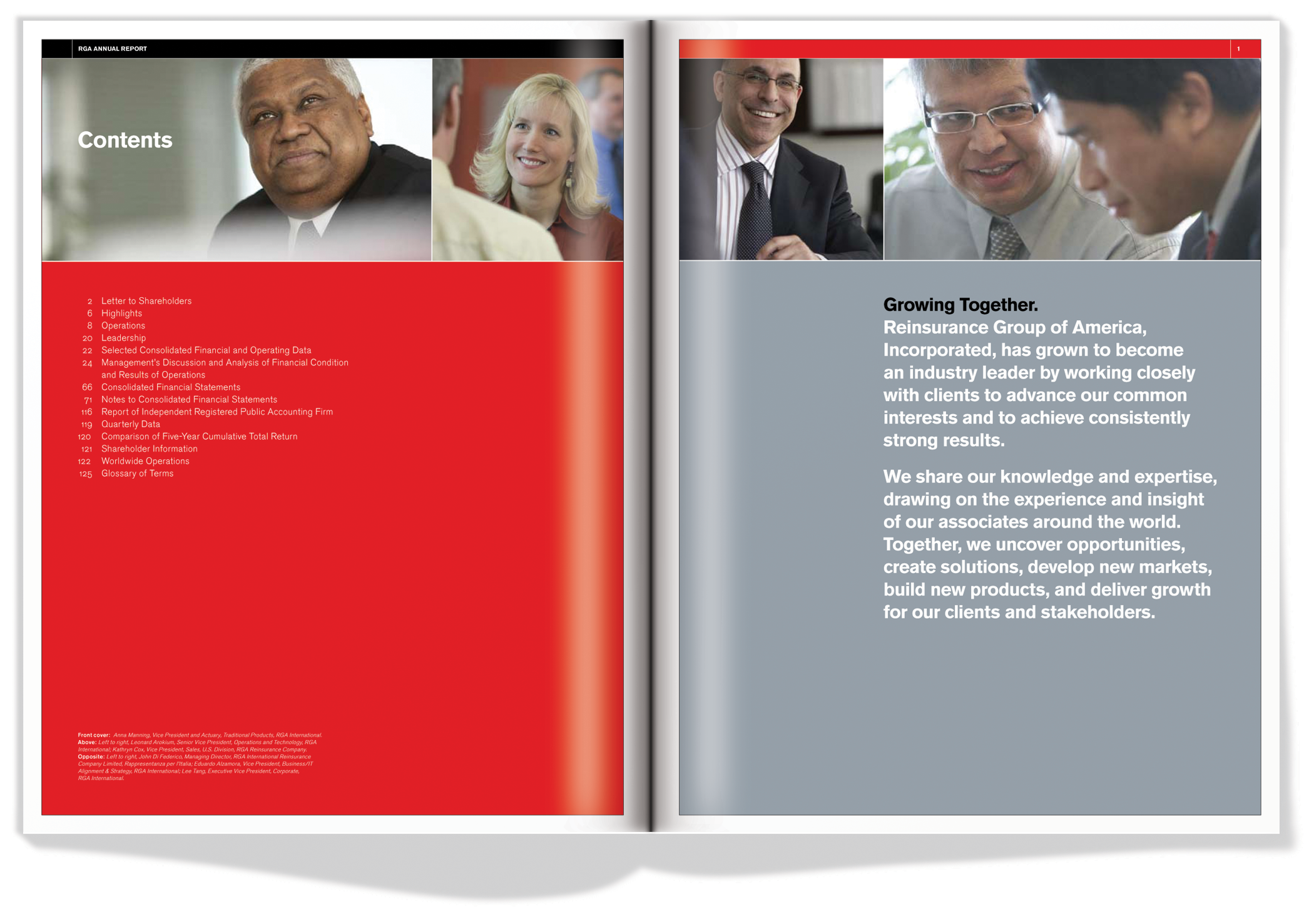
Most business processes are about making choices from a set of existing alternatives. A business must continue to make new viable choices available as well as provide new solutions to problems. Our new graphic identity for RGA does that. We chose red as a provocative differentiator in the sea of blues of the Reinsurance world. We applied rigourous sans serif typography in combination with an image strategy, tagline and strong layout style to project confidence and make RGA stand out from the competition. The minimalist palette was created to specifically address the lack of coherence that was so muddling their brand message. We created a detailed Style Guide to manage the system for all RGA materials.
The updated bold logo has a no-nonsense straightforward appeal. The linked red letters create a bold, confident and simple design representing focus and consolidated team effort. The system of design we created makes pieces easier to produce and builds a unified front and alignment from which RGA can build business. The results have been an outstanding success.



© KerrSmith Design 2023
