[one_half]
2D & 3D Design: Branding
Western University
Applications up 15% over provincial average.
Scope of work
- Research
- Engagement
- Strategy report
- Logo
- Custom typeface
- Visual identity system
- Style guide
- Campaign brand
- Case for support
- Stationery system
- Banners
- Sub-brands
- Print advertising
[supsystic-social-sharing id='1']
[/one_half]
[one_half_last]
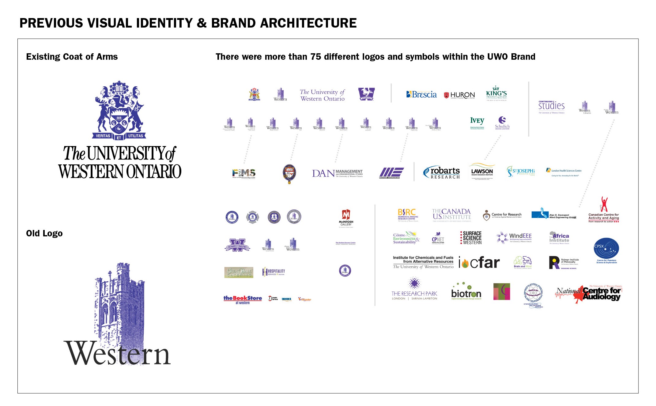
Western University previously known as the University of Western Ontario, has a history of success as a leading research and post-secondary education institution since 1878. However, the brand had come to incorporate over 70 different logos, across 13 faculties, each diluting the central message. Western embarked on a brand renewal prior to the launch of its $750,000,000 fundraising campaign. The objective of the rebranding was to reposition the University as globally competitive and nationally one of Canada’s leading schools. This undertaking necessitated significant consultation to ensure a successful transition and campaign, with students, alumni, family and donors.
Our Role and Responsibility.
We conducted research and an audit of the brand. We worked with Western to facilitate extensive engagement with their community. This included 4,995 survey responses, 9 workshops, 154 student iPad interviews and 63 one-on-one interviews. We translated our findings into a design brief and continued to build a collective vision for the new Western identity.
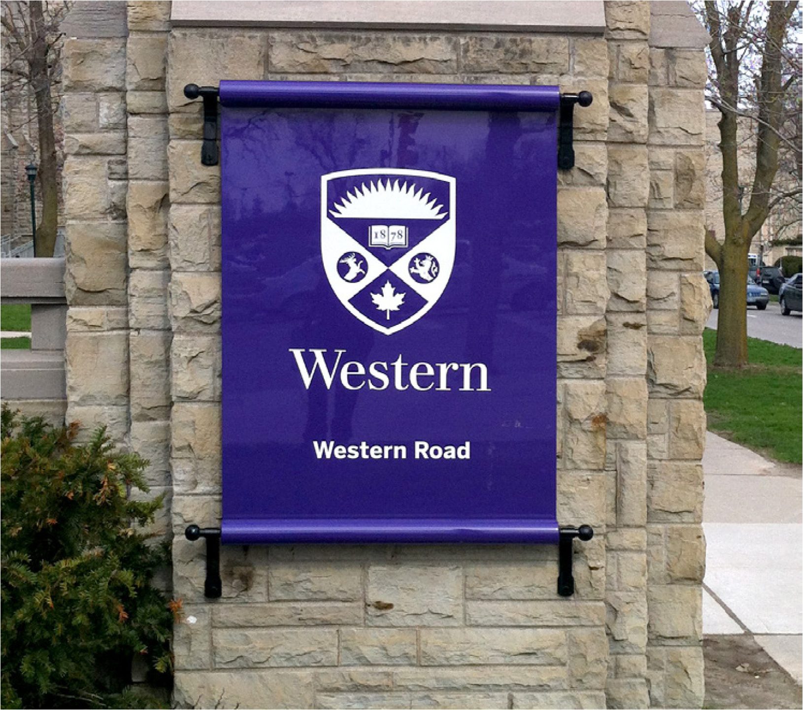
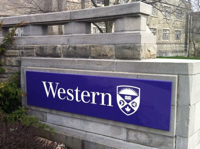
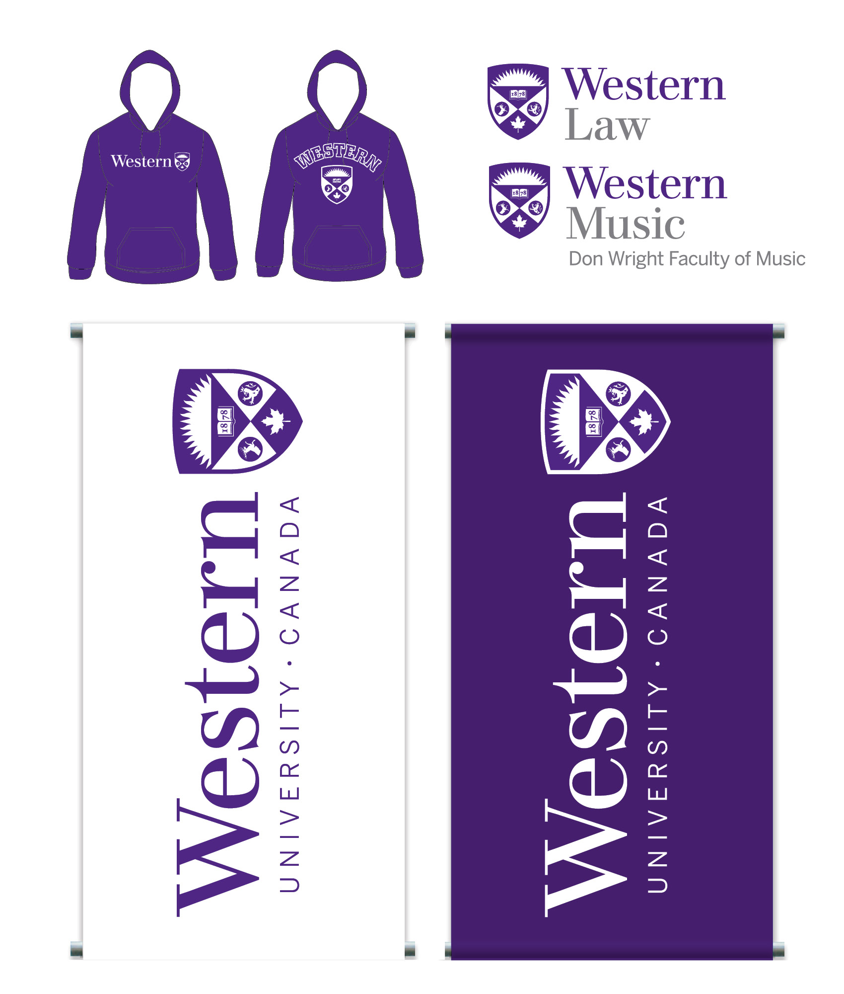
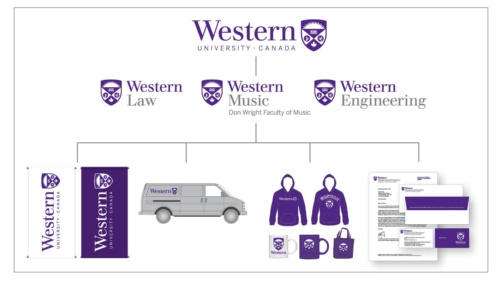
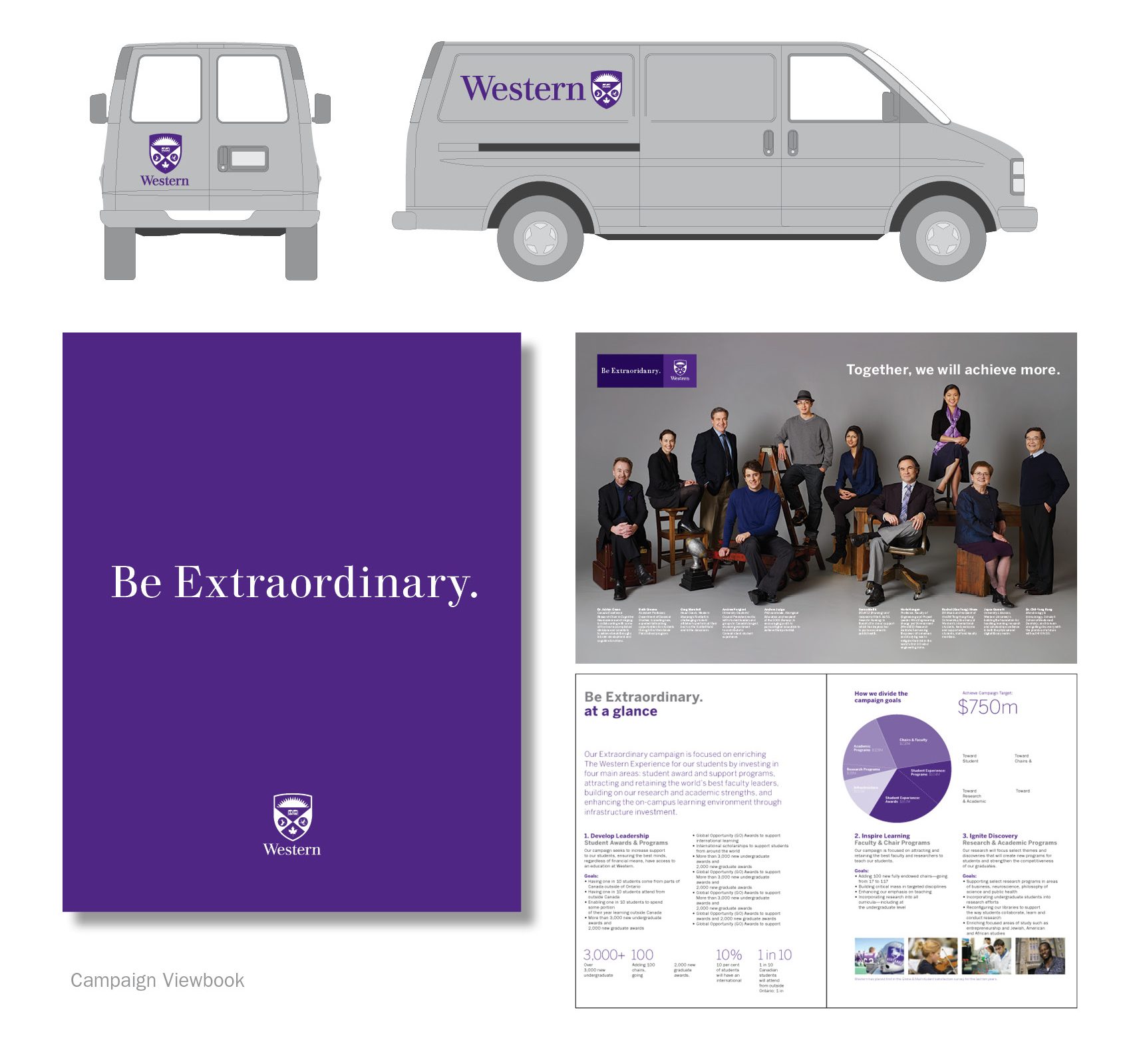
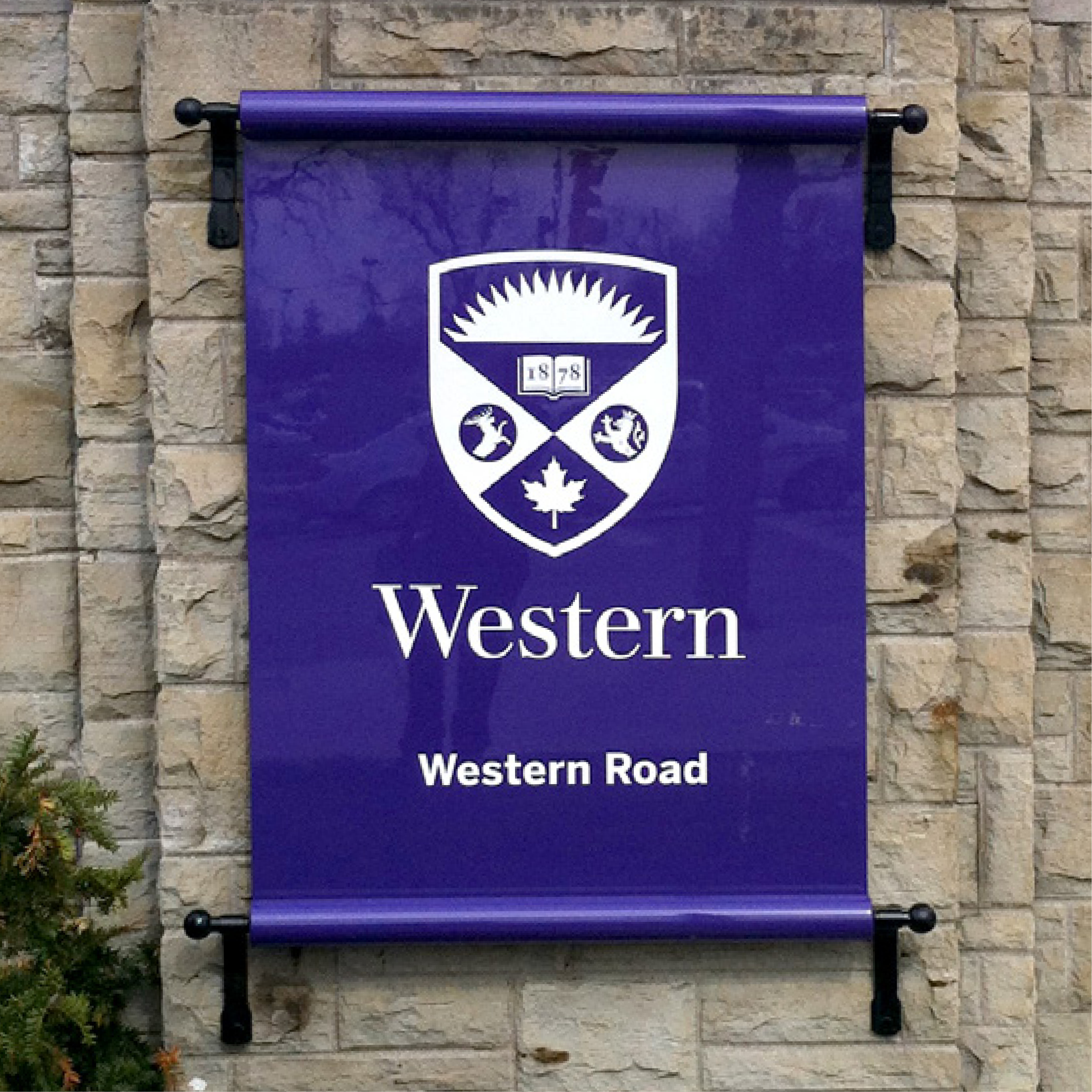
The opportunity identified was to create a visual identity that captured quality and tradition. We reinstated a modified historic shield as the main symbol and developed a custom typeface. The visual identity is an adaptive system, each faculty is able to have it’s own unique wordmark. We developed guidelines for handoff to the Communications Department, and the 13 faculties.
Spring 2014 numbers are impressive with applications up 15% over provincial average and International Student applications up 5%.
[/one_half_last]



No Comments.