How to think about hurricane recovery, according to 3 experts https://t.co/6X8jaY2Scb via @voxdotcom
September 27, 2021 — Comments are off for this post.
https://twitter.com/kerrsmithdesign/status/1442579372712632321
September 22, 2021 — Comments are off for this post.
What are Infographics?
[one_half]
THINKING
What are Infographics?
“It is by the aid of statistics that law in the social sphere
can be ascertained and codified.”
- Florence Nightingale
[supsystic-social-sharing id='1']
[/one_half]
[one_half_last]
What are infographics?
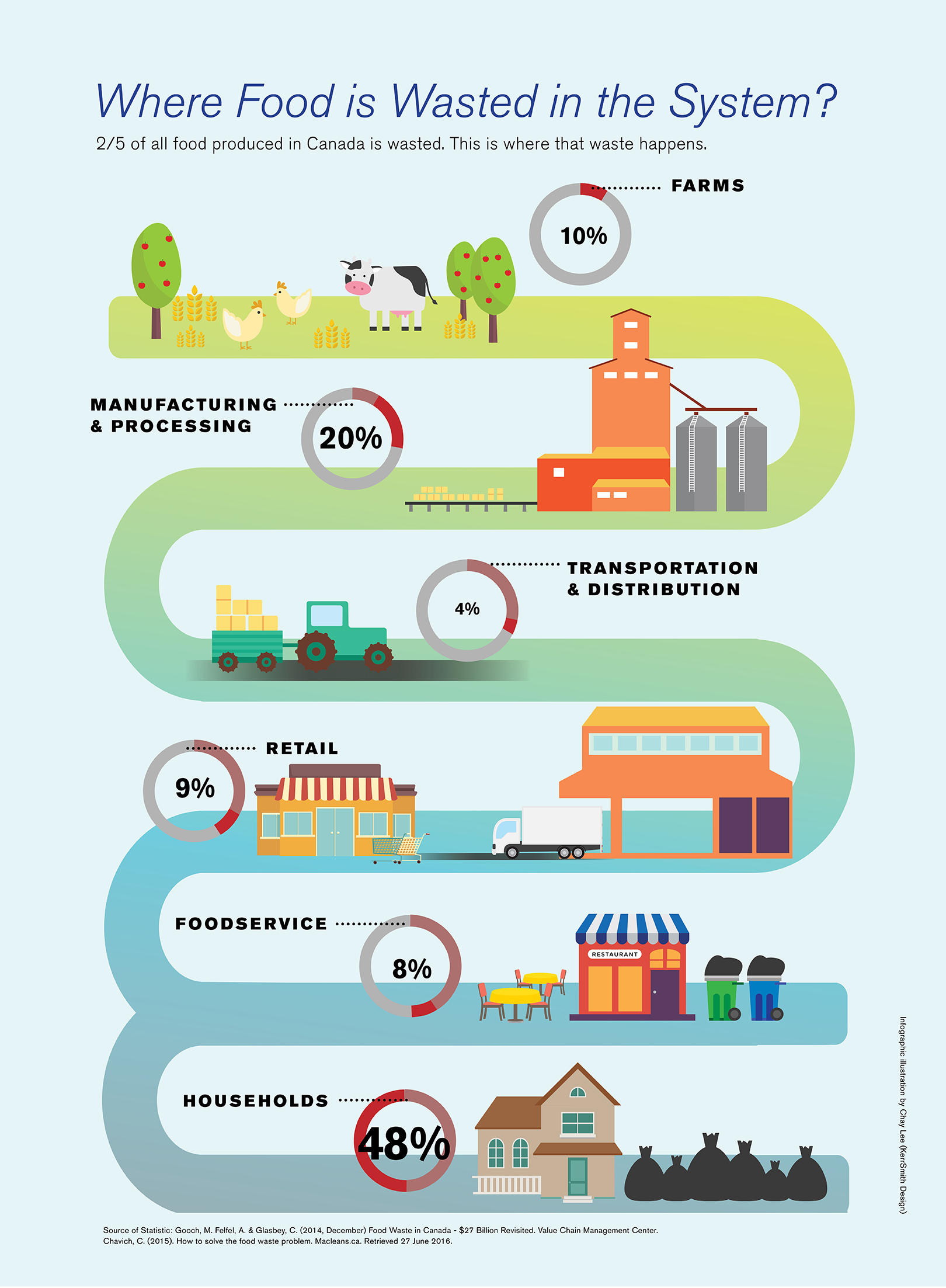
Infographics are visual graphic presentations of data, information or knowledge intended to display that information clearly and quickly. They help understanding because of their ability to help us see patterns and trends more easily. The most dramatic example of the use of infographics I can think of was by Florence Nightingale. By creating detailed graphs of the statistics of wounded soldiers in the Crimean War, Nightingale was able to convince the British military of the need for more sanitary hospital conditions and better living conditions for soldiers. Her work laid the foundation for professional and modern nursing.
Whether it is a map, diagram, chart or table, the conversion of larger concepts or dry statistics into legible “images” of typography with shapes, symbols, colours or aligning arrows, graphics and organizing rules (lines) is a sophisticated and subtle art form. Recently, free tools to convert data into infographics have become readily available. However, these auto-pilot programs often miss the important point of what really needs to be communicated. Solutions might look slick and organized, but upon further inspection, the real message is often lost. The most important idea is to understand that infographics need to be read easily to be understood. Neat and tidy alignments are only part of good design. Titles and explanations need to be in sync with labels and captions. Infographics should tell stories and have a real purpose. We have created work-plan diagrams, icons, system maps, signage systems and detailed systems of tables, charts and graphs for a range of clients in different sectors.
How do we read charts and infographics?
1. We don’t read charts in a predetermined sequence.
Unlike a written report where readers know to start at the top left and read across and down, with a chart or graphic, a reader’s eyes flit from title, key, plotted statistics, axes, explanations and summaries etc.
Solution: Use hierarchies, clear differences, editing and layout to guide the reader. Predictable design will make it easier to understand.
2. Readers are attracted to different emphatic signals.
Large titles or headlines, a peak or valley in a chart, bright colours, density of graphics, intersection points, outliers, graphics, and arrows all attract the eye.
Solution: Align visual emphasis with the key message to be communicated. Use restraint and editing to make the most important information easy to understand.
3. We can only see and understand a limited number of things at once.
More than eight colours, or too many variables will cause overwhelm or confusion
Solution: Judiciously edit every element. Use only the correct amount of info, no more. Decorative shadings or 3D effects just add clutter and confusion.
4. Readers will seek meaning and try to make connections
Patterns, groupings, alignments, and similarities will send messages about relationships.
Solution: Be very conscious of visual cues that cause connections or links. Do not make mistaken, unimportant or irrelevant connections by colour, clusters, proximity or positions.
5. Conventions and traditions are powerful forces in reading and understanding.
We read from left to right, top to bottom. We understand importance through position such as high and low or top to bottom. We use left to right to understand sequence. Colour understandings too, are often based on a general acceptance of beliefs. Red means hot, active or alarm, blue means cool or established, green means safe or good. Light shades are empty, darker shades often mean full or dense. A gradient implies progress.
Solution: Embrace these conventions, flouting them may cause confusion. A good infographic should help the reader make a “short cut”. A bad infographic will make a reader parse information more than necessary. Good charts coalesce complex data into clear ideas.
These observations about how we read infographics come from “Good Charts: The Harvard Business Review Guide to Data Visualization” by Scott Berinato
Integrate writing and design
The full integration of writing and design of infographics is essential. From the title of a table or a chart, to explanations, summaries and other details, the writer and graphic designer must work with the same goal and common understandings.
Titles
Titles of infographics should help to tell the story. Avoid generic or “so what?” titles. Write informative titles with smaller subtitles to give more detail if necessary.
Captions
Captions can be a very important device to draw readers in, give extra information and explain diagrams, or charts in more detail. Captions should give more than just obvious label information.
Explanations
A brief summation of a series of infographics or a report is an important tool when creating effective communication design. Whether it is “this information at-a-glance”, “Executive Summary” or “How to read this report”, a consolidated high-level outline and synopsis of information is nearly always welcome.
Writing at-a-glance texts
Explanatory texts should use titles and brief descriptions to “chunk” important takeaways to create a precise encapsulation of the salient points. User friendly, conversational titles should help the reader navigate. Such as:
- Who should read this report?
- What should I do with the information?
- What should I do next?
Some at-a-glance sections might include:
- How to read these reports
- Accomplishments and ongoing goals
- The need for this information
- What these charts can tell us
Another explanatory text could be a “Frequently Asked Questions” list – FAQs – To create this, use team and user input and critical thinking to determine probable reader enquiries. The questions should be written in a direct and friendly manner. They can cue readers to next steps or point out missed details.
[/one_half_last]
September 22, 2021 — Comments are off for this post.
Washington State Department of Labor & Industries
[one_half]
2D Design: Data Visualization & Report Design Guidelines
Washington State Department of Labor & Industries

Scope of work
- Research
- Interviews
- Systems Mapping
- Design
- Data Visualization
- Graphic Standards
- ADA Considerations
- Model Reports
- Implementation Guidance
[supsystic-social-sharing id='1']
[/one_half]
[one_half]
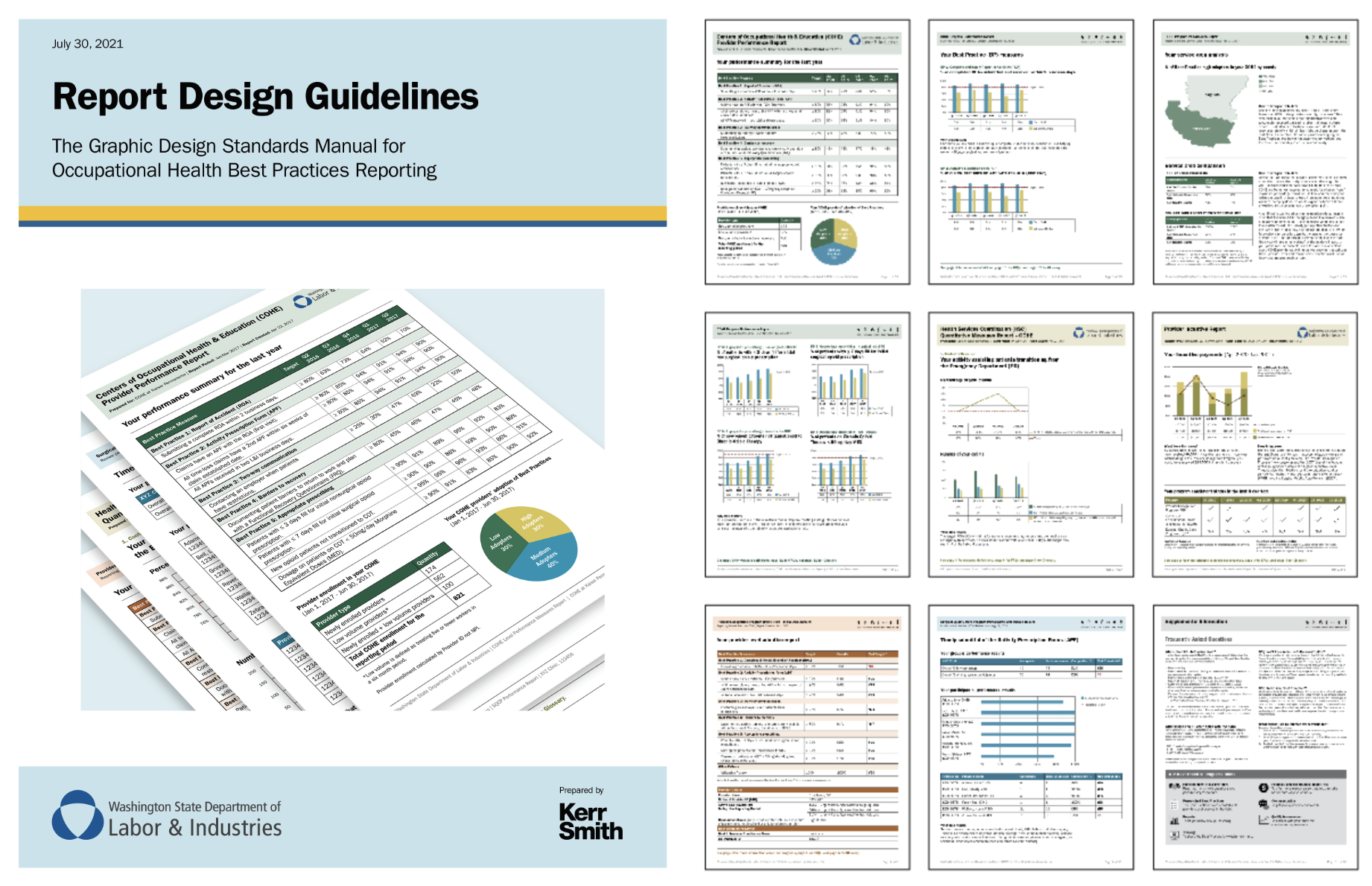
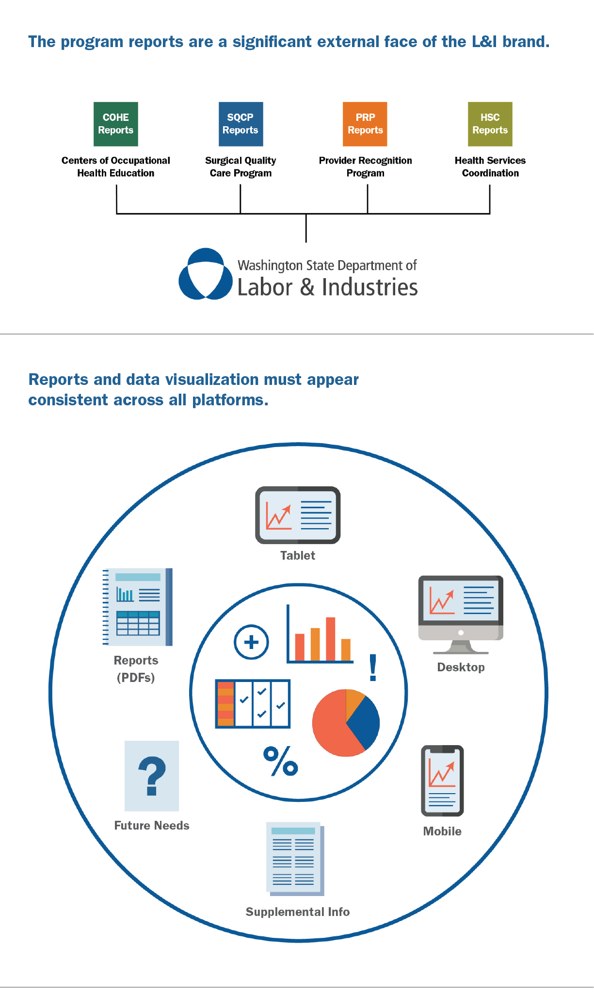
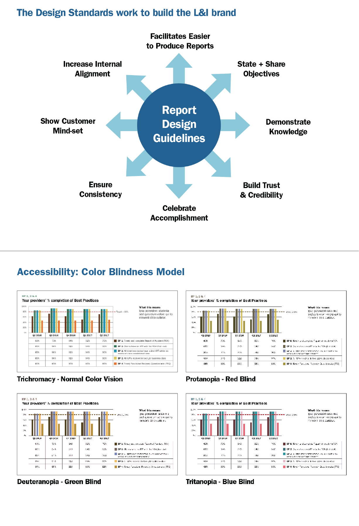
We are currently working with the Washington State Department of Labor and Industries to improve Occupational Healthcare reporting. The goal of this project is to promote the adoption of administrative best practices in order to minimize follow-up questions in case management, and to effectively use data visualization to improve reporting and outcomes. Our work required a systemic understanding of data and information flow between healthcare providers and state government to ensure optimal pathways to recovery for workers injured on the job. We incorporated a human-centered perspective of motivations and behavior as they pertain to measuring and reporting to a variety of healthcare audiences.
Through our research, we gained a more detailed and nuanced understanding of the communication pathways in Occupational Healthcare reporting in Washington and the need for improving decision-making and performance in an evolving context. Both internal and external stakeholders were interviewed to gain comprehensive knowledge of data requirements, information management capabilities, overall system comprehension and evolving technical capacity. We used these perspectives to develop improved tools for distribution of quantitative measures to influence preferred activities, to save tax dollars and, ultimately, to improve the long-term prospects for the workers in Washington.
A summative report of our research, with proposed “Design Principles” and a range of best design practice techniques were presented. In the second stage of work, we integrated our recommendations into reporting samples design system with rigorous structure, typography and graphic styles. A set of nine different model reports were fully designed and written. We also developed a Supplemental Information section with FAQs, measurement information, detailed explanations of Best Practices and a Glossary of Terms. A 40 page Design Guidelines document was written and designed for ongoing production requirements for the systems of reports.
Nine different reports were written and designed for the four administrative programs. Info-graphics included bar charts, tables, maps, and pictograms. We established detailed design rules for all elements including typography and colour. We integrated clear didactic titles and explanations to accompany all the graphics.
[/one_half]
September 22, 2021 — Comments are off for this post.
STLC NEXT
[one_half]
Research, Strategy & Design
STLC NEXT
[supsystic-social-sharing id='1']
Scope of work
- Research
- Engagement
- Website
- Strategy report
- Logo/Brand
- Presentation
- Reports
[/one_half]
[one_half_last]
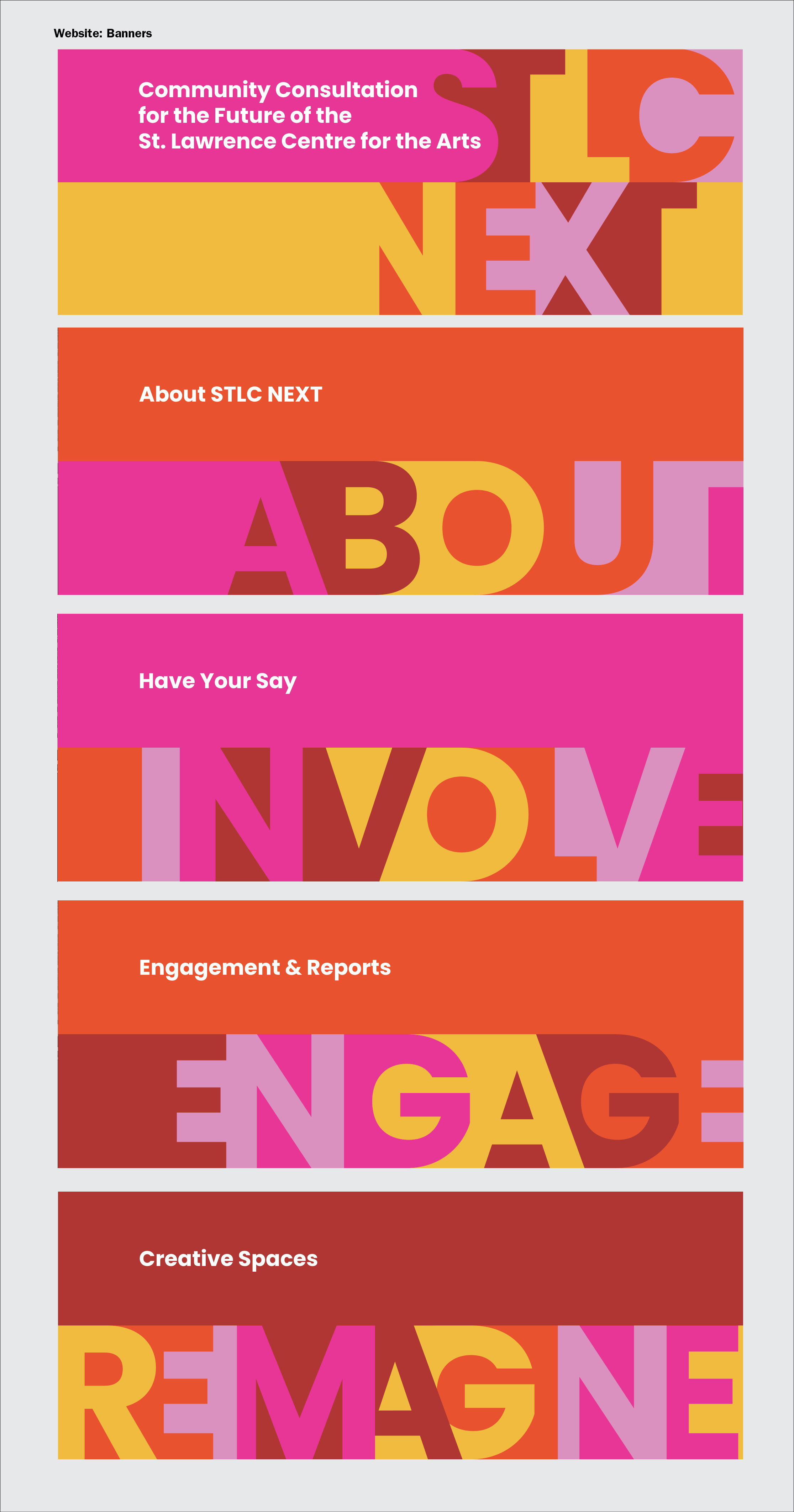
Public Consultation, Engagement, Strategy, Website, Brand & Visual Identity, for the Redevelopment of the St. Lawrence Centre for the Arts
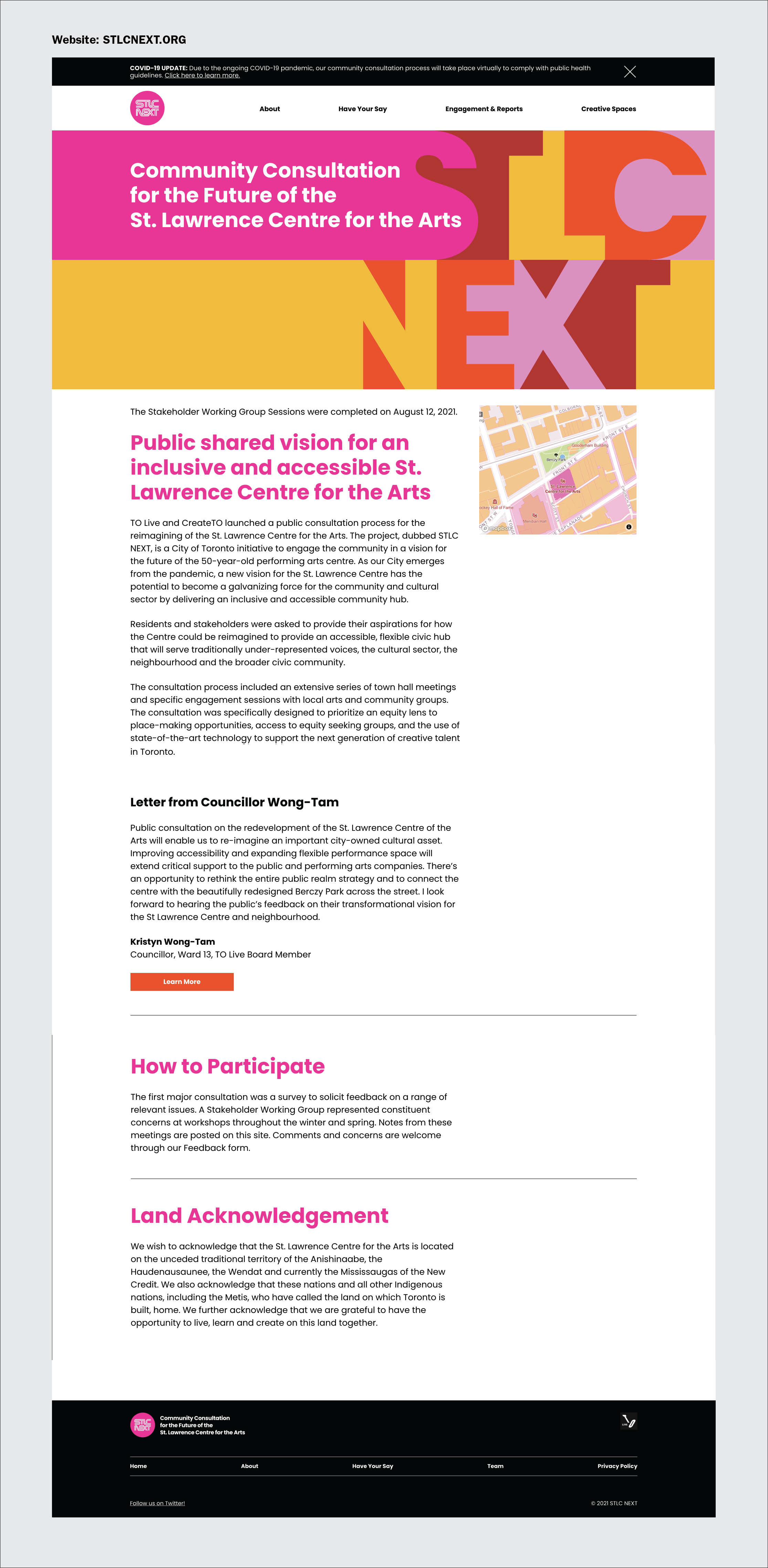
For this public consultation project to re-imagine the St. Lawrence Centre for the Arts in downtown Toronto, we created detailed terms of engagement, a communications plan, website content and design, and digital surveys.
We worked closely with the client at Create TO and the building manager – TO Live – to build a fulsome, detailed and inclusive public consultation plan that reached a wide audience.
Remote Consultation
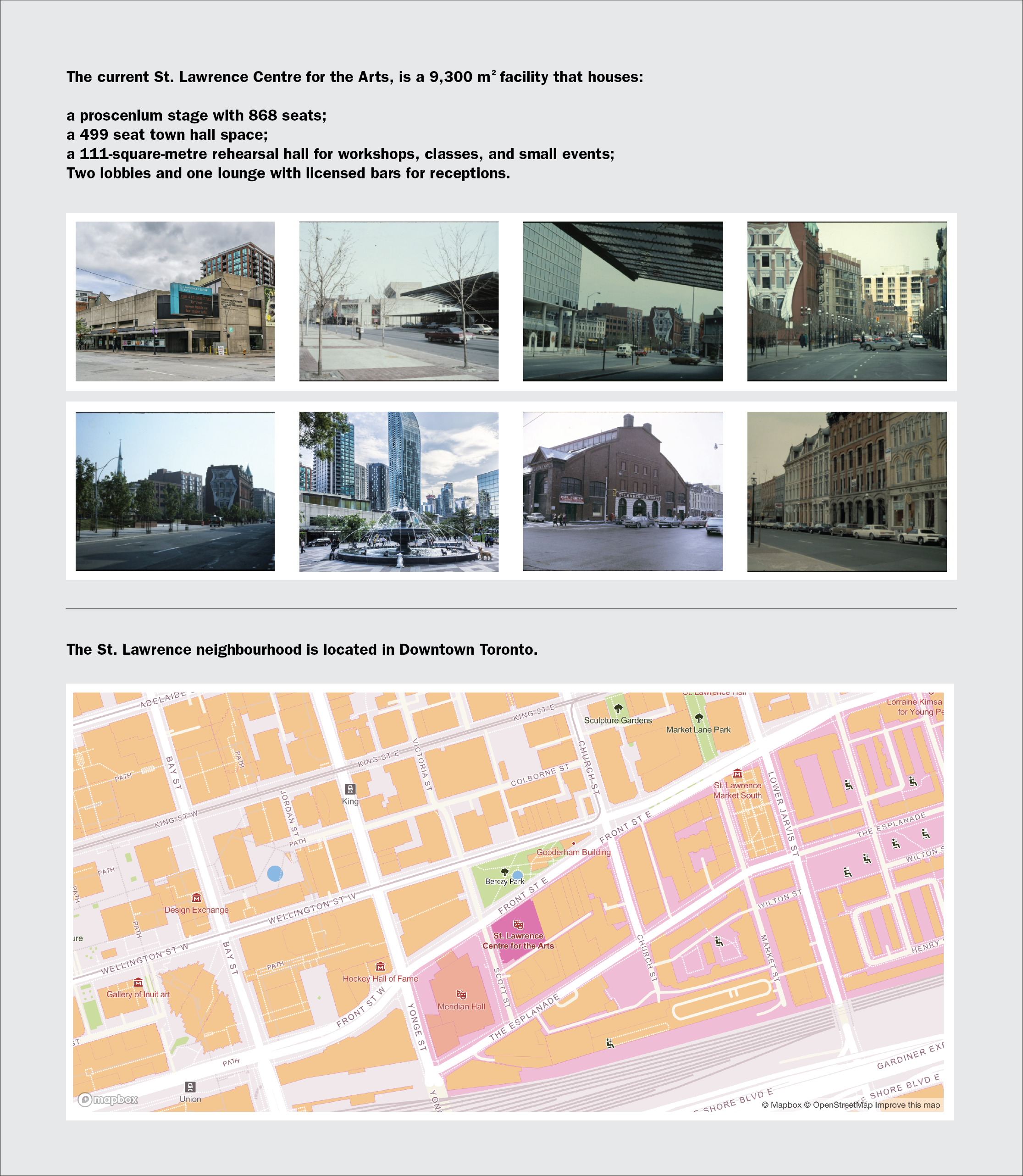
A significant part of the first phase of the engagement was the creation of a community survey delivered electronically. We designed the survey to be fair, open minded and accessible. Due to the pandemic, and the necessity for “remote” townhall meetings the website for STLC NEXT became the most important face and touchpoint for this project. The site published the full story, sharing background information, historic photos, a detailed site map, and listed those involved. STLCNEXT.org shares the full terms of engagement, consultation plan, meeting notes and schedule. With the website we designed an identity with logo and graphic styles to help brand and communicate the project.
A stakeholder working group was formed to represent the 3 major communities involved in the consultation and terms of membership and roles and responsibilities were outlined in the Terms document. We facilitated 4 remote townhall meetings.
We reported after each meeting, circled back regularly to the core project team and wrote final summaries for the City of Toronto Council. This project is under high public scrutiny and must engage with arts groups, marginalized communities, the neighbourhood citizens group as well as the local business group and City of Toronto internal stakeholders.
[/one_half_last]
August 19, 2020 — Comments are off for this post.
Supply Chain Canada
[one_half]
Introduction to
Foresight Training
[supsystic-social-sharing id='1']
[/one_half]
[one_half_last]
Supply Chain Canada ensures Canadian supply chain professionals and organizations are recognized for leading innovation, global competitiveness, and driving economic growth.
By investing in continual career-long learning and curated information, SCC creates the knowledge and skill competencies necessary to succeed. Supply chains are the backbone of the economy. Canada is the prosperous, revered nation it is today because of the continued work of almost a million innovative supply chain professionals.
Canada’s supply chain enables $1 trillion worth of goods movement and is ranked among the top 20 nations in the World Bank’s Logistics Performance Index.
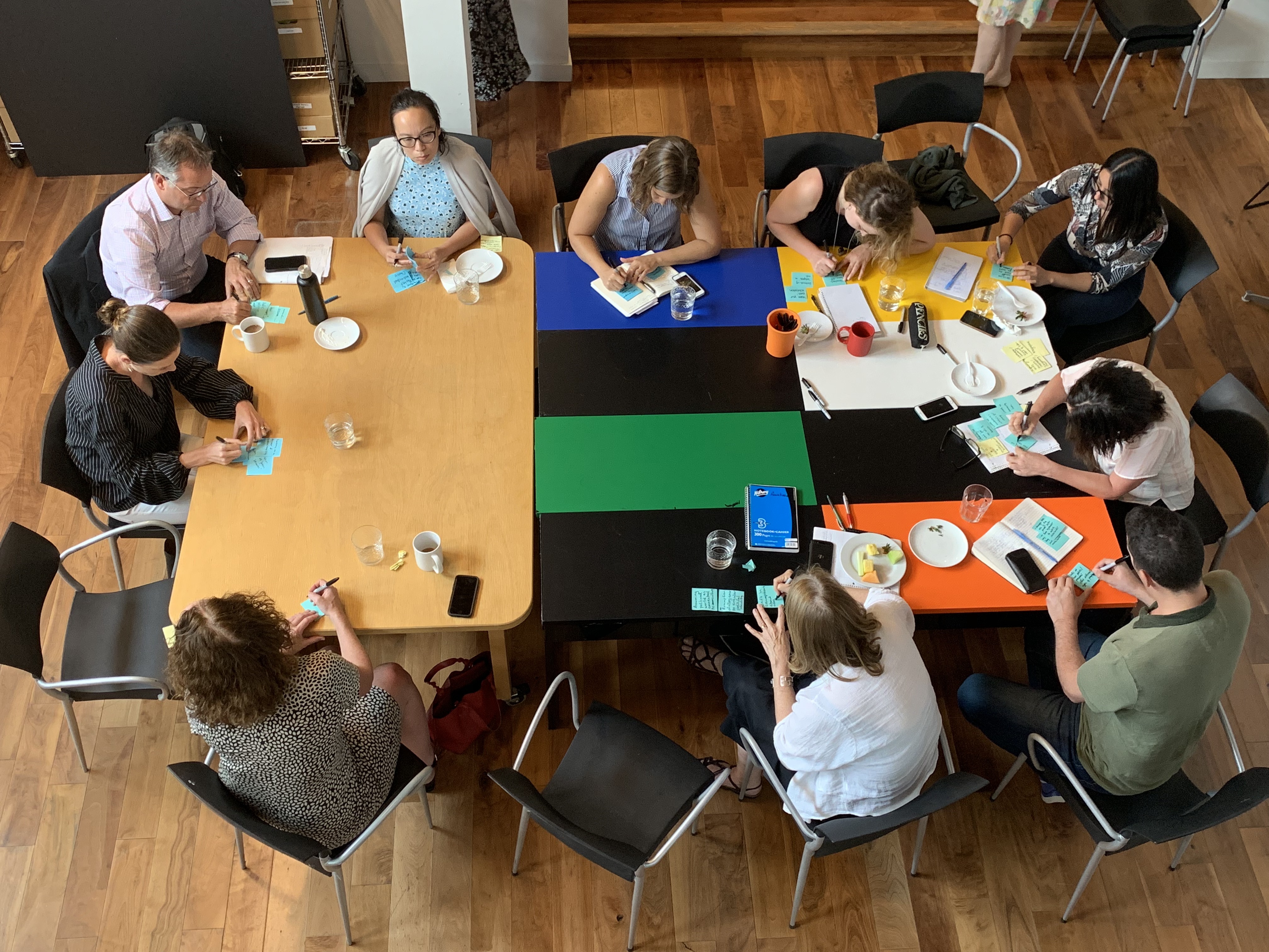
Helen hosted 2 days of intense remote meetings to 300 supply chain professionals. The hands-on workshops included exercises, break-out sessions, feedback with questions and answers, all successfully facilitated using teleconferencing technology.
[/one_half_last]
August 19, 2020 — Comments are off for this post.
TransAlta
[one_half]
TransAlta Workshop
Design Thinking & Clean Energy
![]()
[supsystic-social-sharing id='1']
[/one_half]
[one_half_last]
TransAlta is an electricity power generator and wholesale marketing company headquartered in Calgary, Alberta, and is Canada’s largest clean electricity provider.
With an emphasis on renewable sources of energy, TransAlta operates hydro sites in Alberta and Ontario and has expanded hydro capacity in British Columbia. TransAlta is also Canada’s largest producer of wind energy with sites in Alberta, Ontario, Quebec and New Brunswick, and continues to expand development of this fuel source. TransAlta recognizes the impact and challenges that climate change presents to society and to business today and into the future. TransAlta has been at the forefront of open and transparent dialogue regarding climate change since the early 1990’s.
Helen Kerr conducted a remote talk as part of their Innovation Presentation Series. Helen facilitated a successful “Design Thinking” workshop to 100 members of their international innovation team.
[/one_half_last]
August 19, 2020 — Comments are off for this post.
City of Calgary
[one_half]
Future Focused Calgary
Resilient Futures Workshop

[supsystic-social-sharing id='1']
[/one_half]
[one_half_last]
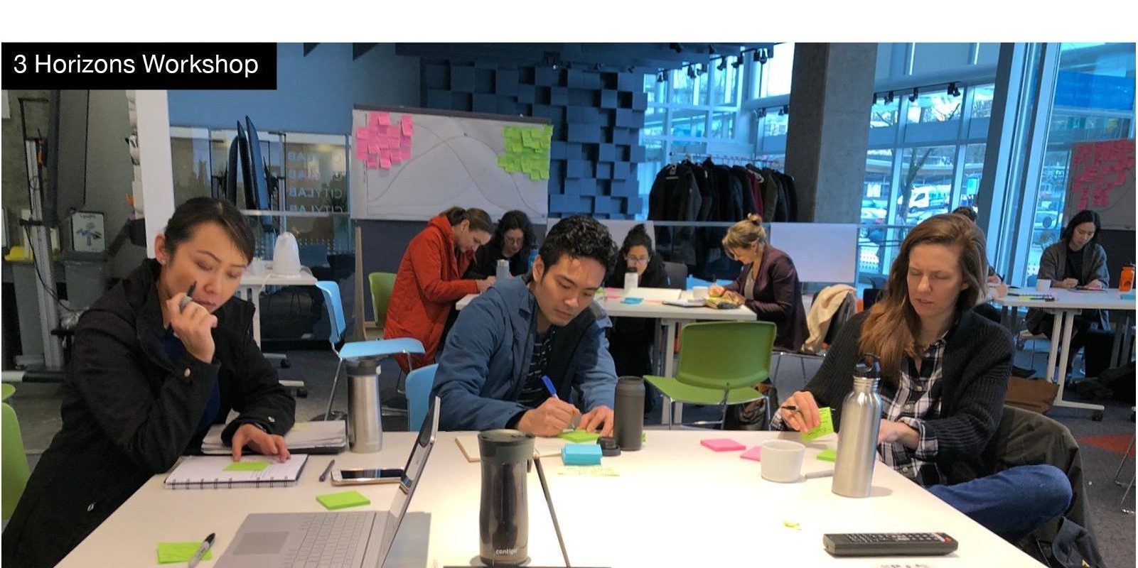
Helen Kerr recently facilitated a Three-Horizons workshop with the city of Calgary Councillors and Mayor. This senior leadership session tackled a range of relevant and forefront issues facing the city at a time of compounded pressures including Covid-19, energy sector strains and weather emergencies. The half-day presentation and exercise allowed a recalibration of vision and priorities. Helen’s expertise navigated the range of opinions and brought insights and a creative problem-solving methodology to the question and answer session.
Our Strategic Foresight lens means long-term goals can be addressed apart from the everyday tactics that ongoing business necessitates. Acuity, diplomacy and outsider perspective build more alignment, common understandings and a more productive environment in complex Leadership settings.
[/one_half_last]
August 12, 2020 — Comments are off for this post.
Anne Fenn
[one_half]
2D Design: Web Design
Anne Fenn
[supsystic-social-sharing id='1']
[/one_half]
[one_half_last]
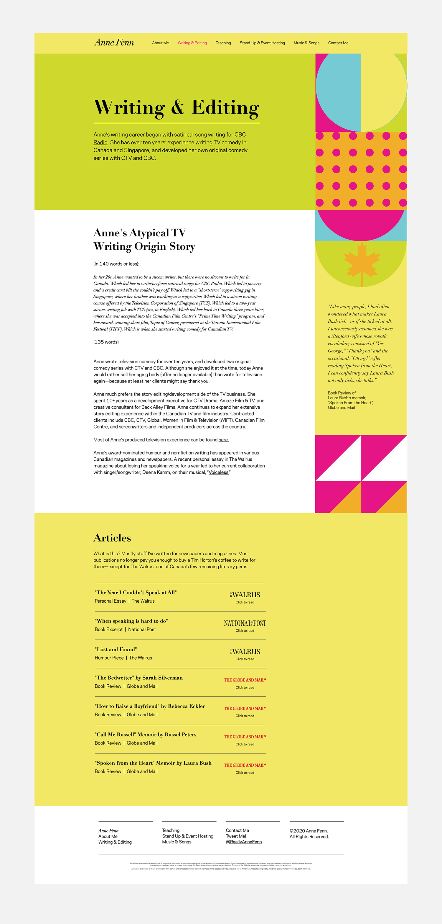
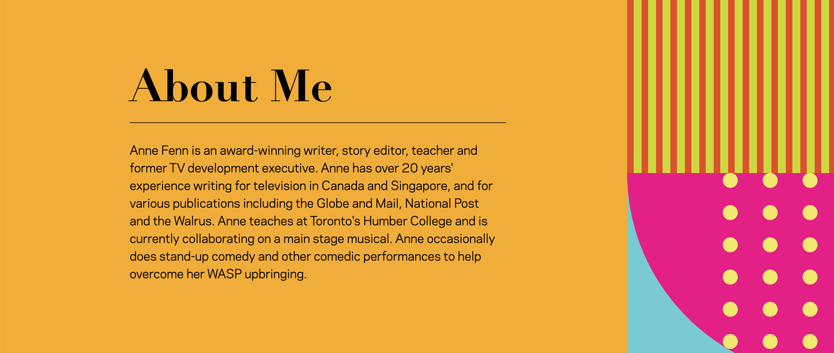
We created a new website for comedian, Anne Fenn. We developed a palette of typography, messages, textures and colours that had to be approved by her best friend. This working method is really wonderful. We get all sorts of direct feedback from Anne, in long discussions about meaning, purpose and reflecting Anne’s ambitions and “story”. But then all the decisions are made by somebody who has nothing to do with the process. Entirely enjoyable and efficient way of working. I highly recommend it. Not to worry. We hid a bunch of silly things in the site. But Anne doesn’t know it yet.
[/one_half_last]


August 4, 2020 — Comments are off for this post.
Rockefeller Center
[one_half]
2D Design: Flag Design
Rockefeller Center
The Flag Project

[supsystic-social-sharing id='1']
[/one_half]
[one_half_last]
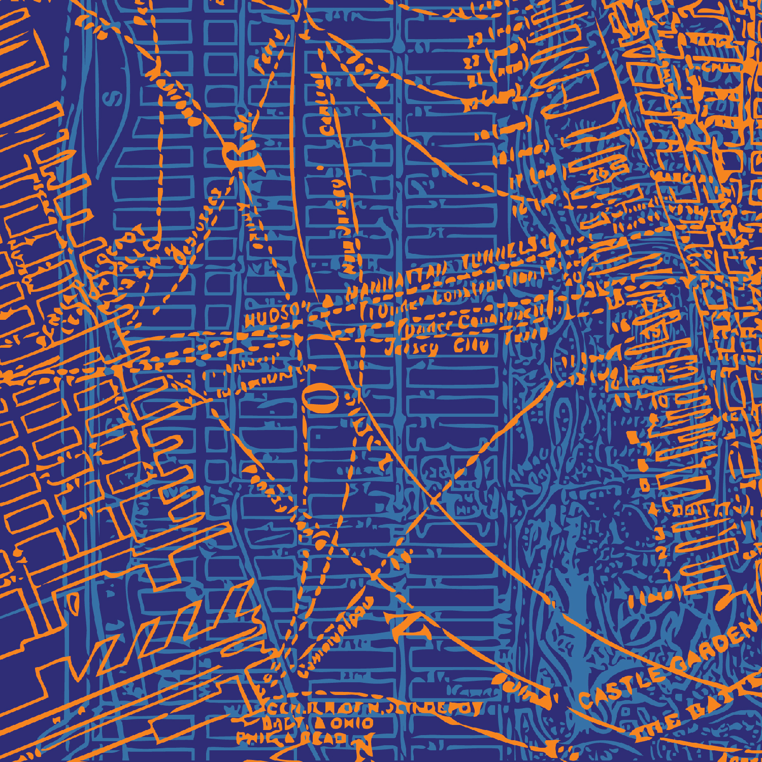
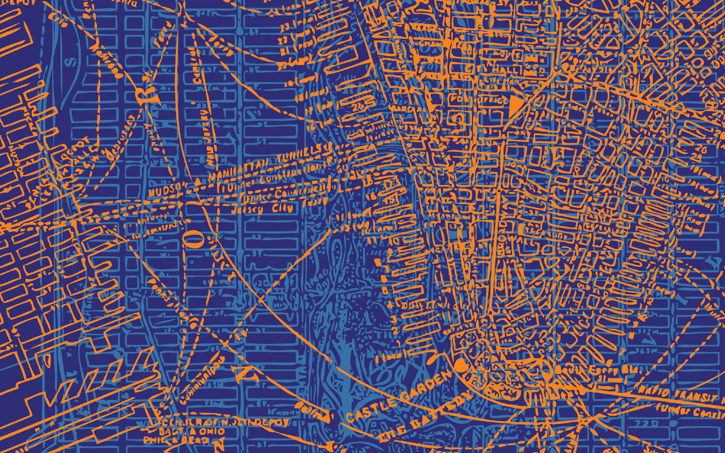
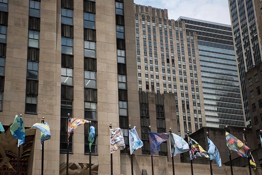
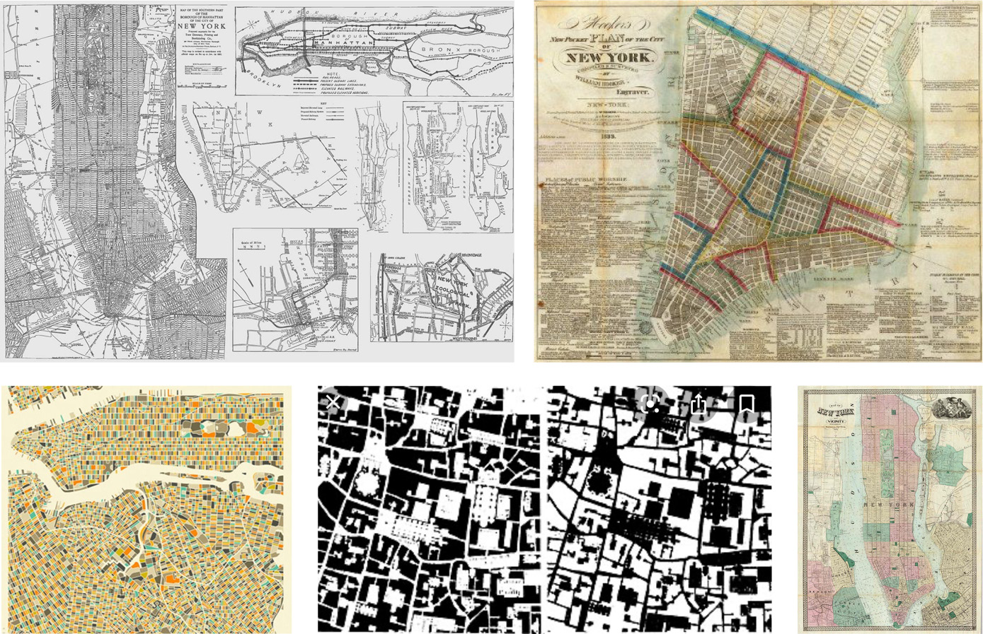
This spring, the Rockefeller Center asked designers across the world to submit a flag design showcasing their love for New York City. Our design was chosen to be flown in the temporary art installation on one of the flag poles surrounding the Rockefeller Center's iconic ice rink. Our winning entry drew inspiration from old New York City maps and overlaid them on top of one another.
The distinct New York City street grid is legendary and historic. Both rigorous and quirky, it represents a mesh of straightforward problem solving and accommodations to anomalies. It was created in 1811 and blankets Manhattan and beyond. It is heralded as a brazen planning tool that captures the city’s early bold ambitions with “beauty, order and convenience”. The colours of our flag were taken from the official city flag and its use of orange and blue. Our flag will be up from August 1st to 16th.
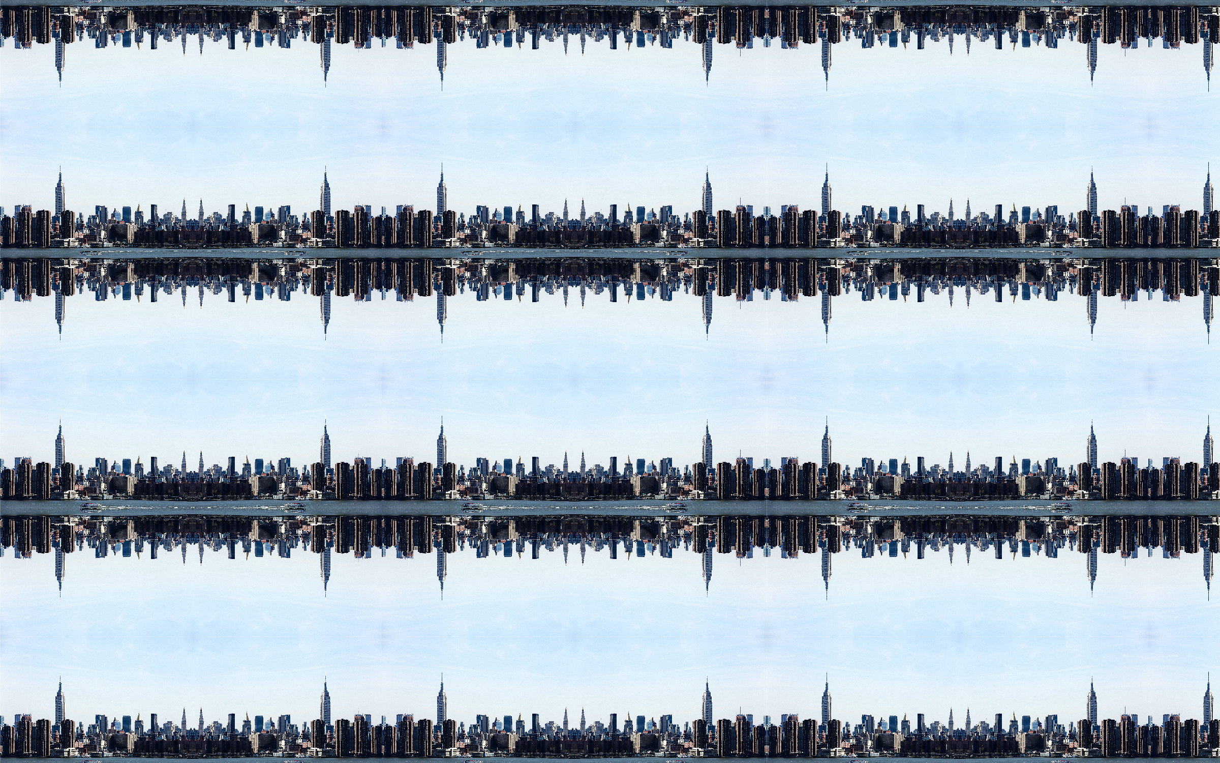
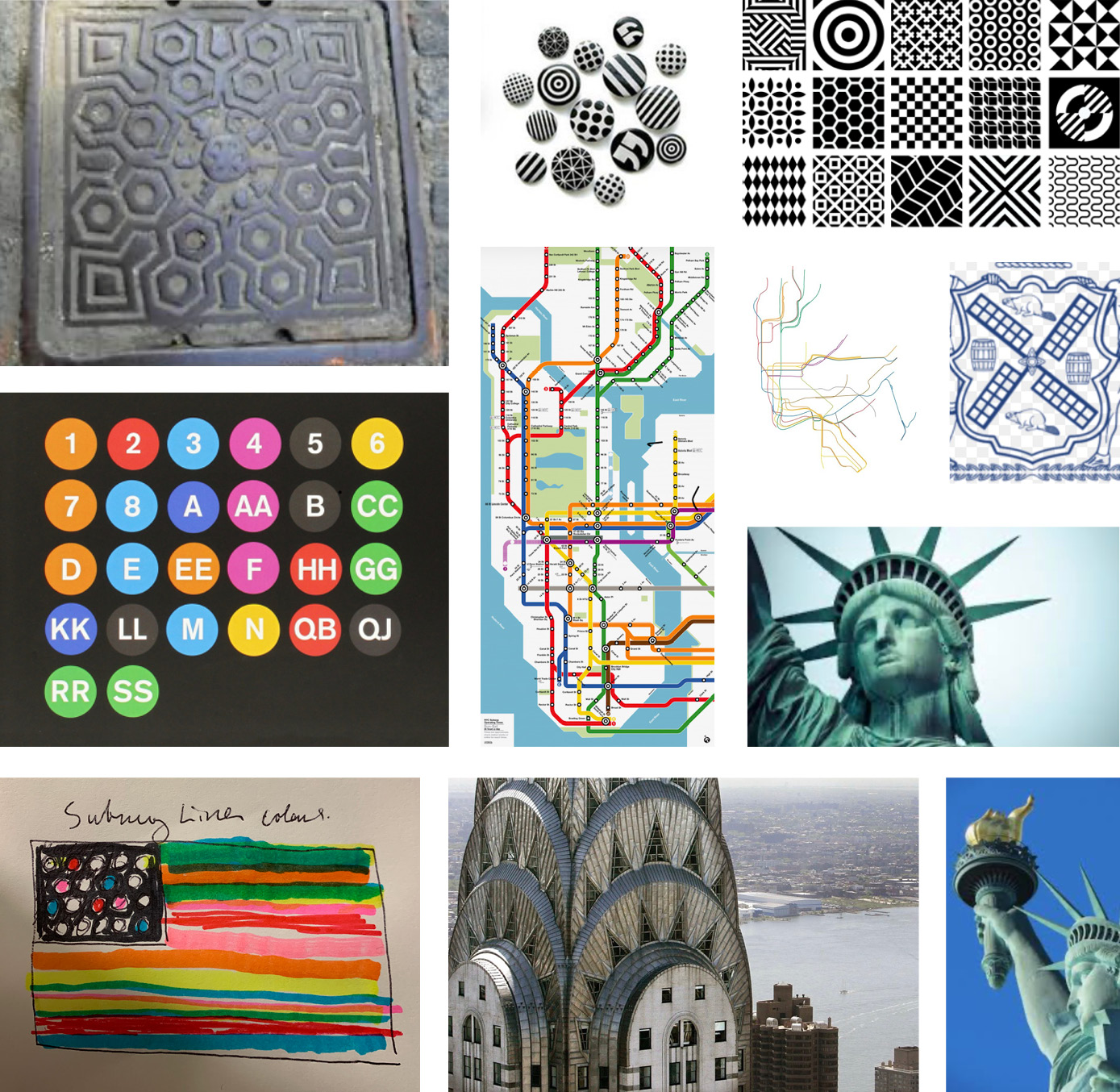
During our design process, we looked at a range of ideas for inspiration. The city offers an extraordinary variety of objects, symbols, colours and even textures that could be considered iconic. One of our lines of study looked at graphics inspired by the subway system. The maps and signs are distinctly playful. We also explored naval flags representing “NYC”. We interpreted sidewalk grates, sewer covers and street furniture and we created a number of kaleidoscopic photographic patterns from the skyline and landmarks as we celebrated Gotham.
View the full map of the flags here (our design is on page 46).
[/one_half_last]
Winning Flag Design
Reference Photos
Sketches
a
[one_half]
 [/one_half]
[one_half_last]
 [/one_half_last]
[one_half]
 [/one_half]
[one_half_last]

[/one_half_last]
[one_half]

[/one_half]
[one_half_last]

[/one_half_last]
[one_half]
[/one_half]
[one_half_last]

[/one_half_last]
[one_half]

[/one_half]
[one_half_last]

[/one_half_last]
[one_half]

[/one_half]
[one_half_last]

[/one_half_last]
Other Reference Material
a
July 27, 2020 — Comments are off for this post.
City of Vancouver
[one_half]
Foresight & Insight
VANCOUVER 2050
Scope of work
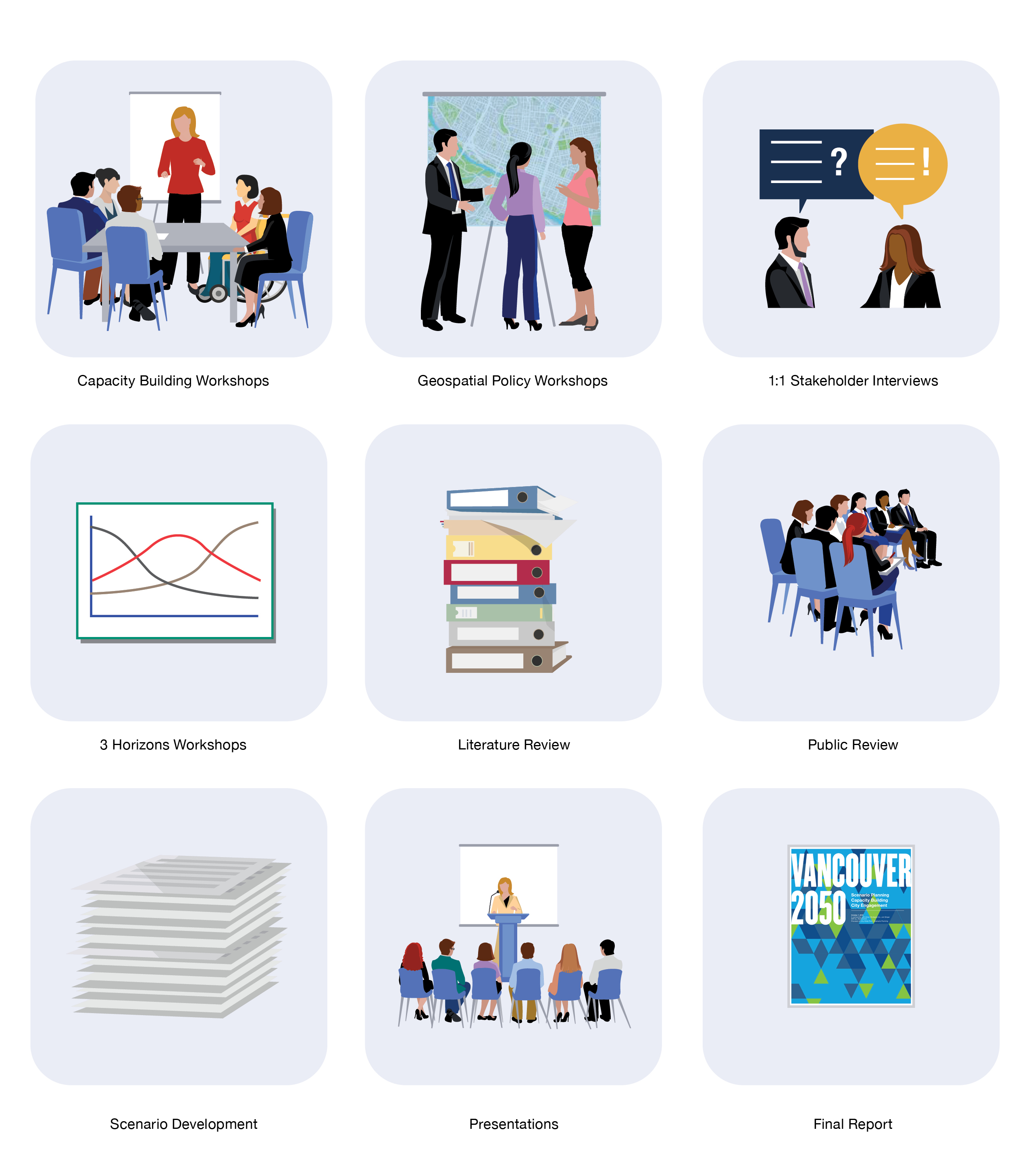
- Capacity Building Workshop
- Desk Research
- Interviews
- Horizon Scan
- Engagement
- Scenario Development
- Foresight Workshops
- Strategic Implications
- Final Report
[supsystic-social-sharing id='1']
[/one_half]
[one_half]
The City of Vancouver is undertaking a scenario planning process to support the provision of a Citywide planning program with KerrSmith. This bold strategic research and Futures project will guide Vancouver as it builds a resilient strategy for the next 30 years.
The City of Vancouver is committed to inclusion, reconciliation and resilience and required both a broad, citizen-based participatory approach to defining a future vision, as well as an expert led exploratory investigation into possible emerging challenges. Our work sets the stage for comprehensive, future oriented, and non-siloed strategic planning and policy development.
Increasingly common to building long-term planning foundations, Futures or Strategic Foresight projects are a robust and disciplined approach to navigating complex futures.
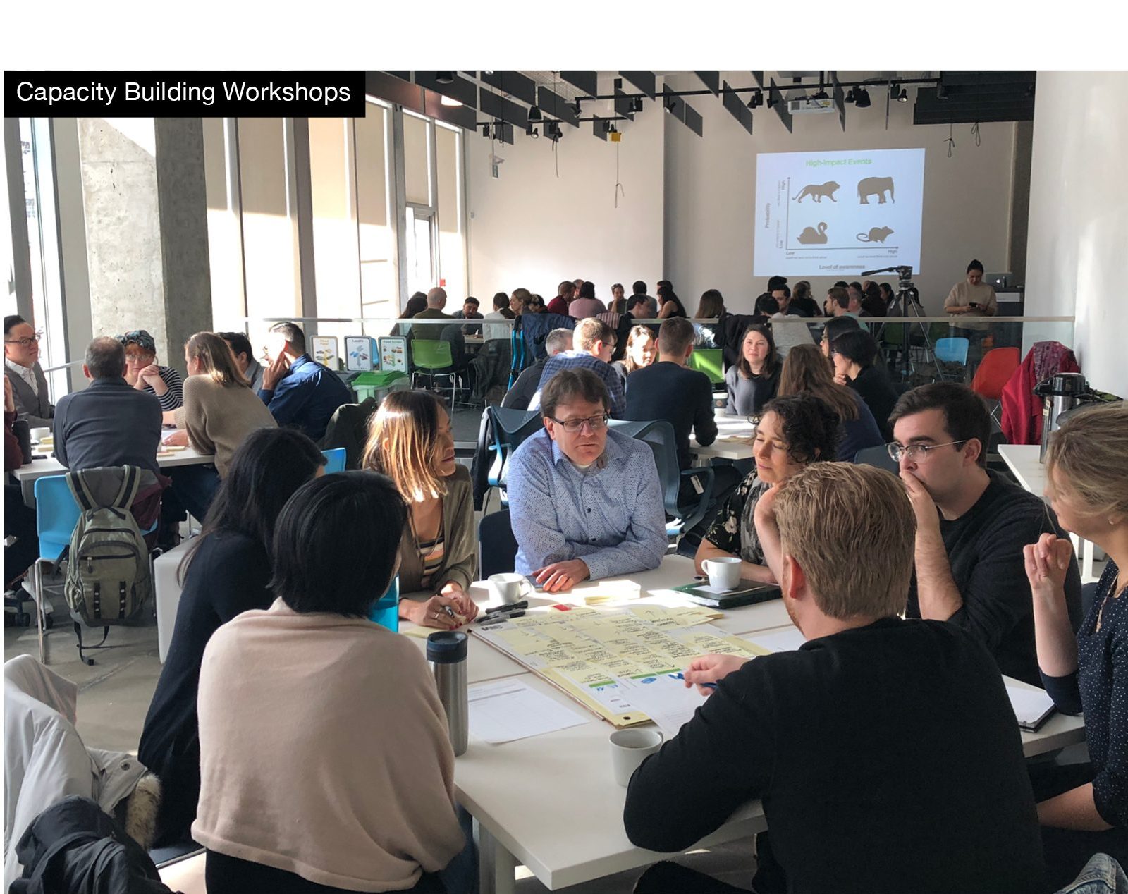
Effective solution making is sharpened by establishing metrics and goals. Throughout this project, we have augmented our deliverables with training, allowing the City to also increase its own capacity for ongoing Foresight research and Scenario Planning.
We are working with a multidisciplinary team of collaborators, including political leaders, planners and technical policy makers. We are drawing upon our experience working with large and diverse bodies of internal and external stakeholders to coordinate the project. As well-informed outsiders with a knowledge of urban issues, resiliency planning and the expectations of policy-makers the goal is to make work inclusive, accurate, unbiased and relevant.
By using a spectrum of participation to consult, involve, collaborate or empower, we have engaged with stakeholders for a thorough exchange of opinions and reasoning.
[/one_half]
[one_half]
[/one_half]
[one_half_last]
Scenarios
The scenarios are anticipated to focus on land use, population, housing, jobs/economy, environment, infrastructure, City services, and overall quality of life in the City. They are intended to help prepare for unforeseen situations and to seed discussion. The scenarios will also include consideration of disparate impacts on different segments of the population; each scenario will consider issues relating to equity, inclusion, resiliency, and reconciliation. It is anticipated that the time horizon will be to 2050.
We have developed a custom methodology which is highly collaborative. The parameters for capacity building, complex criteria and the range of stakeholders required a unique approach appropriate for Vancouver. Our experience in a number of city-building projects brings perspective to the intricate requirements of the project.
[/one_half_last]
[one_half]
[/one_half]
[one_half_last]
Drivers of Change
The following Drivers of Change were identified by the City of Vancouver in the Planning, Urban Design, and Sustainability Department’s Strategic Plan:
- Climate change and natural hazards;
- Population growth, aging population, and immigration (City and region);
- Global economic and technological shifts and innovations, concentration of wealth and capital;
- Growing disparities in income and opportunity, shortage of affordable housing/living;
- Challenges to human and environmental health;
- Densification of neighbourhoods, growing demands for public services and amenities, indications of social isolation;
- Cultural diversity and sociocultural change;
- Reconciliation;
- Growing fiscal/service expectations gap; and,
- Low civic engagement, high digital engagement/externalities of technological change.
[/one_half_last]
Issues

[one_half]
[/one_half]
[one_half_last]
Key Criteria for the Core Scenarios
The preliminary scenarios will be exploratory in nature, and will be used primarily to illustrate the range of possible futures, including radically transformed futures that are still plausible.
- The scenarios will consider the jurisdiction of the City of Vancouver and key partners.
- Among the initial set of scenarios, there will be no “preferred” or “most probable” scenario at the first stage of the project. Each scenario should be equally likely/unlikely and likable/unlikeable.
- The internal logic of each scenario has to be aligned.
- The methods used to construct and evaluate the scenarios will be clear and transparent.
- The scenarios will be easy to recall
- The scenarios will not be “too safe”; they will challenge assumptions and look beyond today’s environment, to help prepare for unforeseen situations and provoke discussion.
- Final scenarios will consider plausibility. The scenarios will consider significant impacts to, or demands on City revenue or other funding sources and may consider potential new funding sources.
- Scenarios will consider “if / then” statements regarding actions in response to potential trends, disruptors, and drivers of change and flag potential trade-offs that will need to be considered.
[/one_half_last]
[one_half]
 [/one_half]
[one_half_last]
Engagement
Ongoing engagement activities will include work which will be required to describe the 3-4 core scenarios as part of the report for public review. We will ensure that there is sufficient support present at the engagement activities to capture ideas generated through the discussion.
Vancouver and Reconciliation
The City of Vancouver’s Vision includes striving to form a sustained relationship of mutual respect and understanding with local First Nations and the Urban Indigenous community, including key agencies. The City will Incorporate a First Nations and Urban Indigenous perspective into their work and decisions and provide services that benefit members of the First Nations and Urban Indigenous community.
The City’s long-term goals
- Strengthen local First Nations and Urban Indigenous relations
- Promote Indigenous peoples’ arts, culture, awareness, and understanding
- Incorporate First Nations and Urban Indigenous perspectives for effective City services
[/one_half_last]
[one_half]
[/one_half]
[one_half_last]
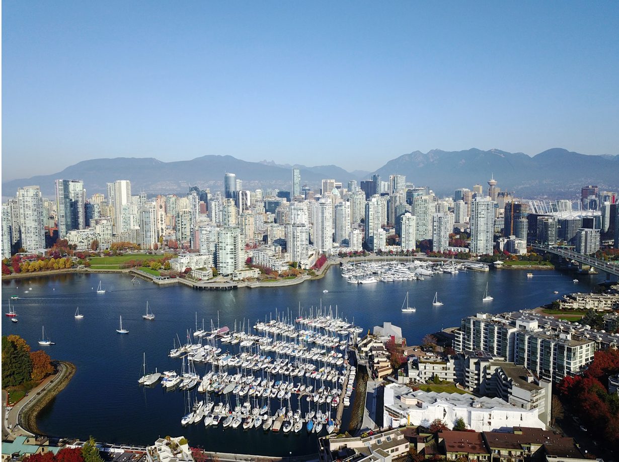
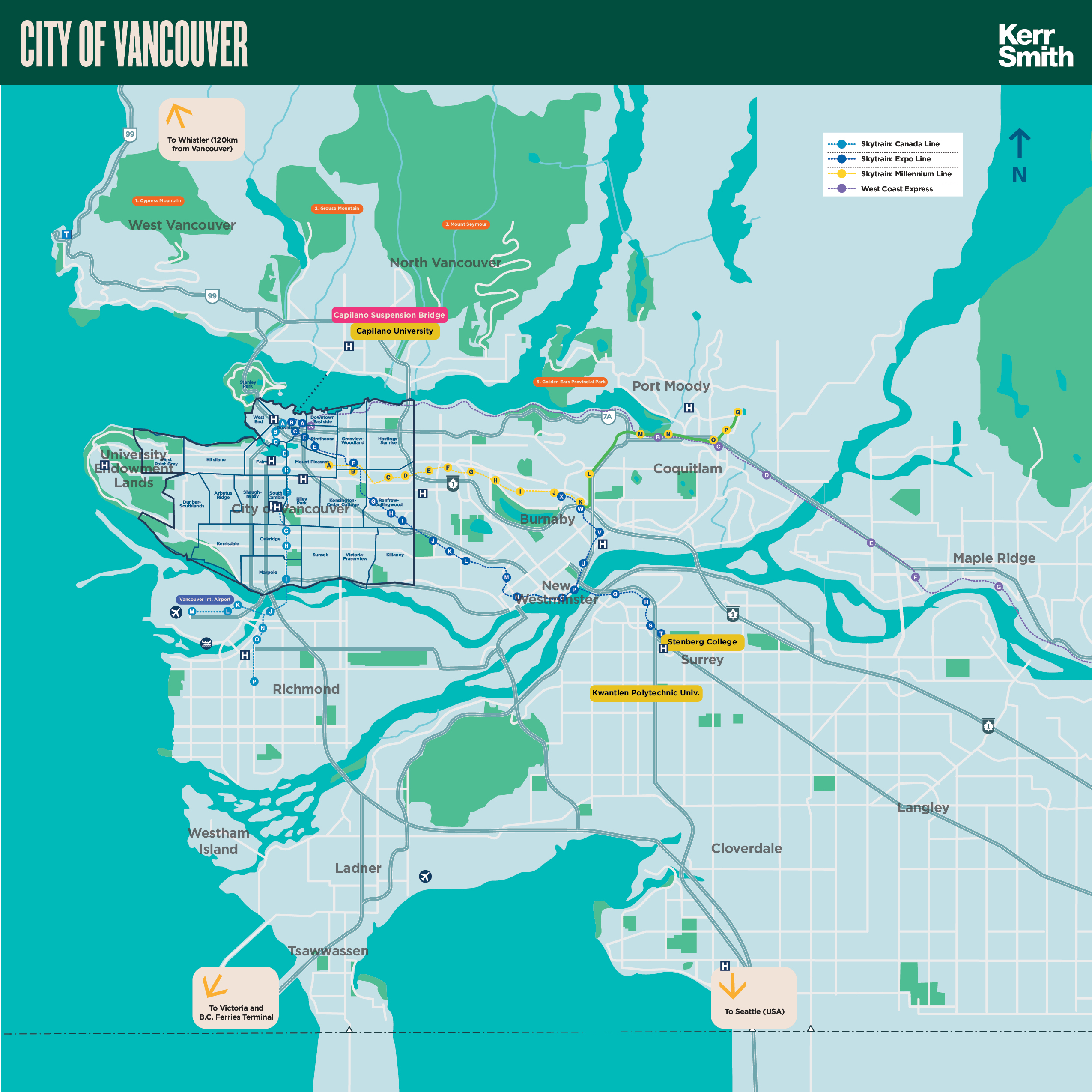
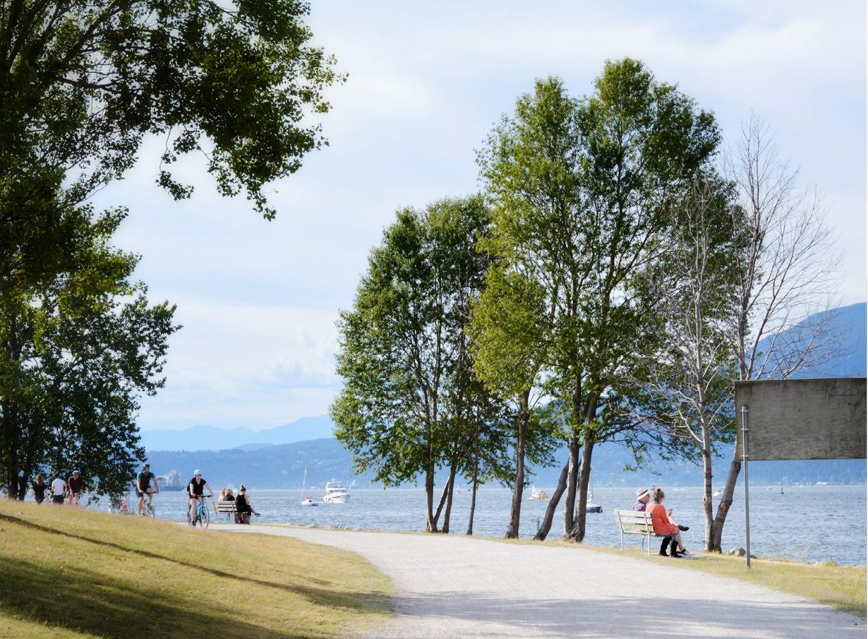
There are approximately 631,000 people living in the city of Vancouver, while the population of Metropolitan Vancouver is close to 2.5 million. Vancouver is the most linguistically diverse city in Canada: 52% of its residents are not native English speakers. 48.9% are native speakers of neither English nor French, and 50.6% of residents belong to visible minority groups
[/one_half_last]
September 21, 2019 — Comments are off for this post.
People for Education
[one_half]
Foresight & Insight
Future of Public Education
To better understand the complexities of the emerging and evolving public education context as part of changing societal landscape in Canada and beyond.

Scope of work
- Interviews
- STEEPV Workshop
- Horizon Scanning
- Impact-Uncertainty Workshop
- Report
[supsystic-social-sharing id='1']
[/one_half]
[one_half_last]
We are currently working with People for Education on an investigation of the Future of Public Education in Canada. The aim of the project is to better understand the complexities of the emerging and evolving public education context as part of a changing societal landscape in Canada and beyond, and the social impact of that myriad change. This comprehensive investigation will provide deeper understanding of future issues to support the larger goal of advocating for support of this critical sector.
By engaging with policy makers, education leaders, teachers, students, parents and the larger community we will build a robust platform to contribute to a new resilient ecosystem.
We will evaluate international best-practice and provide a framework for the future of public education. The project will examine knowledge skills and instructional systems to help to develop future-ready education for all.
[/one_half_last]
August 26, 2019 — Comments are off for this post.
TD Bank
[one_half]
2D & 3D Design: Environmental Design
TD Bank 77 Bloor
West Branch

[supsystic-social-sharing id='1']
[/one_half]
[one_half_last]
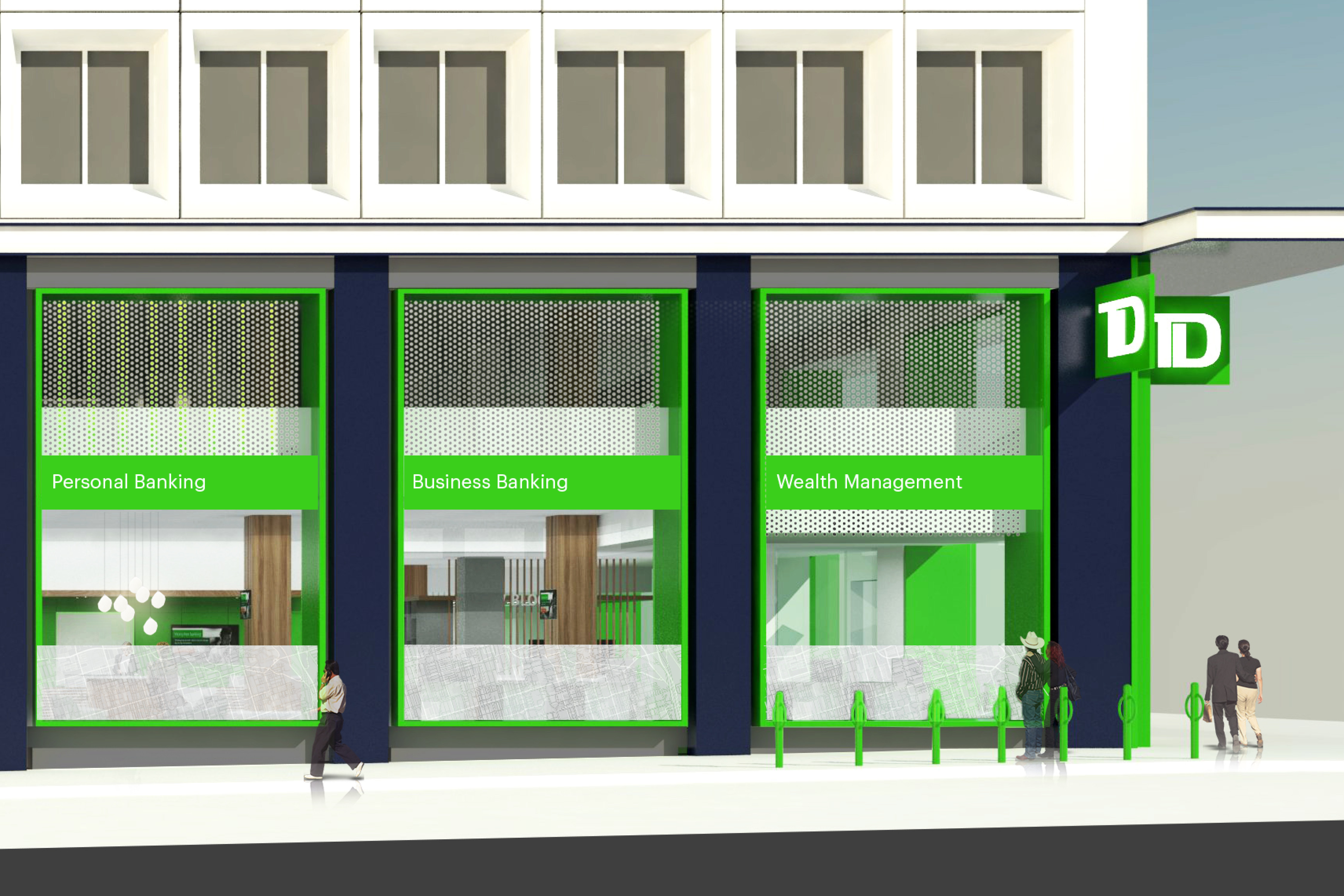
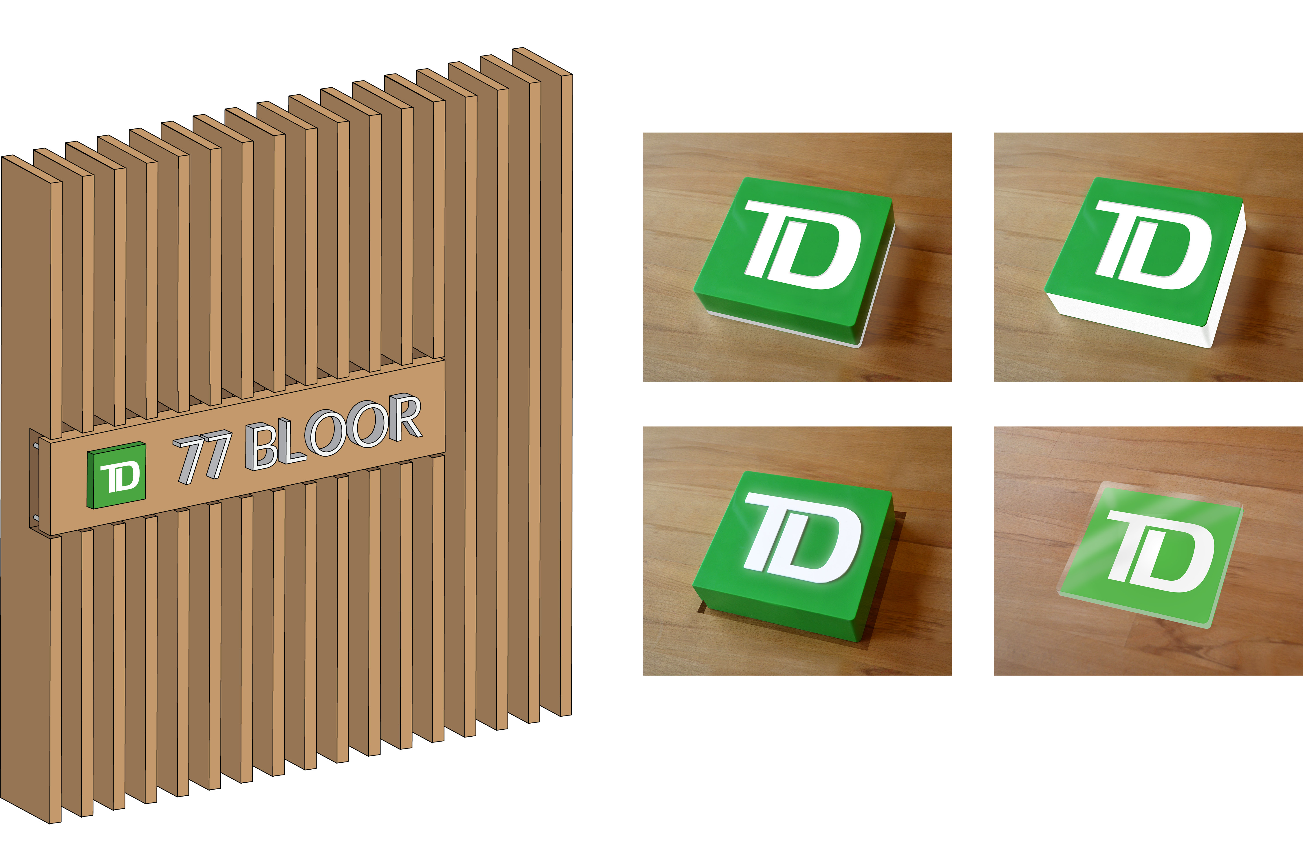
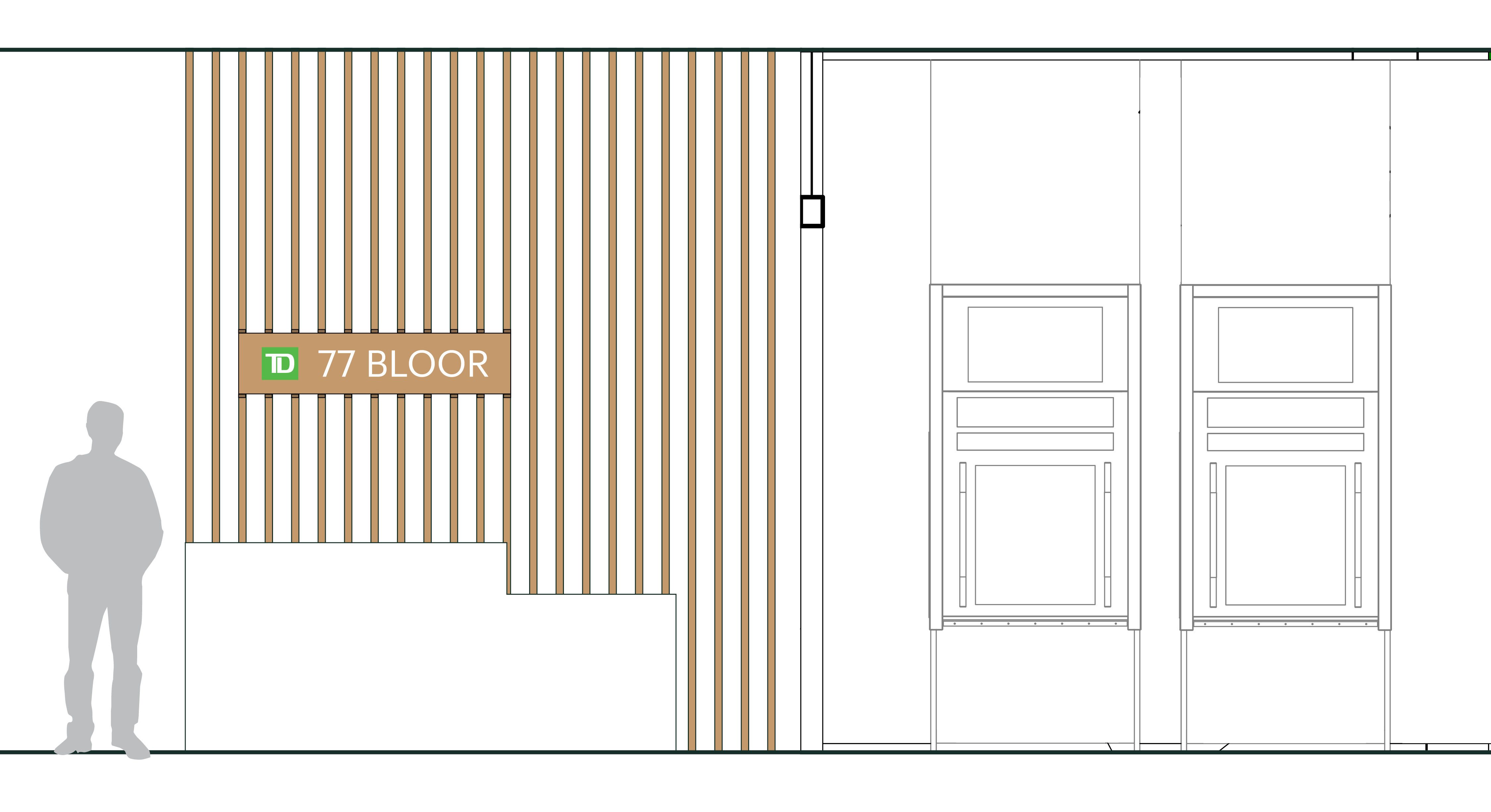
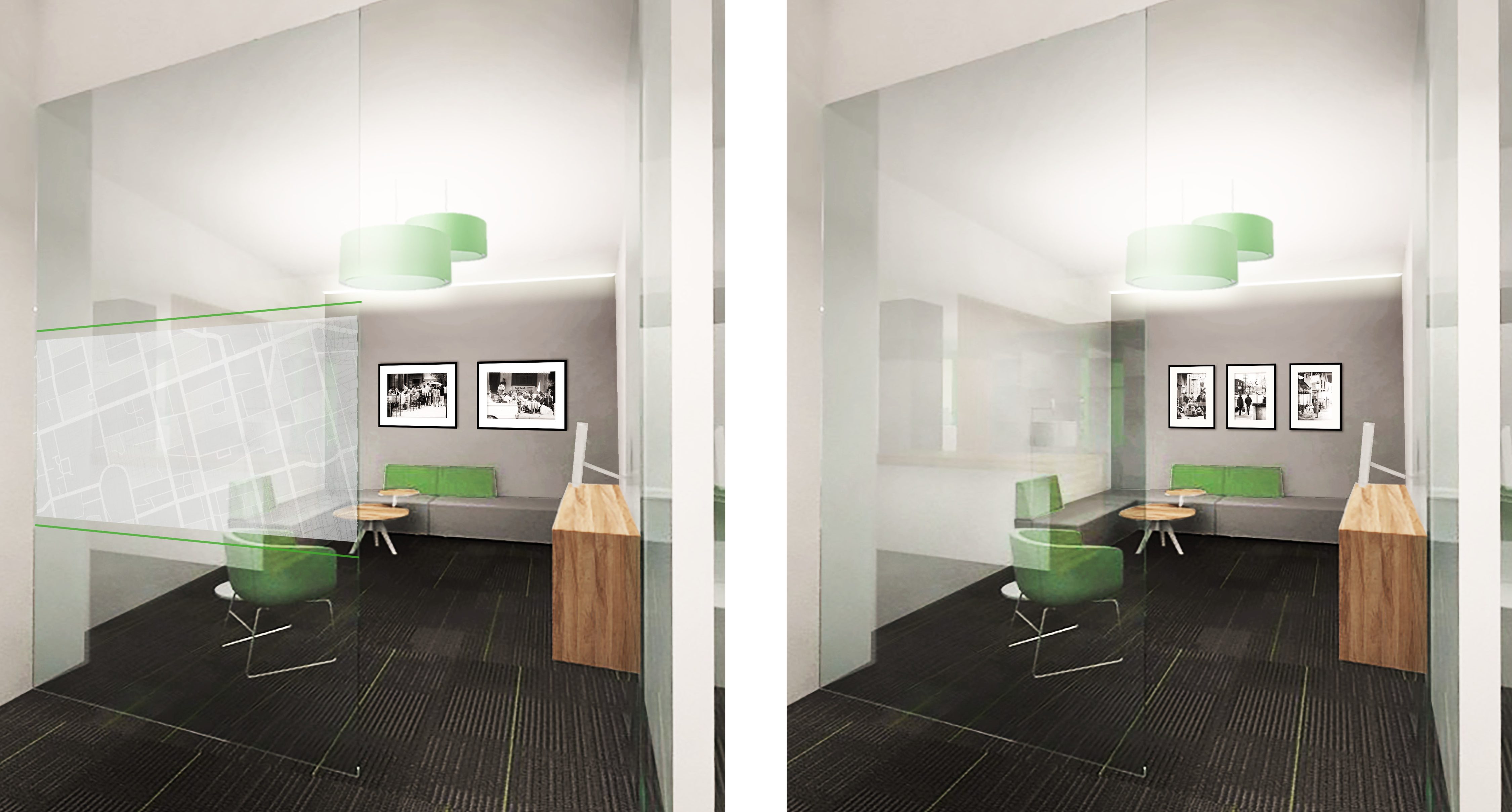
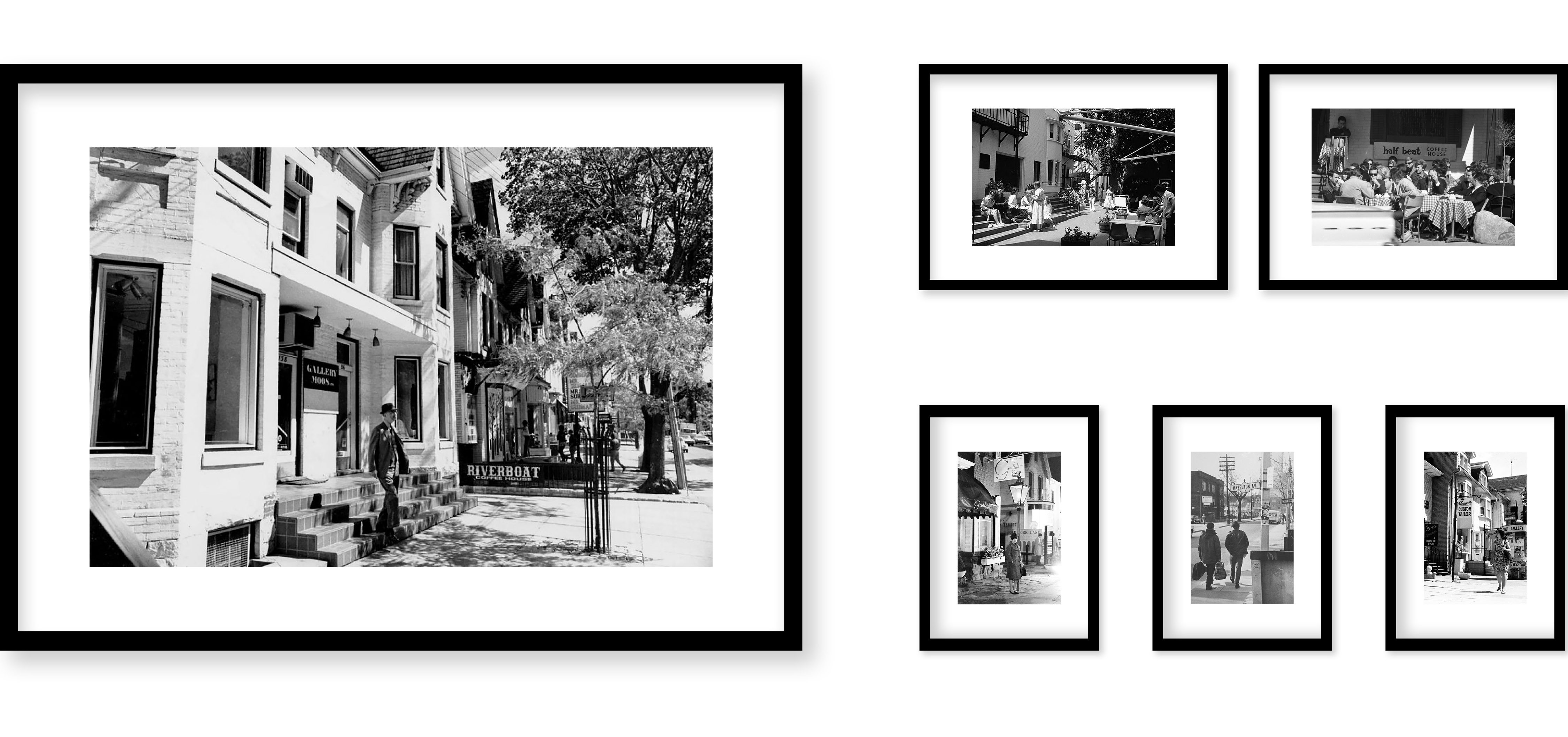
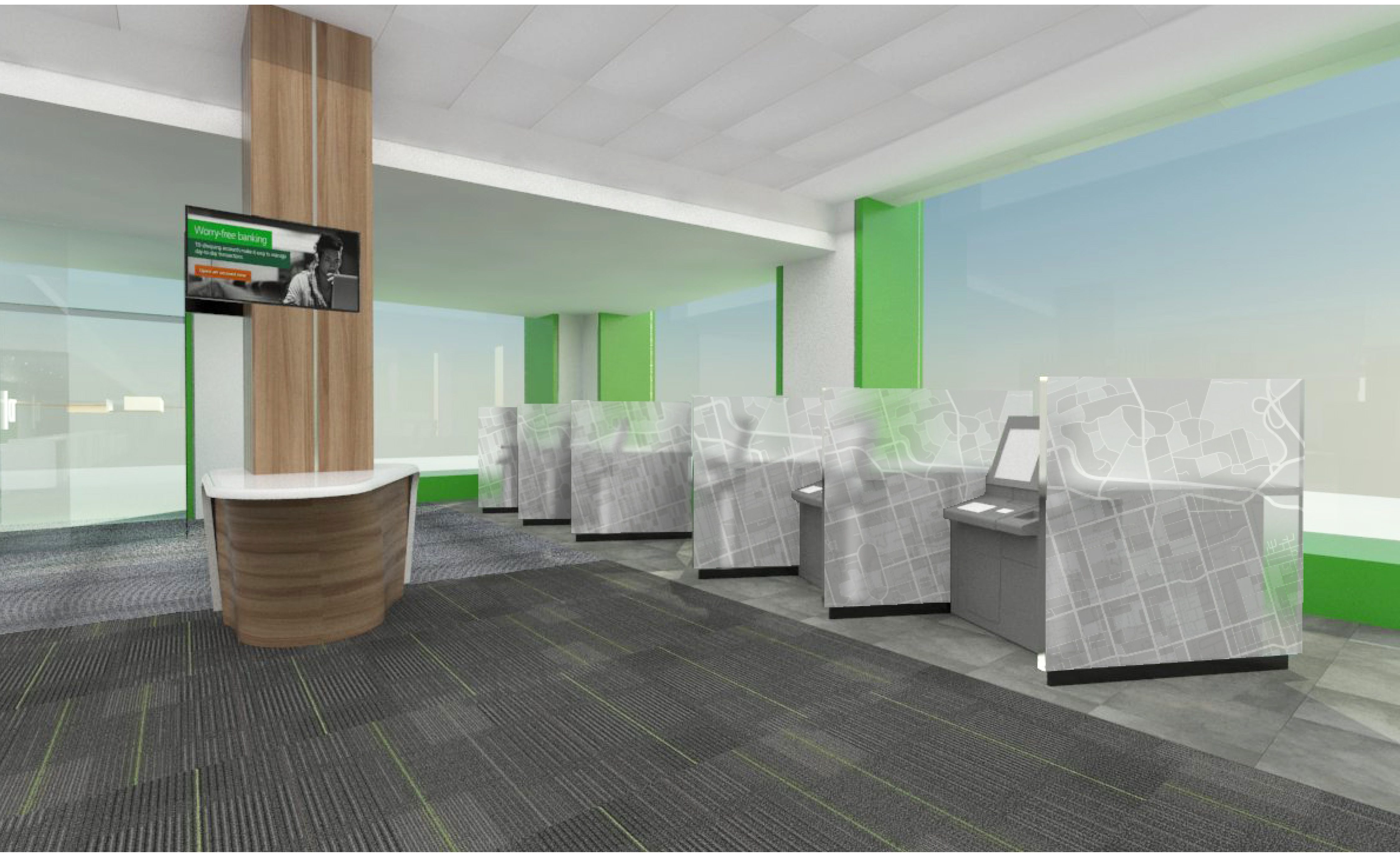
We are working with Bortolotto Architects to design the environmental graphics for this premier flagship branch of the TD bank in central Toronto. The scope includes exterior graphics, gateway signage, ATM privacy screens, office windows, image research and art strategy, digital migration signage and the welcome and menu boards.
We researched best international practice, understood the new TD brand amplification strategy, created a number of concept options and finalized our nostalgic design vision for “Heart of Yorkville”, that celebrates the late 1960s coffee-house culture of local bars and clubs that featured Joni Mitchell, Neil Young and Gordon Lightfoot. We clarified project goals, planned, implemented and navigated all components through production and installation. Completion due in Fall 2019
[/one_half_last]
Exterior Graphics
Welcome Sign Sketches
Office Privacy Screens & Photography Concepts
ATM Screens

August 21, 2019 — Comments are off for this post.
Canadian Opera Company & National Ballet of Canada
[one_half]
Insight
The Digital Stage
An investigation into digital technologies and their use in the Performing Arts.
Scope of work
- Internal and External Interviews
- Environmental Scan
- Horizon Scan
- Recommendations
- Report
- Presentation of Results
- Symposium
[supsystic-social-sharing id='1']
[/one_half]
[one_half_last]
We are currently engaged on the Digital Stage project with a consortium of major performing arts organizations. This project seeks to understand the implications and applications of digital technologies, from both an audience engagement and an artistic/production perspective, in order to develop a new strategic and future-based framework for the performing arts in Canada. It is essential to understand, explore and proactively adopt new and emerging technologies to ensure the long-term viability of the institutions and the sector at large to remain relevant in a rapidly changing market.
By conducting an environmental and horizon scan to understand best practices and cross-pollination, identify challenges and barriers, and determine key digital technologies that can best support the performing arts, the Digital Stage seeks to create a new paradigm for the sector in Canada through deep and sustained collaboration and engagement with all relevant stakeholders.
To see the full environmental scan report, click here.
To see the full horizon scan, click here.
[/one_half_last]
July 5, 2019 — Comments are off for this post.
Canada Council for the Arts
[one_half]
Insight
Framing Change
Scope of work
- Literature Review
- User Interviews
- Systems Mapping
- Data Analysis
- Learning Network Design
[supsystic-social-sharing id='1']
[/one_half]
[one_half_last]
The Canada Council for the Arts is Canada’s public arts funder, with a mandate to foster and promote the study and enjoyment of, and the production of works in, the arts. Their Digital Strategy Fund was created to stimulate the digital transformation of the arts sector in Canada. It supports initiatives to develop a user-centered culture of innovation, a rethinking of organizational culture, work procedures and leadership styles, and the adoption and deployment of available technological solutions.
Council engaged KerrSmith Design to review applications and literature with a view to creating a framework for a learning network that would support the efforts of existing and future DSF recipients. Based on data from DSF application files, we mapped the current arts ecosystem and identified the characteristics that defined how Canadian arts organizations currently work and identified the characteristics that would enable Canadian arts organizations to thrive in a rapidly changing environment.
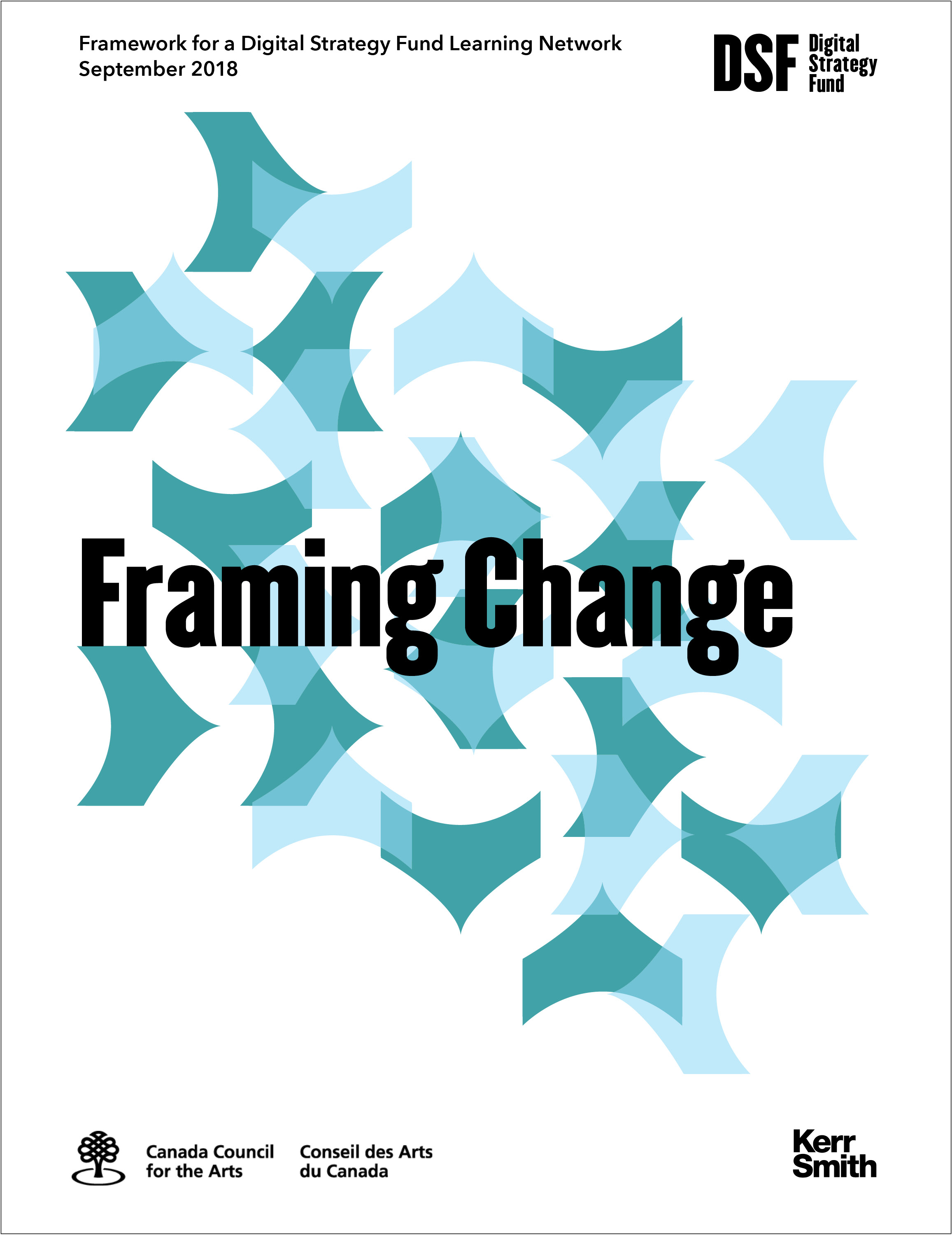
Report Cover: Framing Change
[/one_half_last]
June 24, 2019 — Comments are off for this post.
Fabco Custom Inc.
[one_half]
2D & 3D DESIGN: BRANDING
Fabco Custom Inc.

[supsystic-social-sharing id='1']
[/one_half]
[one_half_last]
Fabco is a Montreal, Asia and China-based custom manufacturer that needed a clear simple message. Their factories use North American standards and processes that are ideally suited for international, Canadian and US markets.
[/one_half_last]
January 22, 2019 — Comments are off for this post.
Paderno
[one_half]
2D, 3D & 4D DESIGN: PRODUCT DESIGN
Paderno
![]()
![]()
[supsystic-social-sharing id='1']
[/one_half]
[one_half_last]
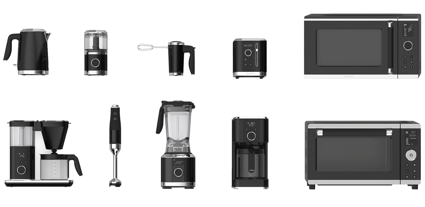
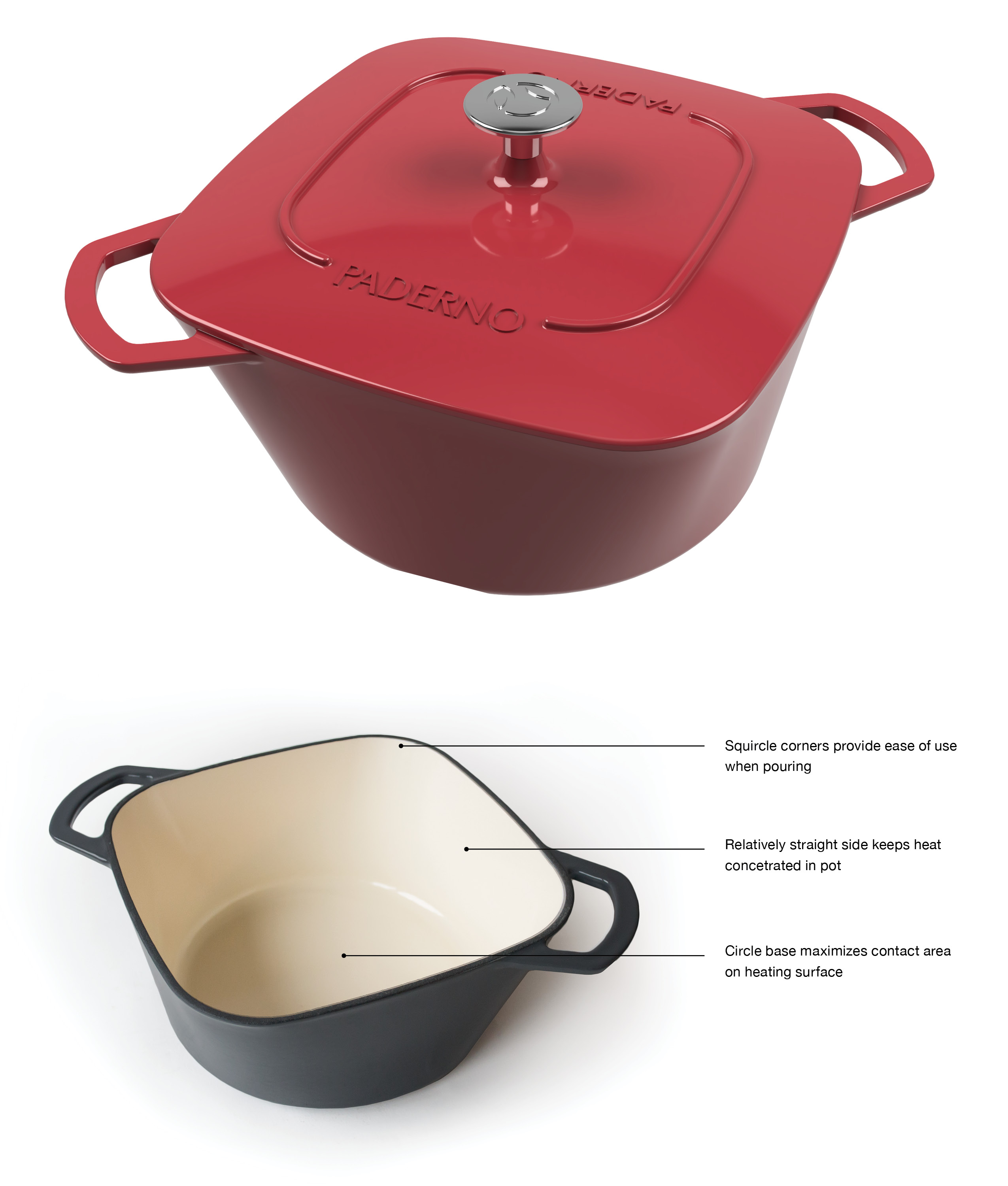
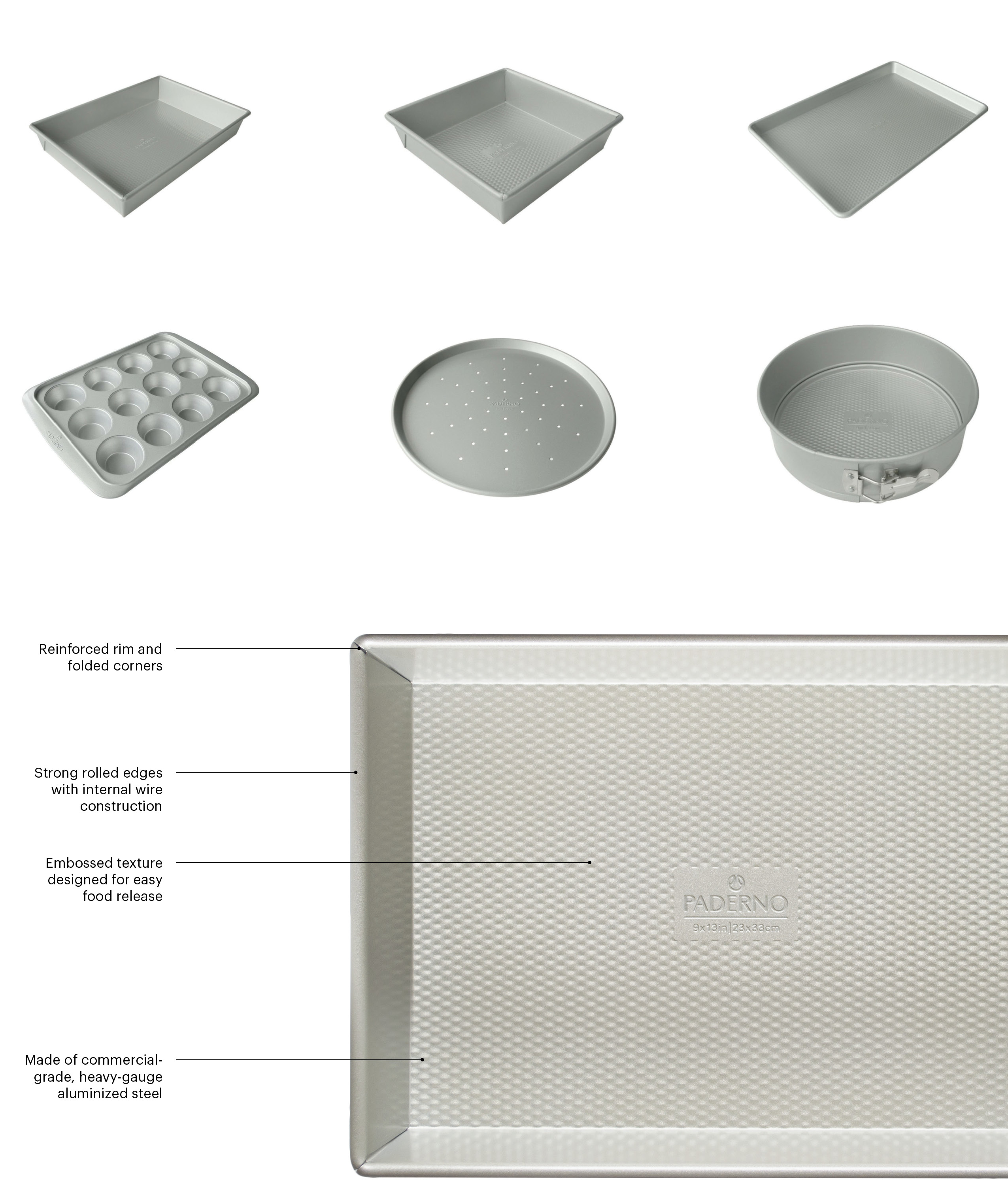
KerrSmith worked closely with the internal design team at Canadian Tire to create a full Visual Brand Language (VBL) strategy for the relaunch of iconic Canadian brand Paderno. Our work included extensive market assessment, ergonomic functional exploration, ethnographic research, form development, material palette creation, user experience modeling and detailed design of hand tools, cutlery, cookware, bakeware and over 10 electronic appliances.
As well as the specifics of product design, our comprehensive VBL also included brand strategy, brand story, brand essence, graphics, typography and a fulsome competitive review.
Our appliance design included all aspects of user experience including user interface design, sequence planning, programming guidance, icon development and design of all controls and displays.
[/one_half_last]
[masterslider alias="ms-11"]

[masterslider alias="ms-9"]

November 18, 2018 — Comments are off for this post.
Elections Canada
[one_half]
Foresight
Vote 2040
The Future of Electoral Administration in Canada

Scope of work
- Desk Research
- Interviews
- Horizon Scan
- Engagement
- Scenario Development
- Foresight Workshops
- Strategic Implications
- Final Report
[supsystic-social-sharing id='1']
[/one_half]
[one_half_last]
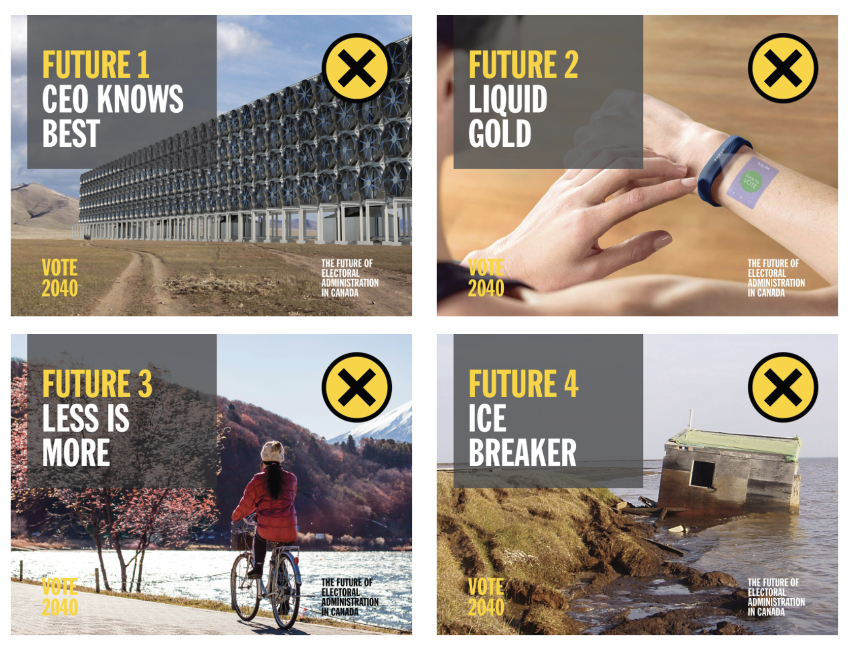
Elections Canada is an independent, non-partisan agency reporting directly to the Parliament of Canada. Its foremost responsibilities include ensuring that Canadians can exercise their choices in federal elections and referendums through an open and impartial process, administering the political financing requirements of the Canada Elections Act, and monitoring compliance with electoral legislation. Elections Canada engaged KerrSmith Design to undertake a Foresight exercise to inform both its innovation agenda and the Chief Electoral Officer’s long-term vision. This work was designed to support the development of a new five-year Strategic Plan that will ensure the most effective use of resources, and also guide strategic and operational objectives that will apply to multiple electoral cycles.
To assist Elections Canada in building resilience in a moment of tremendous global pressure on democratic processes and increasing threats to the integrity of electoral administration, we designed a Foresight research methodology that unfolded in three parts:
Understanding the Context of Electoral Event Administration
In order to identify emerging issues that might influence the changing landscape for elections and the lives of Canadians, we conducted an extensive literature review as well as 15 in-depth interviews with international authorities with a range of expertise. This work culminated in an 80-page Horizon Scan report articulating several hundred “Signals of Change”, six major contextual Shifts and six Drivers of Change in our world today.
Exploring the Potential Futures of Electoral Event Administration
Participatory workshops provided us with insights into the potential impacts of the emerging issues raised in the Horizon Scan. This informed the development of a set of four distinct Future Scenarios (Narratives) set in the year 2040. Scenarios were developed using “Four Alternative Futures” a well-recognized Foresight method developed by Foresight veteran, Jim Dator, and included a detailed backcast of unfolding events between the present and the described future.
Understanding the Implications for Change on Electoral Event Administration
A second participatory workshop enabled us to understand the potential nature of change for multiple stakeholders in the elections domain. Insights gleaned from workshop data informed the development of Strategic Implications for Elections Canada as an organization, Canadian Electors, Political Candidates, and the overall electoral process in Canada.
Impact
We led and convened groups to work together to enable a successful project. For our work to be effective it must be consultative, relevant and easy to use. As always, illustrations, charts and detailed info graphics were part of our deliverables.
The depth and breadth of our work was significant. The process unveiled new ideas, organized issues into useful patterns and facilitated important debate around large topics of risk management and innovation. Our research is supporting senior level directional explorations for policy and has provided an essential platform for participation in a renewal process.
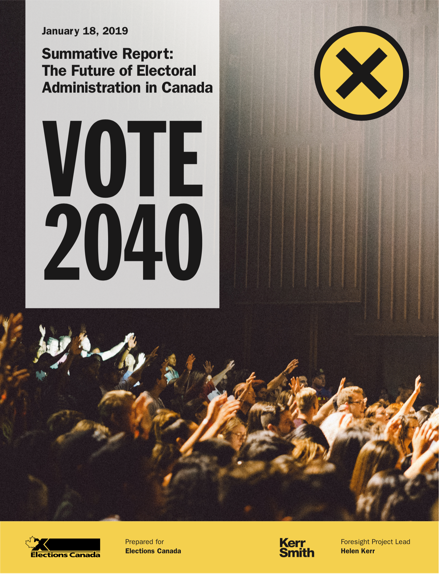
Click here to view the full report.
[/one_half_last]
September 20, 2018 — Comments are off for this post.
International Institute for Sustainable Development
[one_half]
Foresight
Green Conflict Minerals: The fuels of conflict in
the transition to a low-carbon economy

[supsystic-social-sharing id='1']
[/one_half]
[one_half_last]
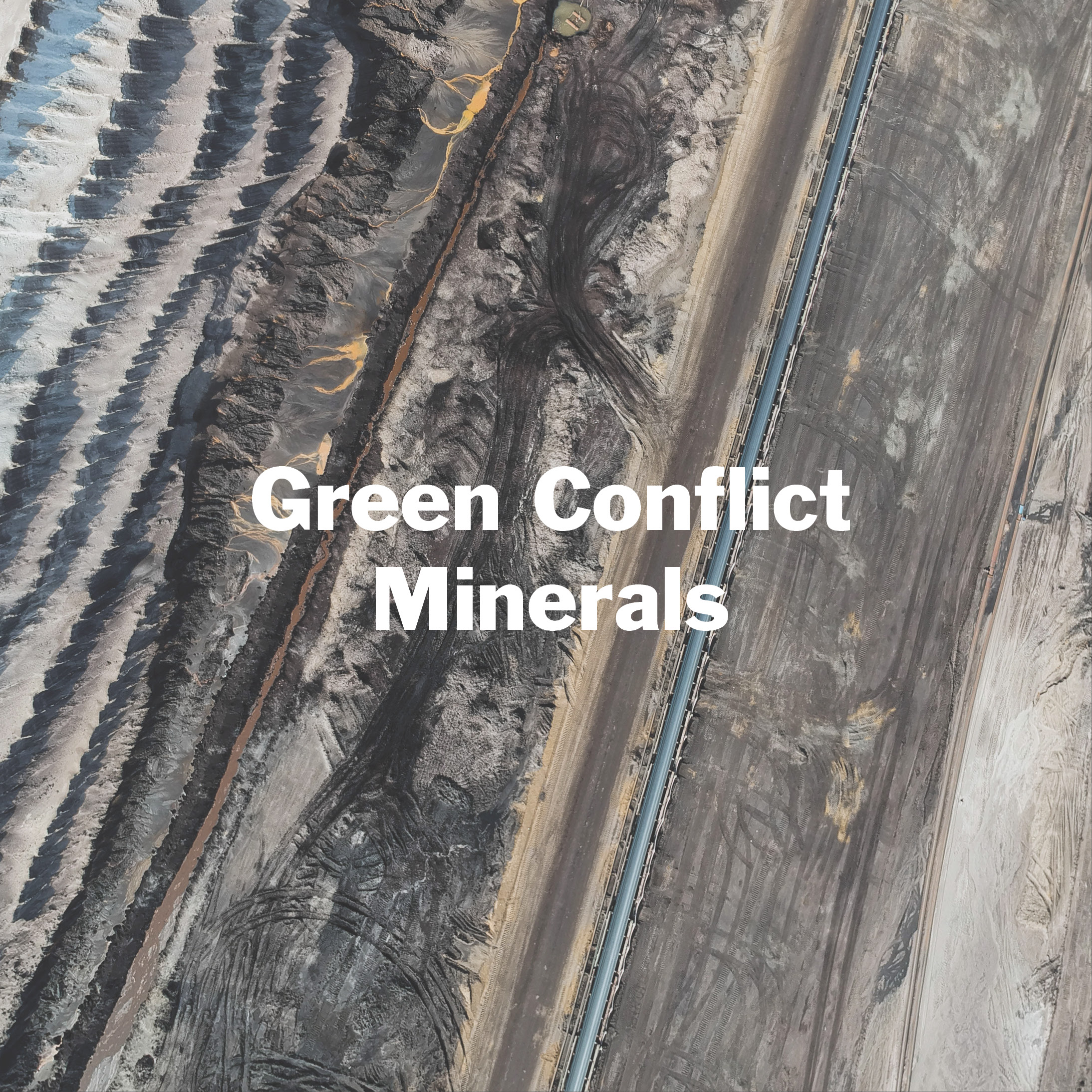
Using a 3 Horizons approach focused on possible pathways to a future where relevant mineral supply chains are conflict-free, Helen Kerr is looking at the Future of Green Minerals 2040 as part of IISD’s larger study on the implications of Conflict Minerals in the emerging low-carbon economy. New “green” technologies such as solar panels, wind turbines, electric vehicles and energy storage demand new materials, which in turn require the extraction of different minerals. Global mining projects of these minerals are growing at a phenomenal rate, while regulation and international best practices are not being universally applied.
“Conflict Minerals” are so named because of the corruption, violence and environmental and social damage their extraction causes in local communities. The need to monitor and establish standards for such resources as cobalt, lithium and rare earths, among others, is an urgent global challenge. It is essential, if the world is to move towards a new age of true sustainability, that steps be taken to establish safe and fair extractive practices. As a world leader in mining, Canada has the potential to leverage our influence to create protocols, laws and policies to broadly improve standards, especially in mineral-rich fragile states. “Civil society groups, the private sector and governments must work together to ensure that the future is one in which the green technologies designed to improve the planet also improve life at the local level.” It is a significant undertaking.
About the International Institute for Sustainable Development
The International Institute for Sustainable Development (IISD) is an independent think tank championing sustainable solutions to 21st century problems. Their mission is to promote human development and environmental sustainability.
The IISD addresses the root causes of some of the greatest challenges facing our planet today – ecological destruction, social exclusion, unfair laws and economic rules, and a changing climate. Through research, analysis and knowledge sharing, they identify and champion sustainable solutions that make a difference. They report on international negotiations, conduct rigorous research, and engage citizens, businesses and policy-makers on the shared goal of developing sustainably.
Established in 1990, IISD has offices in Canada, Switzerland and the United States, and their work impacts economies, communities, ecosystems and lives in nearly 100 countries.
Link to final report:
https://www.iisd.org/sites/default/files/publications/green-conflict-minerals.pdf
[/one_half_last]
June 22, 2018 — Comments are off for this post.
Canadian Stage
[one_half]
2D DESIGN: PROMOTION
Canadian Stage
![]()
[supsystic-social-sharing id='1']
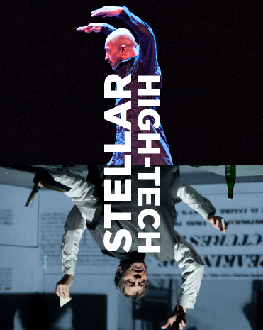
Photo Credits: David Hou, Nichola Frank Vachon
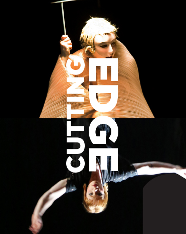
Photo Credits: Sylvie Ann Paré , Justin Nicholas
[/one_half]
[one_half_last]
Canadian Stage was created from the 1987 merger of Toronto Free Theatre and Centre Stage Company. In July of 2009, Matthew Jocelyn joined the company as Artistic and General Director. He unveiled his first programmed season in 2010-2011, along with a new company mission and brand, Canadian Stage. Over the past six years, Canadian Stage has focused on contemporary aesthetics, technologies and themes, the multidisciplinary, and the international.
In its 30-year history, Canadian Stage has produced groundbreaking works by new and established playwrights. It has employed thousands of artists and developed and produced hundreds of new productions. Many of the plays developed by Canadian Stage have been awarded and nominated for Canada's most prestigious literary and performing arts honours, including Governor General's, Chalmers and Dora Mavor Moore Awards.
Throughout the theatre season, nearly 100,000 patrons attend performances and workshops in the three Toronto venues. Throughout its history, Canadian Stage has provided outstanding education and outreach programs cultivating a diverse audience demographic.
Productions have travelled across Canada and internationally to Great Britain, Australia, New Zealand, Norway, the United States, Belgium, Germany and Austria.
Canadian Stage presents an extremely wide variety of avant-garde theatre, performance, music and dance. Working with the company we wanted to create a bold graphic language that would set the tone for this confident and provocative theatre group and link the many types of performance in a consistent promotional style.
We worked closely with the Artistic Director Matthew Jocelyn and Managing Director Su Hutchinson to develop the new look. The company wanted a graphic identity that would help it raise its institutional profile and stand out in the city’s crowded arts landscape, with the goal of attracting new audiences, sponsors and partnerships.
Matthew Jocelyn briefed us to create a visual identity that was different, honest and aligned to the theatre’s ambitious vision. We took inspiration from his own words, and even the words of detractors. We turned criticism into an attribute.
At the centre of the work for Canadian Stage were two common challenges of many performing arts and cultural institutions. The first issue is that any arts organization faces the pull of either promoting its individual productions or the entire institution. Both need to be successful, but budgets are limited and the institution must find a balance. Often in the tradition of theatrical promotion, theatres want to create an individual “iconic” image for every production. However, when each show is promoted individually it does not build continuity or acknowledge the parent institution. When the production becomes noted it establishes a name for the show, not the organization that developed the work.
The second issue is that institutions often don’t have budgets for unique and elaborate images to use in their campaigns for programming. So it can be challenging to find something suitably powerful and memorable that will carry the spirit of the show. Canadian Stage needed a methodology to overcome this deficit as part of their promotion and branding initiatives. They commissioned or acquired good photography of performances, but the result is that there was an unintended sameness to all production promotion. It needed a flexible system that would support all of their plans while promoting an aligned institutional image.
The Solution
We developed a system that can accommodate a wide range of uses but still be unmistakably read as Canadian Stage. Canadian Stage really is different and they wanted to express this edgy stance. We designed a new style that reflects this bold, original voice. The graphics program combines a simple layout device and strong typography to create an iconic visual personality for the company.
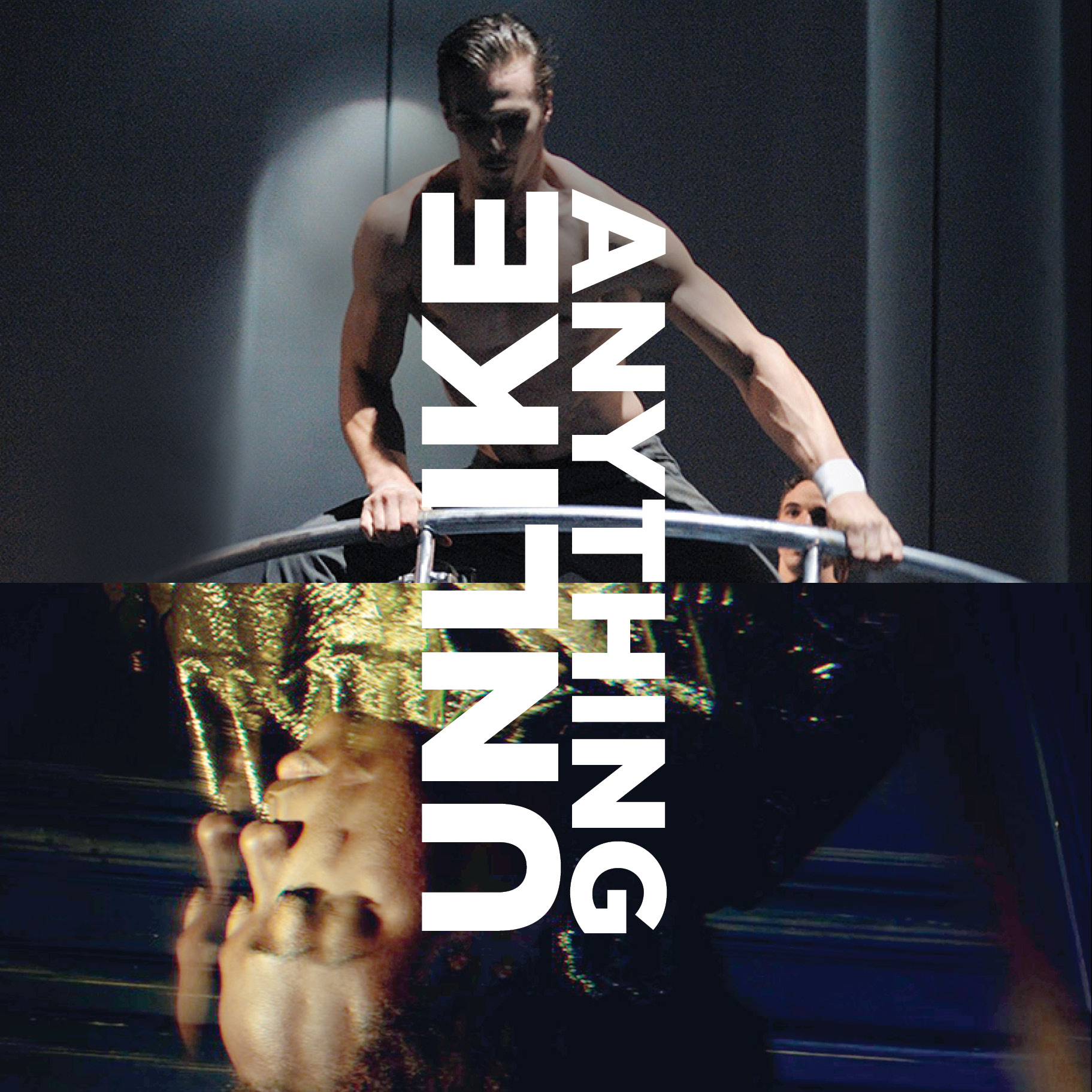
The new framework takes the form of a horizontal image abutment and perpendicular up and down titles in bold typography. The format can be used as a device to present imagery related to a featured play or program, or to represent the larger vision of Canadian Stage.
The written phrases or titles of the posters and brochure covers came directly from the staff, leadership, promotional materials, and media reviews. The joy was to embrace complexity and contradiction in the word choice to reflect the peculiarities of avant-garde contemporary performance.
The identity’s colours are yellow black and white. The concept can also be reduced to typography only. We wanted to create something so distinct that the 2 – dimensional form alone would communicate before the words were even read. The semi-symmetrical pairings with the bold yellow up and down typography are graphic and provocative. They demand pause and a quick deciphering.
The system has a built-in flexibility that will allow it to evolve and adapt with the institution over time. Images of objects, portraits or illustration fragments can be used in the format.
This structure is applied to posters, brochures, reports and the website through a prescribed grid and typographic system that accommodates an ever-changing range of title and image combinations.
[/one_half_last]
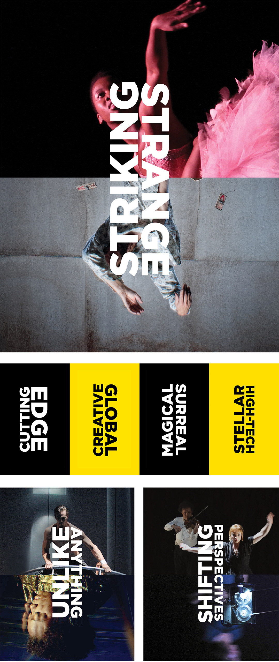
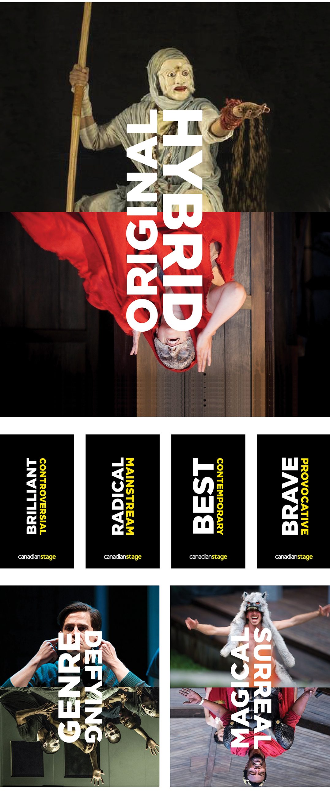
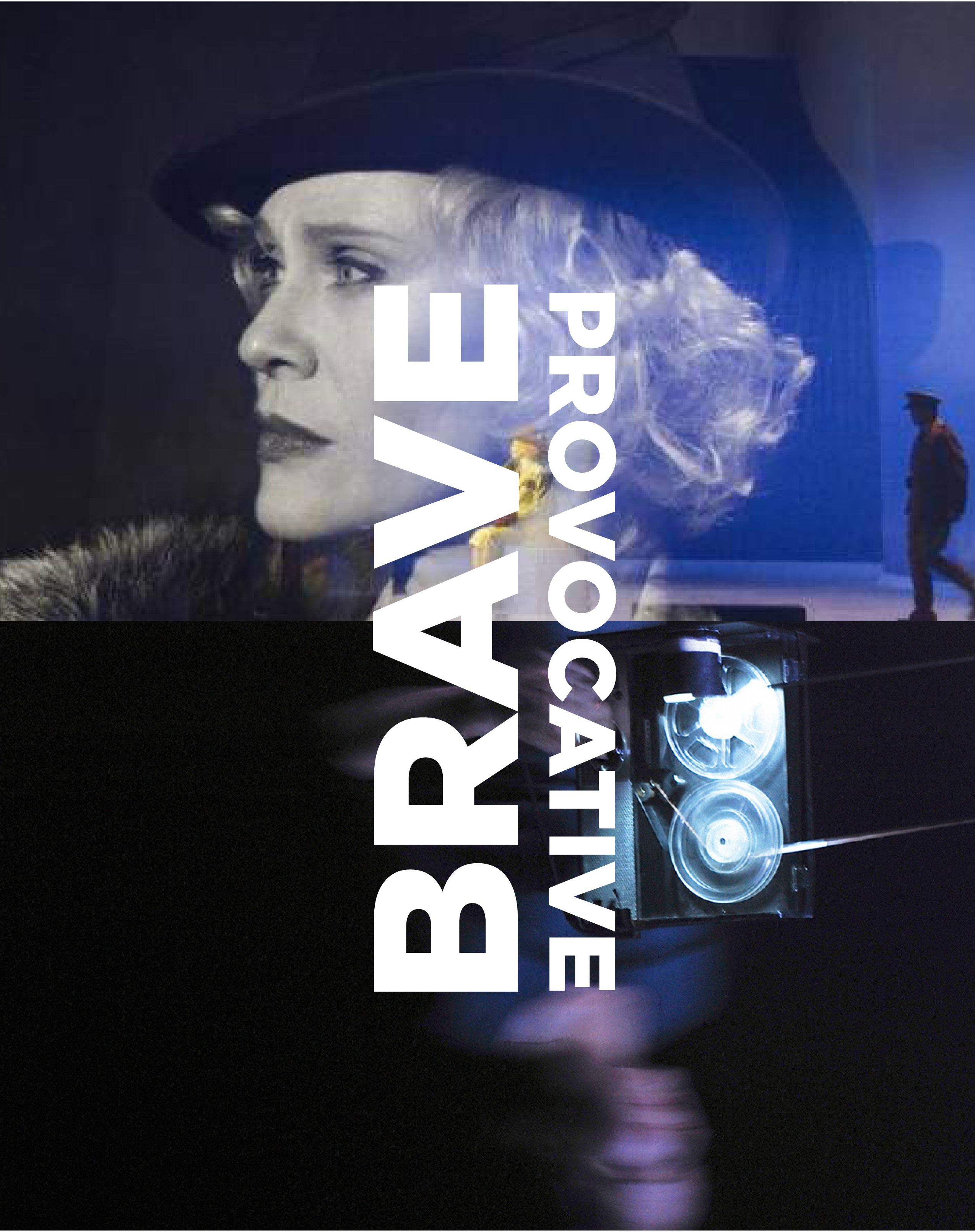
Photo Credits (top to bottom, left to right): John Hogg, Paul Antoine Taillefer, Cirque Éloize, N/A, Justin Nicholas, Prudence Upton, N/A, Jean Louis Fernandez, David Hou, Wendy D Photography, David Hou, David Hou, David Cooper, Prudence Upton.
June 21, 2018 — Comments are off for this post.
Winners
[one_half]
2D & 3D DESIGN: BRANDING
Winners
Winners is Canada’s leading off-price retailer with over 300 stores across the country. It offers brand name clothing, footwear, bedding and housewares. HomeSense, a sister store, is a home accessory retailer.
Scope of work
- Research and engagement
- Wordmarks
- Signage and specifications
- In-store signage and display schema
- Schematics for display design, aprons,
bags, gift cards, vehicles etc. - Marketing concepts
- Extensive style guides
[supsystic-social-sharing id='1']
[/one_half]
[one_half_last]
The Design Challenge
Outdated and disparate graphic design programs were badly in need of strategy, insights, consolidation and streamlining. The brief asked us to speak to the duality of off-price but prestigious brand offerings. The previous identity had evolved casually without a proper research and engagement methodology.
Engagement and Research
We worked very closely with Senior Management and Executive Leadership in Canada and the United States to understand goals and objectives. Our insight that the target market was looking for a more aspirational “up market” look and feel for the two brands, contradicted the initial marketing brief to emphasize the “bargain hunting” sense of excitement that the shoppers loved. We developed a visual survey and questionnaire for leadership that prompted much discussion and debate and allowed us to co-plan and co-create new identities for Winners and HomeSense. Further research, and interviews with other stakeholders pointed out that the previously pre-determined insight, did not ring true. That in fact the attraction of Winners lies strongly in the offering of branded products and merchandize.
We also found that the siloed internal departments did not have a cohesive or aligned vision, strategy or guidelines for consistent application of the brand. Our brand style guide became an essential management tool to communicate common understandings and an articulation of the vision for the stores.
Our Design Solution
In the case of Winners we were inspired by the graphic language of Chanel, DKNY, Calvin Klein, and Marc Jacob. We used a clean elegant extended slightly modified sans-serif type face on a field of black to speak the language of high fashion – while the name of the store communicates the off-price nature of the offering. For HomeSense we eliminated the cliché peaked roof of the old logo which reminded many of hardware rather than housewares and home goods. The new classical serif typography and underline we designed are reminiscent of the labels from high quality linens, gifts and décor shops.
Winners and HomeSense have never looked back. Business growth, brand recognition and marketing recall are extremely high. Our guidelines have been adapted and continue to roll through expansion.
[/one_half_last]


May 9, 2018 — Comments are off for this post.
Toronto Wholesale Food Association
[one_half]
2D DESIGN: PUBLICATION AND ART DIRECTION
Sam Magazine

[supsystic-social-sharing id='1']
[/one_half]
[one_half_last]
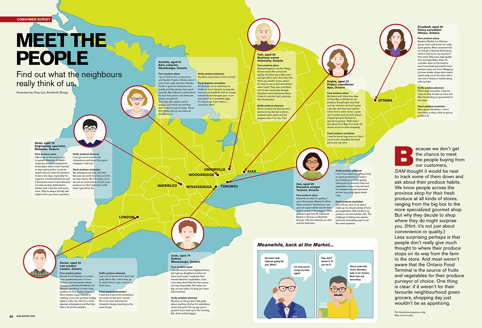
The Toronto Wholesale Produce Association (TWPA) was established in 1933 to represent the wholesaler tenants at the Ontario Food Terminal. Starting out as a small group of wholesalers that supplied retailers in Toronto, it has grown to supply fresh produce across Ontario, Quebec and Eastern Canada. The TWPA makes it possible for independent grocers and restaurants to be in business and is the source of “small, special and local” offerings. Without the competitive wholesale market, the vibrant food scene in the region would not have the international reputation it does. The diversity of the city demands innovative solutions in products and services and the TWPA delivers with high quality, organic, local and exotic fresh produce. The TWPA is the link between farmers near and far and independent green-grocers and restaurants.
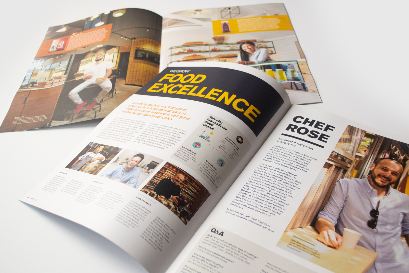
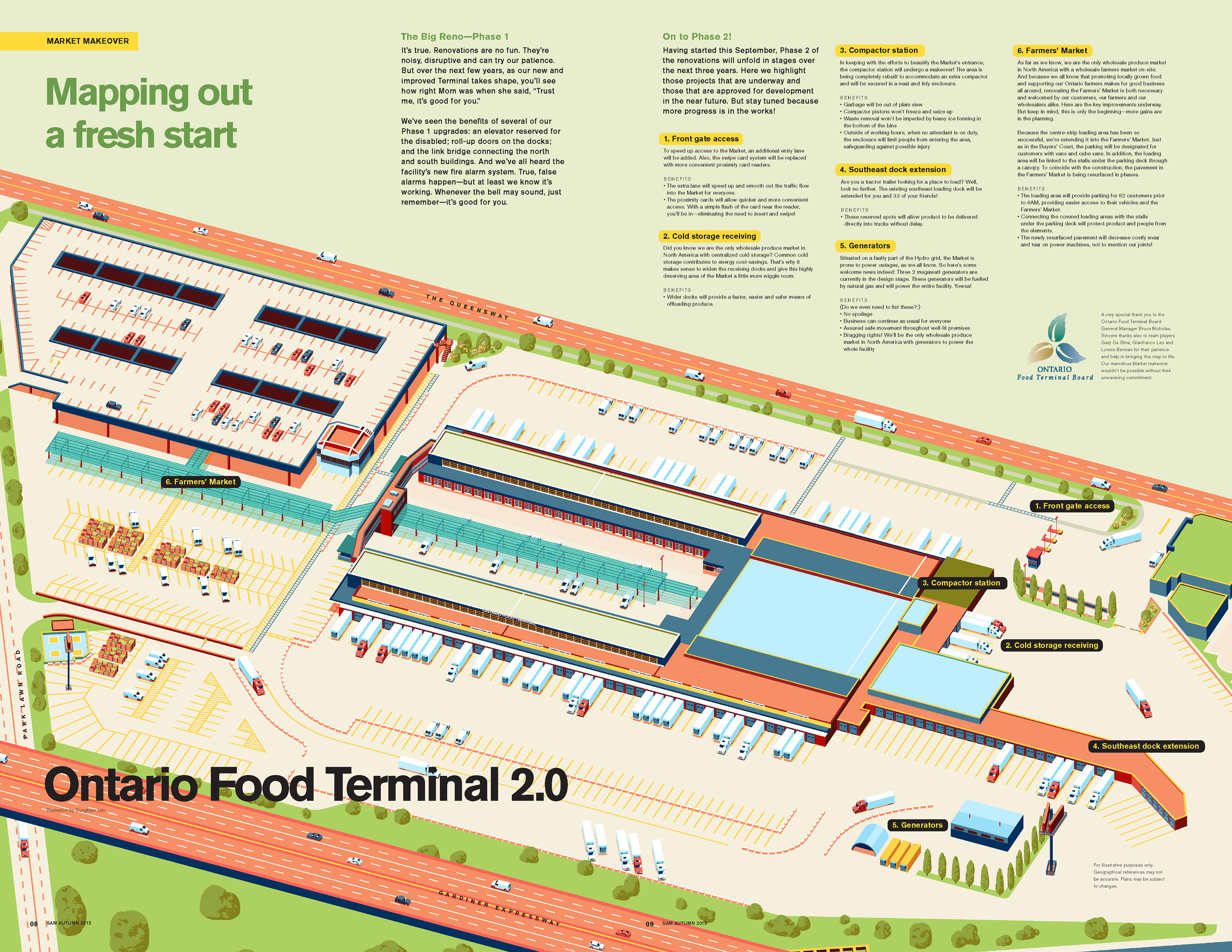
To build community and celebrate the wholesaler tenants, local retailers, and small businesses, SAM magazine was created and distributed quarterly within the TWPA network.
KerrSmith was tasked to design the Fall 2015, Fall 2016, and Winter 2016 issues. We worked closely with the TWPA to art direct the magazine in a way that emphasized the small, unique, and regional characteristics of the many farmers, wholesalers and retailers in Ontario. We designed the magazine to emphasize that food is not just a commodity in our city, but rather, it is a core contributor to the social, cultural, economic and environmental fabric of Toronto. The TWPA quietly has a huge impact on our lives and neighbourhoods.
Through this project we were able to tell the stories of the people behind the faces of these businesses and show how their passion for food is impacting the growth and enormous changes in the city.
[/one_half_last]
[masterslider alias="ms-2-1"]
![]()
[masterslider alias="ms-5"]
![]()
May 8, 2018 — Comments are off for this post.
World Intellectual Property Day
[one_half]
News
World Intellectual
Property Day
Powering Change: Women
in Innovation & Creativity
Ottawa, April 26, 2018
![]()

[supsystic-social-sharing id='1']
[/one_half]
[one_half_last]
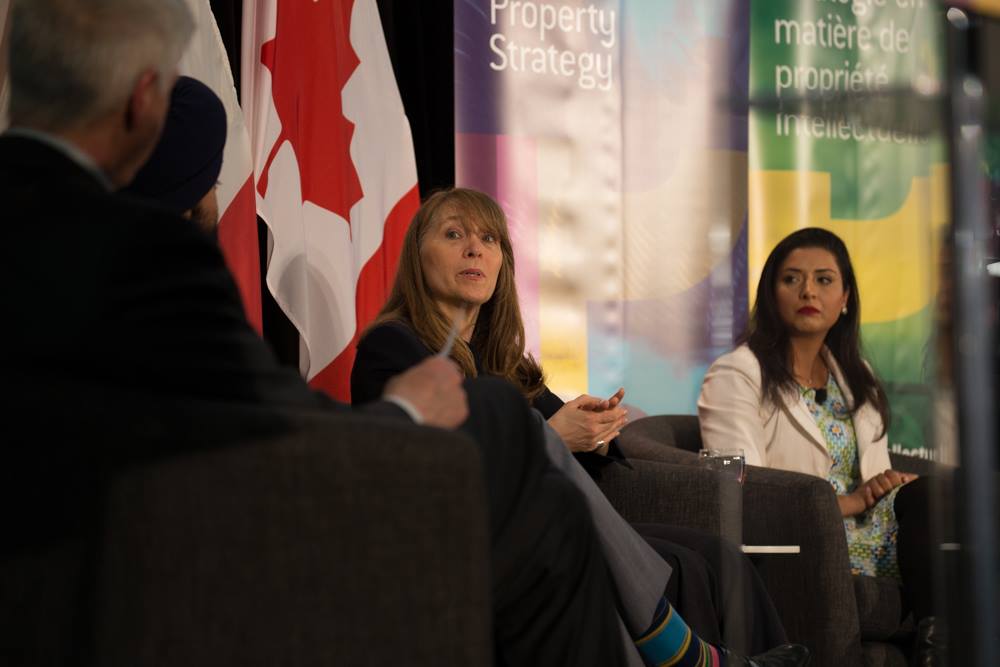
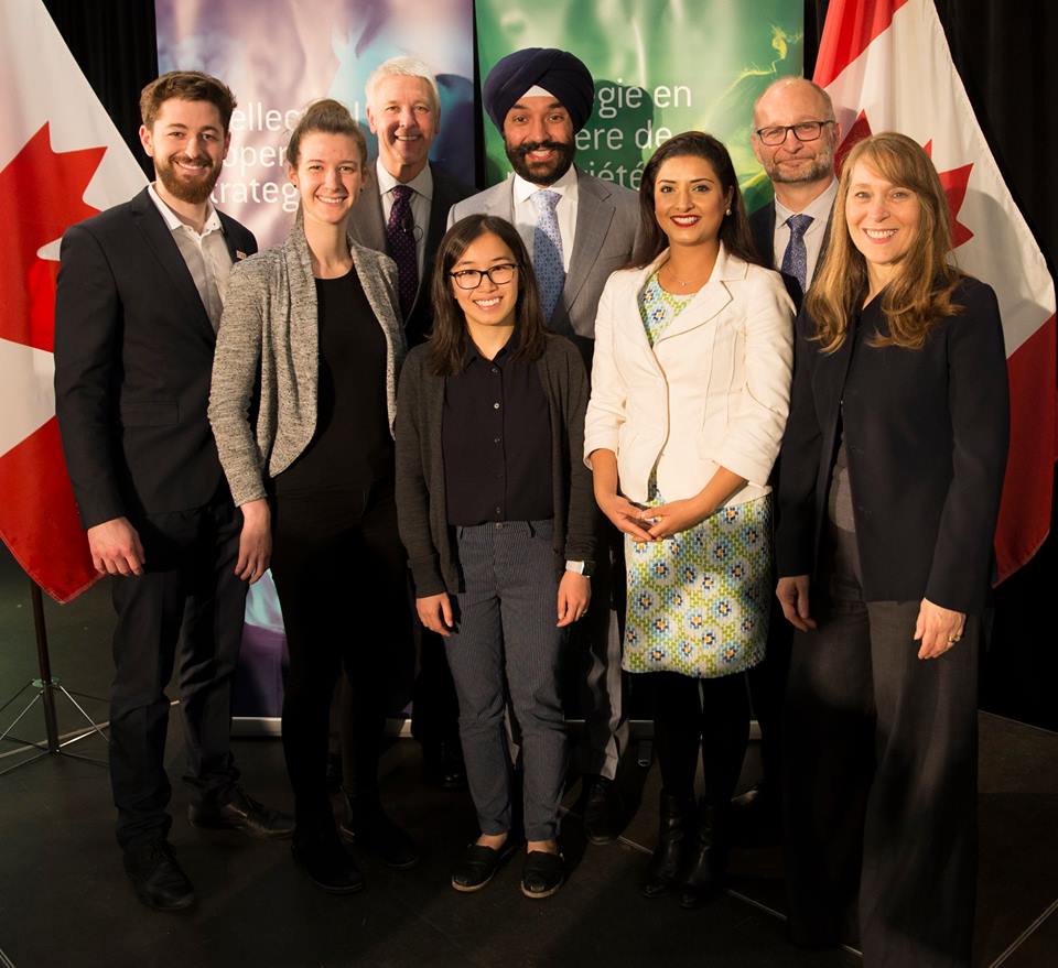
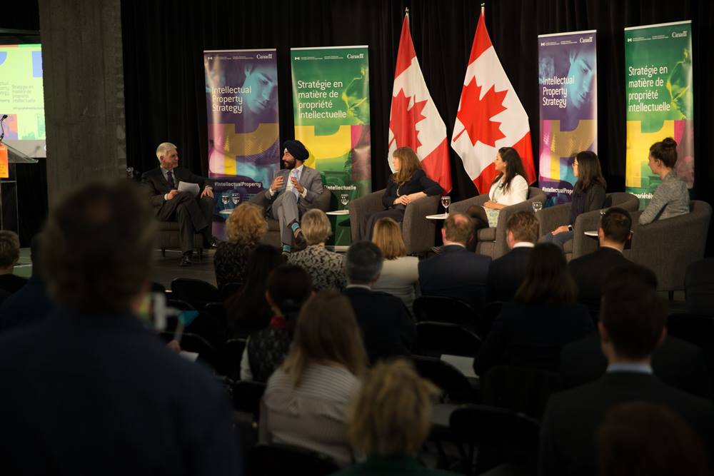
The Federal Government held an event in Ottawa to mark World Intellectual Property Day and to officially announce a National Intellectual Property (IP) Strategy, including the creation of legislation for a governance framework for patent and trademark agents.
As part of this announcement at Bayview Yards, the Federal Minister of Innovation, Science, and Economic Development Navdeep Bains asked Helen Kerr to be part of a roundtable discussion with 3 leading Canadian women innovators. Helen was on stage with with Marie-Pier Corbeil, Eden Full Goh and Surbhi Guleria-Joshi.
As an entrepreneur and holder of over 40 patents in materials, products and systems, Helen has worked with Canadian businesses, universities and other institutions that all have an interest in Intellectual Property in Canada or elsewhere. Her unique experience in the world of business and academia gives Helen an unusual perspective and insight into the worlds of theory and practice. Helen spoke of the need not only to innovate, but also to master the full set of research and business skills in order to be a success.
In the 2018 Budget, the Federal Government announced the first details included in their National IP Strategy, one of which was raising IP awareness and literacy levels of Canadian entrepreneurs. An important prerequisite in attempts to promote development, registration, and use of IP is to ensure that the public has confidence in the overall IP system and the professions that work within it. The announcement ensures that the patent and trademark agents that entrepreneurs and businesses call upon to help them realize their ambitions, are regulated like the other professionals they hire.
Intellectual Property is key to the growth and success of innovative companies. Because innovation and Intellectual Property are so closely linked, countries that are global innovation leaders need to have robust IP systems.
The Ministry of Innovation, Science and Economic Development Canada (ISED) works with Canadians in all areas of the economy and in all parts of the country to improve conditions for investment, enhance Canada's innovation performance, increase Canada's share of global trade and build a fair, efficient and competitive marketplace.
KerrSmith would like to thank the Government of Canada and the many public officials, particularly the Hon. Navdeep Bains, Minister of Innovation, Science, and Economic Development, for their interest and their support.
To watch the livestream, please visit:
https://www.facebook.com/CanadianInnovation/videos/345973002475660/
[/one_half_last]
February 21, 2018 — Comments are off for this post.
City of Toronto: 100 Resilient Cities
[one_half]
Foresight & Insight
City of Toronto:
100 Resilient Cities
Scope of work
- Engagement
- Research
- Horizon Scanning
- 3 Horizons Workshop
- Report
[supsystic-social-sharing id='1']
[/one_half]
[one_half_last]
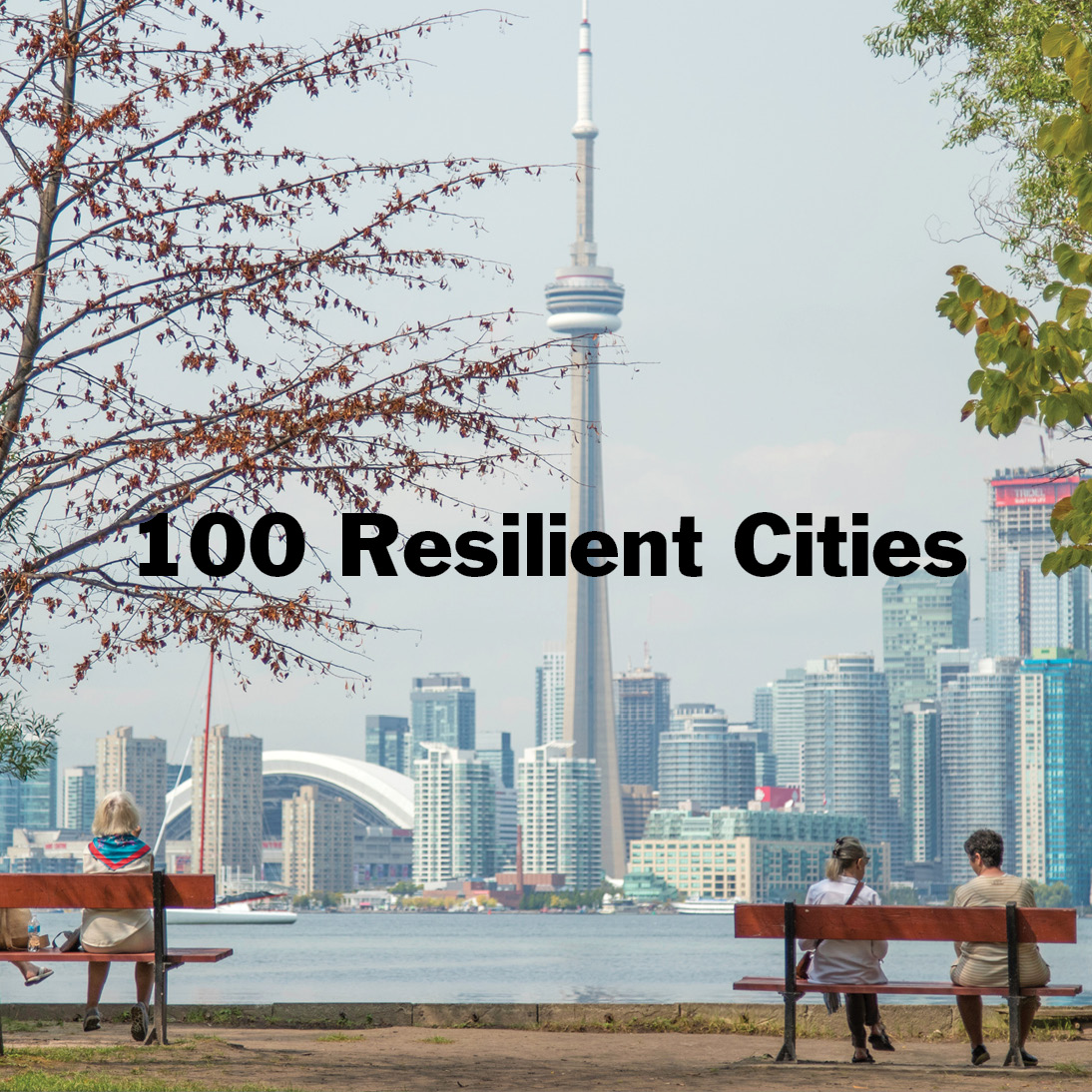
100 Resilient Cities—Pioneered by The Rockefeller Foundation, 100RC has been dedicated to helping cities around the world become more resilient to the physical, social and economic challenges that are a growing part of the 21st century. 100RC supports the adoption and incorporation of a view of resilience that includes not just the shocks—earthquakes, fires, floods, etc.—but also the social stresses that weaken the fabric of a city on a day to day or cyclical basis, such as unemployment, endemic violence, inequity and lack of access to necessary services and infrastructure.
Toronto is striving to build an inclusive, livable and prosperous city, and to develop strategies to bring that vision to reality in the face of growing environmental challenges with enormous impact on the most vulnerable. Helen Kerr designed and facilitated a two-part engagement process to determine a representative set of Vision and Principles to be adopted as part of Toronto’s Resilience Strategy.
The Three Horizons Workshop
Using the Three Horizons Foresight method, 80 representative community leaders in Toronto were invited to generate a set of principles to guide the city through the development of a strategy. Members of non-dominant and marginalized communities worked alongside representatives of social sectors and industry to ensure multiple voices were heard and for unique viewpoints to be included.
Participants were asked to diagnose the current state of resilience in the City of Toronto, to imagine an aspirational “hoped for” state ten years into the future, and to consider, pragmatically, how to bridge the two. Sixteen key themes were identified and ranked according to the intensity of concern and importance for the community, with equity, inclusive governance and actionable sustainability rising to the top. Affordable and available housing and transit were also identified as requiring significant attention.
Using this information as an input, the City of Toronto’s Joint Steering Committee was asked to consider “What would need to be true to make this future vision of a resilient Toronto possible?” Attendees of this meeting brought their rich experience to help advance the strategy development process. Support for resilience as a critical underpinning of all future decision-making for Toronto was established, highlighting the need for bold leadership, change-making initiatives and continuous community involvement. Implementable, resourced undertakings must leverage partnerships across sectors to advance success.
The successful outcome of this work established consensus on Resilient thinking in Toronto, and altered the perspective of 100RC towards alternative engagement approaches.
[/one_half_last]
October 21, 2017 — Comments are off for this post.
Canadian Forces College
[one_half]
Foresight & Insight
Canadian Forces College: Capacity Building Training

Scope of work
- Program development
- Delivery of content: lectures, exercises, workshop, discussion
- Program assessment
[supsystic-social-sharing id='1']
[/one_half]
[one_half_last]
Canadian Forces College is preparing officers in the Canadian Military with skills to withstand the volatile circumstances and rapidly changing roles they face both in Canada and on missions around the world. KerrSmith was brought in to introduce principles of Foresight and build capacity for Generals, Colonels and Majors who are dealing with increased uncertainly related to climate events, heightened geo-political tensions, and technological risks.
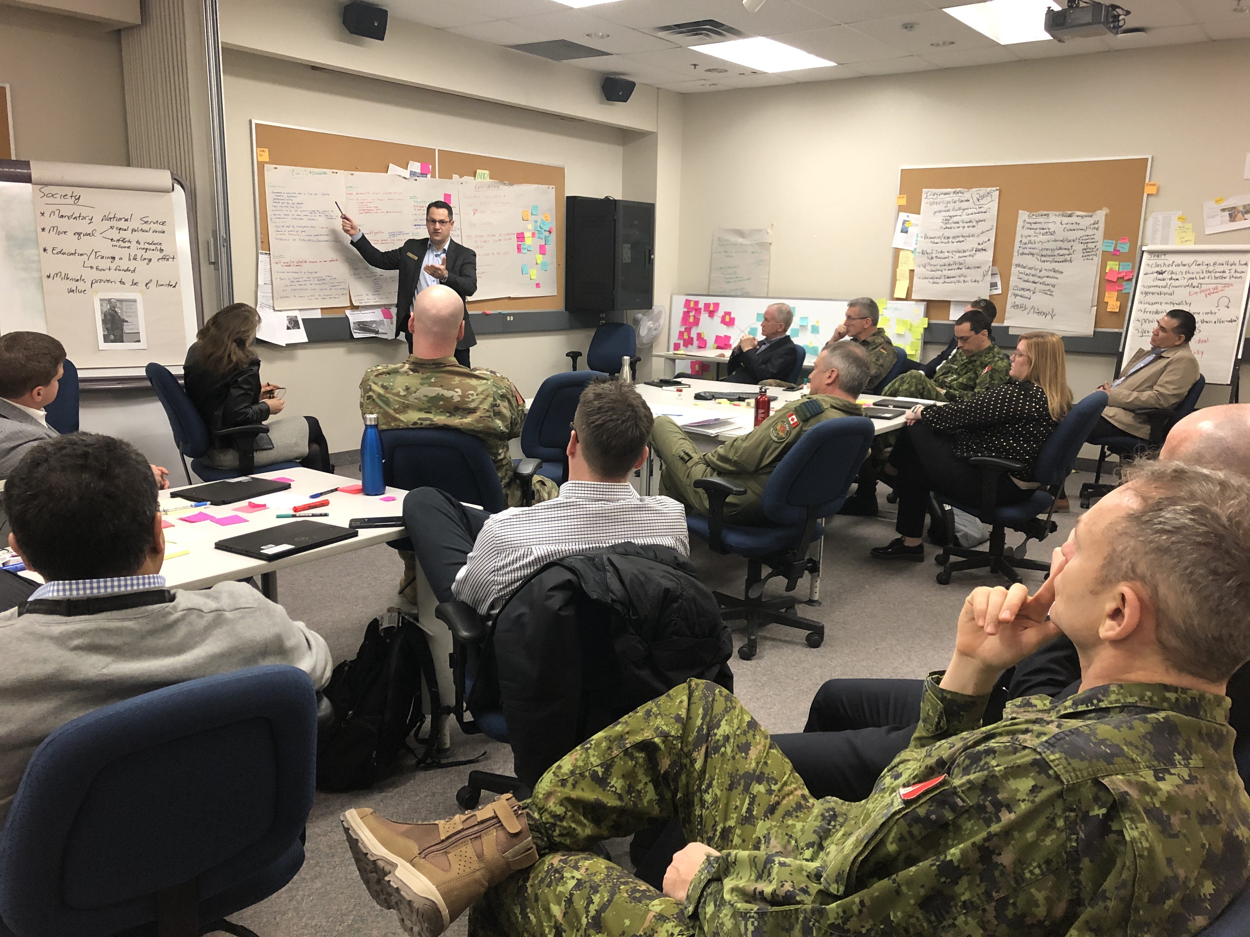
Although some level of scenario planning is currently used in military preparations, external experts typically provide foundational work with internal partners in a more reactive role, leading to a siloed approach for strategic activities. In an effort to encourage integration of futures thinking into a broader mindset throughout the forces, and to encourage collaborative integration with experts, we developed a pilot program. Using human-centered methodologies, delivered through lectures and active applied learning exercises, we developed a customized curriculum tailored to the needs of military learners. The highly successful program will be repeated in 2020.
[/one_half_last]
[one_half]
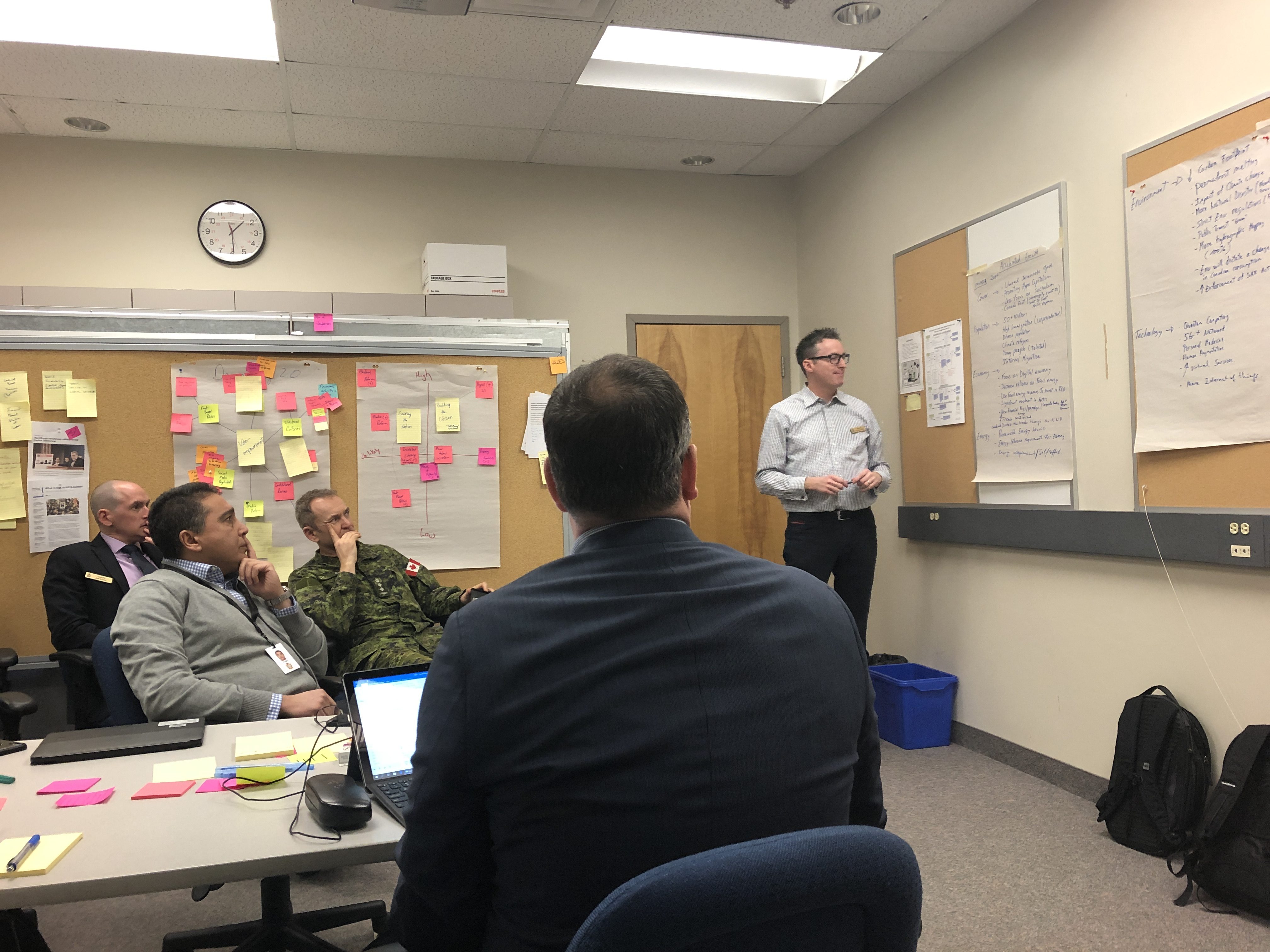
Colonels report out on their group work activities.
[/one_half]
[one_half_last]
[/one_half_last]
[one_half]
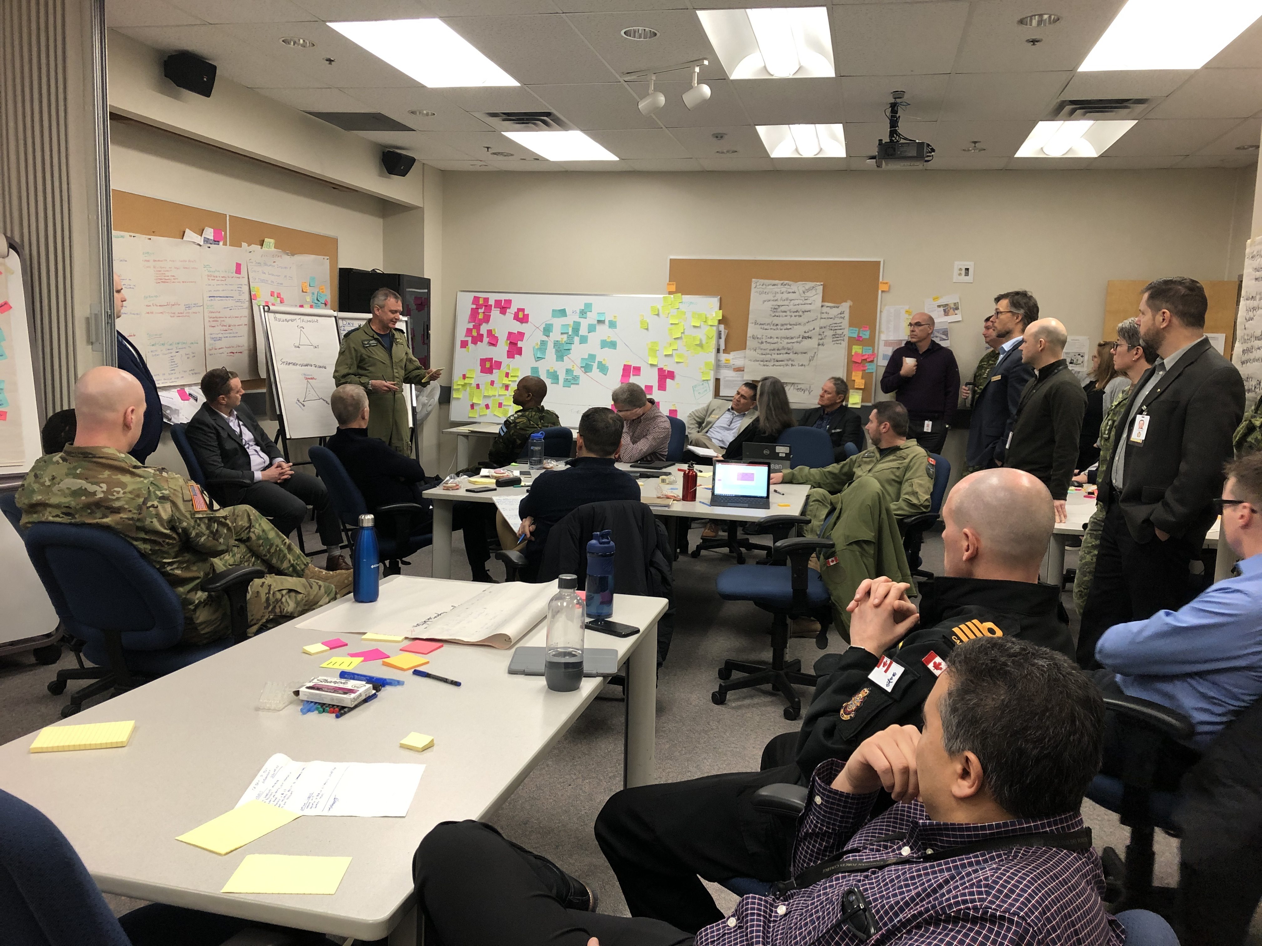
Workshop groups come together to share what they’ve learned.
[/one_half]
[one_half_last]
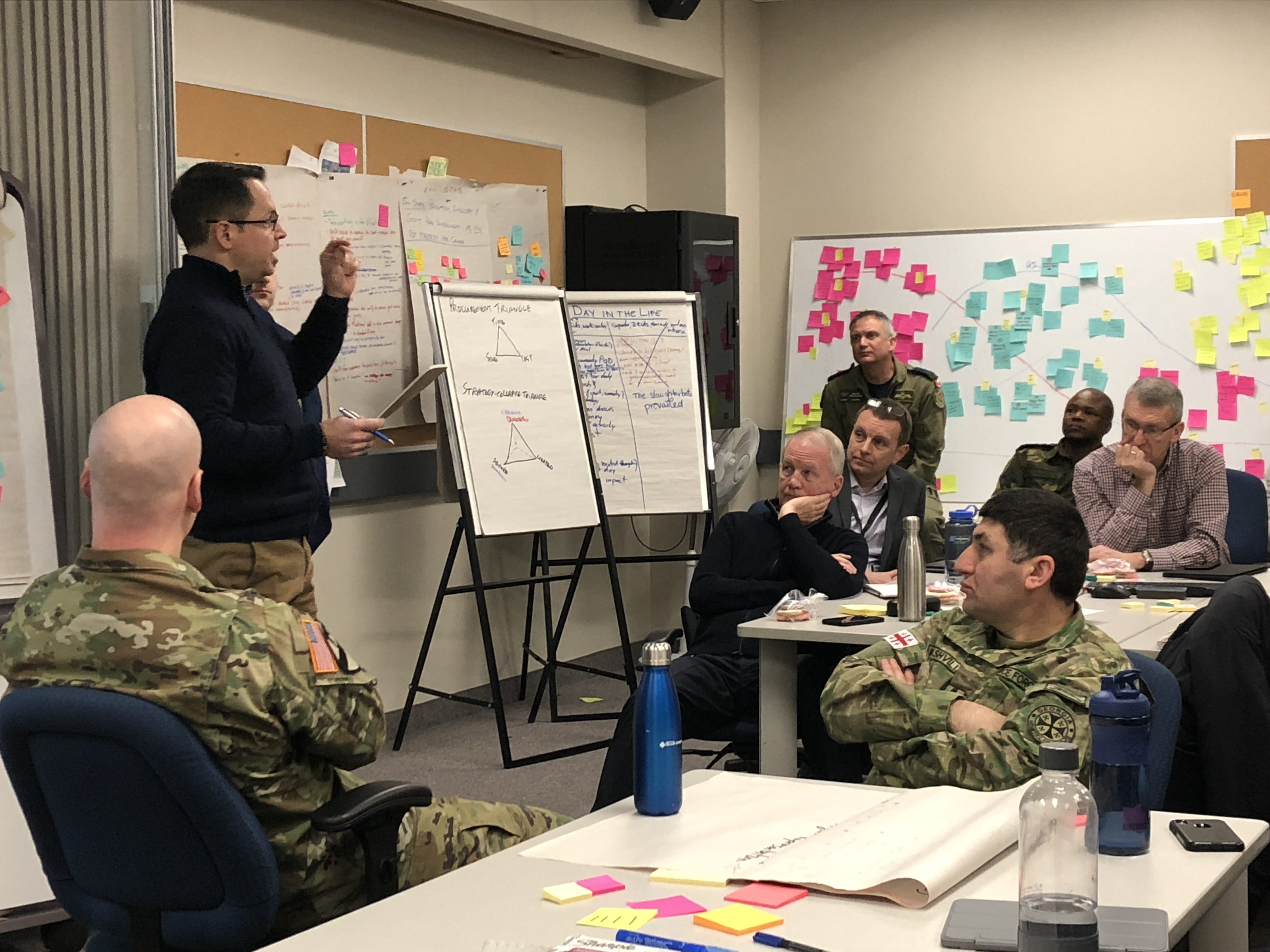
Workshop groups shares the results of their scenarios work.
[/one_half_last]
March 20, 2017 — Comments are off for this post.
Gluskin Sheff: Art Collection
[one_half]
2D Design: Publications
Gluskin Sheff: Art Collection
The Gluskin Sheff Art Collection is one of the defining attributes of the Gluskin Sheff experience.
[supsystic-social-sharing id='1']
[/one_half]
[one_half_last]
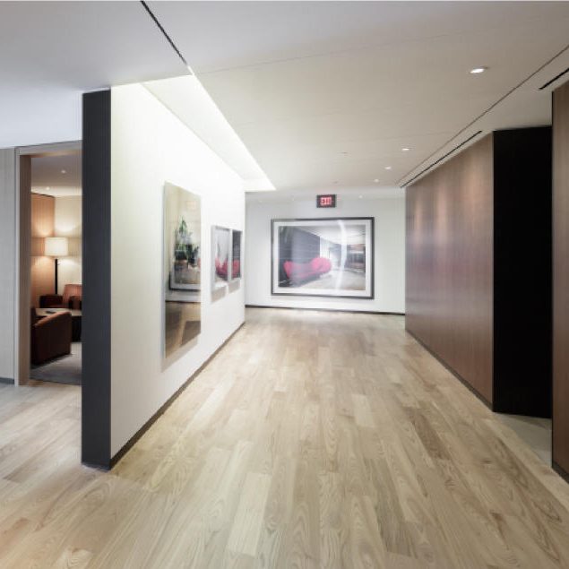
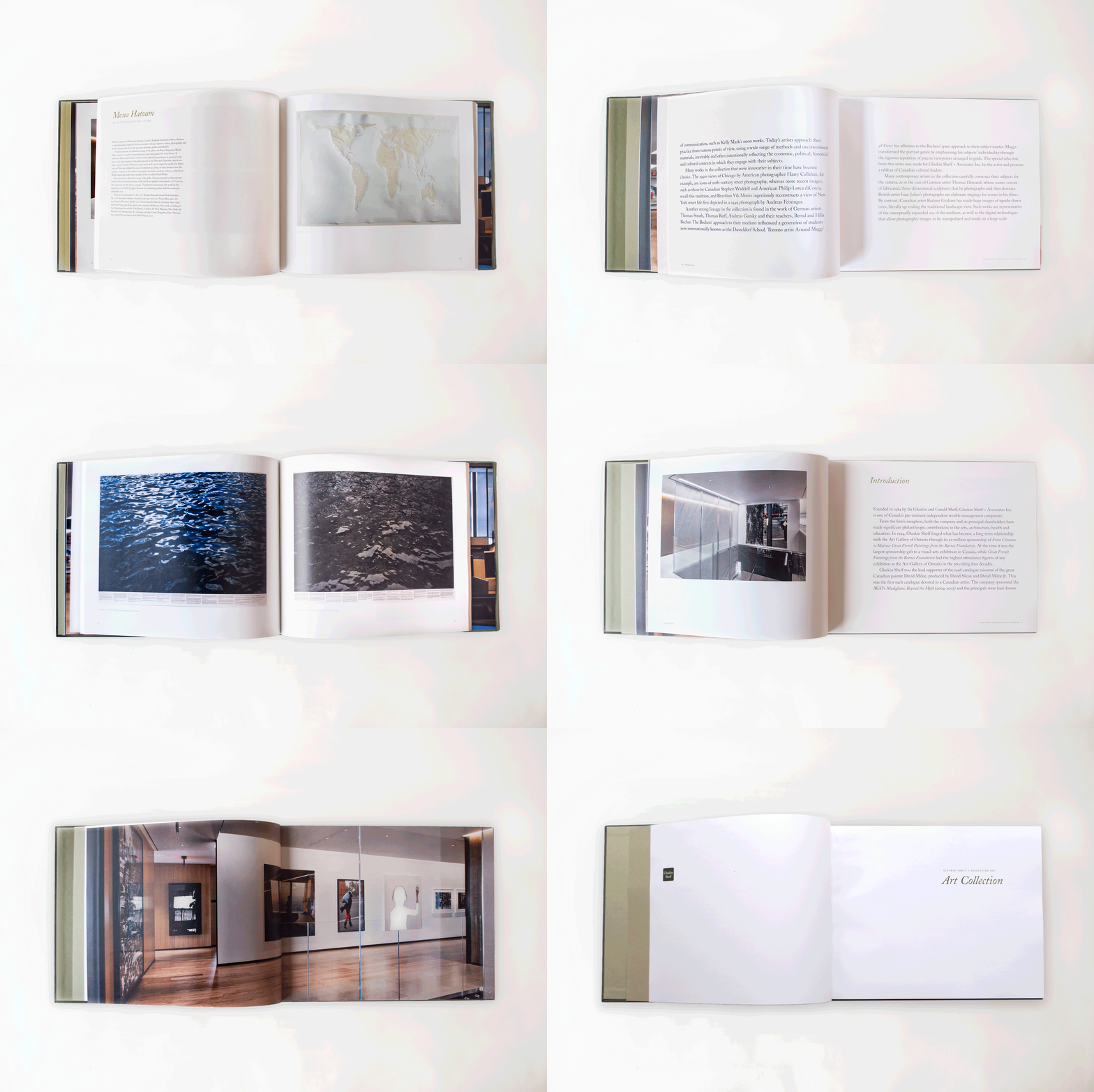
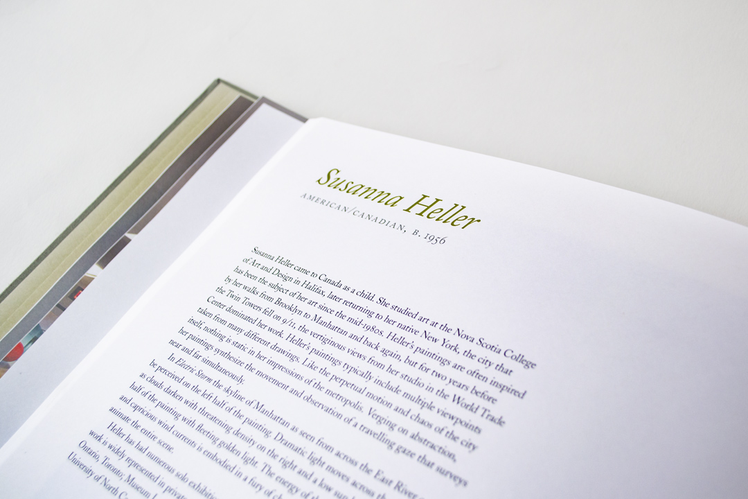
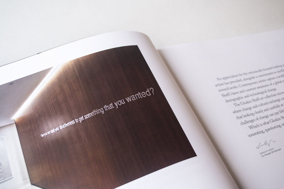
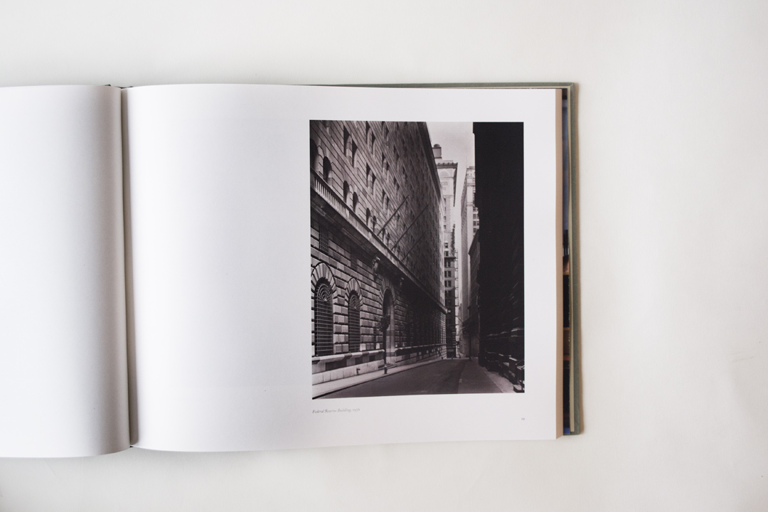
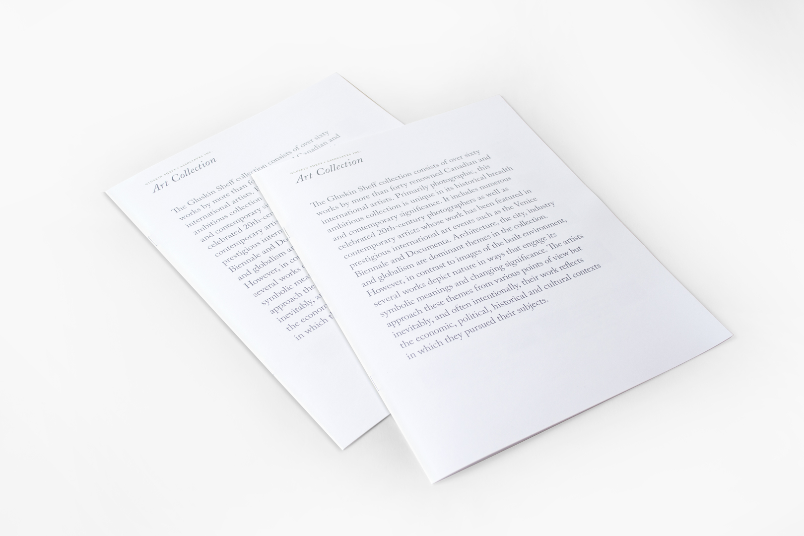
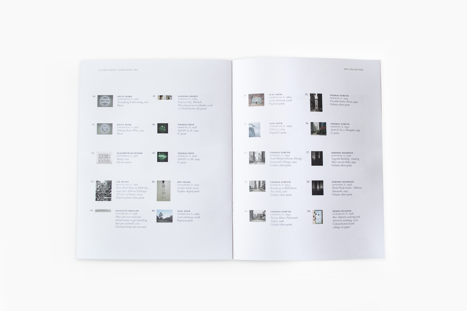
The Gluskin Sheff Art Collection is one of the defining attributes of the Gluskin Sheff experience. The quality of work is internationally notable and not at all a typical Canadian corporate collection. Assembled with unique acuity and rarefied sophistication, this level of distinction speaks to the consistent vision of the firm. The collection is displayed prominently in the office spaces that were specifically designed by KPMB architects to exhibit the works.
We designed a signage system, brochure and 136 page large format, cloth-bound catalogue for the collection. The book was written and curated by Jessica Bradley and senior leadership at Gluskin Sheff played a role in the design and layout of the book.
[/one_half_last]



March 15, 2017 — Comments are off for this post.
Ontario Ministry of Transportation
[one_half]
Foresight
Multimodal Transportation Planning for the Greater Golden Horseshoe
What will the Greater Golden Horseshoe region look like in 2071?

Scope of work
- Research
- Engagement
- Horizon Scan
- System maps
- Foresight Workshops
- Scenario Planning
[supsystic-social-sharing id='1']
[/one_half]
[one_half_last]
Project Description
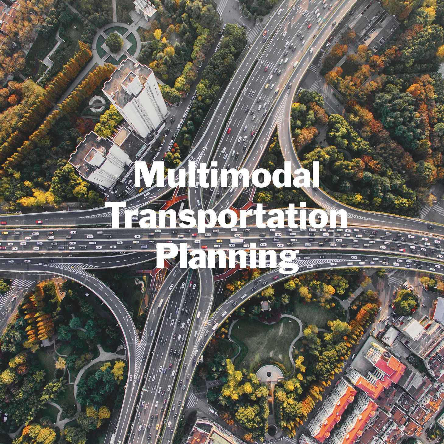
Southern Ontario with 9.5 million people is the second fastest growing region in North America and a key driver of the Canadian Economy. The provincial government had adopted an aggressive localized development intensification strategy in an effort to reduce greenhouse gas emissions and forestall climate change impacts. In light of this, the Ministry of Transportation commissioned an innovative approach to long-term transportation and land use planning: a provocative fifty-year forward Foresight exploration to guide the subsequent 25-year planning of integrated engineering and urban design. We led the move to resilient thinking through the exploration of multiple future scenarios, built on deep research of emerging change signals and broad participatory involvement of authorities, innovators and regional stakeholders from various levels of government and institutions.
We worked with a multidisciplinary team of urban planners, transportation engineers, geo-spatial modellers, government policy makers, researchers, First Nations consultants, data experts and interviewed a range of experts to supplement our desk research.
We established a wider contextual understanding of potential regional changes with the core team. Research, insights, graphics and images were used to create effective documents and presentations to bring vision and focus to the project.
Three Stages
The project unfolded in three stages:
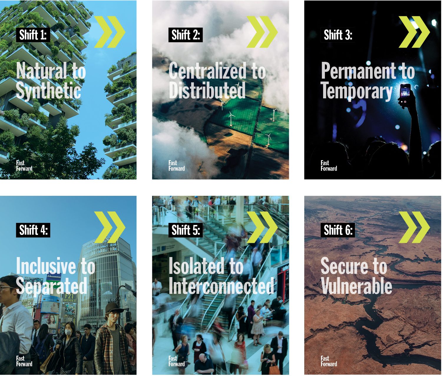
- We developed a 100-page Horizon Scan to articulate signals of change summarized into 6 key Shifts relevant to the project, and 7 significant Drivers of Change. Information we gleaned from 21 international specialist interviews was incorporated into the findings.
- We created 5 comprehensive Narratives (Scenarios) based on the scenario archetypes, (Growth, Transformation, Voluntary Discipline, Involuntary Discipline and Collapse) as seen through the experience of imagined personas. Each Future Narrative included a back-cast, contextual description and parameters of differentiation.
- We facilitated and designed co-creative Futures workshops where participants translated the research inputs into transportation and land-use representations using progressive frameworks.
Scenarios
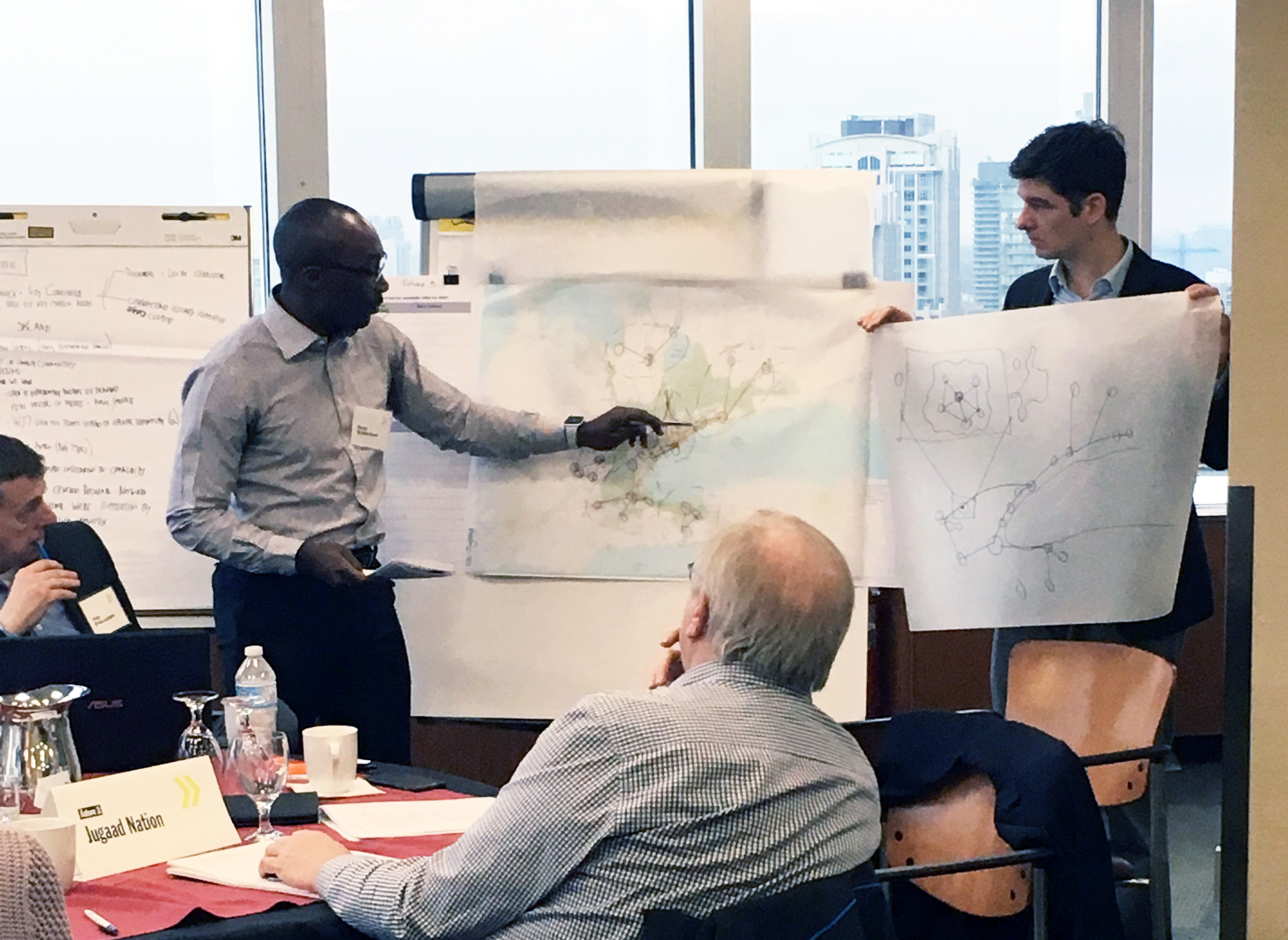
For each Narrative, we explored the complex dynamics of different interactions of economic activity (what is traded & how, who works doing what, and the trajectory of growth or decline), as well as societal characteristics (open, controlled societies, employment, philosophies of life) and environmental conditions (climate change conquered, mitigated, or environmental collapse). By tangibly expressing the futures in this way, we helped participants to geographically map how land would be used (where people lived, locations of employment, agricultural activity, etc.) and the transportation networks that would be necessary to support each imagined Future Scenario.
Using the various trajectories, this exploration enabled planners to craft a preferred and aspirational vision for sustainable transportation in the Southern Ontario region to the year 2071 that will serve for resiliency development planning to 2051.
The reports and documents from this project are confidential.
[/one_half_last]
[one_half]
[/one_half]
[one_half_last]
Tangible Futures
For each narrative, we explored the complex dynamics of different interactions of economic activity (what is traded & how, who works doing what, and the trajectory of growth or decline), as well as societal characteristics (open, controlled societies, employment, philosophies of life) and environmental conditions (climate change conquered, mitigated, or environmental collapse). By tangibly expressing the futures in this way, we helped participants to geographically map how land would be used (where people lived, locations of employment, agricultural activity, etc.) and the transportation networks that would be necessary to support each imagined world.
Using the various trajectories, this exploration enabled planners to craft a preferred and aspirational vision for sustainable transportation in the region to the year 2071.
[/one_half_last]
March 14, 2017 — Comments are off for this post.
Metrolinx
[one_half]
2D & 3D DESIGN: WAYFINDING
Wayfinding Harmonization
The Greater Toronto and Hamilton Area is in the process of a major transformation in public transit infrastructure.
![]()
Scope of work
- Research
- Engagement
- Strategy
- Design principles
- System Identifier
- Wayfinding and signage harmonization
- Graphic design
- Industrial design
- Pilot Evaluation
[supsystic-social-sharing id='1']
[/one_half]
[one_half_last]
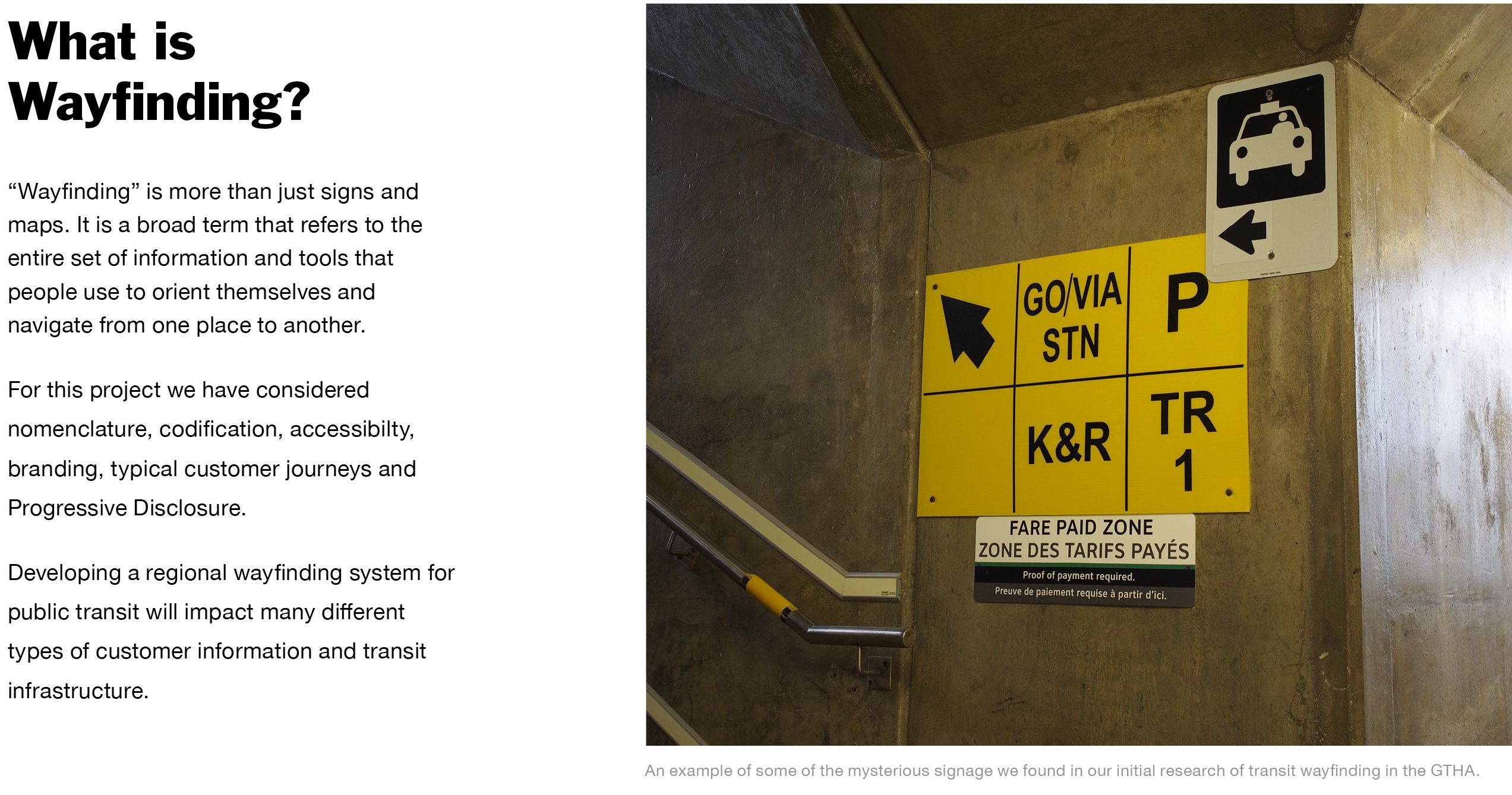
Metrolinx, an agency of the Government of Ontario, was created to improve the coordination and integration of all modes of transportation in the Greater Toronto and Hamilton Area. This area is now in the process of a major transformation in public transit infrastructure. Historically, the region’s ten transit operators have worked independently within their municipal boundaries, employing contrasting wayfinding information, planning and design standards. This siloed approach has resulted in significant inconsistencies in nomenclature, coding and transit information display, making it difficult to plan and make cross-municipal journeys in the region, particularly at interchange hubs.
Regional transit integration requires consideration of fare structure, zone boundaries and mode transfer. These issues underlie significant policy and governance challenges. The communication and signage of this information in a clear consistent manner is essential for a customer-first solution.
This highly complex, multi-year project involved the writing of white papers, public and expert consultation and the development of region-wide wayfinding, planning and design standards, harmonizing information display across the full range of complex architectural platforms as well as the development of sophisticated digital wayfinding and signage products.
KerrSmith worked with Applied Wayfinding of London across all levels of the “Seamless Network” project from planning, liaison, research, design, prototyping and testing.
Seamless integration of transit communications required the establishment of foundational Design Principles to share understandings, to build common purpose and to develop design solutions. Shared vision and goals were established to move the project forward. This work included a wide range of collaborative research methods including customer journey mapping, literature review, expert interviews, ethnography, and stakeholder engagement, and was subject to intense public and broad-based governmental scrutiny. “Seamless Network” required convening different groups of public stakeholders (passengers, workers and neighbors) and regional transit representatives and experts.
The end of the first phase of the project resulted in the delivery of full regional design standards including summative reporting on methodology, discussion of target audiences, recommendations, guidelines for Universal Design solutions, graphic and industrial design guidelines and approaches to sign planning, installation, messaging and lighting.
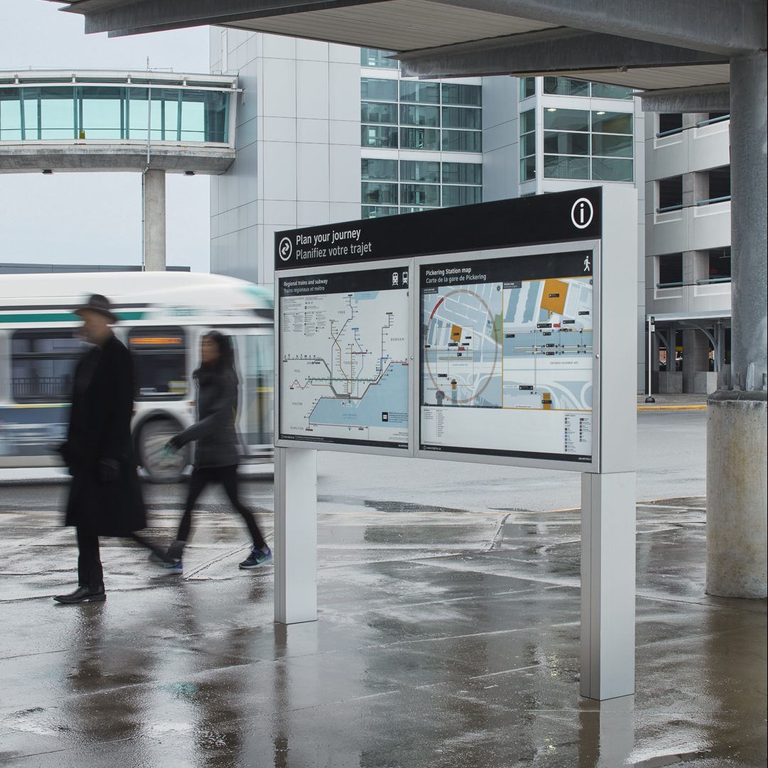
We worked with a multi-disciplined team to design, manufacture and install 275 signs, maps, display cases, bus stops, platform signs and identification placards at a multi-modal transit station at Pickering just east of Toronto. This test site is currently being evaluated in premonition of a region-wide implementation strategy. Ongoing public stakeholder engagement will be essential for a successful and meaningful new system design for the region.
It was essential to take a Systems Thinking approach to this work for Metrolinx, exploring the deeper causes, interactions and implications that drive the systems dynamics in the longer term. This enabled us to broaden the perspectives of participants to think beyond silos and consider fully integrated and more effective solutions.
[/one_half_last]
Research
In order to create a user-centred wayfinding system a variety of information gathering processes were conducted
consisting of desk research, field research, interviews, and customer journeys. Information was used to develop prototypical
customer travel scenarios which helped determine progressive information users need during a trip.
[masterslider alias="ms-6"]
Workshops
Using co-creative techniques, the team listened to opinions, ambitions, constraints and shared ideas about
customer experience and information across the GTHA. A steering committee with representatives from all agencies,
meets regularly to assess progress and deliver feedback.
[masterslider alias="ms-7"]
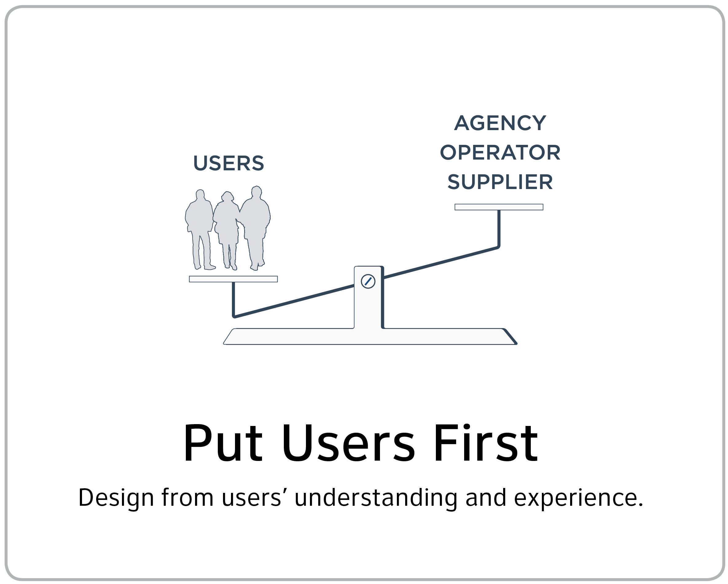
Design Principles
Eleven design principles were established that will inform a harmonized system and will serve as the basis
for future implementation.
Pickering Pilot
[masterslider alias="ms-10"]
Work in Progress
The team is developing preliminary ideas across a number of the initiatives. Design solutions must be consistent,
coherent, functional, aesthetically appealing, easy to use, continuous and memorable. We are incorporating different levels
of information: identification, directional information, safety, security and accessibility.

Making it Happen
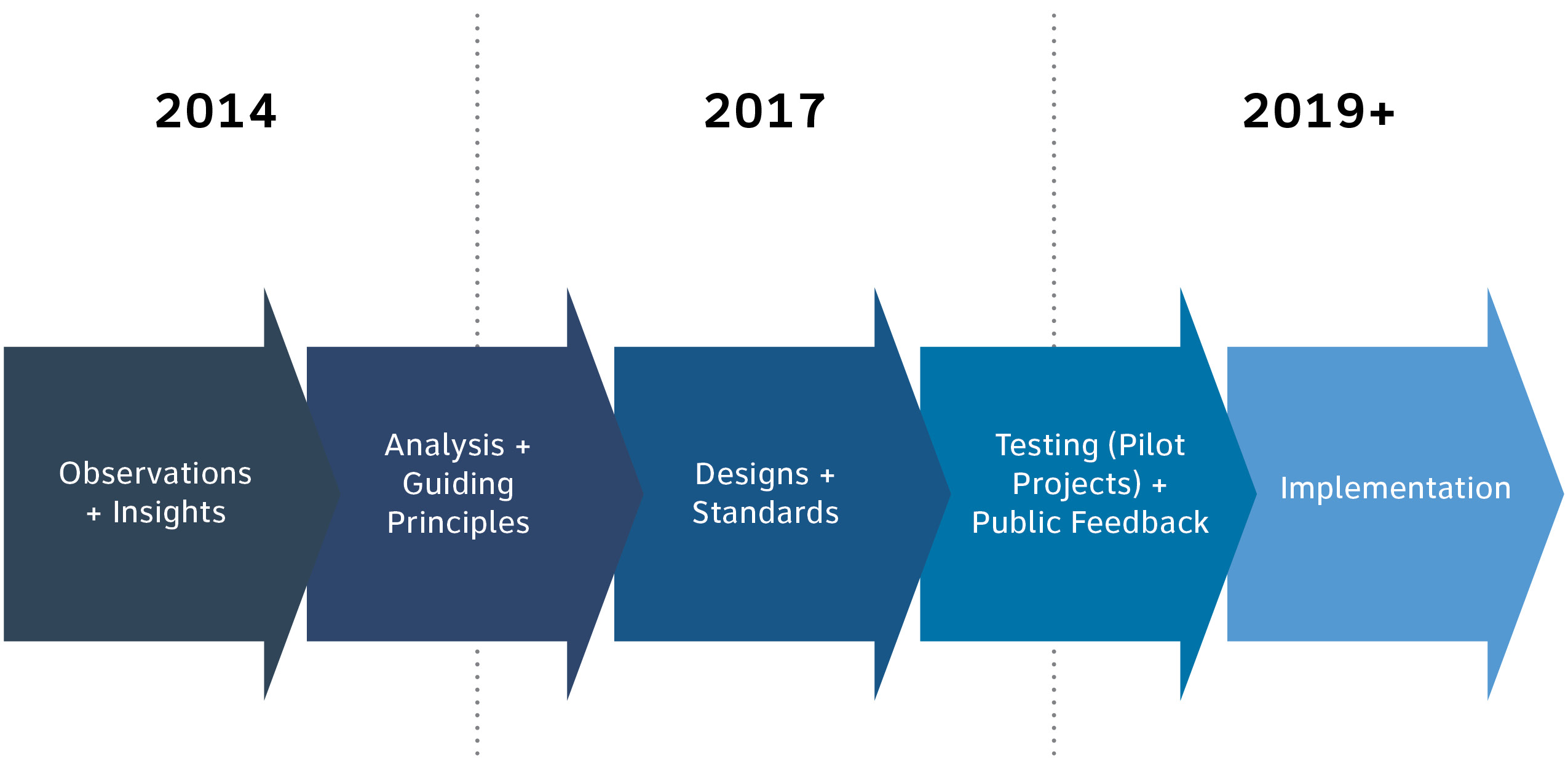
The following diagram indicates some approximate milestones for the next steps in
wayfinding harmonization that will allow for the collection of public feedback on the new wayfinding system
before incorporating it into all future transit projects.
For further information about the Wayfinding Harmonization Project
and other regional transit developments and initiatives, please visit:
www.metrolinx.com/wayfinding
March 14, 2017 — Comments are off for this post.
Countdowns
[one_half]
Thinking
Countdowns
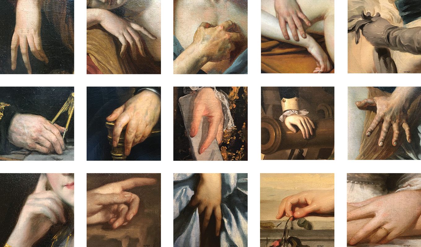
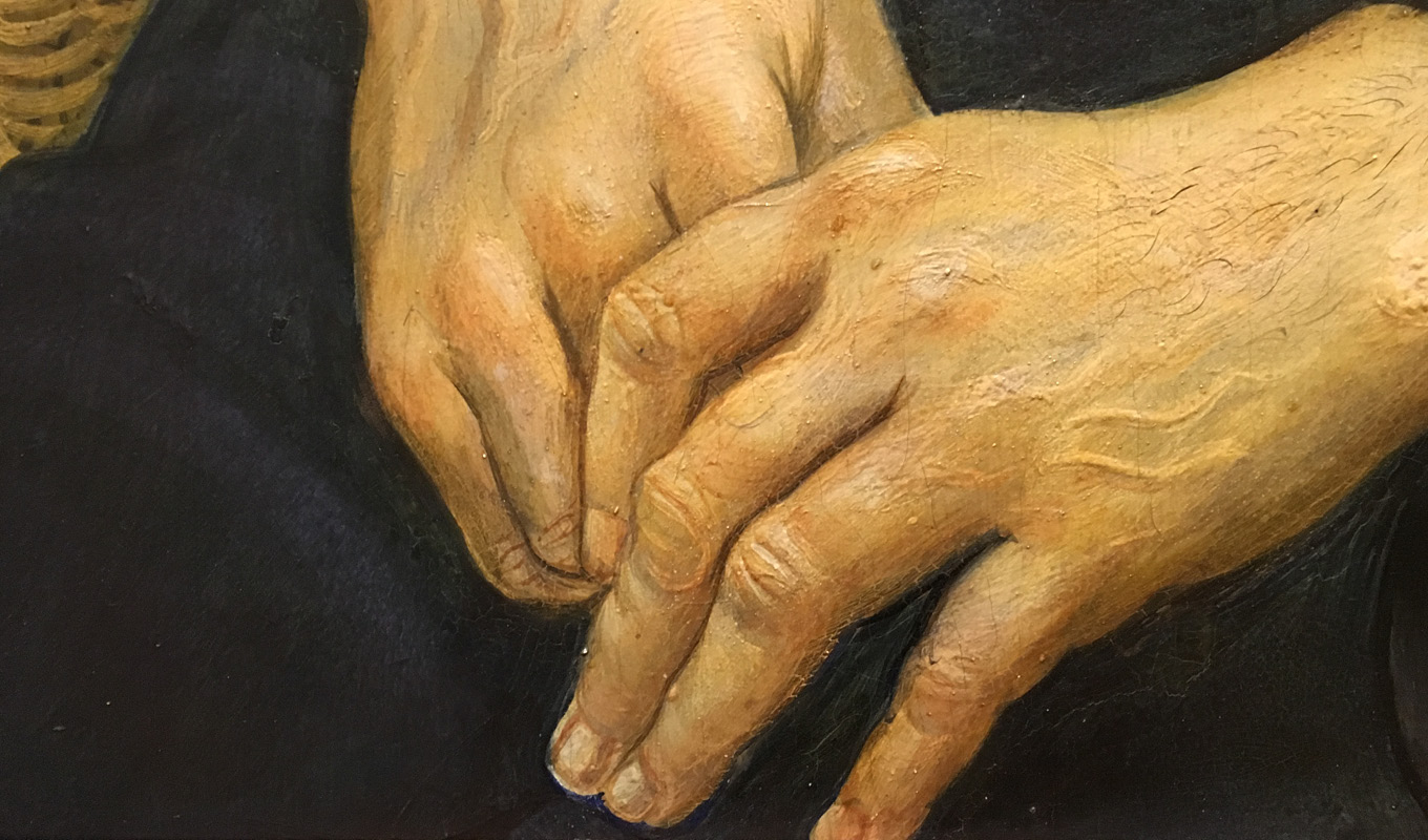
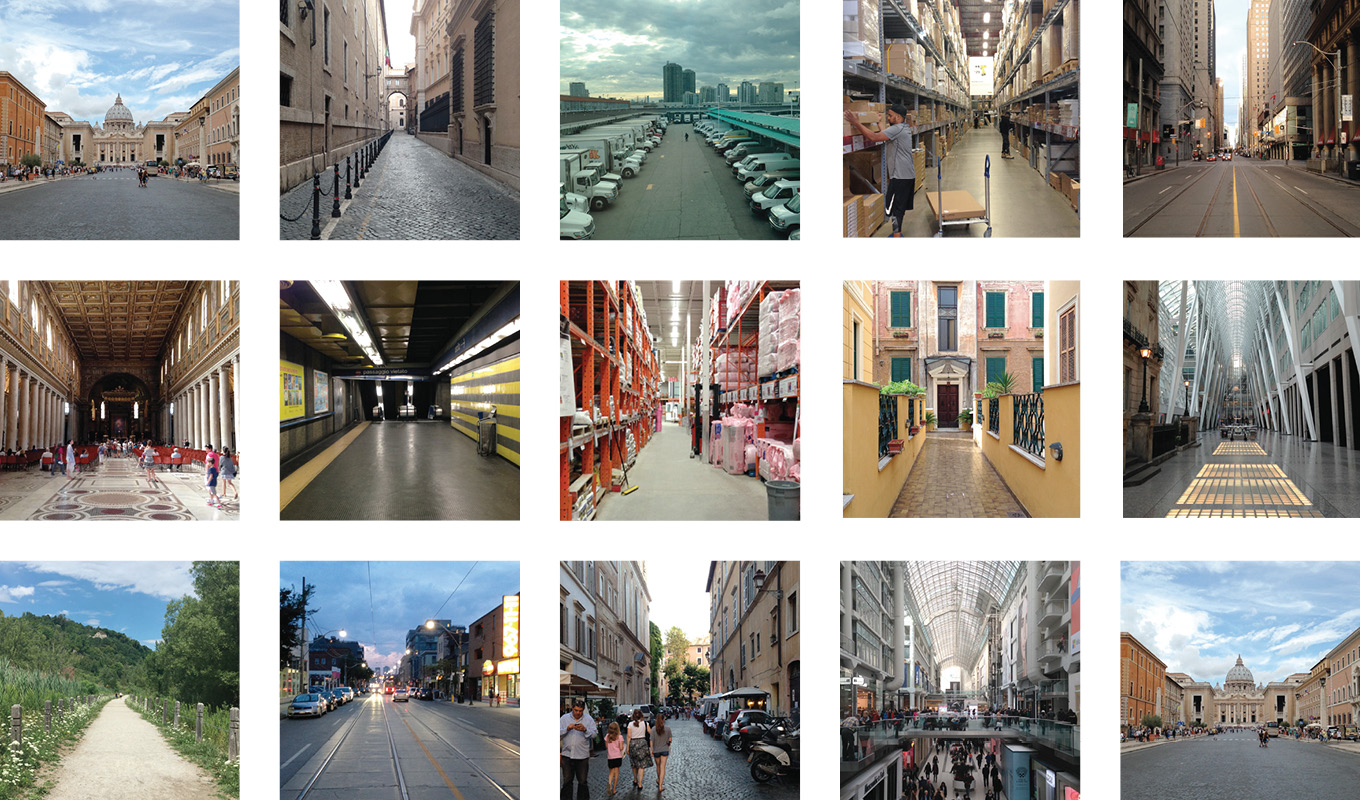
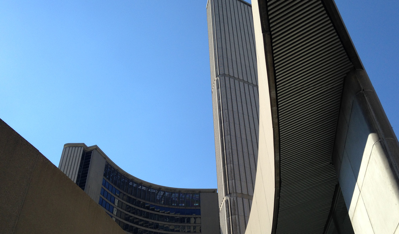
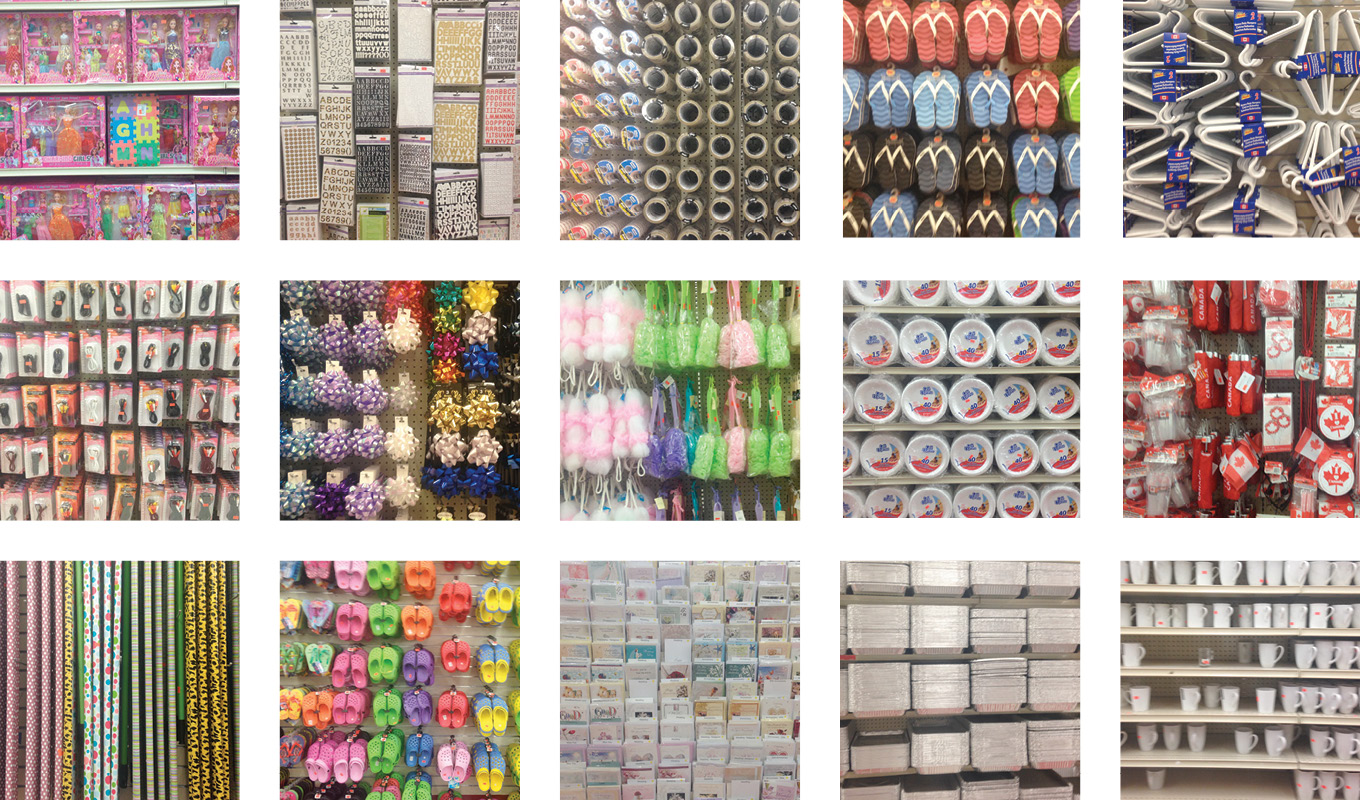
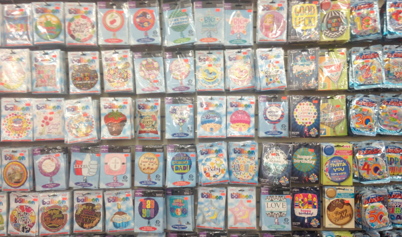
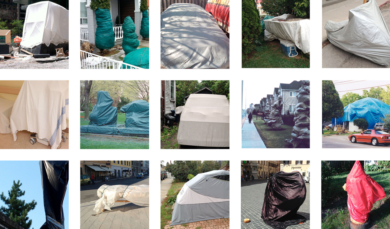
Photo essays on the context of our work.
[supsystic-social-sharing id='1']
[/one_half]
[one_half_last]
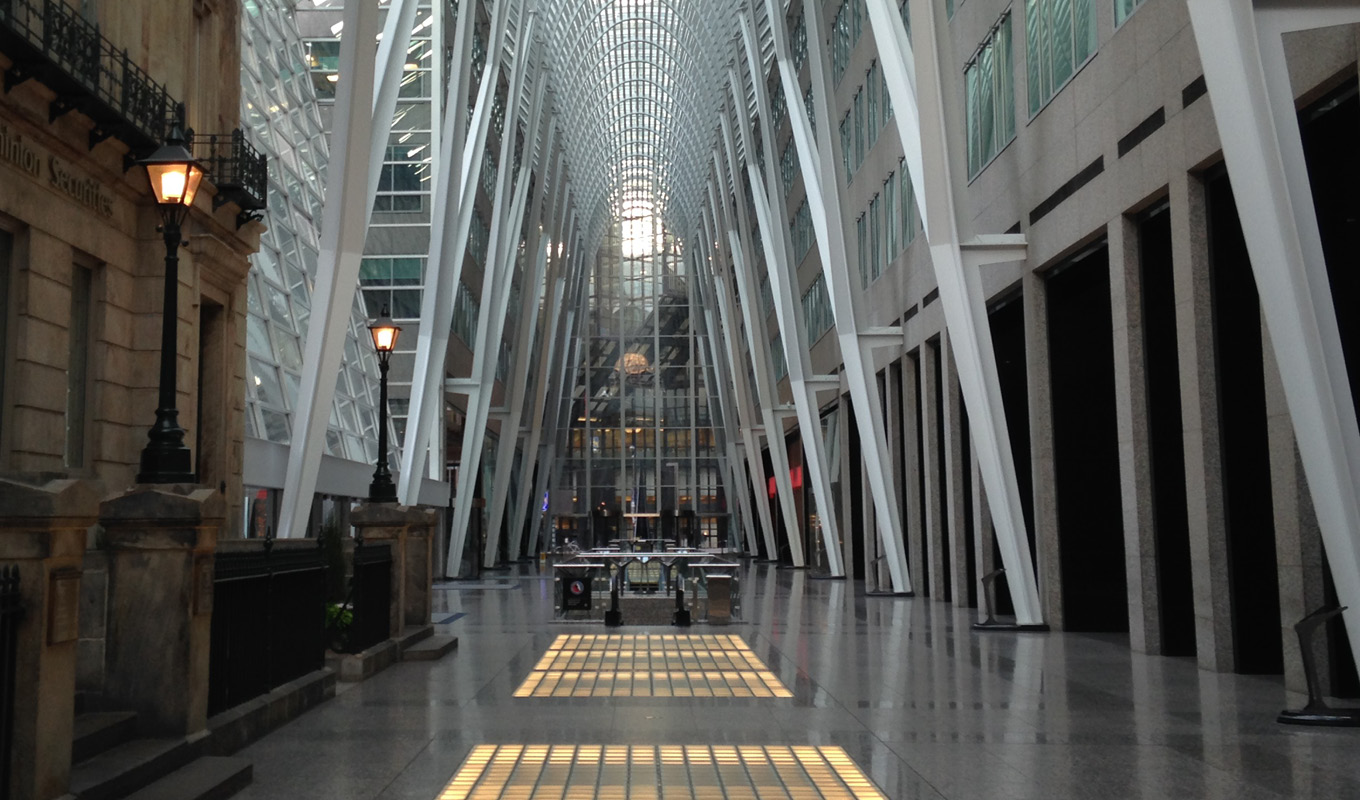
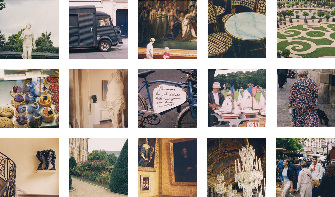
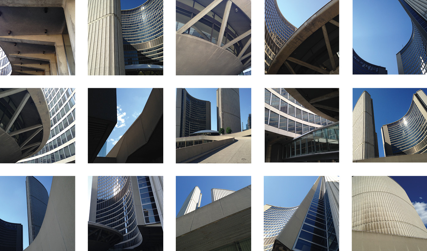
Contextualization reveals connections between Design and the conditions of production, whether these are formal, social, or ideologically defined. Institutional critique, economic positions, issues of globalization, value changes, consumerism, technology, power shifts, threats to ecology and changing demographics are all closely related to social and political changes, and are relevant subjects of our research, design methodology and production.
[/one_half_last]
Hands in Cleveland
[one_half]
[/one_half]
[one_half_last]
[/one_half_last]
One-Point Perspectives
[one_half]
[/one_half]
[one_half_last]
[/one_half_last]
Paris
[one_half]
[/one_half]
[one_half_last]
[/one_half_last]
City Hall
[one_half]
[/one_half]
[one_half_last]
[/one_half_last]
The Dollar Store
[one_half]
[/one_half]
[one_half_last]
[/one_half_last]
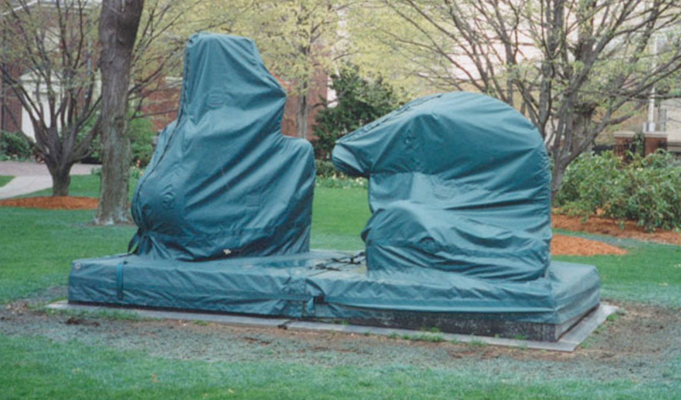
Shrouds
[one_half]
[/one_half]
[one_half_last]
[/one_half_last]
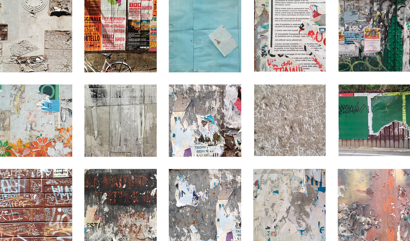
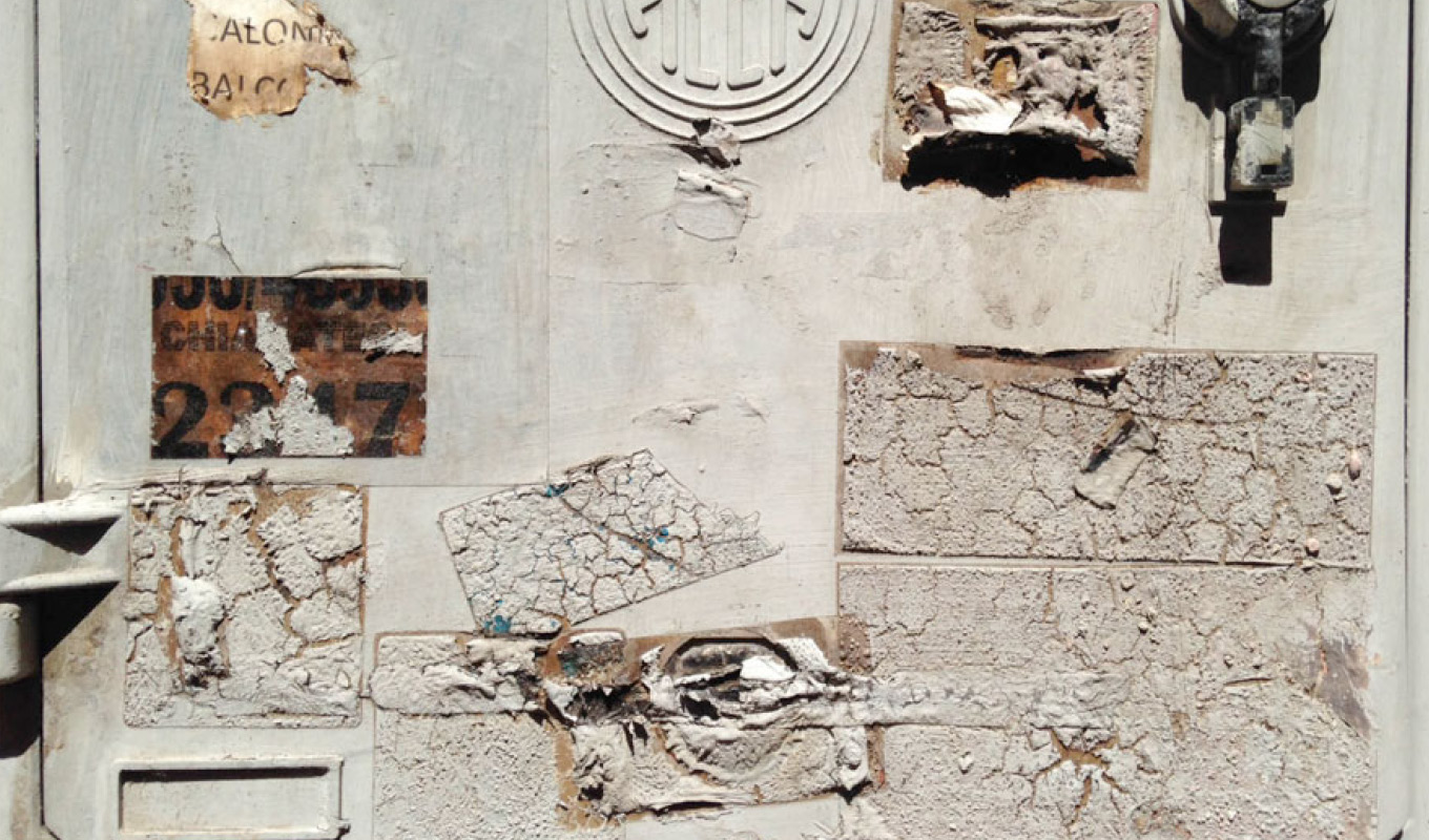
Walls of Italy
[one_half]
[/one_half]
[one_half_last]
[/one_half_last]
March 14, 2017 — Comments are off for this post.
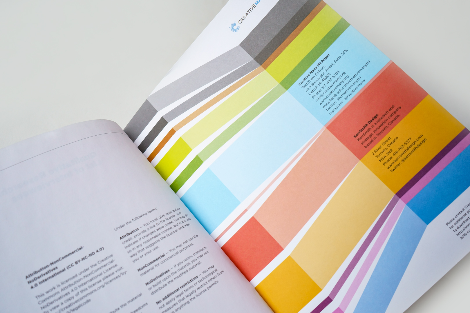
Creative Many Michigan
[one_half]
Insight
Creative State Michigan
This ambitious and far-reaching project
for the entire state of Michigan has national significance.
Scope of work
- Research
- Engagement
- Creative strategy
- System maps
- Workshops
- Benchmarking
- Data analytics
- 3 Horizon Workshop
- Website
- Public Presentations
- Recommendations
[supsystic-social-sharing id='1']
[/one_half]
[one_half_last]
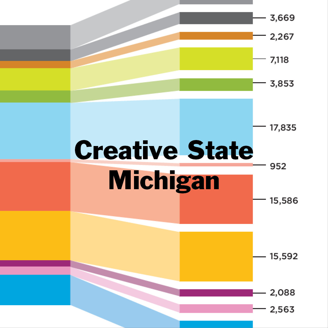
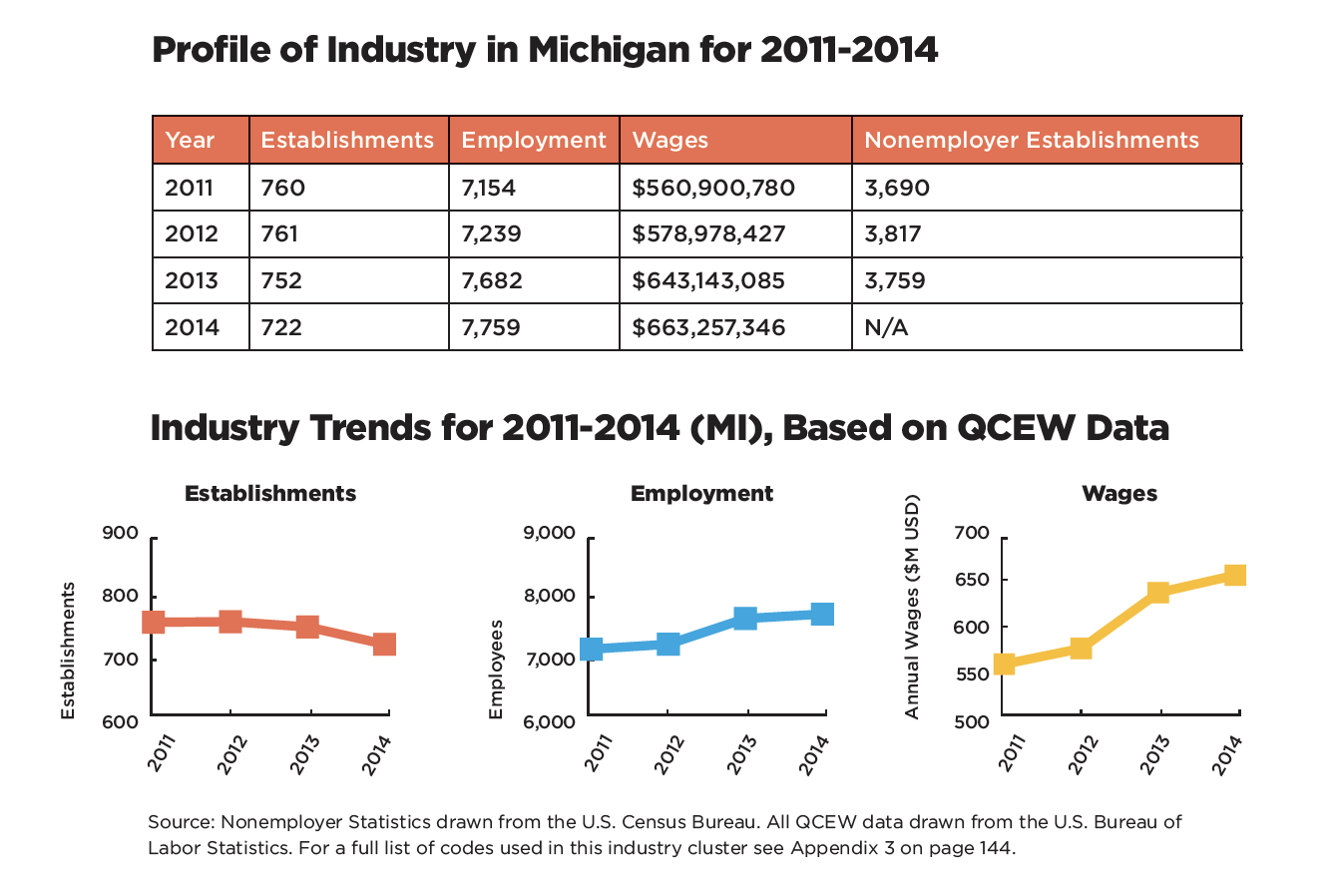
With many large regions transforming from “legacy” economies to economies of the future, it is necessary to build strategies that encompass new business models, new expectations and new metrics. The Michigan economy is a complex mix of powerful global brands (Ford, GM, Kellogs, Herman Miller, Steelcase, Dow) as well as important universities (University of Michigan, Michigan State and Wayne State) and thousands of smaller thriving businesses. The Detroit region has begun to transform from urban despair to a region with a new focus on growth, innovation and extraordinary opportunity, while Flint struggles with infrastructure deterioration.
The findings and recommendations of our work were positioned as a framework for the development of state and regional economic development priorities, strategies and investments to strengthen and grow jobs and businesses across Michigan’s creative and design industries for competitive advantage.
We undertook a full assessment of barriers to change and potential alternatives. This involved both quantitative and qualitative inputs and included assessment of future revenues and costs, potential partnerships in service provision and training, key activities and channels for delivery of new offerings, and required resource development with both employees and citizens.
Workshops in Four Cities
Future visioning workshops were conducted in Flint, Grand Rapids, Ann Arbor and Detroit with members of the arts, culture and design communities. In these workshops, participants identified current challenges in the arts and culture ecosystem, explored their vision for the future and outlined intermediary changes that would be necessary to achieve a visionary future.
[/one_half_last]
[one_half]
[/one_half]
[one_half_last]
Development of Creative Industries Toolkit
Grounding research in achievable action plans is a necessary step towards positive change. Articulation of approaches to support learning and skills development in the future workforce and workplace, to help Michiganders transition to or from current jobs and to improve retention strategies for highly skilled workers was part of this work. We identified the replication model for this project for applied use by other local, regional and state entities in the US seeking to advance understanding and growth opportunities for the creative and design industries.
Design and Development of Tools
The overall look, feel and tone of the project to align to other media channels, including print, was designed. Effective communications tools were created throughout this project including meaningful information graphics for multiple media applications. A strategic plan was formed to distribute findings through multiple channels, including traditional platforms and social media.
[/one_half_last]
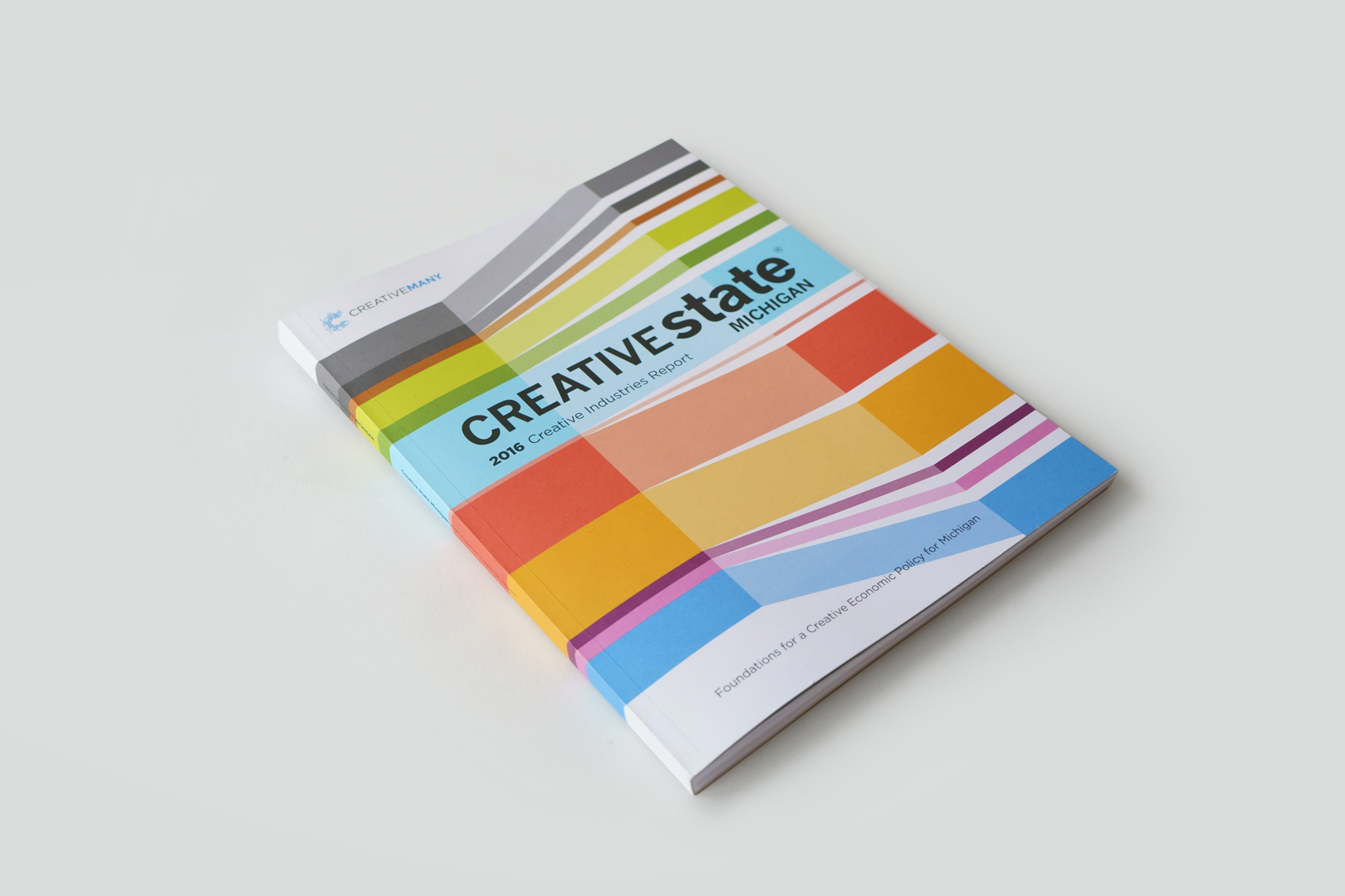
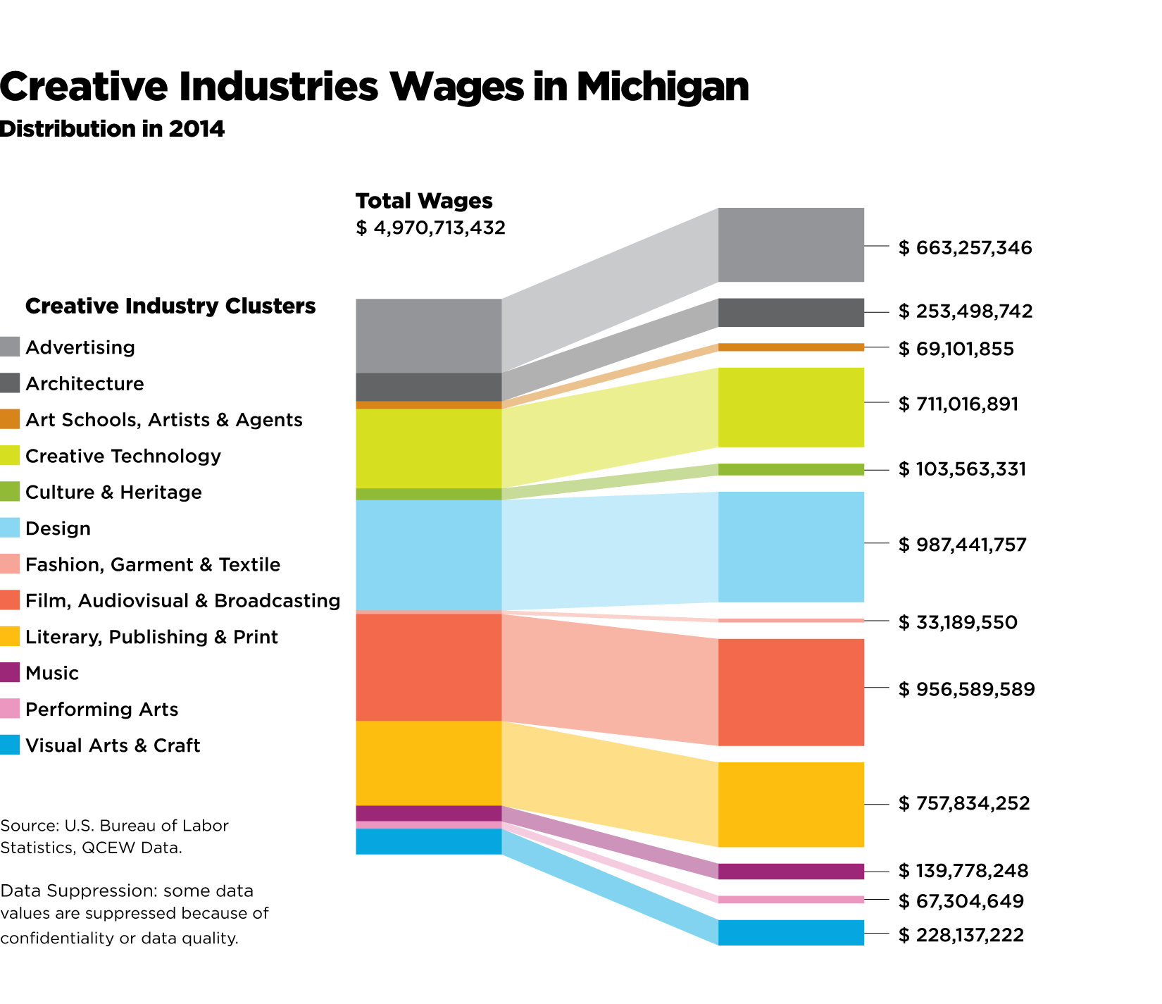
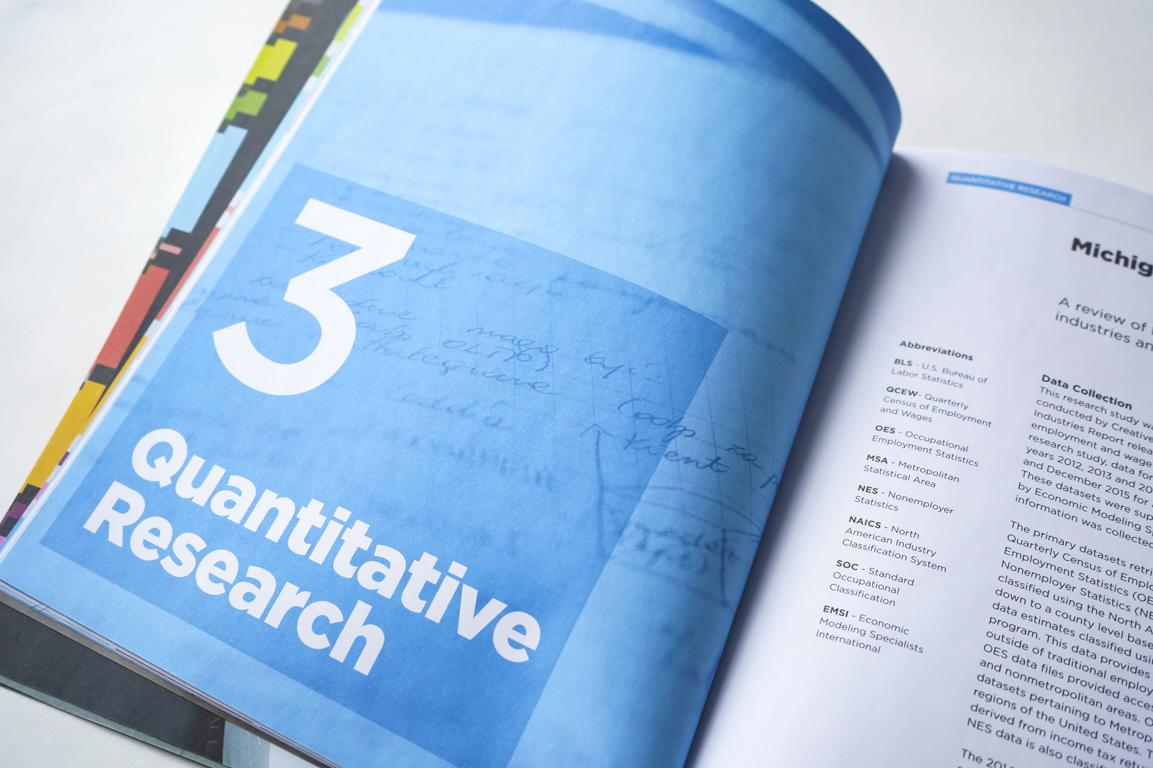
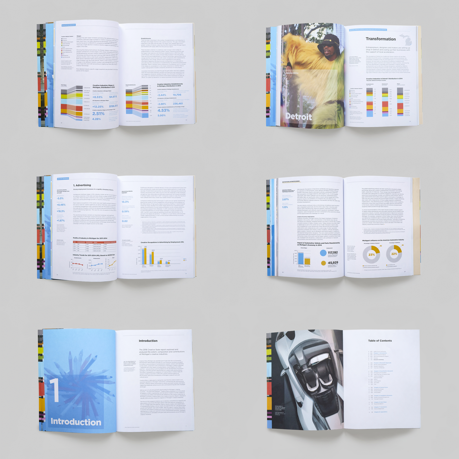
Click here to download the full report
March 12, 2017 — Comments are off for this post.
Keilhauer
[one_half]
3D Design & Insight
Sittris
Whole life-cycle analysis and systemic thinking underpinned this complex project.

[supsystic-social-sharing id='1']
[/one_half]
[one_half_last]
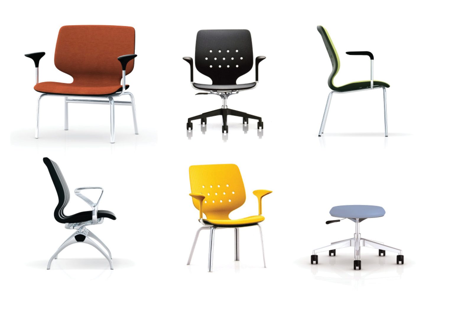
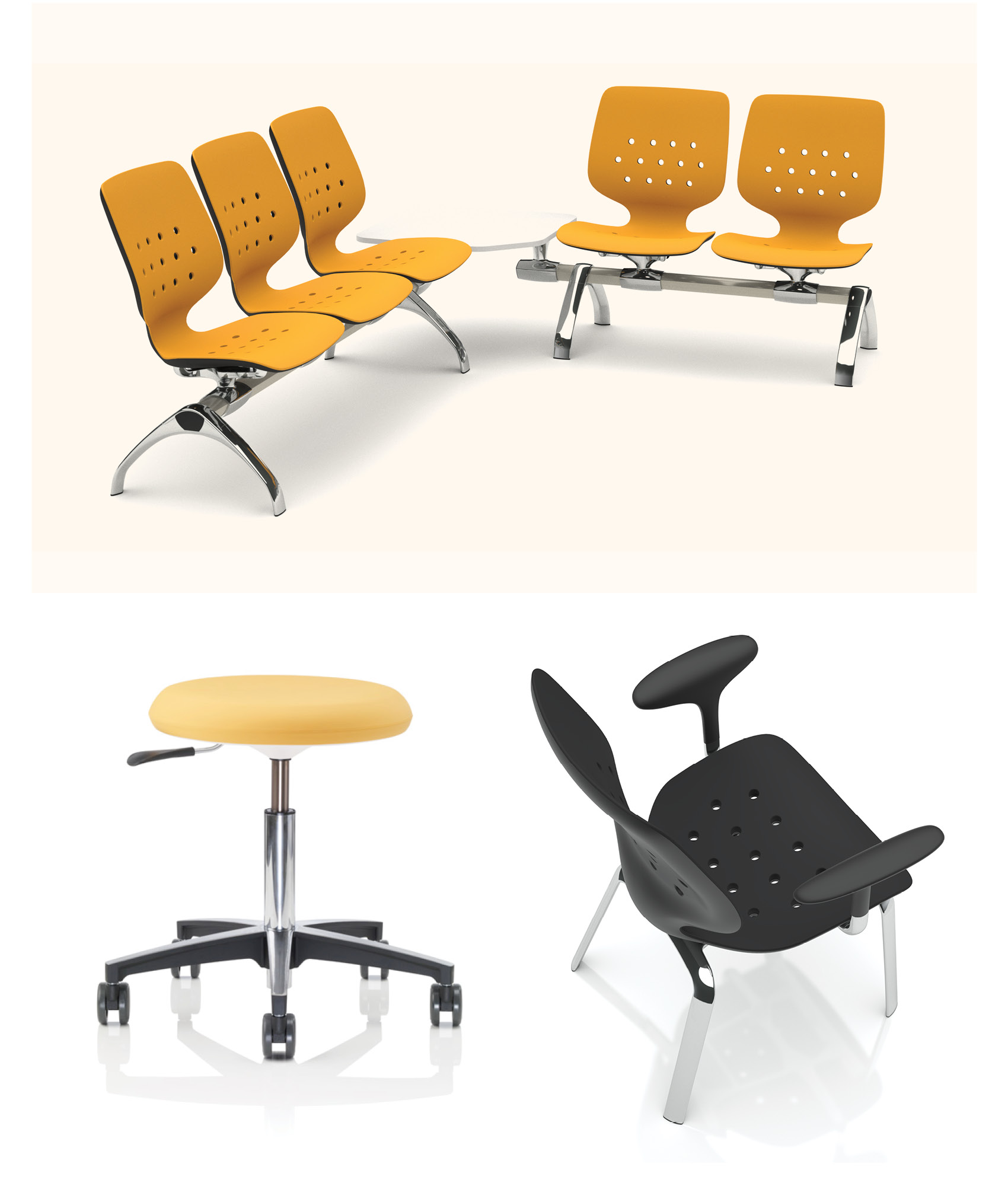
Sittris is an innovative and award-winning multi-component healthcare seating system designed to maximize infection control and improve worker health and safety while providing patients with comfort and dignity in their various hospital interactions. The patented silicone first-contact surfaces that prevent microbial growth without toxic off-gassing are the result of extensive evidence-based research and direct collaboration with international manufacturing and materials experts.
Whole life-cycle analysis and systemic thinking underpinned the entire project. Strict verification and validation methods were incorporated to mitigate risk throughout. Field replaceable components acknowledge the 24/7 nature of heavy use and institutional maintenance requirements; 75 different chairs in the series are built from 19 interchangeable parts with universal fastenings.
For Sittris, we identified unmet needs in existing hospital furniture and introduced an evidence-based development approach to the problem. Using observation, interviews, and testing, we established new benchmarks for the product experience. We applied detailed engineering and design skills to create a fully integrated solution that addresses the key issues in healthcare environments today: infection control, worker health and safety, patient diversity and budget constraints.
Outcome
This solution provides improved treatment access and reduction of skin deterioration in long-term seating situations while considering altered cleaning protocols in a post-SARS world. Deep empathic research revealed an underserved population of bariatric patients and prompted the first ergonomically accurate seating solution for this group.
Among the many awards and accolades, Sittris was recognized by the prestigious Nightingale Prize for Healthcare Innovation.
[/one_half_last]


March 12, 2017 — Comments are off for this post.
Vineyard Road
[one_half]
2D Design: BRANDING
Vineyard Road
Truth in Wine.
[supsystic-social-sharing id='1']
[/one_half]
[one_half_last]
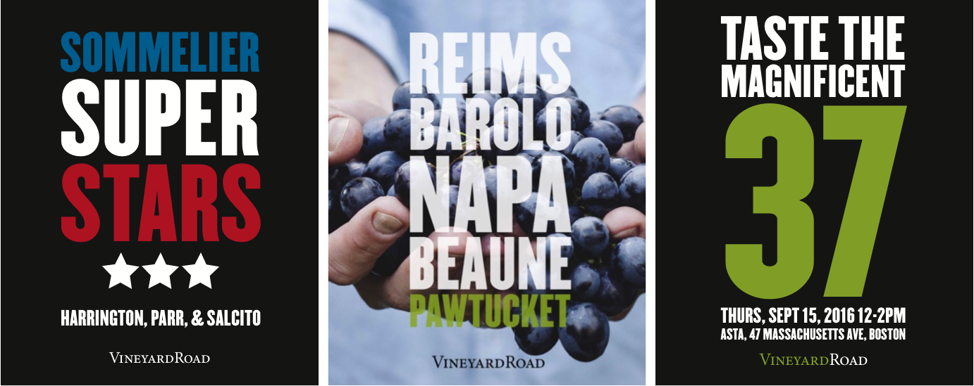
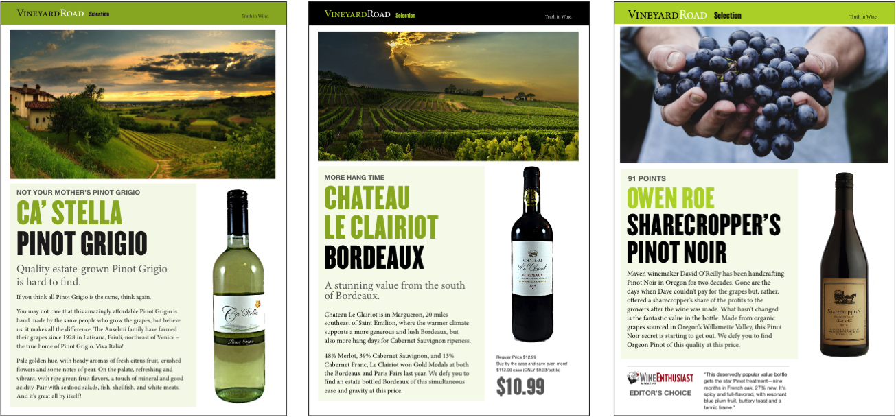
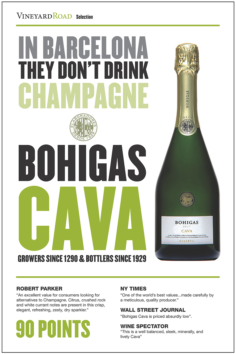
This upstart importer supplies unique international wines to the French consulate in Boston, as well as Harvard faculties and leading restaurants in Massachusetts and New England. We designed a full brand image and collaborated on events, copywriting and promotions.
Vineyard Road became more conscious of the need for an aligned and consistent message both inside and outside the company. As they grow they have more “touchpoints” of the brand and they all need to speak a similar language. We designed systems, templates and ways of updating messages, events, emails, newsletters, and invitations that are easier and faster for them.
And as more people create those touchpoints, we established some guides so they produce consistent marketing and communications. The exercise helped clarify what it is they do exactly, and who with, and who for. Good branding builds a sense of trust and consistency to build business. Vineyard Road now talks to customers, partners and suppliers with the same voice and message so everybody understands them better. Vineyard Road will continue to raise their profile to compete and win business.
The Grapes of Wrath
Their authenticity and sense of humour – as well as their expertise and thorough research - makes them stand out from the competition. Vineyard Road will continually move forward and look alive, fresh, and relevant.
[/one_half_last]


March 12, 2017 — Comments are off for this post.
What is Design anyway?
[one_half]
THINKING
What is Design anyway?
"Design is thinking made visual."
Saul Bass
[supsystic-social-sharing id='1']
[/one_half]
[one_half_last]
Design aspires to the power of music. Beautiful, sophisticated aesthetics create exhilaration. Spatial relationships, forms, image and colour can stir powerful emotions that come from perception, tactility, ease of use and joy of performance.
The often complex and difficult task of combining any number of factors to create sheer pleasure holds an apparent contradiction. When a work of design resonates with clarity, simplicity and beauty it emanates a natural "it’s always been this way" facility.
A great Design hides the very difficult and demanding process of selection, editing, refinement, decision-making and critical thinking that is required to create it. The apparent effortlessness is in fact the result of considerable effort.
It is hard to verbalize. But we know great design when we see it.
Design has no natural beginning or end.
Art is about asking questions. Design is about solving problems.
Design is about understanding human behavior and beliefs.
Design brings structure, and clarity to perception.
Design must consider implications.
Everything is designed, but not necessarily well considered.
Design is about the future.
The design of systems is the most important design.
If somebody doesn’t hate it - chances are nobody loves it.
Design is about purpose - what are we trying to do? And why?
"Design is not just what it looks like and feels like. Design is how it works."
Steve Jobs
[/one_half_last]
March 11, 2017 — Comments are off for this post.
Great Minds of Design
[one_half]
Thinking: DOCUMENTARY
Great Minds of Design
Helen Kerr and her work at KerrSmith.
Helen Kerr and her work at KerrSmith are the feature of this documentary. The series on designers and their ideas was broadcast on CBC Television.
[supsystic-social-sharing id='1']
Click here to watch a clip of Helen Kerr on the Design Process.
[/one_half]
[one_half_last]
Everything from a cereal box to a skyscraper starts with a design. Great Minds of Design follows a wide variety of designers as they complete a project. What alternate forms of energy can be used? How can a building be structured to promote efficiency? How has printing technology evolved? What are the design motivations of a street artist? How do exotic cultures sustain themselves?
The creative personalities of designers and their innovative ideas drive the series. Each episode follows a different design process from concept to completion. We discover a new creation directly from its maker as it happens; learn about a different design medium and its history; and meet the visionary people behind everyday objects and ambitious ideas.
Great Minds of Design features everyone from computer-aided industrial designers to street artists, and designers whose work becomes quite conceptual. Themes that unite these visionary forces vary from their desire to create something that is functional and aesthetically pleasing, to finding solutions to human problems, social issues, or groundbreaking improvements to previous designs.
[/one_half_last]
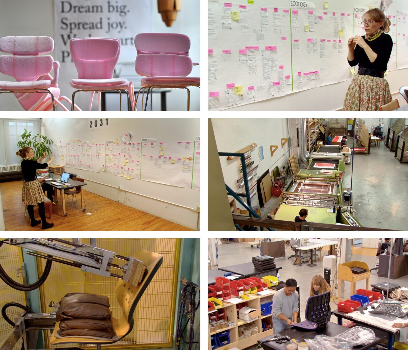
[one_half]
Click to read more about the film
[/one_half]
[one_half_last]
Helen Kerr
Helen Kerr leads product and system development with a focus on research and strategic innovation. From the complex realm of healthcare, to relevant sustainability issues, and the intimate study of how we eat, her insights and design direction guide clients to realize business ideas as fully integrated solutions. For more than 20 years, Helen has collaborated with her team to deliver complete brand experiences. She is an Associate Professor in graduate studies at OCADU. She has applied her foresight capabilities to government policy both federally and provincially and is often sought as a lecturer, juror and conference speaker. She has been recognized at the highest level by IDSA and Phaidon Press.
Helen Kerr has earned the trust of an extraordinary range of clients. Kerr has gained a reputation for innovative, influential and effective work by integrating planning, strategy and commercialization to create results that are directly beneficial to short and long-term client goals. Kerr’s impressive expertise ranges from large strategy and “Horizon Scanning” projects through to trend analysis, knowledge of materials, manufacturing and tooling, retail expertise, logistics design, quality control, sourcing and sustainability audits.
[/one_half_last]
March 10, 2017 — Comments are off for this post.
St. Michael’s Hospital
[one_half]
2D & 3D Design: SIGNAGE
St. Michael's Hospital
Li Ka Shing Knowledge Institute.
[supsystic-social-sharing id='1']
[/one_half]
[one_half_last]
The Keenan Research Centre and the Li Ka Shing International Healthcare Education Centre create knowledge translation and narrow the gap between insight and impact at this 337,000 sq. ft. new research facility. We designed over 1,000 signs throughout nine floors. The Li Ka Shing Knowledge Institute recognizes $77 million in donations with our donor recognition
and walls.
[/one_half_last]
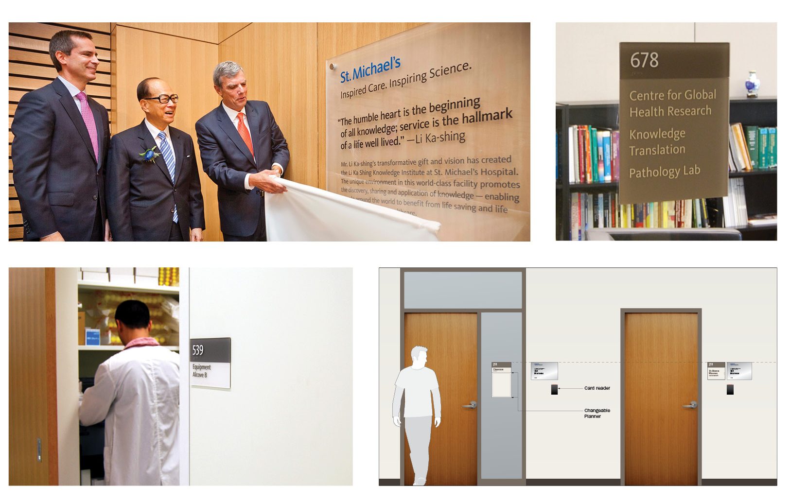
March 10, 2017 — Comments are off for this post.
Canada Council for the Arts
[one_half]
Foresight
Canada Council for the Arts: Art. Future. Change.
Understanding the Evolving Canadian Visual Arts Ecosystem.
Scope of work
- Research
- Engagement
- Foresight Workshops
- Visioning
[supsystic-social-sharing id='1']
[/one_half]
[one_half_last]
The Canada Council for the Arts is Canada’s national, arm’s length, public arts funding agency. In existence since 1957, the Council support artists and arts organizations across a wide range of disciplines. Over the years, the Council has seen a marked increase in requests for support from an ever-growing number of artists and arts organizations. Despite an increase in its budget allocation, the public funder recognized the need to rethink the way it supports the arts sector.
The Visual Arts Section engaged KerrSmith Design to help them conduct a cross-country consultation process with the visual arts community so they could have a deeper understanding of how the visual arts ecosystem was evolving.
In addition to a review of literature relevant to the changing visual arts landscape, we worked with the Visual Arts Section to validate their mandate and core objectives in supporting the sector. As a result of this process, it was clear that the usual cross-country consultation process would not effectively serve the Section’s purposes. We designed a future-visioning workshop (based by the Three Horizons foresight methods) that would enable participants to identify what wasn’t working in the current system, to describe the characteristics of an aspirational future visual arts ecosystem, and identify innovative pathways to this future.
While the cross-country workshops extended to 12 cities across Canada, it was important to the Visual Arts Section that consultation process to include more than the 220 individuals who participated in the workshops. Based on initial insights from the workshops, we created an online survey that reached many hundreds of Canadian artists and cultural workers around the world. Pressing concerns from the visual arts community touched on the need to demonstrate the value of the visual arts to society, the search for new business models in light of stagnant public funding, impact measurements methods that are appropriate for visual arts, and importance of understanding and engaging audiences.
The findings and insights from this study informed the design of the Council’s new structure and funding programs to support an evolving ecosystem.
[/one_half_last]
March 10, 2017 — Comments are off for this post.
Dufflet
[one_half]
2D & 3D Design: PACKAGING
Dufflet
Pure and sweet.
[supsystic-social-sharing id='1']
[/one_half]
[one_half_last]
Dufflet Pasties is a market leader in the invention, baking and delivering of fine cakes and pastries. Over 30 years the company has grown from local notoriety to a national presence with distribution across major supermarket chains. We had worked with Dufflet 20 years previously on some French chocolate and sauce packages, so it was exciting to renew our relationship.
[/one_half_last]


March 10, 2017 — Comments are off for this post.
Bio-Diverse City Modeling
[one_half]
Insight: URBAN ECOLOGICAL RESEARCH
Bio-Diverse Modelling
of Cities
Reimagining the natural ecosystems
of New York City.
In collaboration with the Biomimicry 3.8 Institute
[supsystic-social-sharing id='1']
[/one_half]
[one_half_last]
What would a city look like if it performed as well as the natural ecosystems that were once abundant in that place? Could cities be inspired by forests, waterways and bio-diverse systems that are now covered in concrete and asphalt? KerrSmith, working with the Biomimicry 3.8 Institute, the Wildlife Conservation Society of New York and supported by the Summit Foundation, researched ways to turn that inspiration into reality.
Our work flows from the Manahatta/Welikia research project headed by Dr.Eric Sanderson of the WCS:
“Before becoming the center of the Western cultural universe, Manhattan was Mannahatta, “Island of many hills,” in the language of 17th-century Native Americans. Using computer modeling, painstaking research and a lot of legwork, Wildlife Conservation Society ecologist Eric Sanderson has re-envisioned, block by block, the ecology of Manhattan as it was when Henry Hudson first sailed into the forested harbor in 1609.
The Mannahatta Project presents the eye-popping fruits of Sanderson’s research, from the
now-flattened hills of the financial district to the river otters of Harlem. The project’s astonishing
visualizations are realized by computer-graphics wizard Markley Boyer, and encompasses a book, a website and a 3-D map — a sort of Google Earth of ancient New York. Plaques around town will commemorate a lost creek or habitat. Far more than a mournful look back at what has been irrevocably paved over, the Mannahatta Project is designed to inspire ecological sustainability for New York and for other cities.” (Resource: Ted.com)
That groundbreaking work was focused on interactive imagining of alternative ecosystems largely for educational purposes. But it held the potential for use by those who build, protect, use and are inspired by the tangible realities of a specific place. Our work investigated how to build tangible tools to empower city-makers and city users to better understand the potential of their urban places. The algorithms developed for Manahatta/Welikia represent an opportunity for the creation of Environmental Performance Standards, Metrics or Indicators. The goal was to build a platform tool that provides core information and is a repository of place specific emergent knowledge to enable the creation of built environments that perform as well or better than the ecosystems the city replaced. The project brought together stakeholders within New York, and the Mannahatta project to highlight how the indigenous landscapes of the island of Manhattan can be accessed by the public for greater understanding, and also for helping solve innovative challenges. The study initiated a series of workshops, and interviews with recommendations to the Biomimicry Institute for systemic changes in how place can be incorporated into innovative strategies. This concept spawned the ‘genius of place’ movement that has been taken up by cities around the world to accelerate place based innovation practices.
With Tim McGee of Biomimicry, KerrSmith coordinated a multidisciplinary stakeholder group, researched context, precedent and possible innovative solutions while collaborating with a diverse team of experts in ecology, parks, city systems and urban geography.
Our expert mapping, graphics and presentation capabilities were key to moving the project forward, — from the abstract to the real — by explaining complexities in manageable “chunks”, discernable examples and articulated models and diagrams.
[/one_half_last]

March 10, 2017 — Comments are off for this post.
The Bucky Bag
[one_half]
3D Design: PRODUCT DESIGN
Bucky Bag
Carry your stuff with cardboard.
[supsystic-social-sharing id='1']
[/one_half]
[one_half_last]
The description inside the Bucky Bag reads:
The Bucky Bag is a geodesic game-changer. Tetrahedronally engineered to dymaxion-out all of your life engineering issues, the Bucky is one sleek piece of paper re-purposing. Part of a continuum in the rich typology of geodesic integration, this satchel will be a new page in your life liberated from constraints and tutelage. The Bucky is designed with “Tensegrity”, a philosophical model of coherence and an anticlassical approach to structure, construction and load-bearing. You cannot fold in the face of pressure. In the immortal words of the man himself: “Don’t fight forces,
use them.”

[/one_half_last]
March 9, 2017 — Comments are off for this post.
Rem Koolhaas
[one_half]
2D Design: Publications
Rem Koolhaas
Delirious New York: A Retroactive Manifesto for Manhattan.
[supsystic-social-sharing id='1']
[/one_half]
[one_half_last]
Rem is foremost an editor. He works by selection and reaction to design propositions. He quickly builds things up – or gets others to do that – so he can choose, combine, rearrange or eliminate. He enjoys accidents, failures, missteps and restarts - although he doesn’t always show it in the nicest of ways.
His relentless tenacious optimism plows incrementally through ideas. We made at least 6 full “dummies” of DNY to facilitate our long distance collaboration. His rat-tat-tat feedback in phone calls and notes, as distinct as his uneasy genius.
[/one_half_last]
March 9, 2017 — Comments are off for this post.
Gluskin Sheff + Associates
[one_half]
2D & 3D Design: BRANDING
Gluskin Sheff
+ Associates
Defining Excellence.
[supsystic-social-sharing id='1']
[/one_half]
[one_half_last]
Our work for Gluskin Sheff + Associates brought clarity and focus to the visual identity and communications of one of Canada’s pre-eminent financial management firms. We delivered better brand recognition with current and potential clients through all consumer touch points. We streamlined communications over their substantial statement and reporting system.
[/one_half_last]

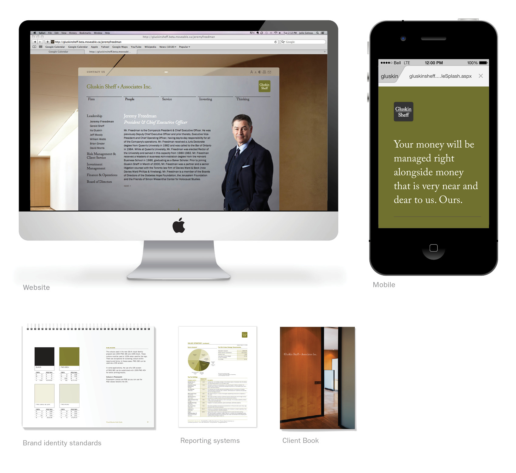
March 9, 2017 — Comments are off for this post.
OCAD University
[one_half]
Foresight
OCAD University
We worked in a highly collaborative way, bringing together the broad community that shapes the university to develop resiliency, relevance and a culture of innovation.
Scope of work
- Research
- Engagement
- Foresight Workshops
- Visioning
[supsystic-social-sharing id='1']
[/one_half]
[one_half_last]
Ontario College of Art and Design University (OCADU) has been in the business of delivering quality art and design education and research for over a century. The university, like many educational institutions, operates in a shifting landscape, one increasingly experienced online, and shaped by Federal and Provincial economic development policies that favour industry and research alignment. OCAD University’s goal was to maintain and develop a strong foothold within this transforming landscape.
Our Role
Helen Kerr and her team participated in a comprehensive and highly consultative process contributing to the creation of a five-year strategic plan for OCAD University. Helen’s work was to look at the future and the changes that will come, to develop plausible scenarios to make the school more resilient in their strategic planning process. We worked in a highly collaborative way bringing together the broad community that shapes the university.
Engagement
Consultations included interviews with external representatives from government, arts, design, business and academia. Internally, interviews were conducted with the President, Board of Directors, Senior Cabinet, management as well as students, graduates and alumni. The interviews helped OCAD University understand the perspectives of those involved in leadership positions and to provide insight that would help interpret empirical results.
Our Process
In a world of uncertainty, scenarios help identify both future opportunities and gaps in order to act in the present. Our Horizon Scan addressed two questions: given the identified megatrends, how will societal, political and economic changes alter the role of art, design and culture? And, what will be the key drivers influencing the next five years of art and design education? Scenarios were used to stretch thinking about how OCAD University will continue to be successful in the future.
Results
Our work served as a critical component of the overall strategic planning undertaking. In a time of significant change in the education sector, resilience, robustness and flexibility are required skills. We helped to build a platform to discuss and act on the challenges likely to face the University in the highly competitive, fiscally constrained and technologically demanding future.
[/one_half_last]
March 9, 2017 — Comments are off for this post.
MoMA
[one_half]
2D Design: PUBLICATIONS
MoMA
Catalogue for Chuck Close.
[supsystic-social-sharing id='1']
[/one_half]
[one_half_last]
For this award-winning publication for the Museum of Modern Art in New York, we chose a series of powerful, enormous details from the artist's paintings. The design emphasized the various media and techniques of this significant artist. We work closely with curators and design staff to complete this complex and demanding catalogue.
[/one_half_last]
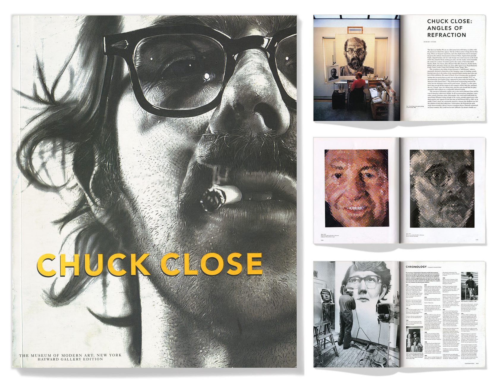
March 8, 2017 — Comments are off for this post.
Cuisipro
[one_half]
3D Design: Branding & INDUSTRIAL DESIGN
Cuisipro
Tools for Cooks.
[supsystic-social-sharing id='1']
[/one_half]
[one_half_last]
We developed a comprehensive product strategy, visual identity program, packaging systems, and various communications and event materials for this premium quality international kitchen tool manufacturer.
[/one_half_last]
![]()

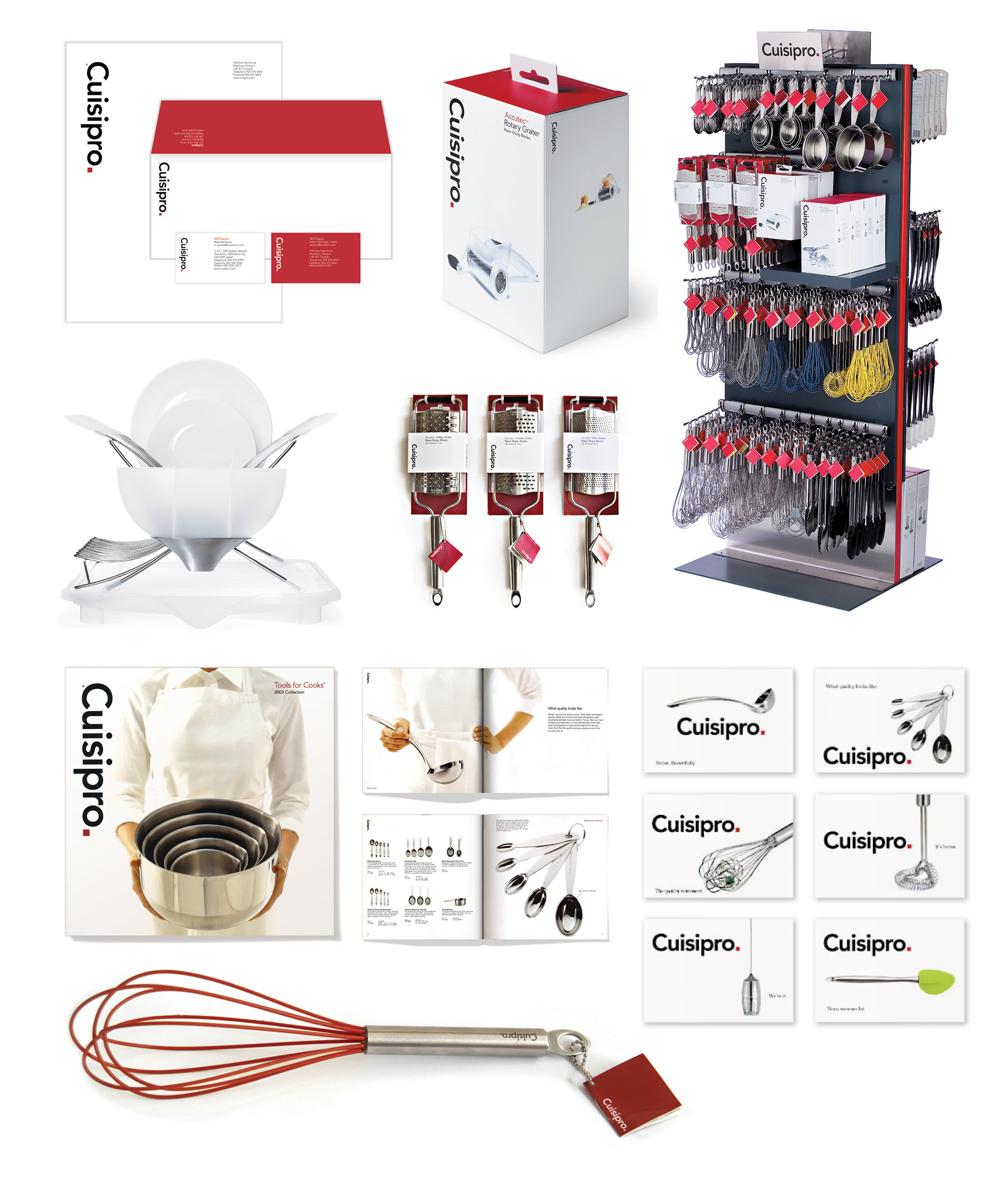
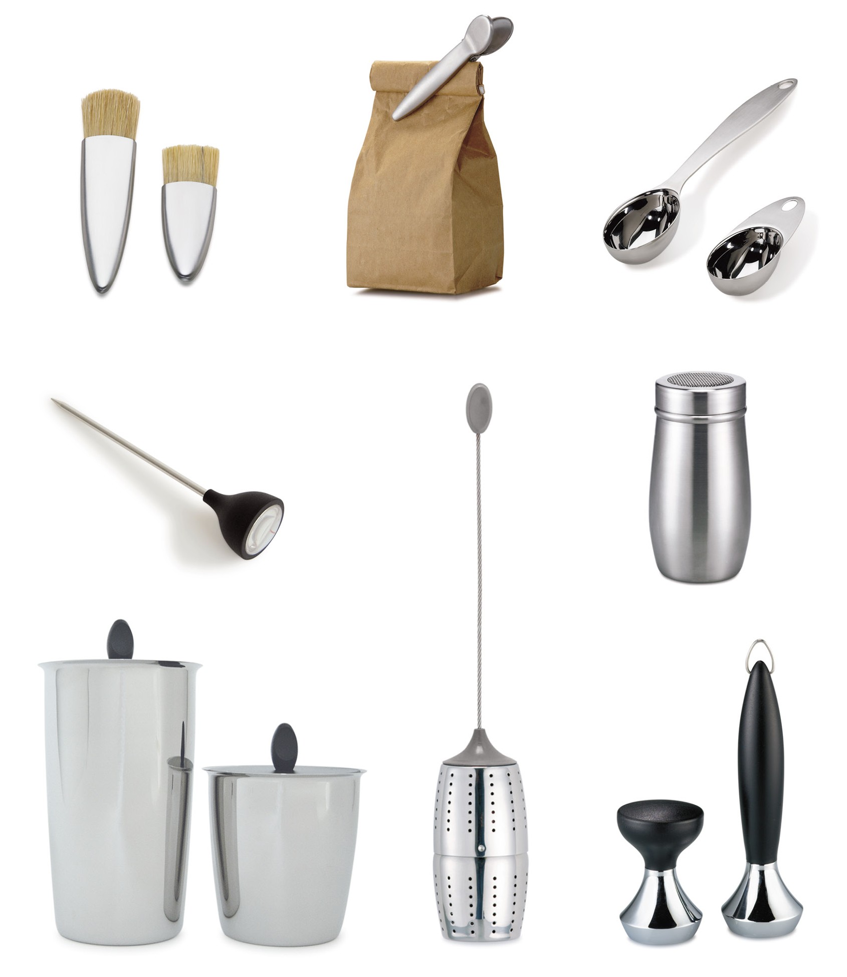
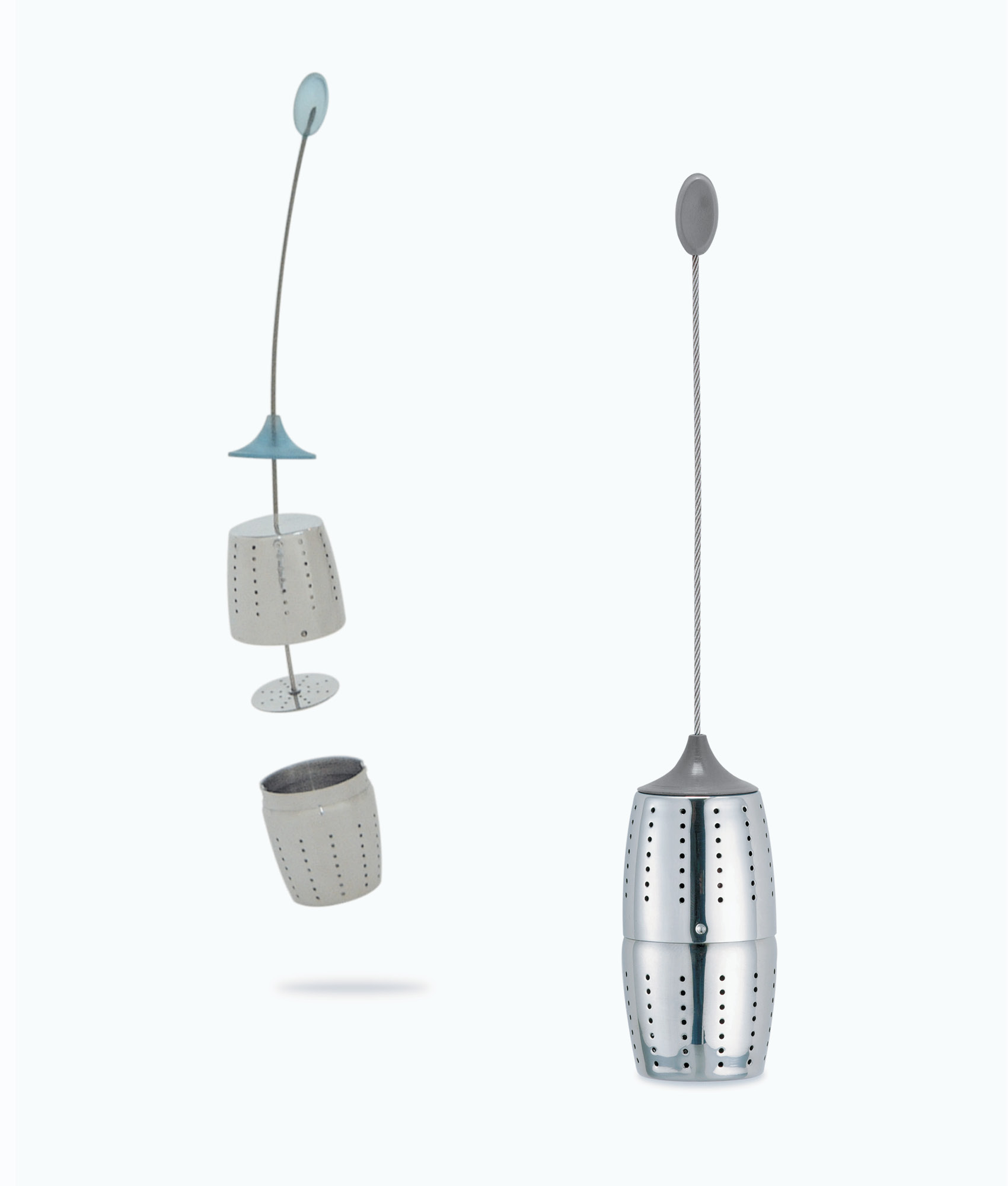

March 7, 2017 — Comments are off for this post.
Cadillac Fairview
[one_half]
2D Design: BRANDING
Markville Shopping Centre
From mall to shopping centre.

[supsystic-social-sharing id='1']
[/one_half]
[one_half_last]
The Markville Shopping Centre brand is about the shopping experience and is driven by a premium, exciting, diverse and branded merchant presence. Clean, contemporary, modern and sleek, Markville provides the backdrop for the successful retail environment created by energetic and highly desired retail tenants.
The Markville brand is key – it demonstrates identity, status, knowledge and worth. It must send the right signals to shoppers and create the draw for shopping “inspiration” and a highly enjoyable experience. The Markville brand sets high standards for quality and performance. It is reflected in the architecture with glass balustrades, skylights and a chic and restrained palette of white, black and gray materials. The Markville graphic identity is built around an elegant custom-designed serif word-mark, supported by a monogram “MV” and repeat black and white pattern. The components of the graphic system set the stage for a refined, tasteful and classical expression of the brand. It captures a common purpose that is at the heart of every great brand.
[/one_half_last]
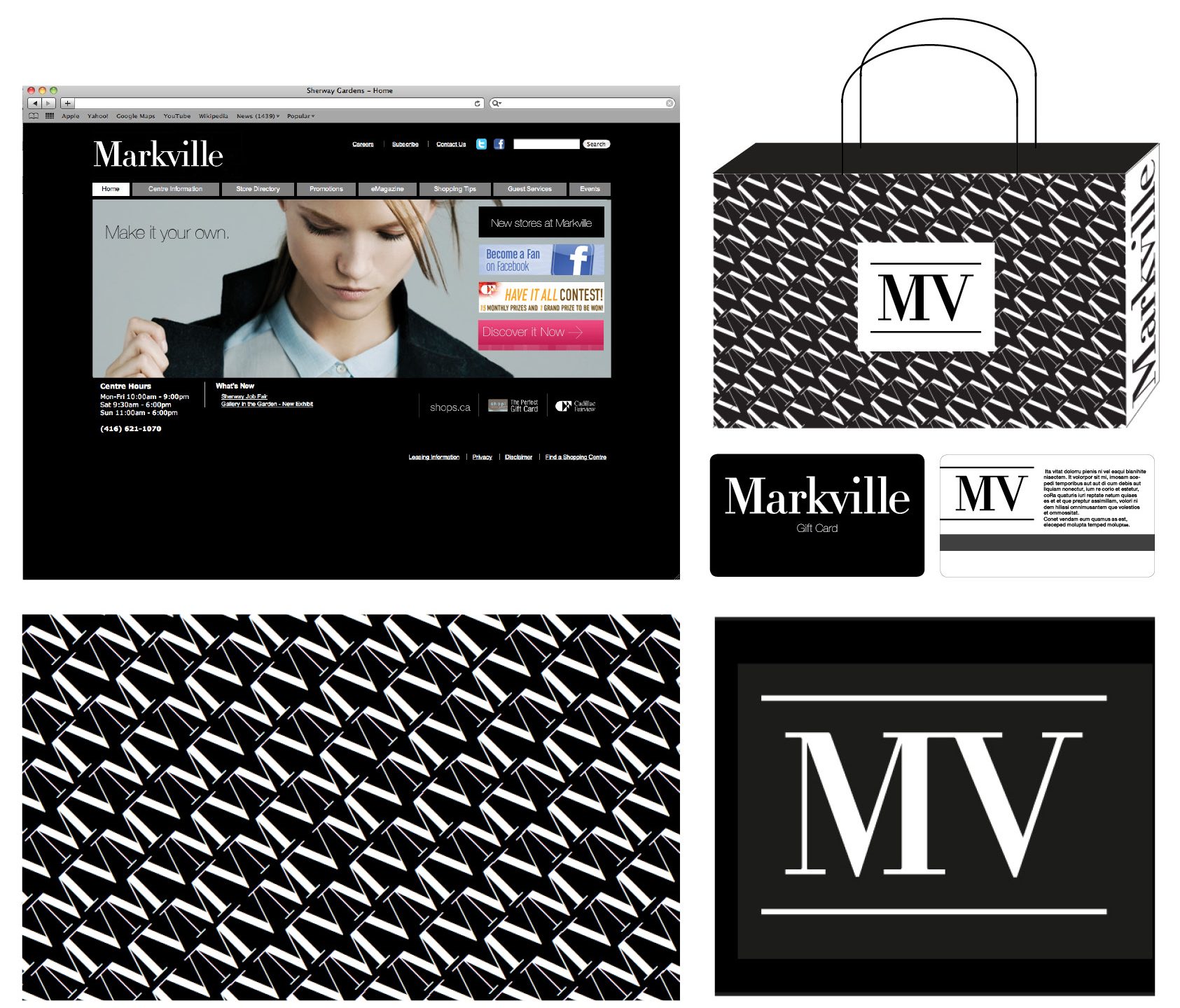
March 6, 2017 — Comments are off for this post.
Waterfront Toronto
[one_half]
2D & 3D Design: Branding
Waterfront Toronto
Amplifying the brand for Toronto's massive redevelopment project.
[supsystic-social-sharing id='1']
[/one_half]
[one_half_last]
Waterfront Toronto is the 3-part government agency that is the steward for the massive waterfront redevelopment of Toronto’s former industrial portlands, which stretch from Leslie Street to Bathurst Ave and beyond. It is one of the largest urban development projects in the world.
Challenge
The general public needed to be engaged. The challenge was fuelled both by a pervasive cynical attitude in the city to the lack of activity and slow progress, as well as the 30+ years that the project will actually need to be completed.
Our Role
In 2010, Waterfront Toronto had a number of urgent and important strategic and branding projects. As Waterfront Toronto’s Marketing Agency of Record, we drove the strategy, content, design and development of seven large communication pieces:
- Reinvigorate and redefine the overall communications strategy through engagement and insight
- Design a revitalized visual identity
- Write key messages
- Infuse the brand with a higher level of design sophistication at all touchpoints
- Create a corporate vision brochure
- Write and direct a corporate video,
- Oversee a major redesign of the Waterfront Toronto website.
The completion of the projects had to be carefully managed to meet deadlines, stay on budget, and coordinate the various writing, design, photography, video, and programming needs.
Objective
Create a cohesive group of brand communication pieces for Waterfront Toronto to engage stakeholders and all Torontonians, to illustrate that things are moving on the waterfront.
[/one_half_last]
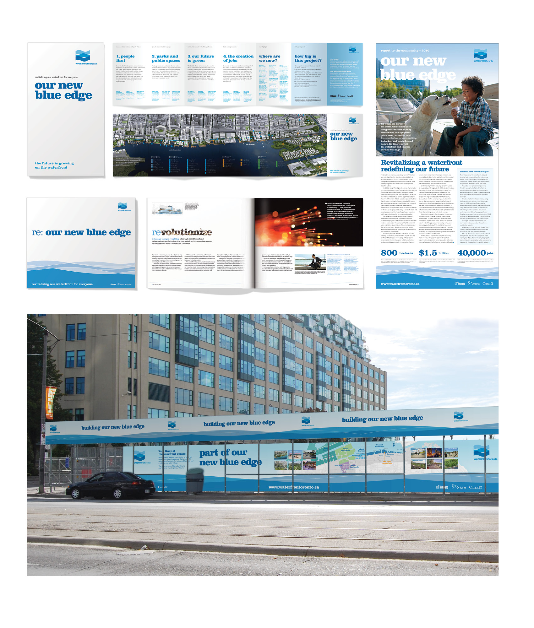
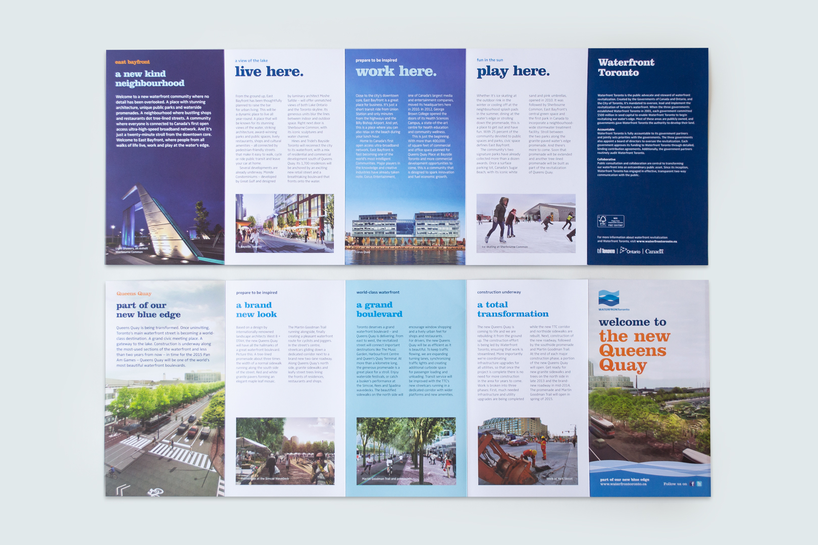
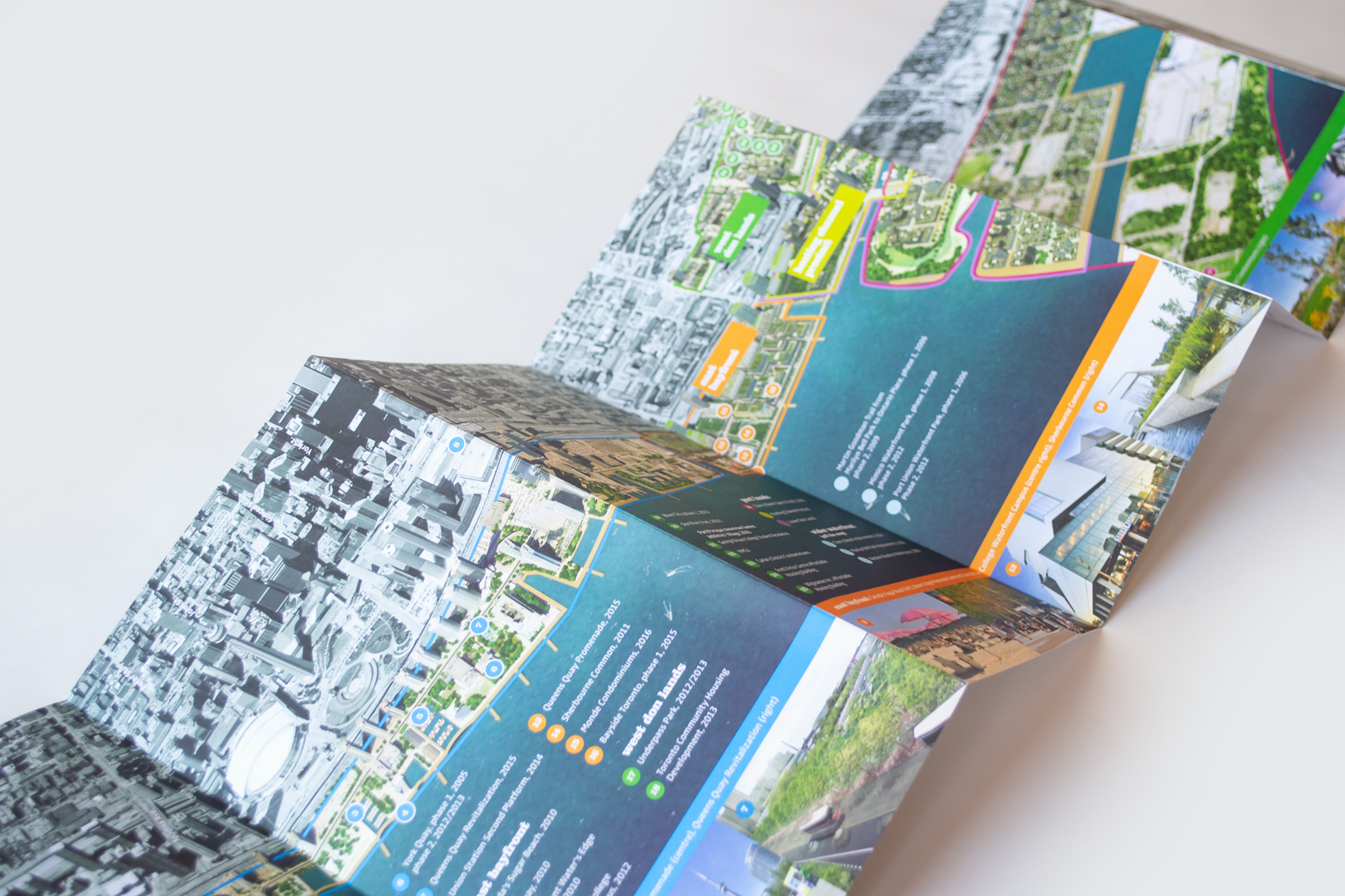
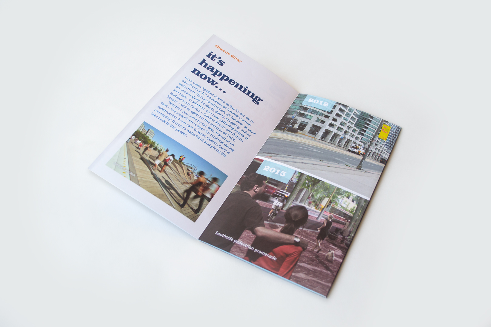
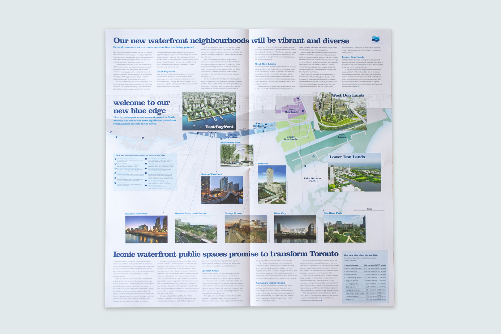
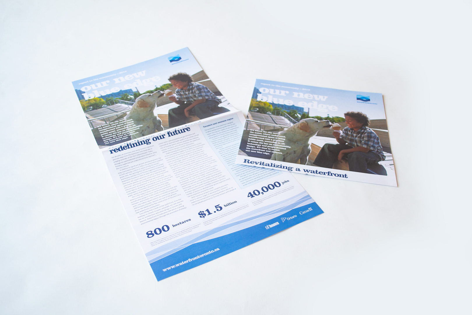
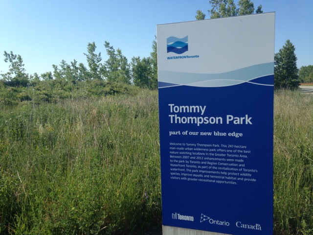
March 6, 2017 — Comments are off for this post.
Western University
[one_half]
2D & 3D Design: Branding
Western University
Applications up 15% over provincial average.
Scope of work
- Research
- Engagement
- Strategy report
- Logo
- Custom typeface
- Visual identity system
- Style guide
- Campaign brand
- Case for support
- Stationery system
- Banners
- Sub-brands
- Print advertising
[supsystic-social-sharing id='1']
[/one_half]
[one_half_last]
Western University previously known as the University of Western Ontario, has a history of success as a leading research and post-secondary education institution since 1878. However, the brand had come to incorporate over 70 different logos, across 13 faculties, each diluting the central message. Western embarked on a brand renewal prior to the launch of its $750,000,000 fundraising campaign. The objective of the rebranding was to reposition the University as globally competitive and nationally one of Canada’s leading schools. This undertaking necessitated significant consultation to ensure a successful transition and campaign, with students, alumni, family and donors.
Our Role and Responsibility.
We conducted research and an audit of the brand. We worked with Western to facilitate extensive engagement with their community. This included 4,995 survey responses, 9 workshops, 154 student iPad interviews and 63 one-on-one interviews. We translated our findings into a design brief and continued to build a collective vision for the new Western identity.
The opportunity identified was to create a visual identity that captured quality and tradition. We reinstated a modified historic shield as the main symbol and developed a custom typeface. The visual identity is an adaptive system, each faculty is able to have it’s own unique wordmark. We developed guidelines for handoff to the Communications Department, and the 13 faculties.
Spring 2014 numbers are impressive with applications up 15% over provincial average and International Student applications up 5%.
[/one_half_last]



March 5, 2017 — Comments are off for this post.
What is Foresight?
[one_half]
THINKING
What is Foresight?
"The future is already here - it's just not very evenly distributed."
William Gibson
[supsystic-social-sharing id='1']
[/one_half]
[one_half_last]
“Foresight” forms around a disciplined formal structure to create and maintain a high quality, coherent and usable view of the future, and to use the insights arising from that view in productive ways. For example Foresight can be used to detect future opportunities or markets as well as adverse conditions, possible barriers to innovation, or changes to an operating environment. Foresight can guide strategy, shape policy and be used to develop new opportunities, resources, markets, products and services. In short. it sets the stage for innovation.
How do you identify risks and opportunities for growth in a world of constant change?
Risks and Opportunities
The future is not entirely predictable, but uncertainty is navigable. An organization sensitized to relevant emergent trends in Society, Technology, Politics, Economics, Ecology, and shifts in Values and culture (STEEPV), is one that can be resilient and adaptable. Change happens quickly. Identifying which indicators to monitor and understanding their implications for your organization builds your strategic advantage.
Our Approach
Our approach to Strategic Foresight includes a full spectrum framework to ensure bias is avoided and to include the full peripheral view. We use participatory engagement to build capacity and clarify purpose within your organization. We use “farsight” to look into emerging possibilities. We use “nearsight” to identify likely intersections of consequence in the near future. We look at your present to establish challenges and potential. And finally, we look at your past to understand context and history.
We don’t predict the future. We do help you understand what scenarios are preferable, possible and probable. We believe that forewarned is forearmed.
Find Weak Signals of Change
We use a methodical research approach to identify trends that are likely to specifically pertain to your sector. We distill both our understanding of the environment surrounding your activity and the “weak signals” of change on the far horizon. We detect groundswell shifts in perception, behaviour and worth as you grapple with uncertain times in a continuum of change. Using these findings, it is possible to create plausible scenarios of the future, both positive and negative, and measure their implications for the evolving opportunities of your business in the competitive landscape and society
at large.
[/one_half_last]
March 3, 2017 — Comments are off for this post.
SynapTek Surface
[one_half]
3D DESIGN & INSIGHT
SynapTek Surface
This self-powered product conserves energy by learning about the habits of its users.
[supsystic-social-sharing id='1']
[/one_half]
[one_half_last]
The SynapTek Surface transforms a building into an intelligent organism. It is a physical interface between office space users and the technology that surrounds them (environmental systems, lighting systems, information technology systems). This self-powered product conserves energy by learning about the habits of its users. For example, what if your office was able to learn that:
- You usually don’t power up the computer until 1/2 hour after you’re in the office…
- Your preference for lighting is low except when there are more than two people in your space...
- You’ve left for the day and everything should be powered down…
- There is an emergency in your building. The SynapTek floor tells you which exit route to use…
By linking a sophisticated pressure activated sensor surface with software 'intelligence' the SynapTek Surface allows a building to become aware of its inhabitants. By merely walking across the floor the 'user' of a room communicates with the system. It ‘feels’ a user’s steps and converts them into pattern data. By linking this data with the data from a building’s systems the SynapTek Surface collects knowledge about users’ habits. Over time, the system recognizes patterns of activity, and can anticipate the needs of its users.
As an employee walks through the work space, the floor system would sense their presence, through electrical signals being generated by their footsteps, and start turning on necessary electrical systems, computer, lighting and even environmental systems. Upon departure, the system would recognize that these technologies are not needed and, based on knowledge about the user, would initiate a 'shut down' sequence. Spaces that are rarely used (e.g. storage rooms) are cut off from power hungry systems until entered. Spaces of fluctuating use (e.g. the photocopier room) are supplied resources based upon public use patterns. Areas of consistent use are supplied resources based on prior use patterns to maximize comfort while minimizing waste.
For more information, please contact Gary Abric.
[/one_half_last]
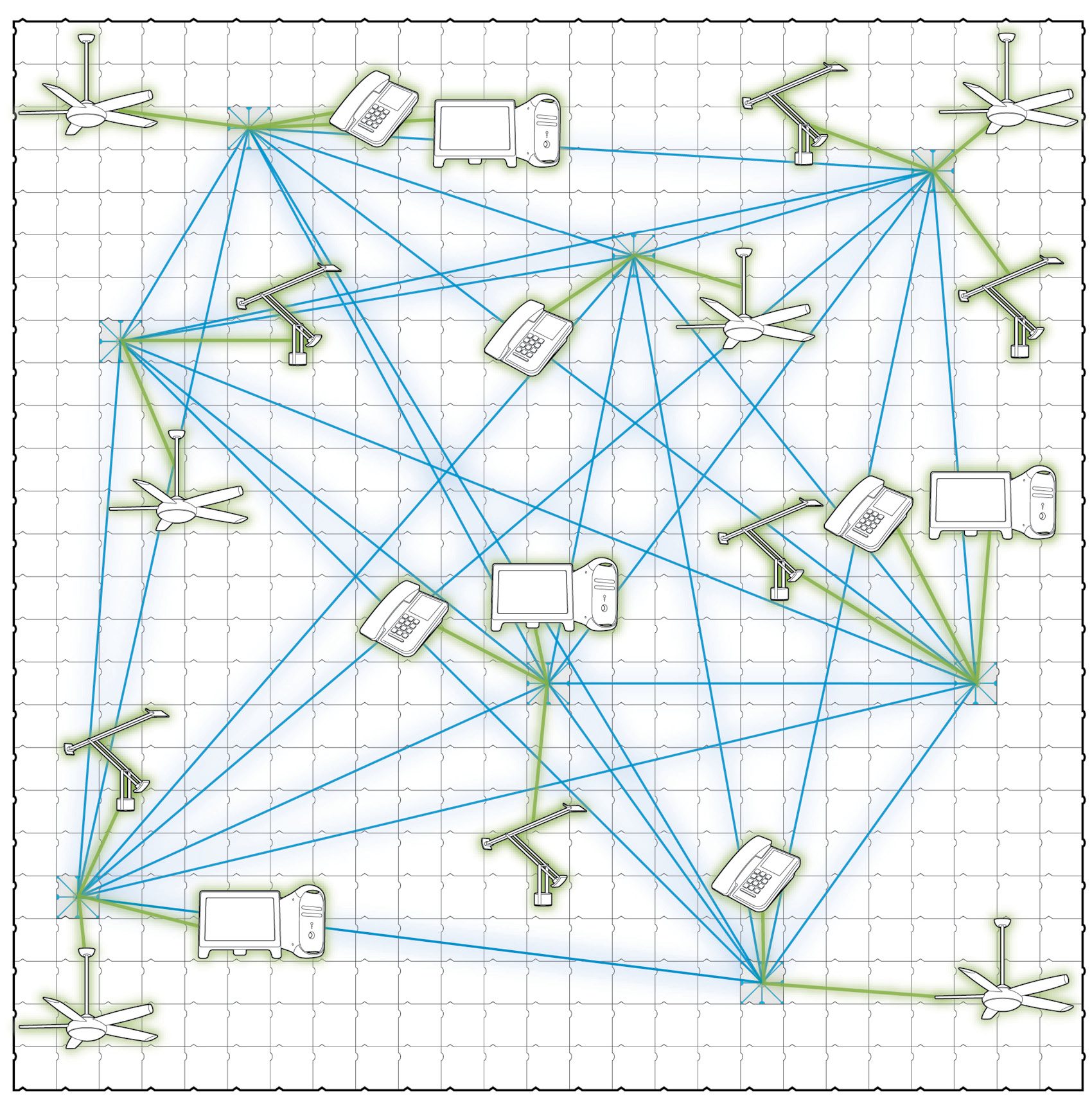
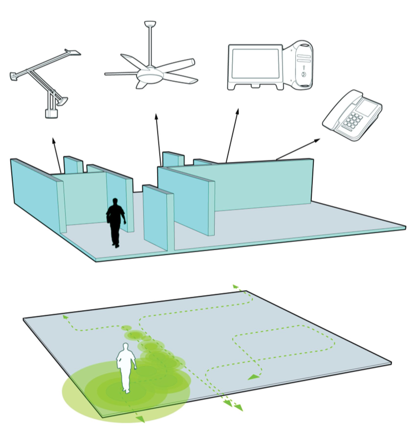
March 3, 2017 — Comments are off for this post.
United Way
[one_half]
Insights & Foresight
The Future of Philanthropy
Not all return on investment is measured
in dollars.

Scope of work
- Horizon Scan
- Scenario planning
- Trends impact analysis
- Engagement
- Strategic implications
[supsystic-social-sharing id='1']
[/one_half]
[one_half_last]
United Way Centraide Canada is a not for profit national organization for over 100 autonomous, local organizations across the country. Each United Way office raises money for local groups that address community issues and problems such as poverty, homelessness and at-risk families. The national organization provides leadership, resources and co-ordination to its members. Each United Way Centraide is responsible to its own community, raising the resources and distributing it back to their community.
Not all return on investment is measured in dollars. Reputation, resilience and relevance are all critical outcomes of investing in strategic thought and planning.
In order to effectively deliver on its essential mandate through turbulent and rapidly shifting economic and social conditions, the United Way movement required deep understanding of the future of philanthropy and the role of funding agencies.
For United Way Centraide we conducted a ten year Horizon Scan to uncover critical uncertainties within the landscape of the not-for-profit sector including significant changes in donor motivation, technology related to service distribution and message targeting. This work involved deep research and facilitated engagement of key stakeholders.
We met with senior leaders in the government, police, business, faith-based institutions and community organizations in a fulsome and deeply investigative process. We workshopped emerging insights with a group of national leaders within the United Way movement.
We delivered a significant 80-page report and three comprehensive presentations of our findings to senior leadership nationwide, bringing future-focused research into practical application for present day problem solving.
We identified 28 trends and implications on a local and international context that went into shaping United Way’s strategic planning.
[/one_half_last]
March 3, 2017 — Comments are off for this post.
Scotiabank
[one_half]
Foresight & Insight
Looking at Transforming Markets
To continue growing and adapting through turbulent and rapidly shifting economic and social conditions, Scotiabank required a deep understanding of the future of a new market sector.
![]()
Scope of work
- Horizon Scan
- Scenario planning
- Trends impact analysis
- Engagement
- Strategic implications
[supsystic-social-sharing id='1']
[/one_half]
[one_half_last]
Scotiabank is the third largest bank in Canada by deposits and market capitalization. It serves 19 million customers in 55 countries and offers a broad range of services including personal, commercial, corporate and investment banking. It has assets of over $750 billion.
In order to continue to grow and adapt through turbulent and rapidly shifting economic and social conditions, Scotiabank required deep understanding of the future of a new market sector. We were asked to outline possible realities for both Scotiabank and a particular group of Canadians ten years into the future. This work involved deep research and facilitated engagement of key stakeholders.
The research, workshops, reports, discussions and material we provided prepared Scotiabank for a more detailed examination of some of the characteristics of three personified customers (‘personas’). We investigated the impacts of potential futures on their lives and their banking needs, and specifically how that might provide opportunities Scotiabank’s banking offerings.
It was important for Scotiabank to suspend their objections as to whether or not the future would unfold exactly as described in the narratives we outlined. We used logical constructs as a tool to imagine how things might be different in the future. We looked for opportunities and threats to Scotiabank’s business through the lens of human centered changes in behaviour, values and social systems.
We met with 20 senior leaders at the bank in six different departments. We interviewed 40 representative customers in person or by phone. We conducted 2 highly successful workshops, analyzed significant quantitative data and created data visualization tools that identified several key insights.
We delivered a 90 page written report and gave three presentations of our findings to senior leadership. The report provided the groundwork to explore innovative approaches to the development of new and appropriate products, services and spaces to meet the potential future needs of the identified market sector with respect to their financial well being and their changing lives.
Strategic alternatives to current practice were uncovered that will allow the bank to expand it’s offerings and better serve this transforming segment. This will mean that Scotiabank is preferentially positioned to gain traction with this audience.
[/one_half_last]
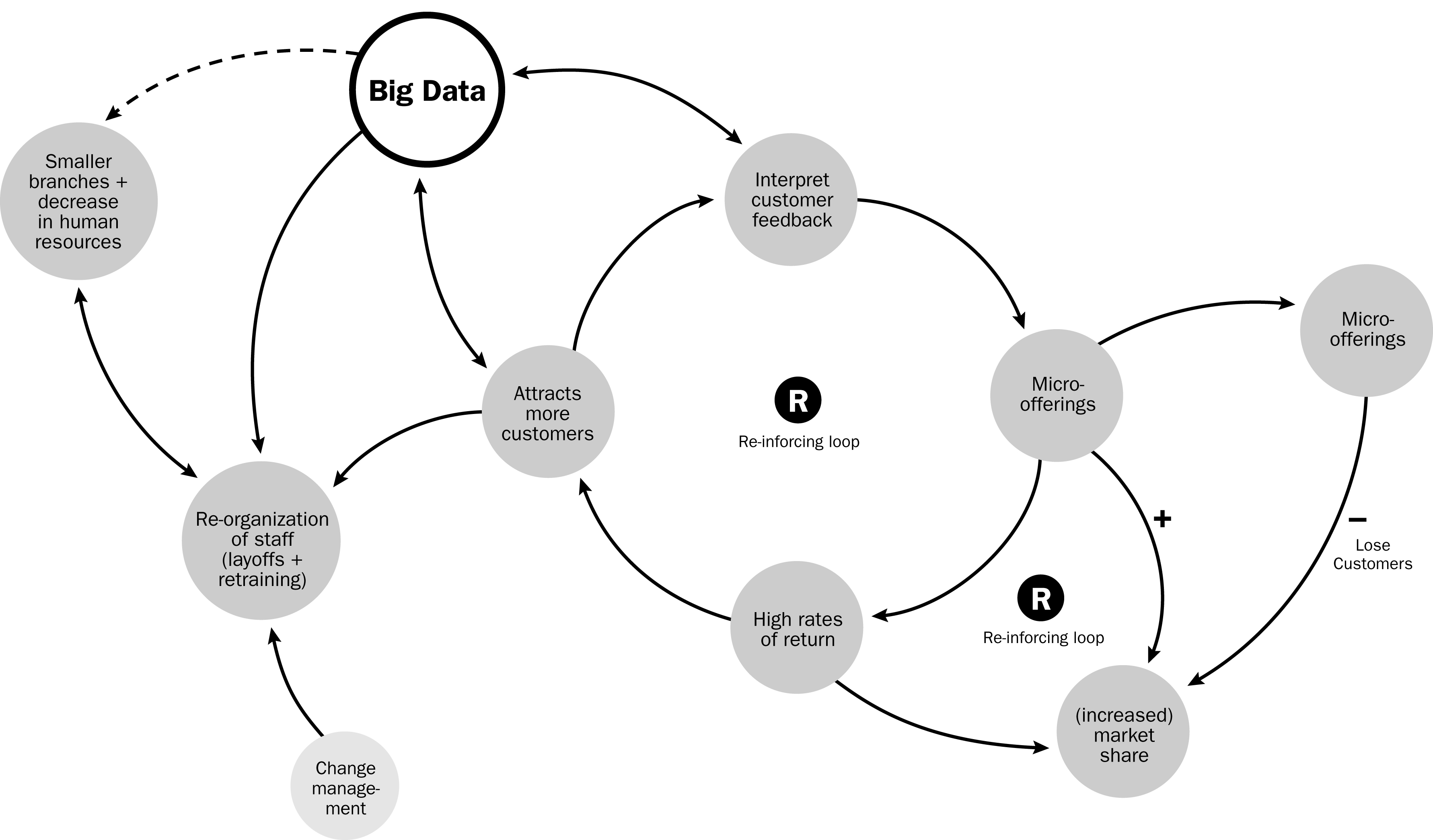
March 3, 2017 — Comments are off for this post.
Pinecone Lamp
[one_half]
3D Design
Pinecone Lamp
Our ongoing explorations with material scientists help us arrive at unexpected solutions.
[supsystic-social-sharing id='1']
[/one_half]
[one_half_last]
The Design Challenge
When we start with “what if?” we usually get to “here’s how.” Pinecones open up their scales in the heat of a forest fire to release the seeds that will grow a new tree. What if the heat of light could open a lamp to release light into a room? We used heat sensitive bi-metallic muscle wire to shift the levers attached to wooden fins and created a lightscape.
(Winner of Off/Cut: Best of Canadian Wood Design 2005)
[/one_half_last]

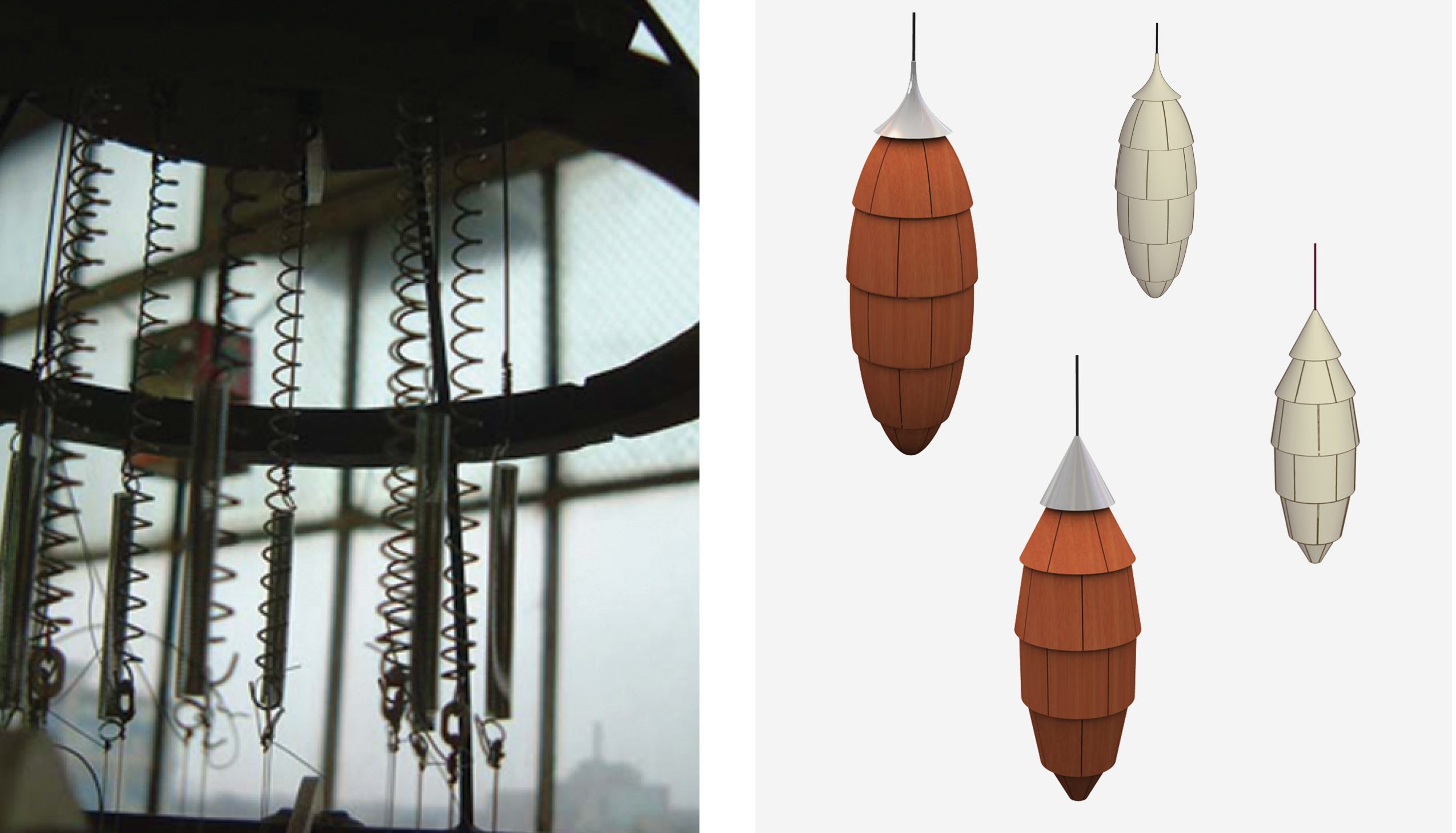
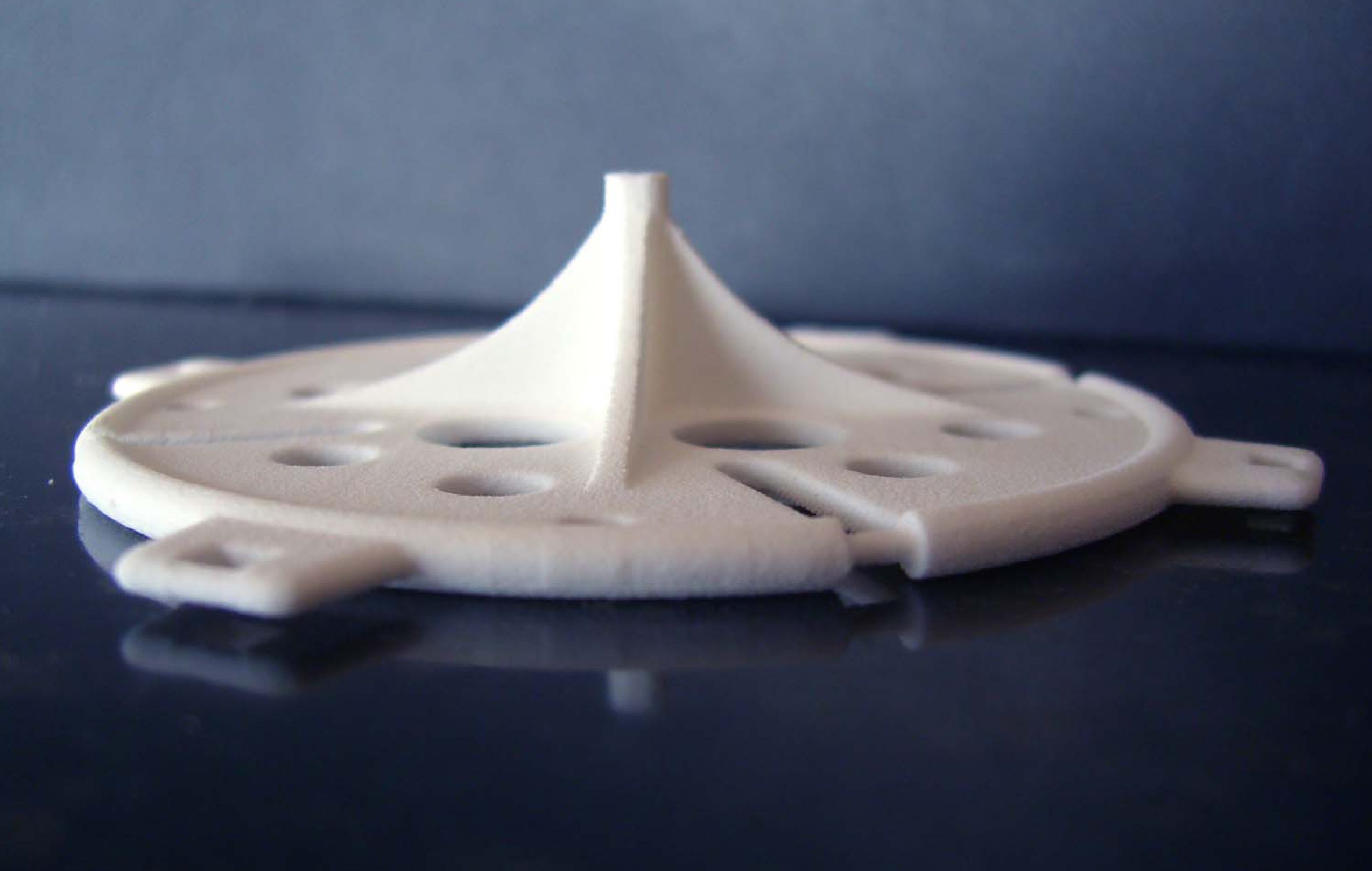
March 2, 2017 — Comments are off for this post.
Harvard University, Graduate School of Design
[one_half]
2D & 3D Design: BRANDING
Harvard University, Graduate School of Design
Harvard Design School is one of the world’s great architecture and design schools. We worked closely with them to create a differentiated brand that addressed both the traditional and innovative aspects of the school.
Scope of work
- Logo and wordmark
- Stationary
- Recruitment Poster
- Calendars
- Magazines
- Invitations
- Banners
- Catalogues
- Harvard Design Institute
[supsystic-social-sharing id='1']
[/one_half]
[one_half_last]
The Design Challenge
The “GSD”, or Graduate School of Design, presented itself in a very formal and traditional way. As we engaged with the GSD on a recruitment piece it became apparent that a fairly radical repositioning would be beneficial to their profile in the highly competitive marketplace of international architecture education graduate programs.
Engagement and Insights
We worked closely with leadership, management, faculty, staff and outside consultants in a highly collaborative and iterative process to build a design strategy and brand architecture that could be applied across a wide variety of channels and media. We researched the competitive landscape and did an audit of current materials. We discovered that it was important to leverage the name of Harvard in colloquial use to identify the school in a larger global context. There was also much discussion around the school’s position – noted for the best of both traditional design and contemporary thinking.
The school had important brand architecture considerations with 3 departments: Architecture, Landscape Architecture and Urban Design and Planning and important stakeholders and prestigious faculty. Significant time and effort was put into colour studies to create a palette to complement the traditional Harvard crimson.
Our Role and Responsibility
Along with a new logo and wordmark, we developed a strategy and larger vision for the new positioning. This included a complex kit of admissions forms, cards and envelopes. We designed a multi-tiered stationery system accommodating three departments and numerous endowed chairs. We created a style guide for the ongoing implementation of the identity. We also redesigned the “GSD News” (a newsletter-format journal) as “Harvard Design Magazine”. Formerly available only to the design school community, it was made available by subscription and on newsstands.
[/one_half_last]
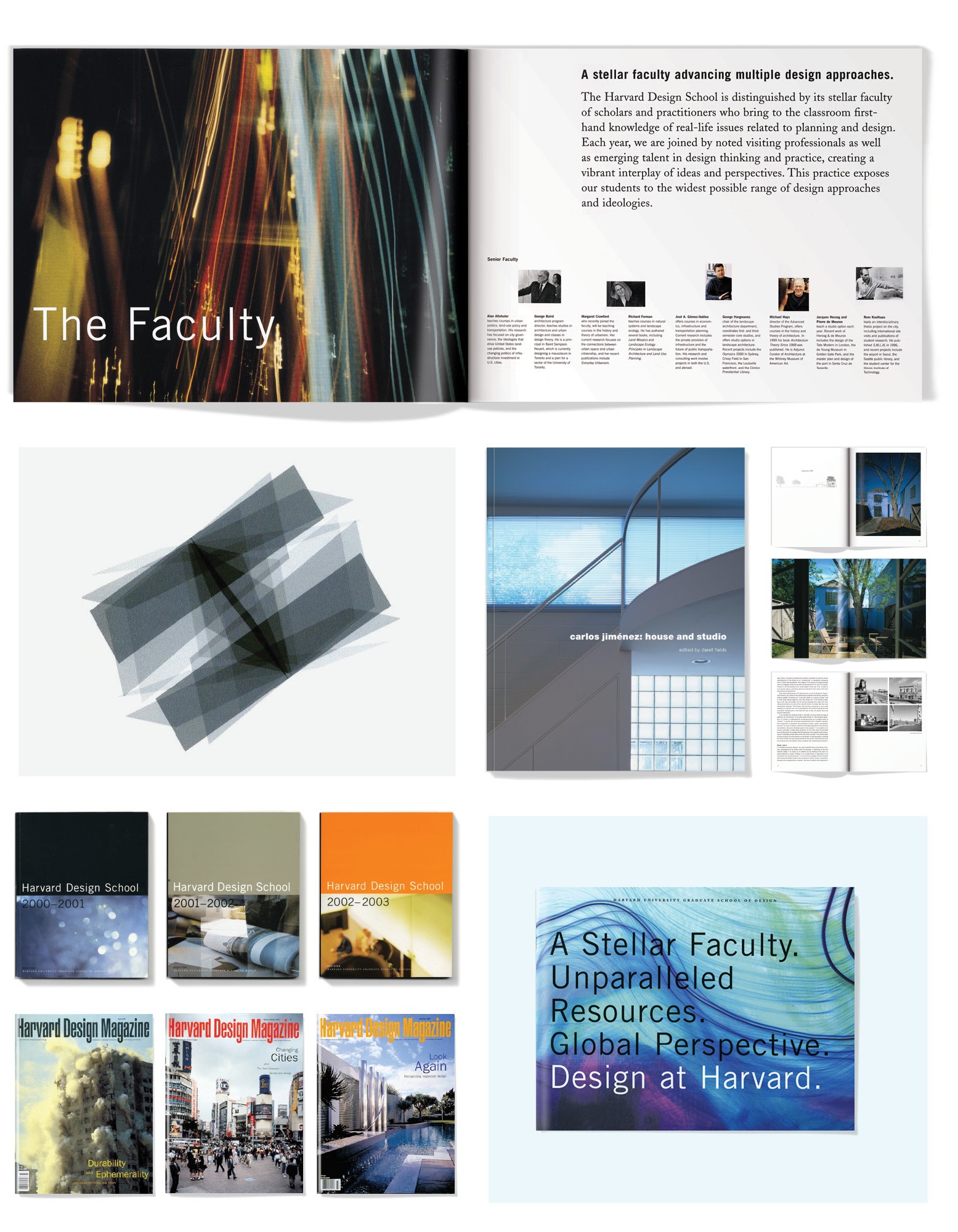
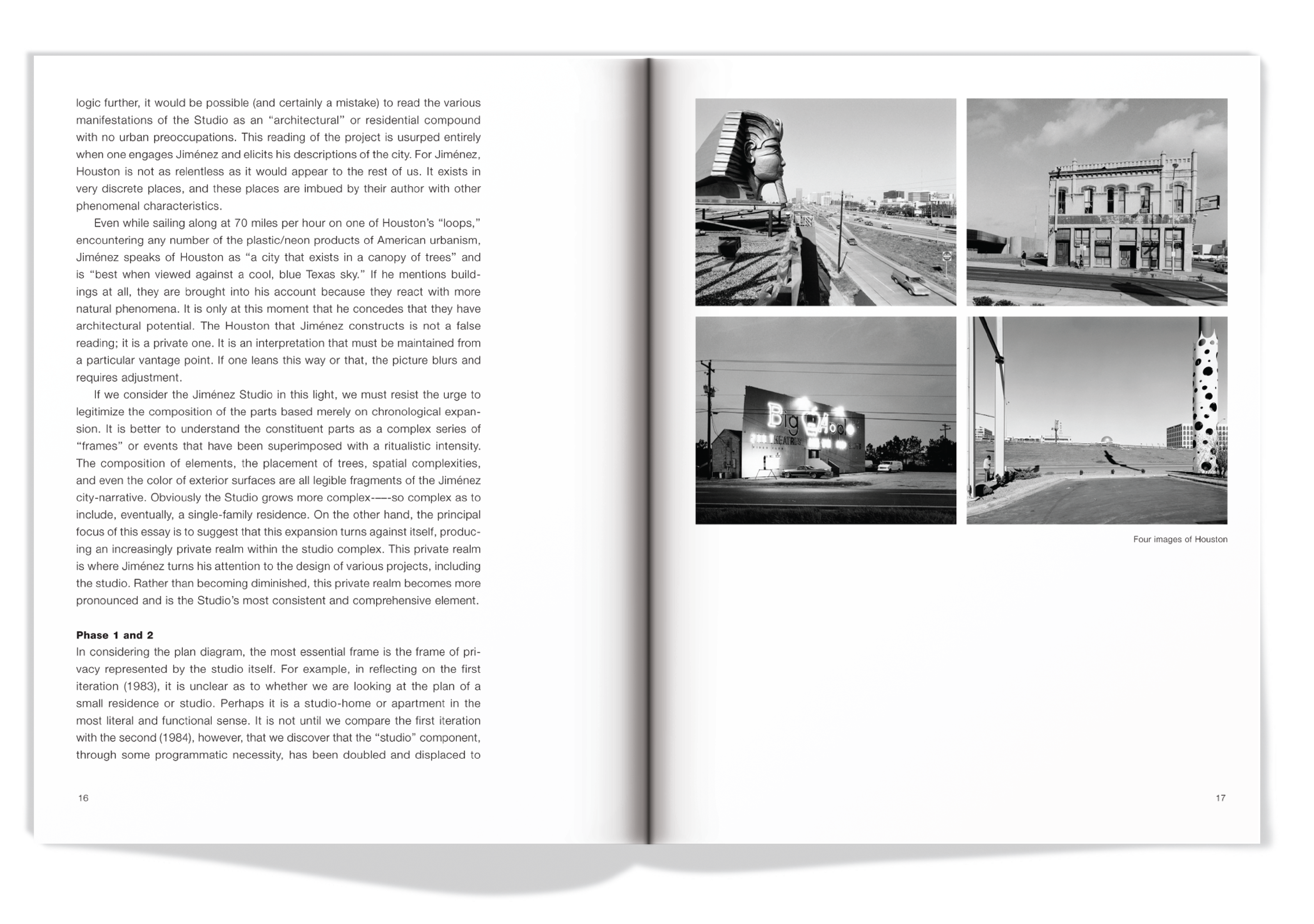
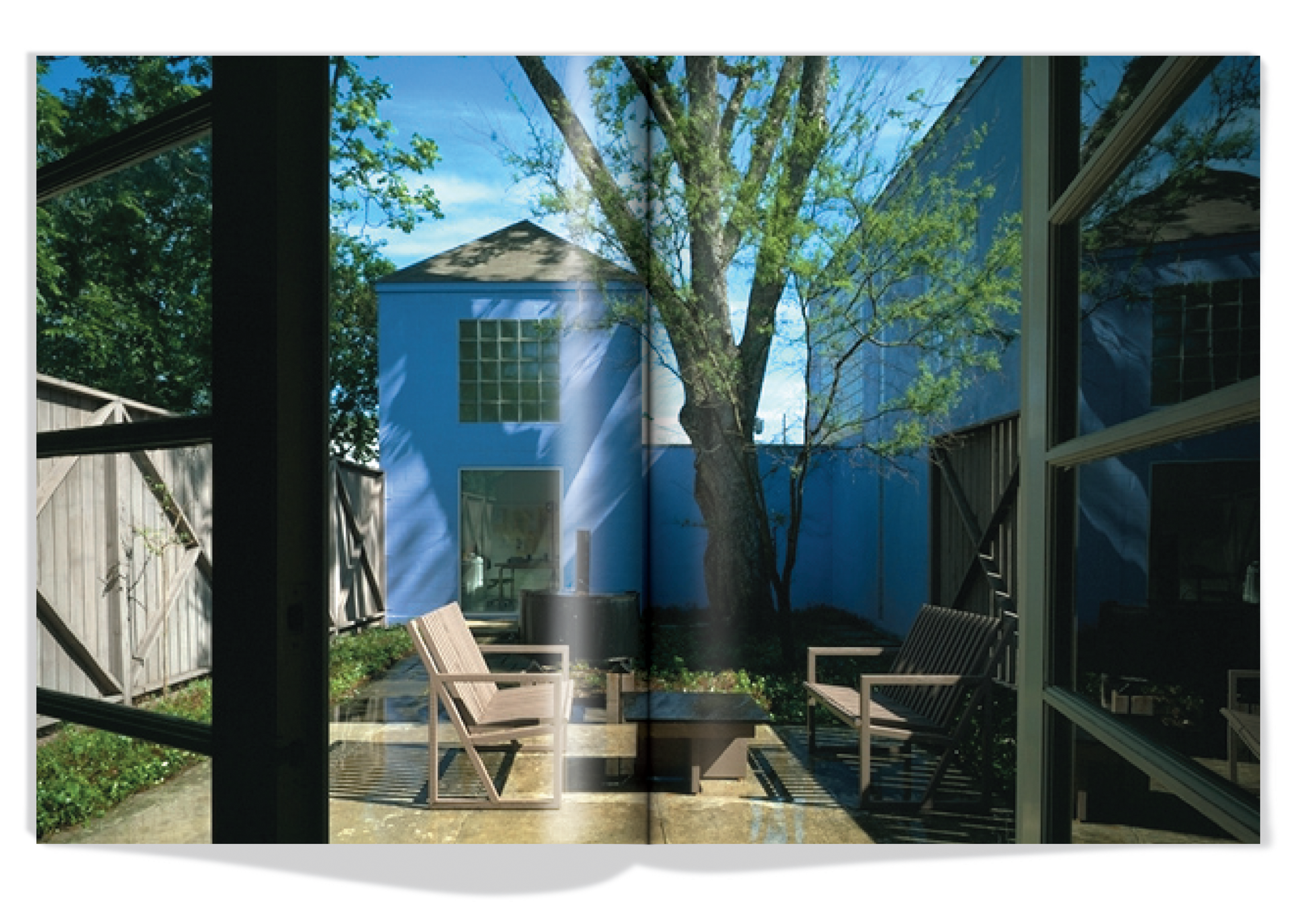
March 2, 2017 — Comments are off for this post.
Ontario College of Teachers
[one_half]
Foresight
The Future of Professional Self-Regulatory Bodies
The world of self-regulation is evolving as rapid, systemic and turbulent changes impact professionals and the bodies that certify, discipline and set standards for their practice.

Scope of work
- Horizon Scan
- Scenario planning
- Trends impact analysis
- Engagement
- Strategic implications
[supsystic-social-sharing id='1']
[/one_half]
[one_half_last]
The Ontario College of Teachers is the regulatory body that licenses, governs and regulates 190,000 teachers in the province of Ontario. The world of self-regulation is evolving as rapid, systemic and turbulent changes impact professionals and the bodies that certify, discipline and set standards for their practice. The Ontario College of Teachers commissioned KerrSmith to describe possible, plausible futures as a tool for resilient planning and strategic visioning.
With a view to better understanding the context of self-regulatory bodies, the KerrSmith team conducted a scan across diverse news and information sources (from both the public and private sectors), looking for “weak signals” of discontinuous change. Analysis of the research findings, trends and drivers of change were then collected, organized and prioritized.
In order to understand the needs of self-regulatory bodies, we conducted a series of interview with thought leaders across the globe. In addition to validating our initial research findings, interviews helped to raise new issues for consideration. Armed with a deeper understanding of needs and emergent regulatory issues, the team created three human centred narratives to position alternative scenarios of both positive and negative possibilities. These were accompanied by representative stakeholder personas, which explored the needs of professionals, regulators and the public in each scenario.
Analysis of the possible human centred narratives in a workshop with representatives from various sectors brought forth a wide range of potential implications that could affect the self-regulator space quite immediately.
Finally, we delivered a 103 page document that encompassed an extensive trends and driver report, human centered narratives and personas, backcasts, future systems maps and detailed implications for the broad and multi-disciplinary professional self-regulatory sector. The final report formed the basis of a one hour presentation at the College’s international conference on regulation, which takes place in Toronto every four years.
[/one_half_last]
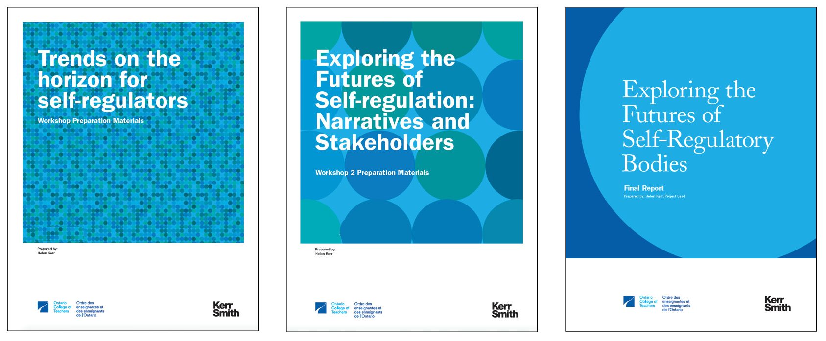
March 1, 2017 — Comments are off for this post.
Gourmet Settings
[one_half]
2D & 3D DESIGN: PRODUCT & PACKAGING
Gourmet Settings
Get set.
[supsystic-social-sharing id='1']
[/one_half]
[one_half_last]
We created a comprehensive program of research, product design, environments, branding, identity communications and package design for the tabletop industry’s most innovative company. Gourmet Settings has set standards as the leading and most emulated design driven company in the industry. A focused and differentiated design system provides the flexibility needed to sell GS products in a variety of retailers from Bloomingdales to Wal-Mart.
[/one_half_last]

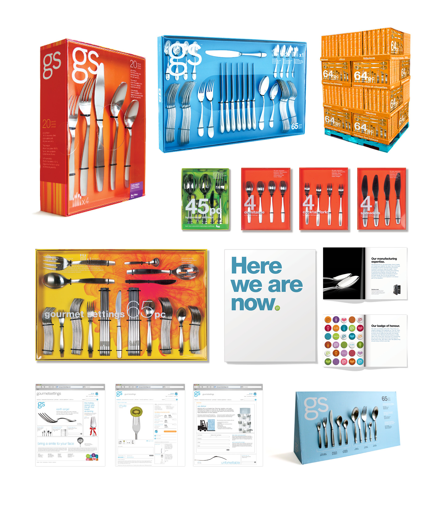

February 18, 2017 — Comments are off for this post.
Oxford Properties
[one_half]
2D & 3D DESIGN: SIGNAGE
Oxford Properties
Signage and rebranding for a major architectural renovation.

[supsystic-social-sharing id='1']
[/one_half]
[one_half_last]
We renamed and rebranded the Richmond Adelaide Centre in the core of downtown Toronto. Oxford Properties wanted a distinct signage system that would unify the 5 buildings as part of the $350 million architectural renovation.
We identified the architectural legacy of 111 Richmond - designed by early Modernist Peter Dickinson and created the narrative and marketing materials that secured Google as the tenant.
[/one_half_last]
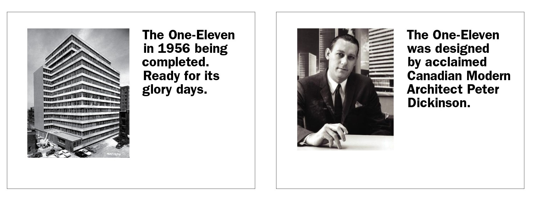
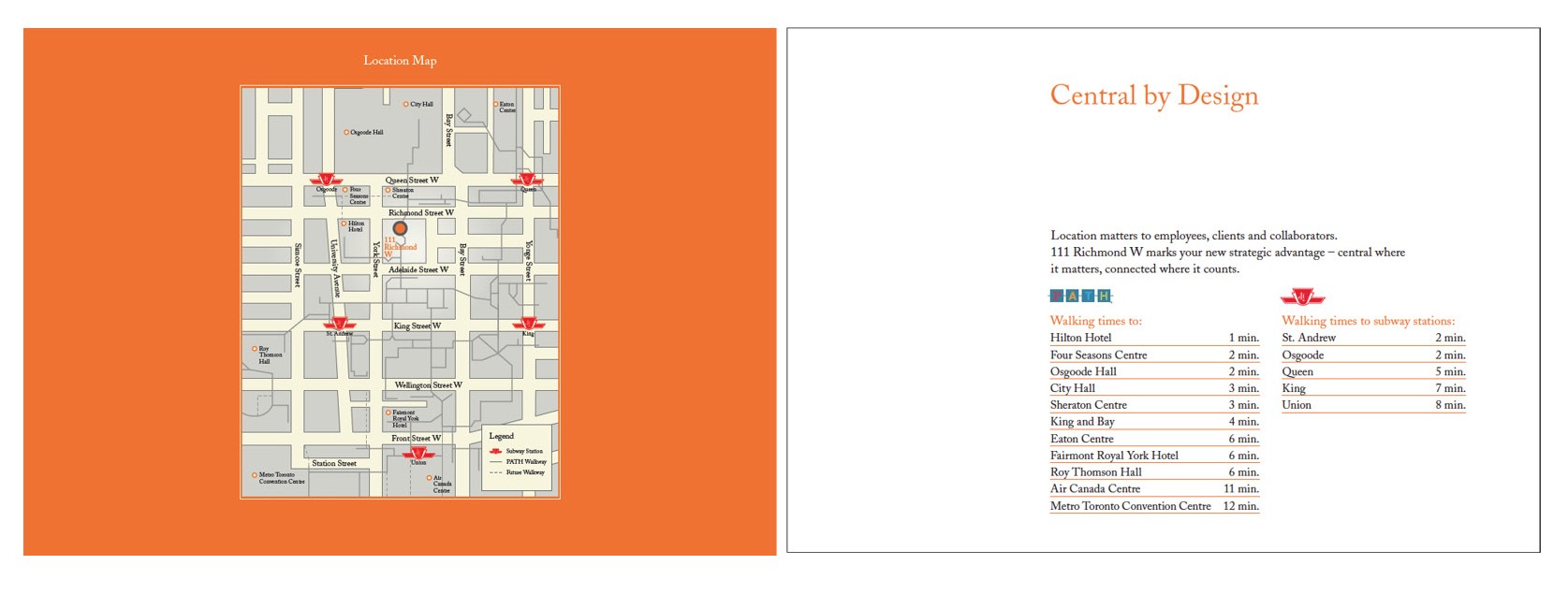
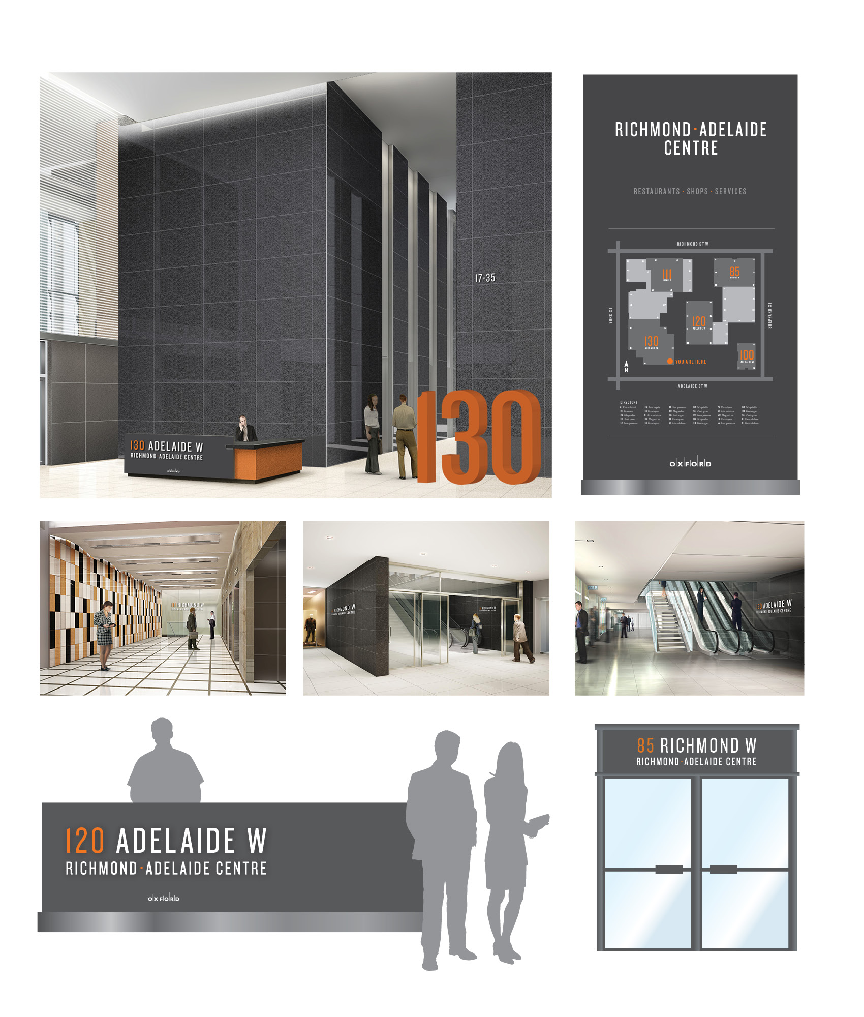
February 16, 2017 — Comments are off for this post.
Government of Ontario
[one_half]
Foresight
Economic Futures for Ontario
The primary objective of our Foresight work for the Government of Ontario’s Economic Futures project was to foster organizational learning and guide decision-making through the structured investigation of alternative futures.
Scope of work
- Horizon scan
- Scenario planning
- Trend impact analysis
- Engagement
- Strategic insight
- 120 page report
[supsystic-social-sharing id='1']
[/one_half]
[one_half_last]
The primary objective of our Foresight work for the Government of Ontario’s Economic Futures project was to foster organizational learning and guide decisionmaking through the structured investigation of alternative futures. To reach this goal, our foresight facilitators and analysts made use of a variety of methods to leverage evidence, expertise, interaction and creativity. Among the methods used were Horizon Scanning and Scenario Planning. We systematically explored the external environment to better understand the nature and pace of change affecting policy at the provincial level. This allowed for the identification of potential opportunities, challenges and likely future developments.
The team worked individually and collaboratively to scan across diverse news and information sources (public and private), looking for “weak signals” of discontinuous change. Through the analysis of the findings, patterns were detected which were critical in identifying the trends and drivers of change for the next step in the scenarios process.
From the analysis of the research findings, trends and drivers of change were collected, organized and prioritized. A deck of significant trends was compiled and impact analysis was conducted. This analysis was a forecast that examined the cause, nature, potential impact, likelihood and speed of arrival of emerging issues or change. Trend Impact Analysis looked at the envelope of possibilities that deviated from the expected norm. This information is being used for strategic planning, scenario planning and policy option analysis.
The first phase of the work developed a long-term vision of Ontario’s economy. The research was extensive and farreaching. We identified changes on the horizon and painted possible future scenarios to guide present day planning. To obtain the most comprehensive information we used a broad range of internal and external stakeholders. Over 250 people participated in this significant endeavour.
The purpose of this work was to increase capacity within Ontario Public Service for the development of innovative strategies, programs and policies that will guide and support a thriving Ontario economy over the next 10 to 20 years. The tools we developed, and the broad engagement we facilitated, touched hundreds of members of the OPS and external stakeholders, crossing ministerial boundaries and creating a foundation of common understanding.
[/one_half_last]
February 16, 2017 — Comments are off for this post.
Lawrence S. Bloomberg Faculty of Nursing
[one_half]
2D DESIGN: PROMOTION
Lawrence S. Bloomberg Faculty of Nursing
Strategic Admission, Promotion Recruitment and Brand Communications

[supsystic-social-sharing id='1']
[/one_half]
[one_half_last]
For one of Canada’s leading schools of nursing, our strategy, brand toolkit, photography, main messages and key recruitment and promotional materials created an emotional connection for stakeholders to see nurses as personable, confident and professional. Our work helped build a 35% increase in applications.
The Design Challenge
The Faculty of Nursing at the University of Toronto wanted to use strategy, consistency and discipline to communicate their leadership in nursing education. They specifically wanted to highlight their various programs, departments and facilities, and forefront important faculty members. It was also important to create a design strategy that linked with the over-arching University of Toronto design style and blue brand.
Insight
We looked at the landscape of nursing education in Canada. Our research and engagement revealed that the faculty was missing the opportunity to project a friendly, diverse and real face to prospective students, faculty and alumni. We also discovered, the complexity of Bloomberg’s offerings required organization, infographics, clear typography and good writing to clarify the main messages.
Image and Text
The slogan “First in Nursing” boldly states the confidence of the faculty. Fundamental to the strategy was our new image library. We art-directed an original portfolio of 25 photographs, which we used on the website, brochure, e-cards, postcards, posters, PowerPoint presentations, advertisements and website template. The portraits deliver a friendly professional message that reflect the diversity of the faculty and students. We chose an orange accent colour to complement the U of T blue and precise typography was used throughout. We employed editorial design techniques in a system of carefully tiered messages to give readers a compelling, accessible and engaging read.
Results
A 35% increase in applications to the Faculty of Nursing were achieved in the first year.
[/one_half_last]
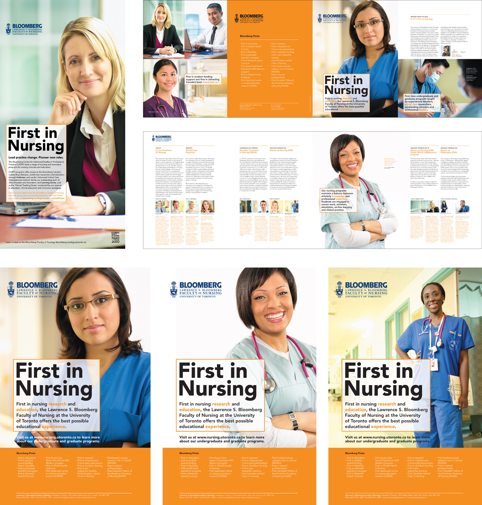
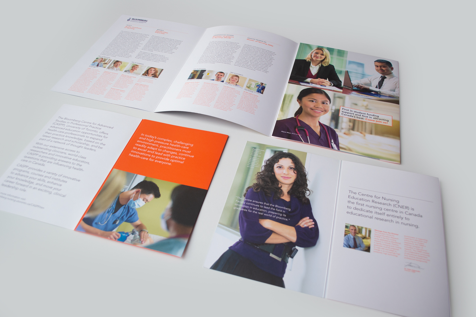
February 15, 2017 — Comments are off for this post.
Canadian Opera Company
[one_half]
2D DESIGN: PROMOTION
BAM
A unique fundraiser for the
Canadian Opera Company.
[supsystic-social-sharing id='1']
[/one_half]
[one_half_last]
This unique fundraising project for the Canadian Opera Company was an innovative way to engage high-level donors at an exclusive event. Celebrating The Nightingale directed by Robert LePage at the Brooklyn Academy of Music, a select group of COC supporters was treated to an extraordinary experience.
[/one_half_last]
February 15, 2017 — Comments are off for this post.
Brookfield
[one_half]
2D & 3D DESIGN: BRANDING
First Canadian Place
Visual Identity for Canada's Tallest Skyscraper.
![]()
[supsystic-social-sharing id='1']
[/one_half]
[one_half_last]
First Canadian Place – the tallest skyscraper in Canada – required a fitting re-launch after a significant $100m + upgrade. The re-skinned building with large infrastructure updates and improvements to the common areas and a new and gleaming glass tile surface on the tower is home to many significant Canadian companies including the Bank of Montreal and Osler, Hoskin and Harcourt.
For Brookfield’s most important commercial property we worked closely with senior management, property managers, marketing and event planning to create a brand strategy, platform and expression. Insights about the competitive nature of the landscape, user needs, and management expertise were all synthesized in a series of collaborative workshops, reports and presentations. Interviews workshops and data analysis were all part of the research. The identity system and schema were presented to the senior client team members and have been very well received. Now the identity has been implemented across all communication channels including print, digital and signage.
[/one_half_last]
[one_half]
 [/one_half]
[one_half_last]

[/one_half_last]
February 14, 2017 — Comments are off for this post.
SickKids Hospital
[one_half]
2D & 3D DESIGN: BRANDING
Capitalize for Kids
From the online to conference experience, C4K wishes to boldly make a statement to raise money for SickKids Hospital.
Scope of work
- Competitive Review
- Visual Identity Design
- Web Design
- Communication Design
[supsystic-social-sharing id='1']
[/one_half]
[one_half_last]
We developed the Capitalize for Kids Brand across all touchpoints. Capitalize for Kids organizes, facilitates and hosts a highly successful investors’ conference in Toronto. All proceeds go to benefit Sick Kids Hospital. By providing North America’s leading money managers with a platform to present their ideas to 500 qualified institutional investors and capital allocators, C4K creates a valuable win/win formula and forum for relationship building, business exchange, and philanthropy.
While at the conference, attendees benefit from an exclusive networking opportunity. No comparable event offers such an intimate gathering of prominent money managers and capital allocators in Canada. Investors gain from the money managers‘ presentations and immediately follow–up with meetings as desired. C4K facilitates this networking opportunity by establishing meeting rooms and schedules.
Simultaneously, all involved give generously, by having 100% of their admission fees donated to fund the highest-priority needs at the hospital for Sick Children Centre for Brain and Mental Health.
In their community, however, the Capitalize for Kids brand was unclear and inconsistent. We developed core meanings, brand strategy, value proposition, brand creative, tagline, key messages, an “at a glance” page, visual identity, website, print and promotional materials.
[/one_half_last]
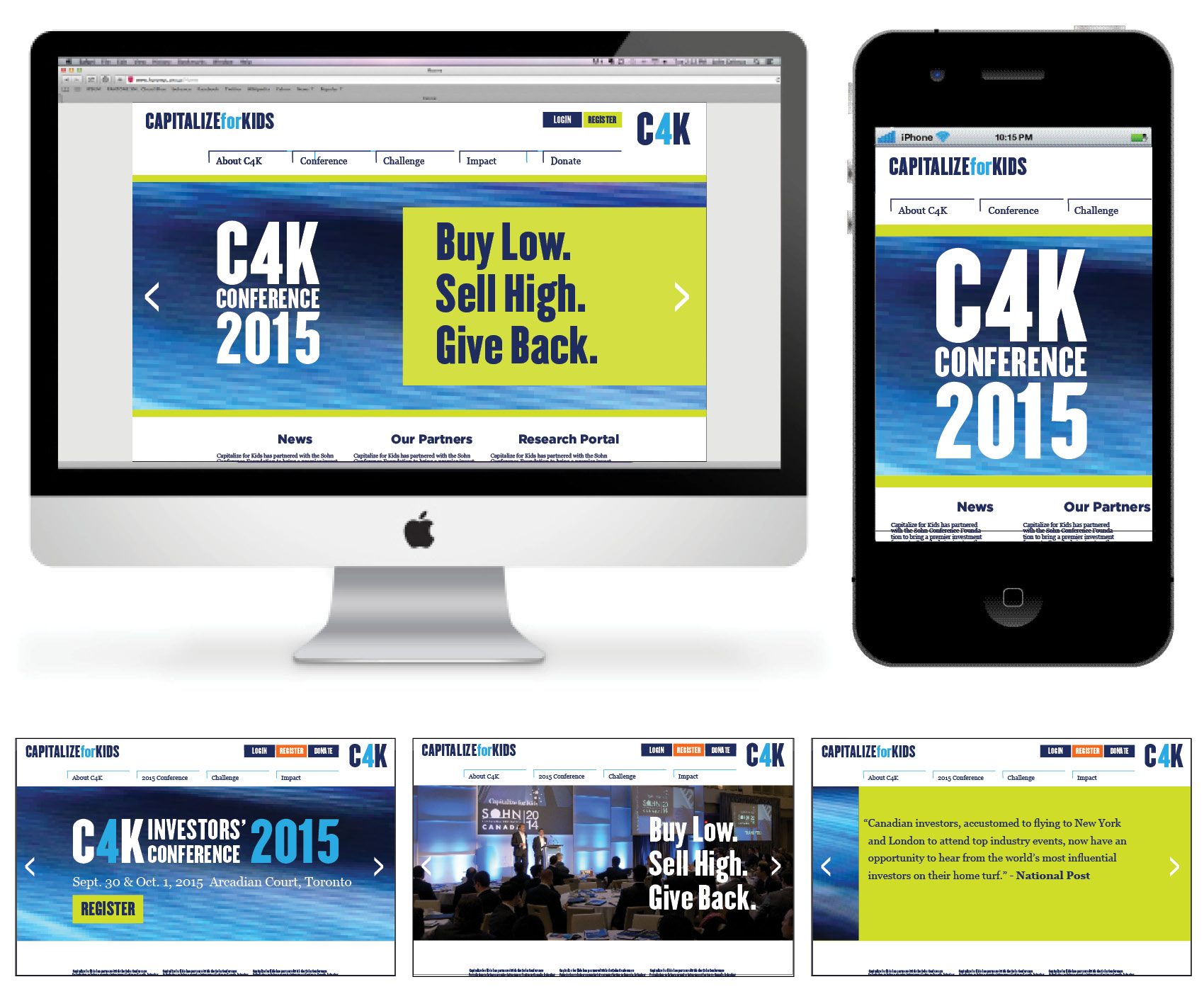
[one_half]
[/one_half]
[one_half_last]
Three important ideas for C4K:
- Provide exclusive valuable privileged useful knowledge
- Deliver charitable impact for SickKids
- Facilitate and host a sophisticated wonderful experience
The C4K full experience
The area where C4K can most powerfully differentiate is in the fully integrated experience of the two days at the conference. This requires a comprehensive approach and precise execution (people, place, electric atmosphere, with “celebrity” presenters and luxury lifestyle brand sponsorship). This is hard to replicate. Beyond digital and print promotions, the conference allows all C4K stakeholders the opportunity to become fully immersed in a full environment that must be entirely “curated” by C4K. This means full consideration must be given to all conference details from food and wine to décor, staging and gifts.
[/one_half_last]
February 12, 2017 — Comments are off for this post.
Evidence-Based Research
[one_half]
THINKING
Research
Evidence-based Research.
[supsystic-social-sharing id='1']
[/one_half]
[one_half_last]
We know where to look for information, and we know what to do with it when we find it. Our research is not done in support of pre-determined theories. It is intense investigation that drives our real design solutions.
Science
Helen Kerr holds a degree in Environmental Science. She applies laboratory and scientific acumen to her design studio. This unique combination of art and science has established KerrSmith as a leading Canadian design practice.
Laboratory
We work hard to develop solutions that are a part of real life. Although we may push boundaries, we make a point of bringing workable designs out of the theoretical ether. As in everything we do, we observe, evaluate, test, measure, record, refine, and test again. Our results speak for themselves. We provide business-changing innovation that our clients can use. We hold multiple international patents and are credited with scientific research and experimental development credentials by the Government of Canada.
Methodology
We engage in rigorous methodology that includes benchmarked verification and validation of results. We use primary, secondary and tertiary information gathering techniques including ethnographic study and experience prototyping.
Over the past few years we have also forged connections with academic researchers and institutions to maintain our cutting edge in emerging science, materials and processes. Particularly in the area of sustainability, our experience is deep.
Communication
We create research reports that document the process and findings and provide insights and recommendations.
[/one_half_last]
February 11, 2017 — Comments are off for this post.
Upper Canada College
[one_half]
2D DESIGN: COMMUNICATION DESIGN
Upper Canada College
Fundraising Brand Campaign & Materials

Scope of work
- Brand strategy
- Art direction of photography
- Brochure design
- Copy writing
- Campaign name and wordmark
[supsystic-social-sharing id='1']
[/one_half]
[one_half_last]
Upper Canada College is Canada’s leading independent boys’ school. In order to maintain a position of pre-eminence, UCC embarked on a massive fundraising campaign. Entitled “ Think Ahead”, a trio of priorities anchored the campaign: scholarships, boarding and facilities. The cornerstone of the campaign was to establish a sector-leading, needs-based financial assistance program. UCC is committed to ensuring 20% of students receive financial assistance and that students reflect diversity and a range of perspectives and backgrounds.
To maintain UCC’s relevance, we designed, articulated and created a communication system for this ambitious undertaking.
The campaign was an unprecedented success. UCC surpassed their $100 million goal.
[/one_half_last]
February 10, 2017 — Comments are off for this post.
Big Smoke Burger
[one_half]
BRANDING
Big Smoke Burger
Rebranding Toronto's Craft Burger.
[supsystic-social-sharing id='1']
[/one_half]
[one_half_last]
We rebranded the Toronto gourmet burger restaurant Craft Burger to address new location opportunities and expanded franchise operation in the U.S. We created a consolidated and differentiated brand in a competitive and growing segment, that also provided the flexibility to enter new markets and to appeal to both urban and suburban customers alike.
[/one_half_last]

January 15, 2017 — Comments are off for this post.
Sustainability
[one_half]
THINKING
Sustainability
[supsystic-social-sharing id='1']
Going Green.

[/one_half]
[one_half_last]
Everyone is thinking about sustainability but few companies are implementing profound change in the way they create and deliver goods and services. We can help you integrate green methodology and green design in your company.
It requires tremendous discipline to investigate the complete life-cycle of your products, but the impact is worth it. There are efficiencies to be had in terms of materials and processes that are both financially and environmentally beneficial. As well, by using innovative design, entirely new and more sustainable alternatives can replace existing detrimental products.
Advances in technology are making sustainable choices in areas such energy efficiency, waste reduction and elimination of toxicity possible on a broad scale rather than just in expensive and exclusive applications.
Environmental Audits
KerrSmith can provide clients with a full systematic audit of all systems and products from a green vantage point. From there we will plan with you, how to introduce best-practice environmental and sustainable systems to your company.
Supply Chain
For consumer goods makers, high-tech and other manufacturers, between 40 - 60% of a company’s carbon footprint comes from its supply chain – raw materials, transport, packaging, and energy consumed in manufacturing. For retailers it may be as high as 80%. You will have to work with your supply chain partners to reduce emissions, but investment in this chain will pay dividends. Let us show you how.
Helen Kerr has a degree in Environmental studies from the University of Waterloo and has incorporated sustainable practice into product design for 20 years.
[/one_half_last]
January 13, 2017 — Comments are off for this post.
Surrounds
[one_half]
THINKING
Surrounds
Extracting colour from the everyday.
[supsystic-social-sharing id='1']
[/one_half]
[one_half_last]
This exploratory project examines the relationship between colour and subject matter, between the abstract and pictorial, and between form and meaning. From a portfolio of incidental photos, each “surround” was created by isolating a line of pixels in the photograph and “dragging” them across the picture plane. The resulting stripes were then configured in a roundel and superimposed onto the original image.
[/one_half_last]


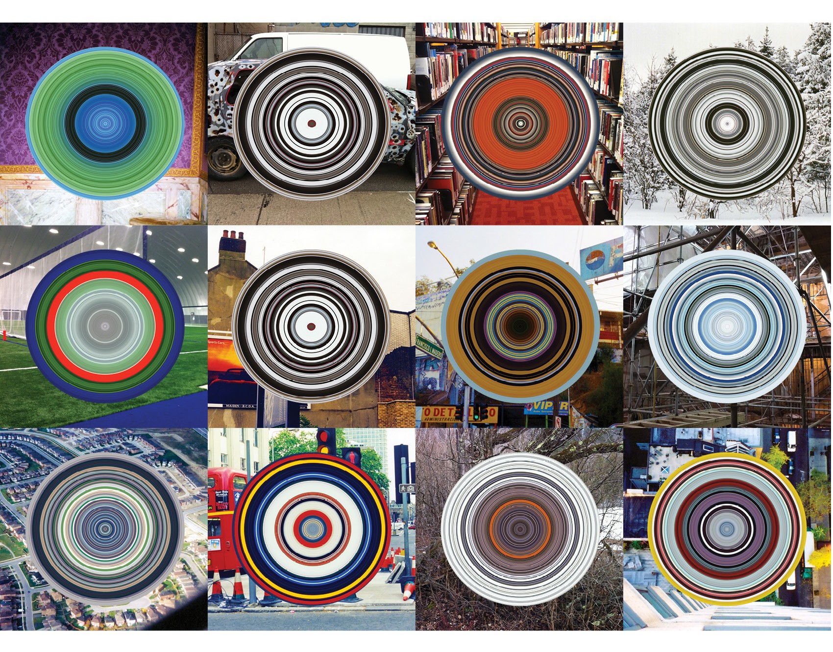
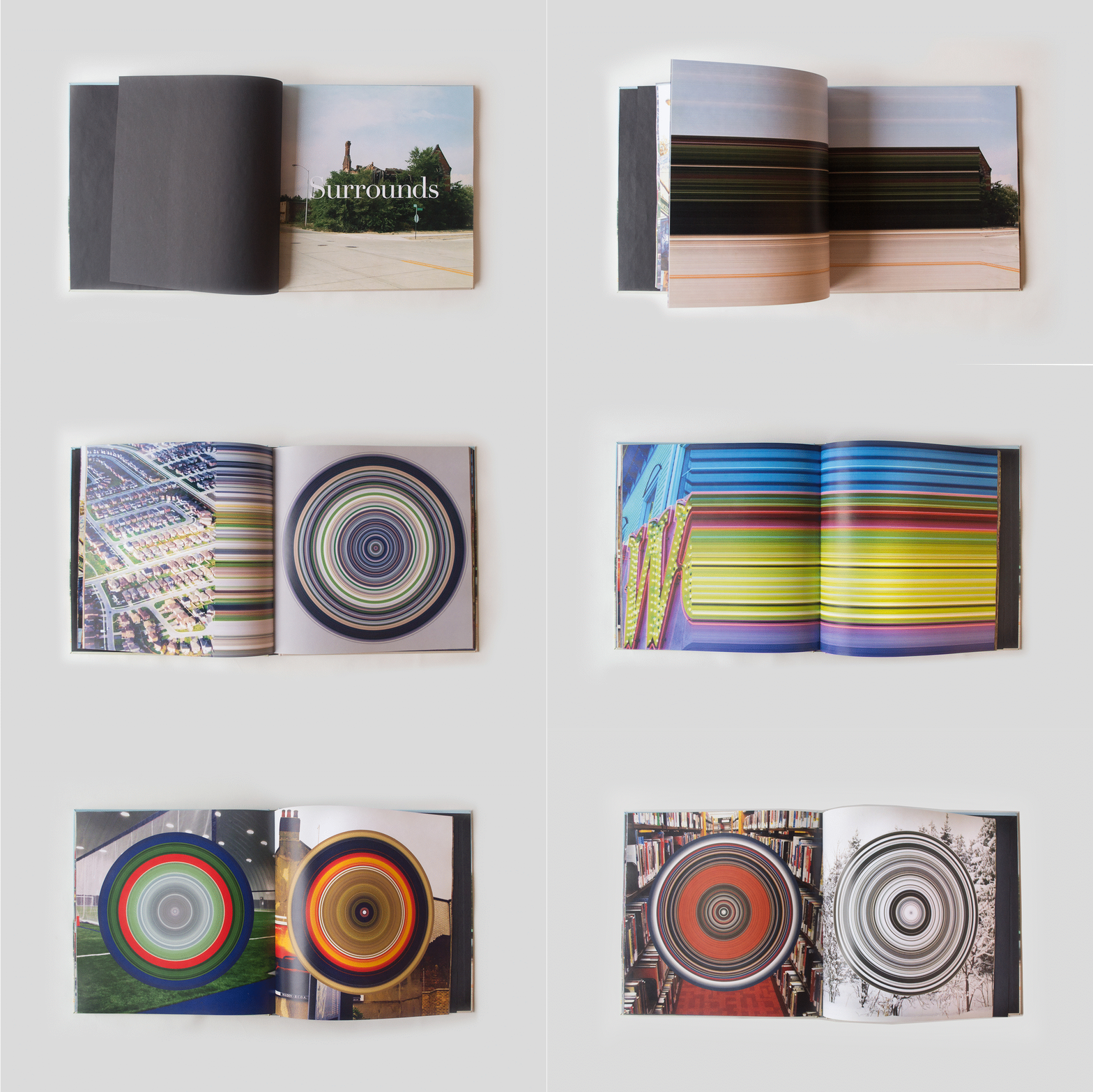

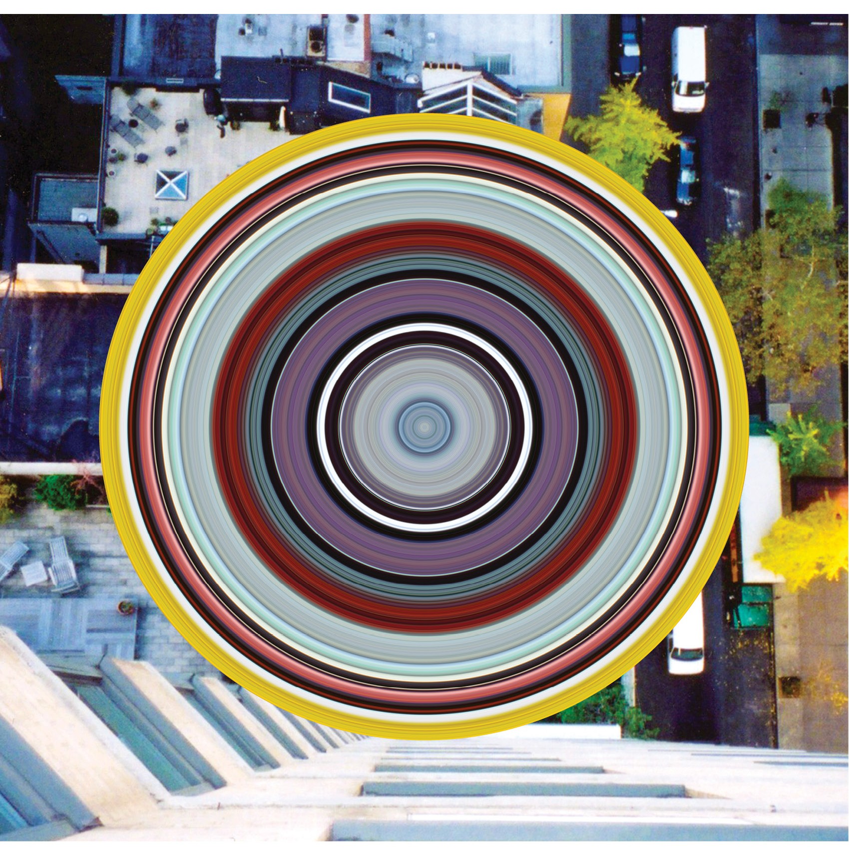

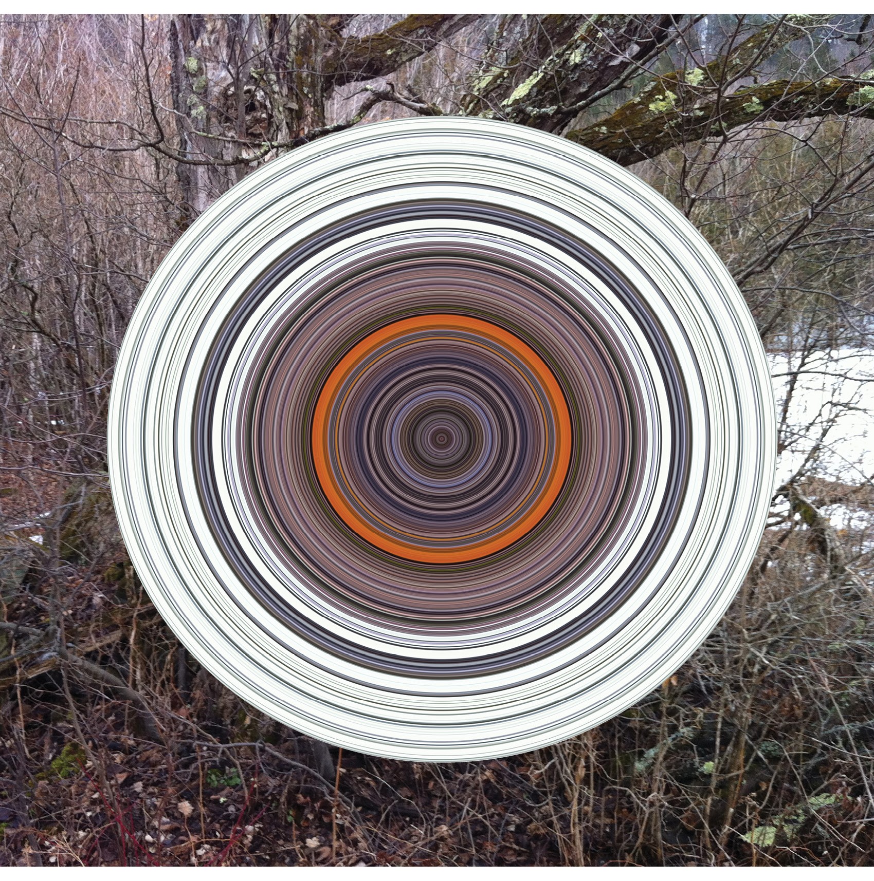

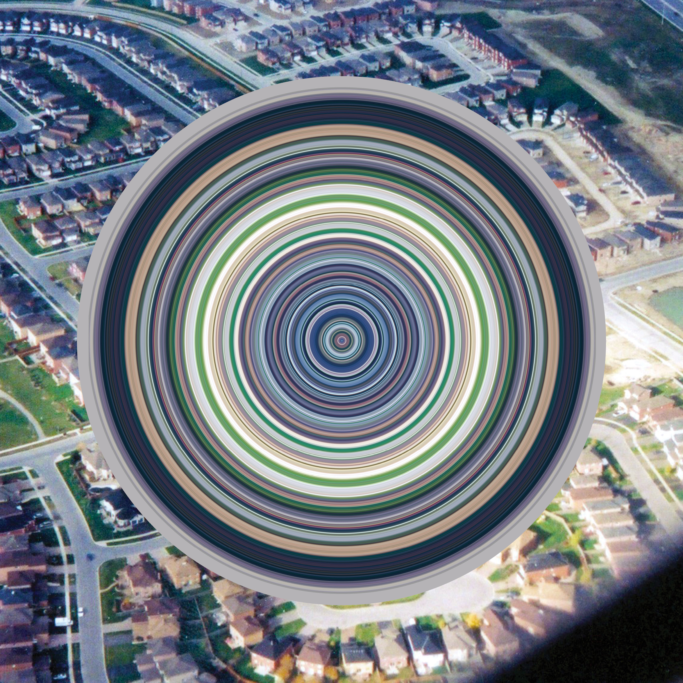

January 12, 2017 — Comments are off for this post.
Greenrock Property Management
[one_half]
2D & 3D DESIGN: SIGNAGE
Greenrock Property Management
Iconic building identifying signs for Greenrock Properties.
[supsystic-social-sharing id='1']
[/one_half]
[one_half_last]
The modular signage system is based on two rectilinear parts that allow angling for best sight lines. The dark green metal plinth supports a back-lit box with large numbers. The units have adapted well for primary and secondary signage and to the different locations, pathways, and garden sites.
The signs work well because of the number of full-scale prototypes we made and tested. The first prototypes were made of cardboard, flimsy but effective. The next were more refined but helped the entire team visualize the final signs. We tested locations, sizes, sight lines and legibility.
The design team included Janet Rosenberg Landscape and Kohn Shnier architects, as part of this renovation project for two downtown Toronto sites.
[/one_half_last]
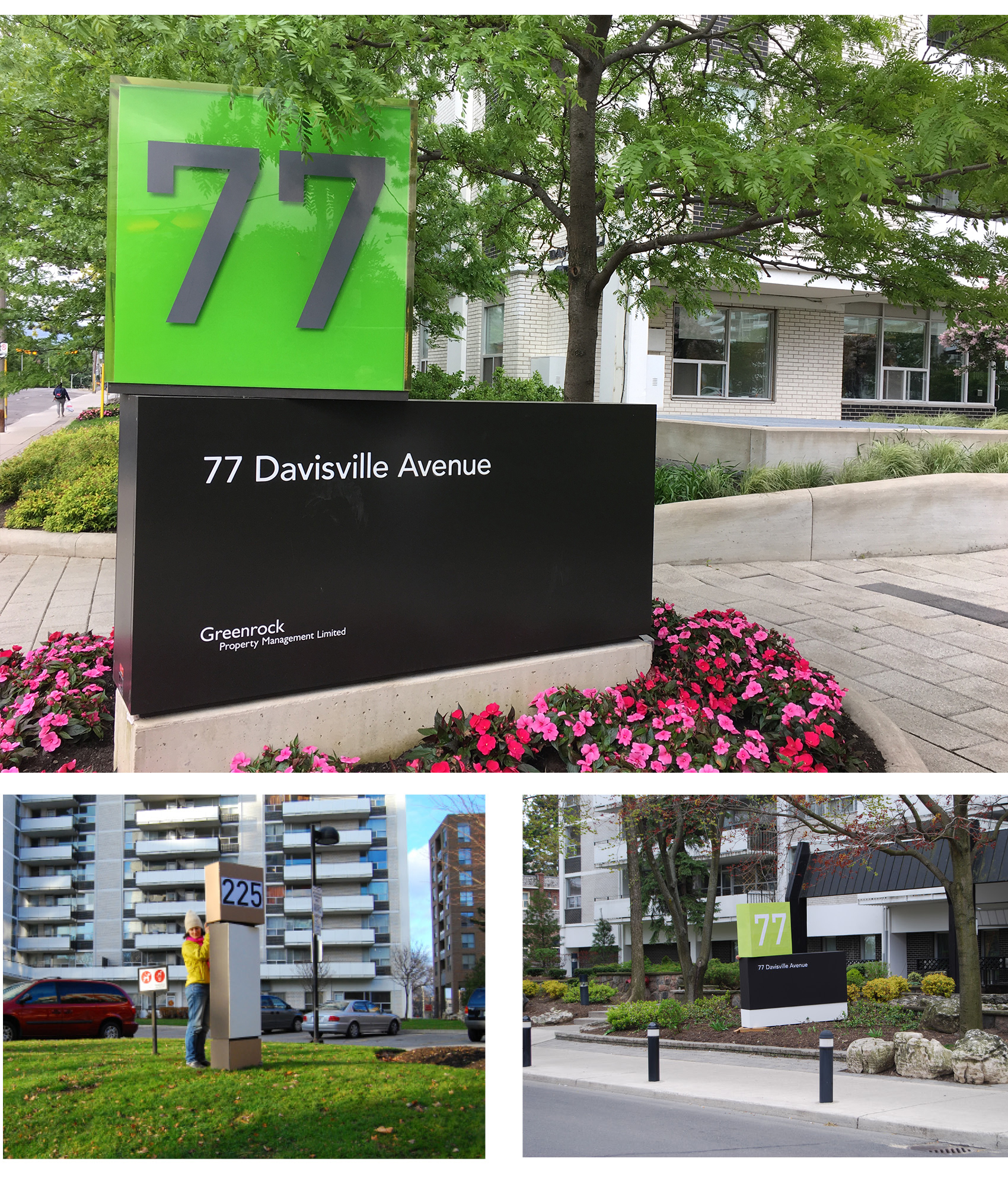
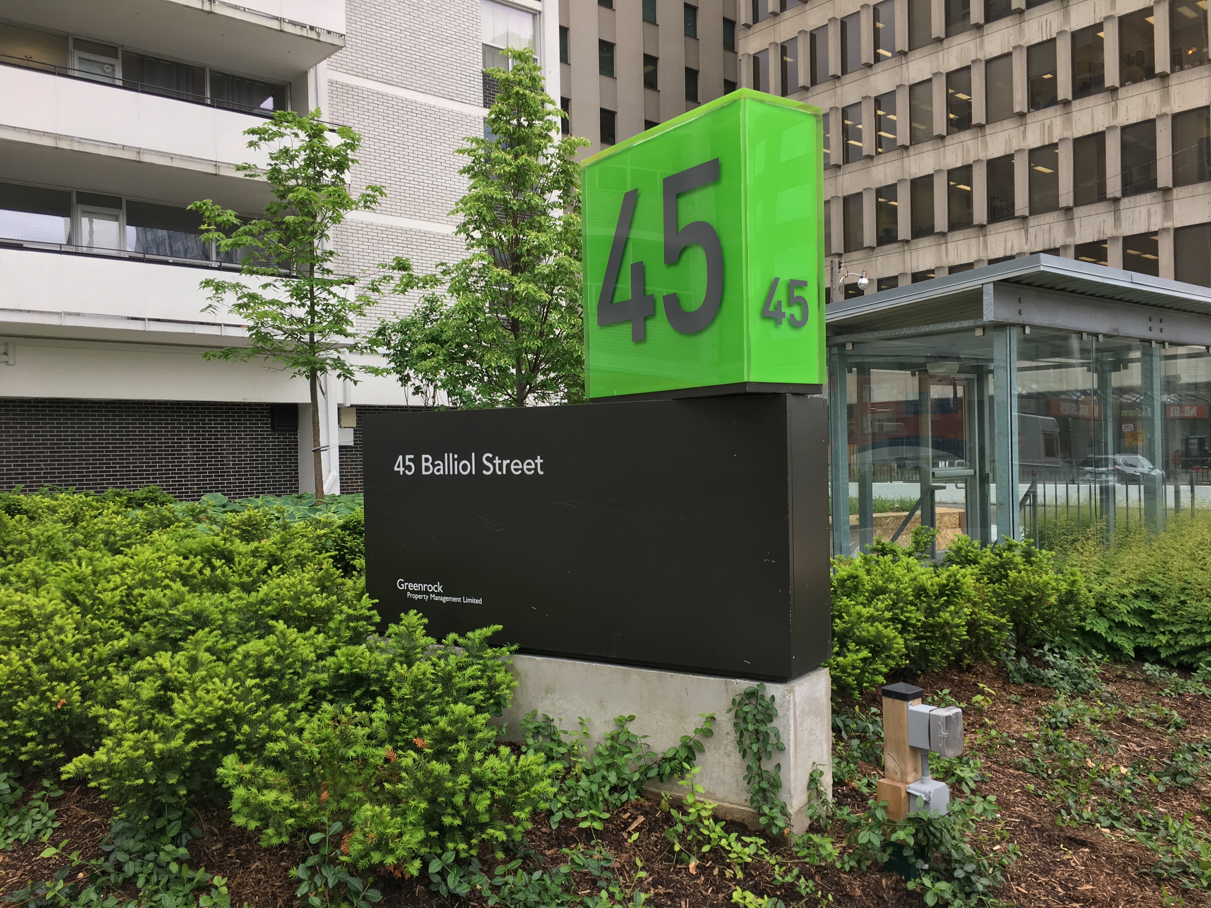
January 10, 2017 — Comments are off for this post.
Arnaud Maggs
[one_half]
2D DESIGN: PUBLICATION
Arnaud Maggs
Works and Notes Capitales
[supsystic-social-sharing id='1']
[/one_half]
[one_half_last]
The role of artists is often a disruptive and questioning one. We work with the world’s leading cultural institutions and pre-eminent contemporary artists on a variety of publication and exhibition projects. We also have a portfolio of clients to whom contemporary art is grounded in their business. Art represents growth, change and the anticipation of risks. It creates a link between business and society — connecting contemporary trends and distant foresight. And it means status, affiliation and distinction. Art can be currency. It signals curiosity, excellence, intellectual pursuit and an international perspective. These qualities are essential for a great business.
Marc Mayer in his introduction to the Arnaud Maggs exhibition catalogue at the Power Plant wrote:
Arnaud Maggs is a major figure in modern art and a fearless aesthete. His work pushes the intellectual boundary of the photographic medium back to the very brink of science, the realm from which it came over a century and a half ago and which still maintains a sizable claim on its uses. In all likelihood, this is as far as art can go toward that heavily armed front without suffering defeat, or destroying itself categorically. Why, then, does his work look so serene? And why has this dangerous exercise been such an important project for modern art? Aside from the exhilaration of a tightrope walk that that Magg’s work has consistently offered its admirers, it shows us the clear and unmistakable difference between art and science and, consequently, why art is so important.
[/one_half_last]
[one_half]
[/one_half]
[one_half_last]
I first met Arnaud Maggs through Marc Mayer and Philip Monk the curator of the Power Plant, in Toronto in 1999. I shamefully recall - like when I first saw the work of Bernd and Hiller Becher - of being nonplussed, or at least oblivious to what I was looking at.
Mind you, the first work was Downwind, which to this day I still don't think is one of Arnaud’s more powerful works. But when the envelopes of “Notification”, the Atget notebooks entitled “Repetoire”, the children’s work tags -“Travail des enfants dans l’industrie: Les etiquettes”, the Hotels signs of Paris and then the sample cases of “L’échantillonnage” unfurled before me, I was taken in entirely. I was mesmerized, entranced and fascinated by this serial Serialist. One with an eye to the detail and also the display of the whole. An artist who told stories through metaphors and symbols.
Phillip Monk writes of Maggs’ “Travail des enfants dans l’industrie: Les etiquettes”:
No more than a bundle of labels when found, “Travail des enfants dans l’industrie: Les etiquettes” unfolds a story of child-labour practices of the early twentieth century. The labels that Maggs found in Montpellier probably itemized piece-work by girls in the weaving industry. The accompanying work, “Travail des enfants dans l’industrie: Les livrets”, shows their individual passbooks, the name of Maggs’s pieces being derived from the French statute recorded on their covers. Unlike the period documents by the American photographer Lewis Hine, these works by Maggs represent a routine activity by reference to the administrative apparatus that the labouring child was a part of. This portrait exists aside from any images of the girls who did the work, and who are only known by their names – their Christian names on the tags, their surnames on their passbooks.
Monk further explains:
The tags reveal another story. In that they probably register piecework by individuals, they measure out time – the time of work and the body’s span of existence as marked by labour. More perishable than living bodies, ironically these paper ephemera are the only trace of the girl’s lives that remain, at least for us.
For the Power Plant catalogue – it designed itself really. Sara Soskolne did some requisite exquisite typography. We modified a font just for Arnaud. I think by adding the big details we added another dimension - another perspective on his work - which he appreciated.
This Catalogue - Notes Capitales, which we worked on for Arnaud after the Power Plant exhibition was based directly on a series of templates which we prepared for designers in France who faithfully used them to create the book. We reviewed the proofs, chose the images and details and corrected the details. I think it does his work justice.
[/one_half_last]
January 10, 2017 — Comments are off for this post.
LCBO
[one_half]
2D DESIGN: PROMOTION
LCBO
Vendor of Record for the LCBO.
[supsystic-social-sharing id='1']
[/one_half]
[one_half_last]
As an official Vendor of Record for the LCBO our work included an extremely wide variety of capabilities and deliverables. Our strategic work encompassed trend analysis, retail studies, colour and typographic studies, writing, art directing of photography and significant project implementation and coordination across a range of print, signage and in-store branding and promotions.
Projects included French and Italian wines, Whiskey promotions, wine buying guides, Christmas packaging, champagne specials, Vintages offerings, Italian wine and food pairings and international beer promotions.
[/one_half_last]
January 1, 2017 — Comments are off for this post.
KPMB
[one_half]
2D & 3D DESIGN: Branding
KPMB
Kuwabara Payne McKenna Blumberg Architects
[supsystic-social-sharing id='1']
[/one_half]
[one_half_last]
We worked closely with all partners to create a logo for Kuwabara Payne McKenna Blumberg Architects. We designed a visual identity, proposal and portfolio system design, stationery and website for one of Canada’s most awarded and internationally recognized architecture firms.
[/one_half_last]


October 3, 2016 — Comments are off for this post.
EDIT
[one_half]
Foresight
Edit
Expo for Design, Innovation, and Technology
Helen Kerr on the Future of Work
[supsystic-social-sharing id='1']
[/one_half]
[one_half_last]
The Expo for Design, Innovation & Technology is a large public exhibition that brings together a range of leading figures from multiple sectors and practices Through an array of participatory experiences, talks, installations, and workshops, participants are challenged to discover how they, too, can design the future.
In partnership with the United Nations Development Programme, EDIT is a 10-day immersive festival that will bring us one step closer to achieving the UNDP's Sustainable Development Goals.
The Future of Work:
Today, the steady advancement of technologies and the accelerated pace of disruptive change create less and less predictable environments in which we work. Organization Design plays a major role in reshaping the way we work, transitioning “old ways” of doing things, to new and better ways of doing and being. These new ways of working enable organizations to create workplaces that accommodate complexity, unconceived technologies, innovation, and (most importantly) our collective and individual purpose.
Fostering a culture of innovation and meaning is a viable way to revolutionize organizations, and unleash the potential of the people that powers them. This talk aims to explore the future of work, and how Design builds thriving organizations in unforeseeable environments.
Moderator: Simon Mhanna
Helen Kerr, KerrSmith
Mark Kuznicki, The Moment
Mark Raheja, AugustPublic
Jane Watson, Actionable
[/one_half_last]
September 27, 2016 — Comments are off for this post.
MIC Conference
[one_half]
Foresight
MIC Conference
Municipal Innovators Community
Helen Kerr on Thinking like a Designer.
[supsystic-social-sharing id='1']
[/one_half]
[one_half_last]
The MIC conference in Guelph this year is a forum focused on cities, innovation, leadership and public service. Participants at MiC2017 will celebrate great municipal work, learn from inspiring, experienced, knowledgeable speakers and connect with a community of dedicated and creative public servants.
The census shows that 82 percent of Canadian population live in large and medium-sized cities across the country, one of the highest concentrations among
G7 nations.
http://www.cbc.ca/news/politics/cities-population-census-2016-1.3972062
Municipalities from across Canada recognize the importance of developing innovative techniques and the importance of being able to demonstrate the tangible benefits of those efforts as they impact on the efficiency and effectiveness of cities.
Thinking Like A Designer
Helen Kerr will be presenting on “Thinking like a Designer”. At the workshop participants will learn to apply designer (problem solving) sensibilities. Merging theory with an example of on-the-ground application in a municipality, this session is based on the deep and broad experience of innovation gained across a range of sectors and projects.
Thinking Like A Designer workshop: Helen Kerr and from the Region of Peel, Marco Romano and Amy Stevens
Presentations at MiC2017 also include:
- Martha LeniofromMars Green Consulting is one of 23 women shortlisted in Canada’s next astronaut search
- Province of Ontario’s first Chief Digital OfficerHillary Hartley
- Best-selling Canadian author Lawrence Hillon the power of storytelling
- The Province of Ontario’s Behavioural Insights Uniton behaviour change
- A conversation with cities operating civic labs about the design, benefits and challenges of this emerging field of municipal innovation with Vancouver Solutions Lab, Kitchener’s Civic Innovation Lab andGuelph Lab
[/one_half_last]
September 26, 2016 — Comments are off for this post.
Helen Kerr and The Future of Food at the UN
[one_half]
Foresight
The Future of Food and SDG2 Workshop
"Global Futures – Geneva Perspectives"
Accelerating the contributions of Local Food Systems
and Global Supply Chains.
Helen Kerr is participating with UN agencies and others
at the World Meteorological Organization in Geneva.
[supsystic-social-sharing id='1']
[/one_half]
[one_half_last]
Concerned by the increasing complexity and scale of the challenges facing humanity in the 21st century, business leaders, think tanks and academic institutions, governments and inter-governmental organizations, international NGOs and influential citizens have recognized the limitations of existing analytical tools and techniques, even systems and structures.
Geneva represents a unique concentration of experience and expertise in relation to policy-relevant research and programming for many of the Sustainable Development Goals. However, there are few opportunities (“safe spaces”) for inter-agency collaboration to leverage the benefits of specialization in collective intelligence and co-creation, incorporating the best of innovations in technology and financing - for the common good.
The 3-day exercise is expected to look at the complex problems of food and agriculture systems across the globe today. Major issues include Food Security, Economic Growth, and Disparity, “Big Food”, Climate Change and Conflict.
Helen Kerr was asked to participate in the sessions as a leading Foresighter after her presentations on Strategic Foresight in Finland and Belgium earlier this year. The UN recently released a report on The Future of Food and Agriculture: Trends and Challenges, and The Food Crises of 2017.
ABOUT FORESIGHT
Foresight does not predict the future. Rather, Foresight enables practitioners to explore plausible futures informed by current trends and trajectories as well as emergent “distant” signals of change to plan for or manage risk for futures that are probable.
Foresight refers to a range of practices, methods, tools, and techniques that help organizations actively explore, shape and manage the future. This includes understanding key drivers of change, horizon scanning, scenario development and the mapping of implications of change on specific businesses, projects or contexts.
http://geneva2030.org/#overview
[/one_half_last]
January 21, 2016 — Comments are off for this post.
Canadian Heritage
[one_half]
Foresight & Insight
Futures of Canadian Identities
Scope of work
- STEEPV framework
- Trends and Drivers of Change
- Horizons Workshops
- Scenarios
[supsystic-social-sharing id='1']
[/one_half]
[one_half_last]
Canadian Heritage was seeking a capacity building approach to enable greater resiliency in policy analysis and anticipatory skills. This action research project had an explicit focus on co-creating and sharing generated knowledge and an experiential knowledge-transfer orientation, operating at multiple levels: Integrated team, buddy system between individual team members, workshops and active participation in design, analysis and conclusions. The experiential learning used a Strategic Foresight investigation of the futures of Canadian identities, which allowed the practice of various elements of the complexity toolkit. Specifically, the shift to decolonization and redistribution of wealth and power within Canada was investigated.
In addition to the transfer of knowledge and capacity building, the project yielded 268 relevant signals of changes, a set of 14 trends, and an analysis of 12 underlying drivers. It also uncovered the top critical uncertain drivers for the PCH team and built 4 scenarios using the top two such uncertainties. Using the scenarios, a rich list of implications and a set of strategic perspectives were developed to assist the Medium Term Planning process in articulating policies and strategies.
[/one_half_last]

© KerrSmith Design 2023


