[one_half]
2D & 3D DESIGN: BRANDING
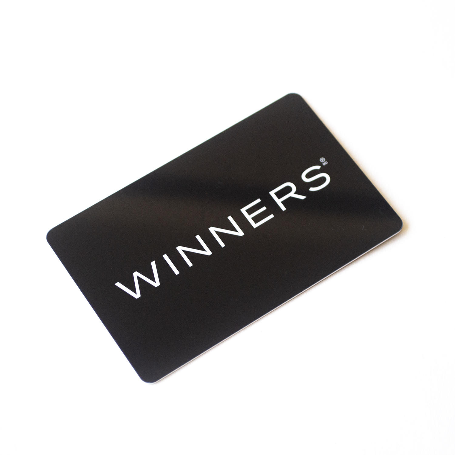
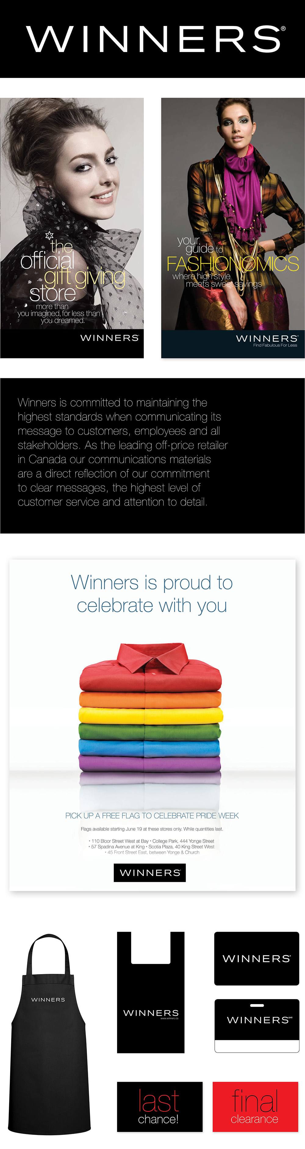
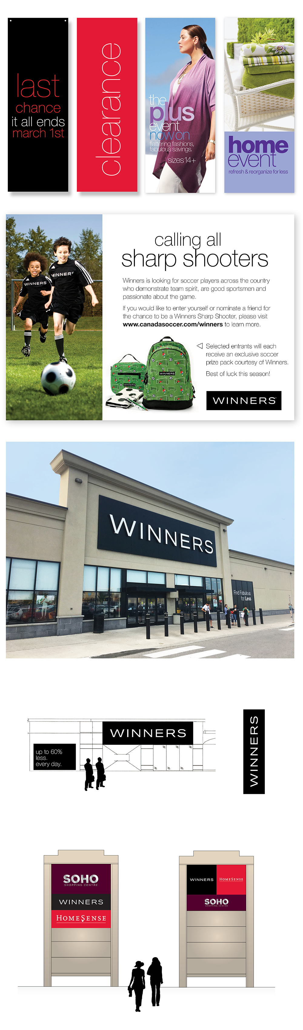
Winners
Winners is Canada’s leading off-price retailer with over 300 stores across the country. It offers brand name clothing, footwear, bedding and housewares. HomeSense, a sister store, is a home accessory retailer.
Scope of work
- Research and engagement
- Wordmarks
- Signage and specifications
- In-store signage and display schema
- Schematics for display design, aprons,
bags, gift cards, vehicles etc. - Marketing concepts
- Extensive style guides
[supsystic-social-sharing id='1']
[/one_half]
[one_half_last]
The Design Challenge
Outdated and disparate graphic design programs were badly in need of strategy, insights, consolidation and streamlining. The brief asked us to speak to the duality of off-price but prestigious brand offerings. The previous identity had evolved casually without a proper research and engagement methodology.
Engagement and Research
We worked very closely with Senior Management and Executive Leadership in Canada and the United States to understand goals and objectives. Our insight that the target market was looking for a more aspirational “up market” look and feel for the two brands, contradicted the initial marketing brief to emphasize the “bargain hunting” sense of excitement that the shoppers loved. We developed a visual survey and questionnaire for leadership that prompted much discussion and debate and allowed us to co-plan and co-create new identities for Winners and HomeSense. Further research, and interviews with other stakeholders pointed out that the previously pre-determined insight, did not ring true. That in fact the attraction of Winners lies strongly in the offering of branded products and merchandize.
We also found that the siloed internal departments did not have a cohesive or aligned vision, strategy or guidelines for consistent application of the brand. Our brand style guide became an essential management tool to communicate common understandings and an articulation of the vision for the stores.
Our Design Solution
In the case of Winners we were inspired by the graphic language of Chanel, DKNY, Calvin Klein, and Marc Jacob. We used a clean elegant extended slightly modified sans-serif type face on a field of black to speak the language of high fashion – while the name of the store communicates the off-price nature of the offering. For HomeSense we eliminated the cliché peaked roof of the old logo which reminded many of hardware rather than housewares and home goods. The new classical serif typography and underline we designed are reminiscent of the labels from high quality linens, gifts and décor shops.
Winners and HomeSense have never looked back. Business growth, brand recognition and marketing recall are extremely high. Our guidelines have been adapted and continue to roll through expansion.
[/one_half_last]
No Comments.